
研究一个动画相册送给女朋友吧
css代码
*{
    margin:0;
    padding:0;
}
body{
    max-width: 100%;
    min-width: 100%;
    height: 100%;
    background-size: cover;
    background-repeat: no-repeat;
    background-attachment: fixed;
    background-size:100% 100%;
    position: absolute;
    margin-left: auto;
    margin-right: auto;
    background-color: pink;
    /* margin-top: 100px; */
}
li{
    list-style: none;
}
.box{
    width:200px;
    height:200px;
    background-size: cover;
    background-repeat: no-repeat;
    background-attachment: fixed;
    background-size:100% 100%;
    position: absolute;
    margin-left: 42%;
    margin-top: 22%;
    -webkit-transform-style:preserve-3d;
    -webkit-transform:rotateX(13deg);
    -webkit-animation:move 5s linear infinite;
}
.minbox{
    width:100px;
    height:100px;
    position: absolute;
    left:50px;
    top:30px;
    -webkit-transform-style:preserve-3d;
}
.minbox li{
    width:100px;
    height:100px;
    position: absolute;
    left:0;
    top:0;
}
.minbox li:nth-child(1){
    background: url(./img/01.png) no-repeat 0 0;
    -webkit-transform:translateZ(50px) rotateY(-180deg);
}
.minbox li:nth-child(2){
    background: url(./img/02.png) no-repeat 0 0;
    -webkit-transform:translateZ(-50px);
}
.minbox li:nth-child(3){
    background: url(./img/03.png) no-repeat 0 0;
    -webkit-transform:rotateX(90deg) translateZ(50px);
}
.minbox li:nth-child(4){
    background: url(./img/04.png) no-repeat 0 0;
    -webkit-transform:rotateX(-90deg) translateZ(50px);
}
.minbox li:nth-child(5){
    background: url(./img/05.png) no-repeat 0 0;
    -webkit-transform:rotateY(90deg) translateZ(50px);
}
.minbox li:nth-child(6){
    background: url(./img/06.png) no-repeat 0 0;
    -webkit-transform:rotateY(-90deg) translateZ(50px);
}
.maxbox li:nth-child(1){
    background: url(./img/1.png) no-repeat 0 0;
    -webkit-transform:translateZ(50px);
}
.maxbox li:nth-child(2){
    background: url(./img/2.png) no-repeat 0 0;
    -webkit-transform: translateZ(-50px);
}
.maxbox li:nth-child(3){
    background: url(./img/3.png) no-repeat 0 0;
    -webkit-transform:rotateX(-90deg) translateZ(50px);
}
.maxbox li:nth-child(4){
    background: url(./img/4.png) no-repeat 0 0;
    -webkit-transform:rotateX(90deg) translateZ(50px);
}
.maxbox li:nth-child(5){
    background: url(./img/5.png) no-repeat 0 0;
    -webkit-transform:rotateY(-90deg) translateZ(50px);
}
.maxbox li:nth-child(6){
    background: url(./img/6.png) no-repeat 0 0;
    -webkit-transform :rotateY(90deg) translateZ(50px);
}
.maxbox{
    width: 800px;
    height: 400px;
    position: absolute;
    left: 0;
    top: -20px;
    -webkit-transform-style: preserve-3d;

}
.maxbox li{
    width: 200px;
    height: 200px;
    background: #fff;
    border:1px solid #ccc;
    position: absolute;
    left: 0;
    top: 0;
    opacity: 0.2;
    -webkit-transition:all 1s ease;
}
.maxbox li:nth-child(1){
    -webkit-transform:translateZ(100px);
}
.maxbox li:nth-child(2){
    -webkit-transform:translateZ(-100px);
}
.maxbox li:nth-child(3){
    -webkit-transform:rotateX(-90deg) translateZ(100px);
}
.maxbox li:nth-child(4){
    -webkit-transform:rotateX(90deg) translateZ(100px);
}
.maxbox li:nth-child(5){
    -webkit-transform:rotateY(-90deg) translateZ(100px);
}
.maxbox li:nth-child(6){
    -webkit-transform:rotateY(90deg) translateZ(100px);
}
.box:hover ol li:nth-child(1){
    -webkit-transform:translateZ(300px);
    width: 400px;
    height: 400px;
    opacity: 0.8;
    left: -100px;
    top: -100px;
}
.box:hover ol li:nth-child(2){
    -webkit-transform:  translateZ(-300px);
    width: 400px;
    height: 400px;
    opacity: 0.8;
    left: -100px;
    top: -100px;
}
.box:hover ol li:nth-child(3){
    -webkit-transform:rotateX(-90deg) translateZ(300px);
    width: 400px;
    height: 400px;
    opacity: 0.8;
    left: -100px;
    top: -100px;
}
.box:hover ol li:nth-child(4){
    -webkit-transform:rotateX(90deg) translateZ(300px);
    width: 400px;
    height: 400px;
    opacity: 0.8;
    left: -100px;
    top: -100px;
}
.box:hover ol li:nth-child(5){
    -webkit-transform: rotateY(-90deg) translateZ(300px);
    width: 400px;
    height: 400px;
    opacity: 0.8;
    left: -100px;
    top: -100px;
}
.box:hover ol li:nth-child(6){
    -webkit-transform:rotateY(90deg) translateZ(300px);
    width: 400px;
    height: 400px;
    opacity: 0.8;
    left: -100px;
    top: -100px;
}
@keyframes move{
    0%{
        -webkit-transform: rotateX(13deg) rotateY(0deg);
    }
    100%{
        -webkit-transform:rotateX(13deg) rotateY(360deg);
    }
}
html代码
<div class="box">
    <ul class="minbox">
        <li></li>
        <li></li>
        <li></li>
        <li></li>
        <li></li>
        <li></li>
    </ul>
    <ol class="maxbox">
        <li></li>
        <li></li>
        <li></li>
        <li></li>
        <li></li>
        <li></li>
    </ol>
</div>
效果图
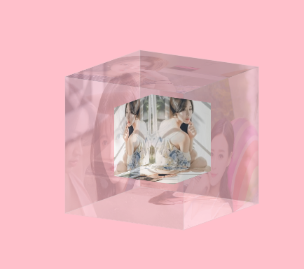
注意:前面6个以0开头的图片大小要裁剪成100像素,另外6个大小为400像素。

 浙公网安备 33010602011771号