
div块元素垂直水平居中方法总结
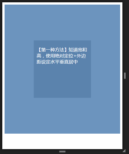
1、已知块级元素的宽和高,使用绝对定位+外边距设定水平垂直居中。
父元素position:relative,子元素position:absolute;top:50%;left:50%;margin-top:-height/2;margin-left:-width/2;
效果图如下
代码:

<div class="box">
    <div class="center-box1">
        <p>【第一种方法】知道长和宽,使用绝对定位+外边距设定水平垂直居中</p>
    </div>
</div>

.box {
    background: #6c94be;
    width: 100%;
    height: 450px;
    position: relative;
}
.center-box1 {
    position: absolute;
    top: 50%;
    left: 50%;
    margin-top: -100px;
    margin-left: -100px;
    width: 200px;
    height: 200px;
    background: #5B83AD;
}
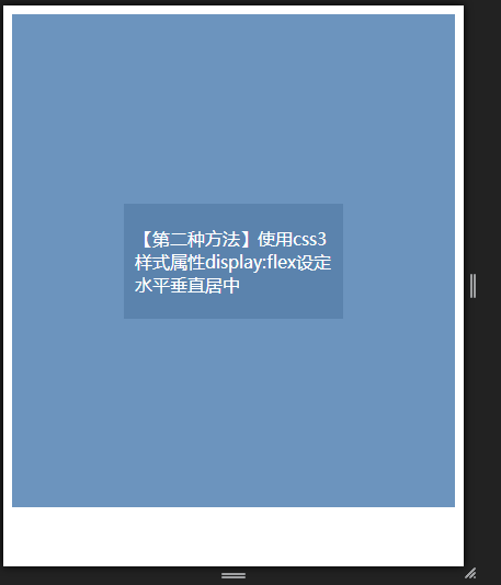
2、使用css3样式属性display:flex设定水平垂直居中,父元素样式属性display:flex;子元素使用margin:auto;未知子元素高度的时候依然可以使用。
一般chrome和火狐都能很好地支持。ie不支持
效果图如下:
代码:
<div class="box">
    <div class="center-box2">
        <p>【第二种方法】使用css3样式属性display:flex设定水平垂直居中</p>
    </div>
</div>

.box {
    background: #6c94be;
    width: 100%;
    height: 450px;
    display: flex;
}
.center-box2 {
    margin: auto;
    width: 200px;
    background: #5B83AD;
}
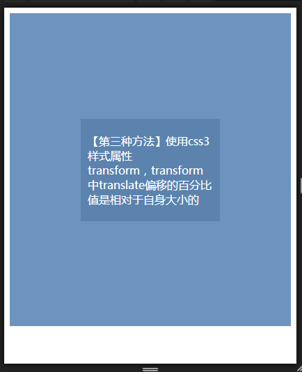
3、依然使用绝对定位+css3样式属性transform
transform中translate偏移的百分比值是相对于自身大小的,无论绝对定位元素的尺寸是多少,其都是水平垂直居中显示的,但问题是兼容性不好。IE9+以及其他现代浏览器才支持。IE9之前版本不支持,在IE8模式下,不居中。
效果图如下:
代码:
<div class="box">
    <div class="center-box3">
        <p>【第三种方法】使用css3样式属性transform,transform中translate偏移的百分比值是相对于自身大小的</p>
    </div>
</div>

.box {
    background: #6c94be;
    width: 100%;
    height: 450px;
    position: relative;
}

.center-box3 {
    position: absolute;
    top: 50%;
    left: 50%;
    transform: translate(-50%,-50%);
    background: #5B83AD;
    width: 200px;
}
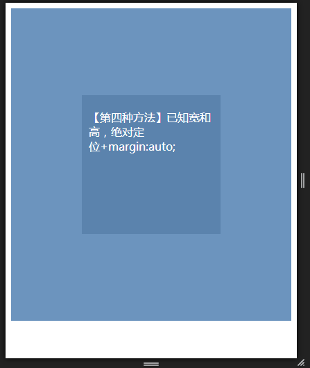
4、已知块级元素的宽和高,设置其样式属性position:absolute;top:0;left:0;bottom:0;right:0;+margin:auto;
效果图如下:
代码:
<div class="box">
    <div class="center-box4">
        <p>【第四种方法】已知宽和高,绝对定位+margin:auto;</p>
    </div>
</div>

.box {
    background: #6c94be;
    width: 100%;
    height: 450px;
    position: relative;
}
.center-box4 {
    position: absolute;
    top: 0;
    left: 0;
    bottom: 0;
    right: 0;
    width: 200px;
    height: 200px;
    background: #5B83AD;
    margin: auto;
}


 浙公网安备 33010602011771号