

瀑布流的一些CSS实现方式
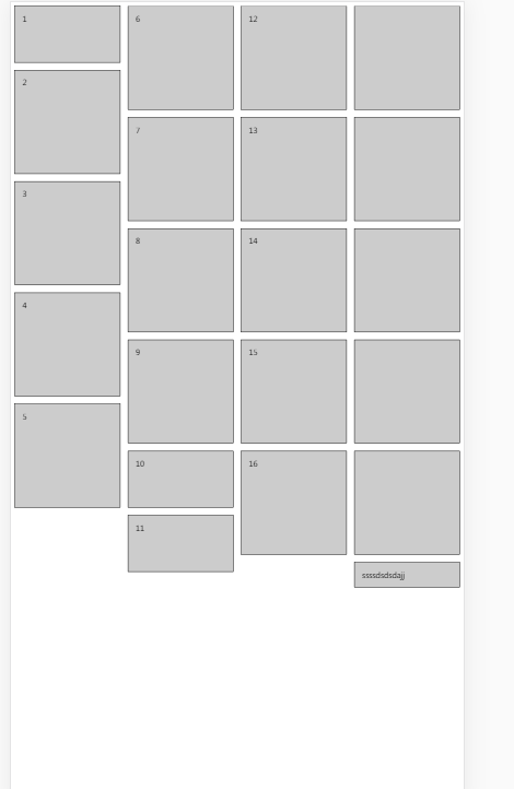
一个选择是用CSS3的多列columns,可以参考这篇文章。但这篇文章给的例子并不怎么好理解,我做了一些更改,在每个元素上加了序号。可以看到,多列布局是在每一列上依次排列元素的,第一列排完才开始排第二列,因为这里规定了4列,会尽量把元素数量均分到每一列。
<!DOCTYPE html>
<html lang="en">
<head>
    <meta charset="UTF-8">
    <title>Document</title>
</head>
<style type="text/css">
    .box{
        height: 123px;
        padding: 1em;
        margin-top: 1em;
        break-inside: avoid;
        border: 1px solid #000;
        background: #ccc;
    }
    .spe{
        height: 225px;
    }
    .box-wrapper{
        column-count:4;
        column-gap: 1em;
    }

  *{
    box-sizing:border-box;
  }
  .ggg{
    height: 100%;
    overflow-wrap: break-word
  }
</style>
<body>
  <div class="box-wrapper">
      <div style="margin-top:0px" class="box">1</div>
      <div class="box spe">2</div>
      <div class="box spe">3</div>
      <div class="box spe">4</div>
      <div class="box spe">5</div>
    <div class="box spe">6</div>
      <div class="box spe">7</div>
      <div class="box spe">8</div>
      <div class="box spe">9</div>
      <div class="box">10</div>
      <div class="box">11</div>
      <div class="box spe">12</div>
      <div class="box spe">13</div>
      <div class="box spe">14</div>
    <div class="box spe">15</div>
    <div class="box spe">16</div>
    <div class="box spe"></div>
    <div class="box spe"></div>
    <div class="box spe"></div>
    <div class="box spe"></div>
    <div class="box spe"></div>
    <div class="box ggg">ssssdsdsdajj</div>
  </div>
</body>
</html>
另外一种方式是使用flex,可以参考这篇文章 关于flex实现的更多细节没有再探究,目前项目中也没有遇到该类需求,把精力放在JS需求上。

 浙公网安备 33010602011771号