实例代码:
<!DOCTYPE html>
<html>
<head>
    <meta charset="utf-8">
    <title>伪类的使用</title>
    <style>
        .box {
            width: 500px;
            height: 200px;
            background: lightblue;
            font: 43px/200px "microsoft yahei";
            color: darkblue;
            text-align: center;
            margin: 0 auto;
            text-shadow: 0 1px 1px #fff;
            position: relative;
        }

        .box:before,
        .box:after {
            content: ' ';
            position: absolute;
            bottom: 8px;
            left: 5px;
            width: 50%;
            height: 20%;
            box-shadow: 0 10px 20px #ccc;
            transform: rotate(-3deg);
            z-index: -1;
        }
        .box:after {
            left: auto;
            right: 5px;
            transform: rotate(3deg);
        }
    </style>
</head>
<body>
<div class="box">
    Hello World By CSS3
</div>
</body>
</html>
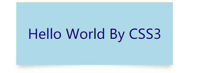
运行效果:


 浙公网安备 33010602011771号