
H5-31 动画
动画是使元素从一种样式逐渐变化为另一种样式的效果
您可以改变任意多的样式任意多的次数
请用百分比来规定变化发生的时间,或用关键词“from”和“to”,等同于0%和100%
0%是动画的开始,100%是动画的完成。
1、@keyframes创建动画
使用@keyframes创建动画
@keyframes name{
from/0%{
css样式
}
percent/50%{
css样式
}
to/100%{
css样式
}
name:动画名称,开发人员自己命名;
percent:为百分比,可以添加多个百分比值;
2、animation执行
animation:name duration timing-function delay iteration-count direction;
| 值 | 描述 |
| name | 设置动画名称 |
| duration | 设置动画的持续时间 |
| timing-function | 设置动画效果的速率(如下) |
| delay | 设置动画的开始时间(延时执行) |
| iteration-count | 设置动画循环次数,infinite为无限次数的循环 |
| direction | 设置动画播放的方向(如下) |
| animation-play-state | 控制动画的播放状态:running代表播放,而paused代表停止播放 |
| timing-function值 | 描述 |
| ease | 逐渐变慢(默认) |
| linear | 匀速 |
| ease-in | 加速 |
| ease-out | 减速 |
| ease-in-out | 先加速后减速 |
| direction值 | 描述 |
| normal | 默认值为normal |
| alternate | 动画播放放在第偶数次向前播放,第奇数次方向反方向播放 |
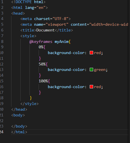
3、切换背景颜色
<div></div>
div{
width: 200px;
height:200px;
background-color : red;
animation:myAnim 3s linear 0s infinite;
}
div:hover{
animation-play-state: paused; 鼠标放上去暂停
}
@keyframes myAnim{
0%{
background-color: red;
}
50%{
background-color: green;
}
100%{
background-color: red;
}
}

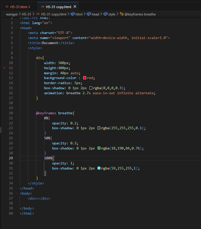
4、呼吸效果
<div></div>
div{
width: 500px;
height:400px;
margin: 40px auto;
background-color : red;
border-radius: 5px;
box-shadow: 0 1px 2px rgba(0,0,0,0.3);
animation: breathe 2.7s ease-in-out infinite alternate;
}
@keyframes breathe{
0%{
opacity: 0.2;
box-shadow: 0 1px 2px rgba(255,255,255,0.1);
}
50%{
opacity: 0.5;
box-shadow: 0 1px 2px rgba(18,190,84,0.76);
}
100%{
opacity: 1;
box-shadow: 0 1px 2px rgba(59,255,255,1);
}
}

 浙公网安备 33010602011771号