H5-25 弹性盒子模型(flex box)

1、定义:弹性盒子是CSS3的一种新的布局模式

  CSS3弹性盒子是一种当前页面需要适应不同的屏幕大小以及设备类型时确保元素拥有恰当的行为的布局方式

  引入弹性盒子布局模型的目的是提供一种更加有效的方式来对一个容器中的子元素进行排列、对齐和分配空白空间

2、CSS3弹性盒子内容

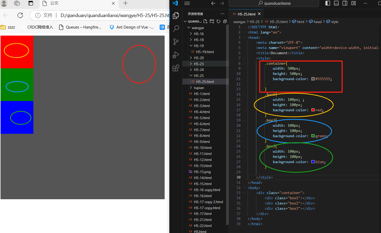
  弹性盒子由弹性容器(Flex container)和弹性子元素(Flex item)组成

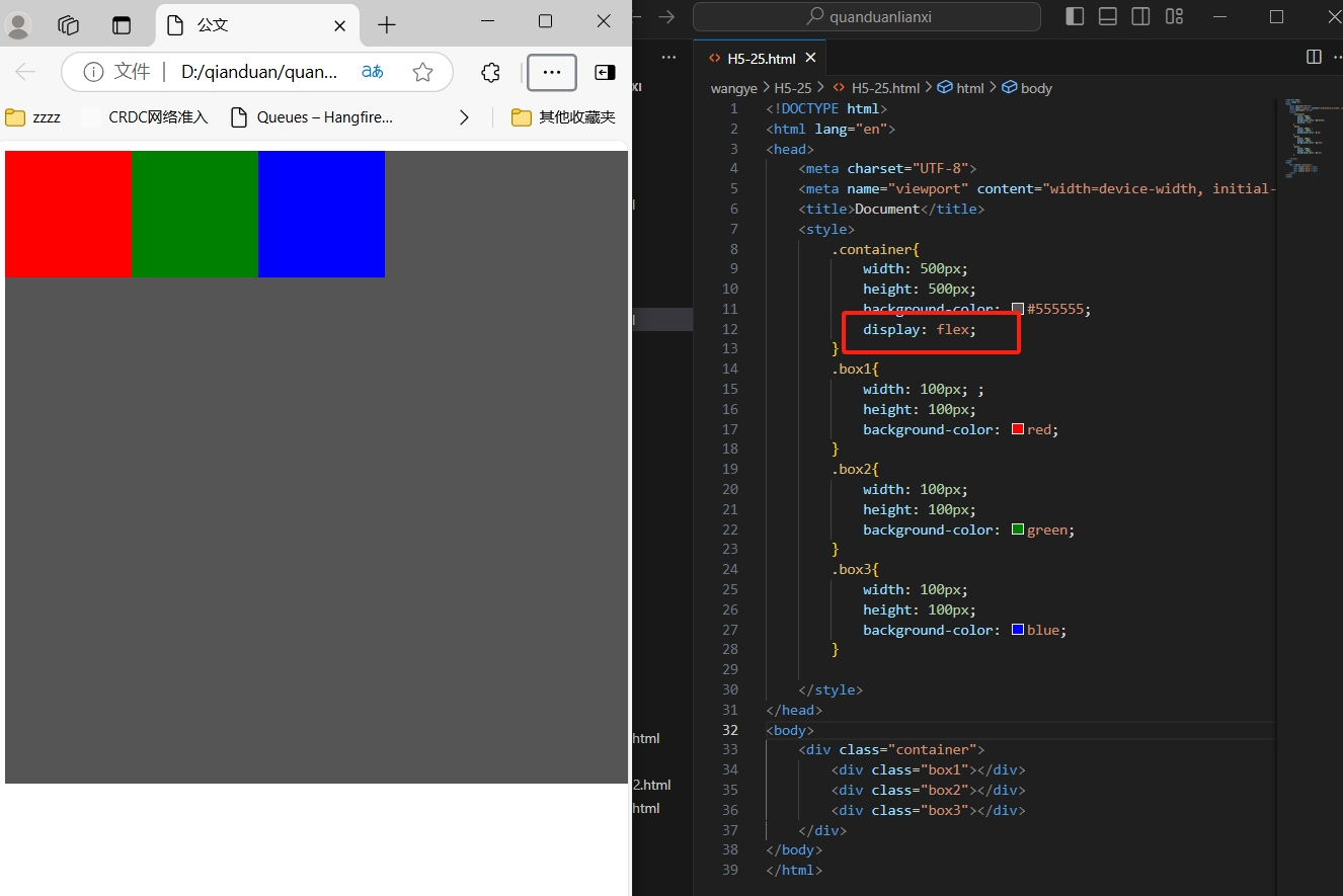
  弹性容器通过设置display属性的值为flex将其定义为弹性容器

  弹性容器内包含了一个或多个弹性子元素

温馨提示:弹性容器外及弹性子元素内是正常渲染的。弹性盒子只定义了弹性子元素如何在弹性容器内布局


  <div class="container">
        <div class="box1"></div>
        <div class="box2"></div>
        <div class="box3"></div>
    </div>


<style>
        .container{
            width: 500px;
            height: 500px;
            background-color: #555555;
           display: flex;
        }
        .box1{
            width: 100px; ;
            height: 100px;
            background-color: red;
        }
        .box2{
            width: 100px;
            height: 100px;
            background-color: green;
        }
        .box3{
            width: 100px;
            height: 100px;
            background-color: blue;
        }


温馨提示:弹性盒子默认横向摆放

3、父元素上的属性:

display属性

  display:flex;开启弹性盒子

  display:flex;属性设置后子元素默认水平排列
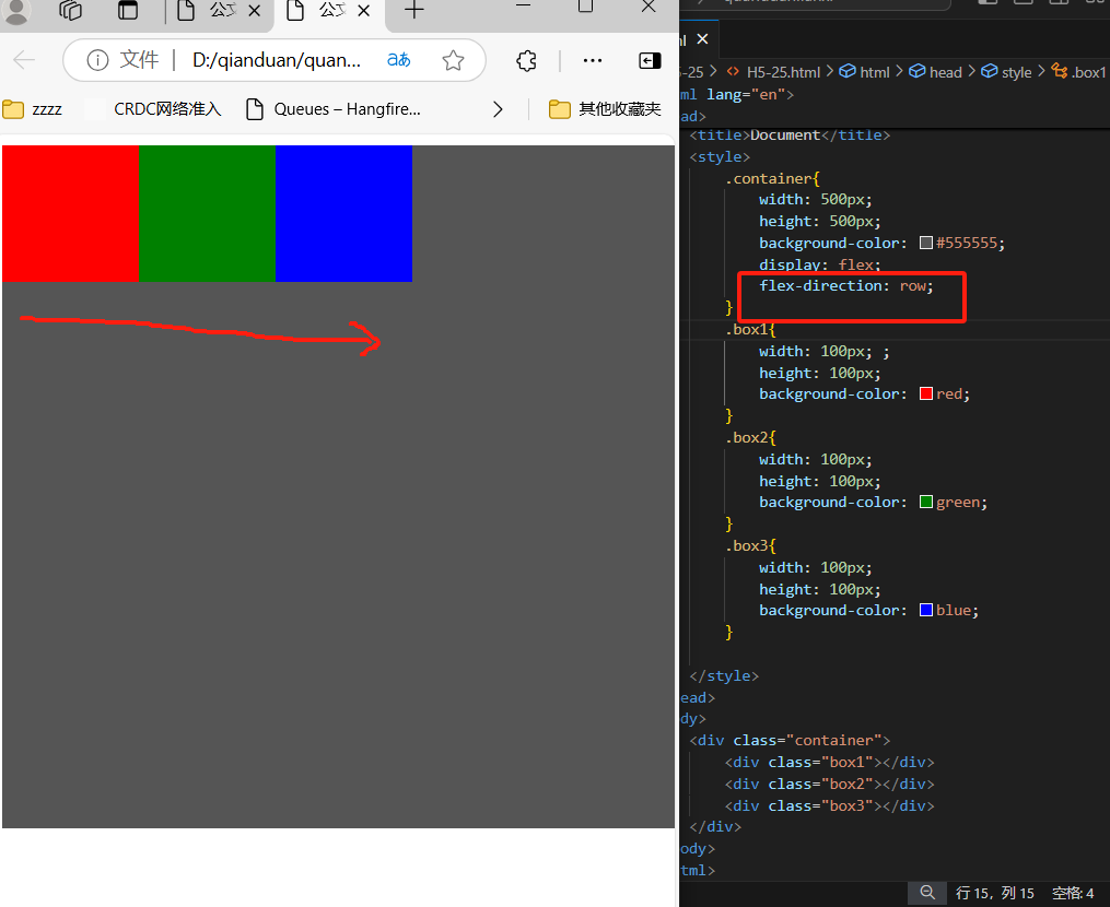
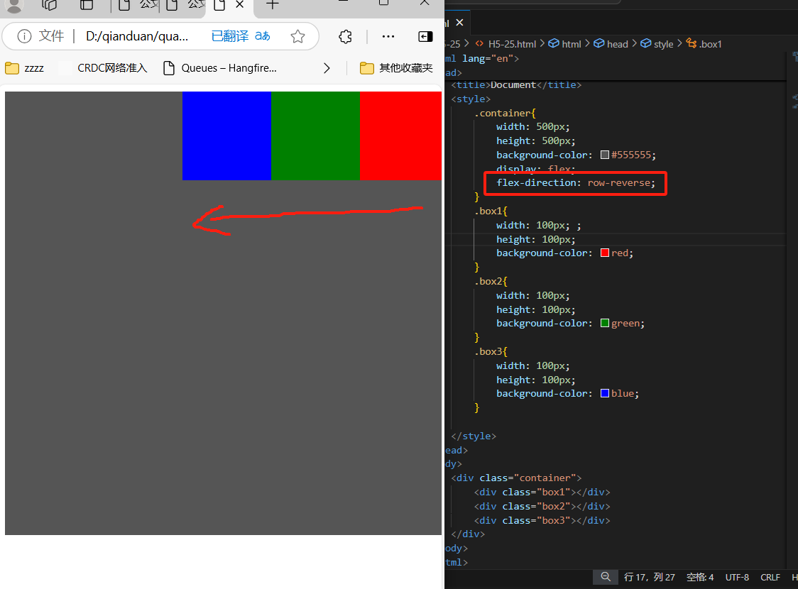
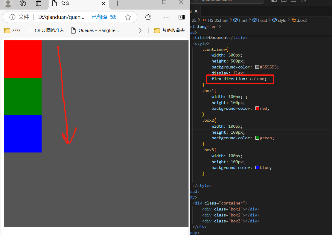
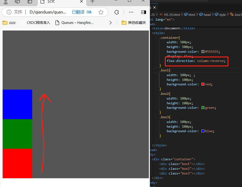
flex-direction属性

  定义:flex-direction属性指定了弹性子元素在父容器中的位置

  语法:

  flex-direction:row、row-reverse、column、column-reverse

  row:横向从左到右排列(左对齐),默认的排列

  row-reverse:反转横向排列(右对齐,从后往前拍,最后一项排在最前面)

  column:纵向排列

  column-reverse:反转纵向排列,从后往前排,最后一项排在最上面


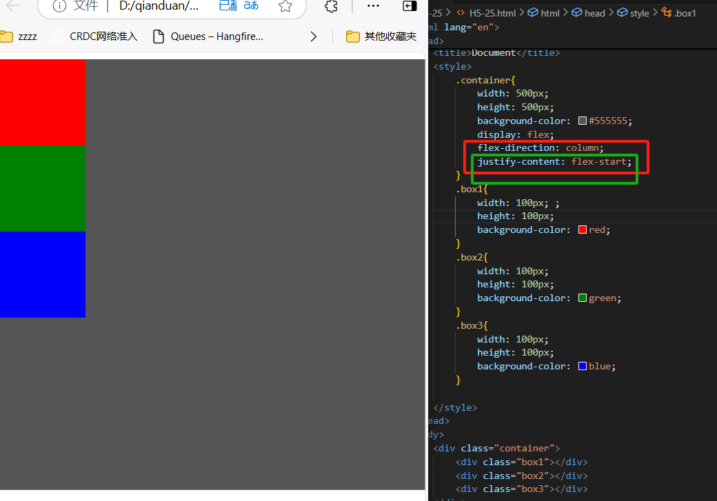
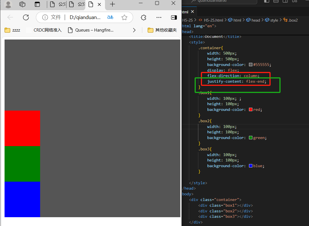
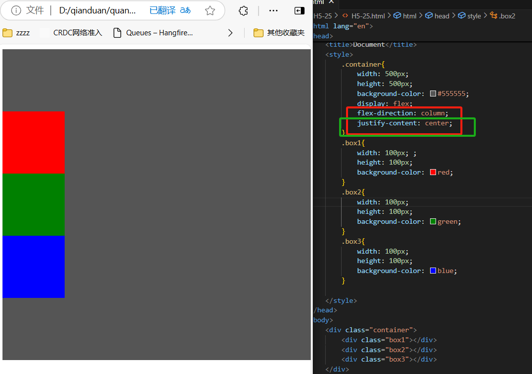
justify-content属性(垂直方向)

  定义:内容对齐(justify-content)属性应用在弹性容器上,把弹性项沿着弹性容器的主轴线(main axis)对齐

  语法:

  justify-content:flex-start(靠上)、flex-end(靠下)、center(中间)

  flex-start:弹性项目向行头紧挨着填充。这个是默认值。第一个弹性项目的main-start外边距线被放置在该行的main-start边线,而后续弹性项依次平齐摆放

  flex-end:弹性项目向行尾紧挨着填充。第一个弹性项的main-end外边距边线被放置在该行的main-end边线,而后续弹性项依次平行摆放

  center:弹性项目居中紧挨着填充。(如果剩余的自由空间是负的,则弹性项目将在两个方向上同时溢出)
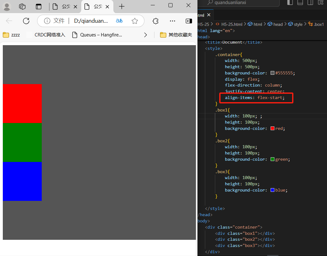
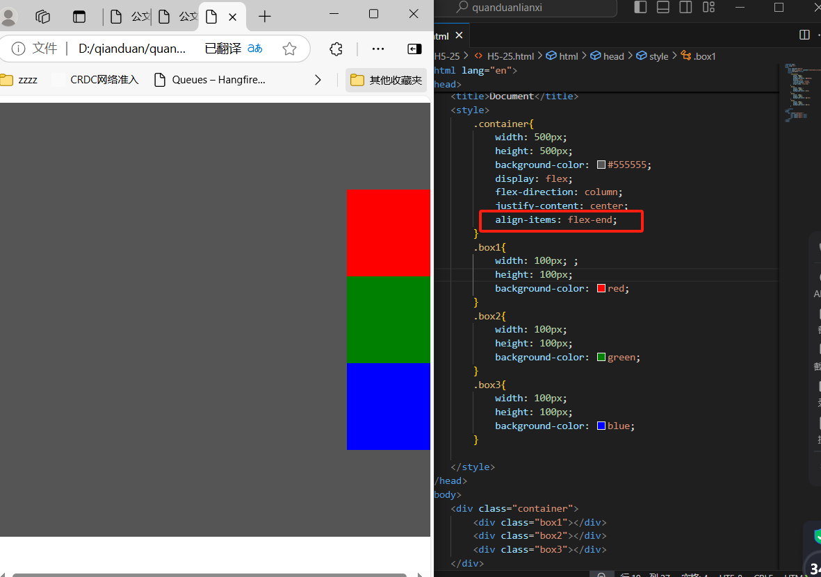
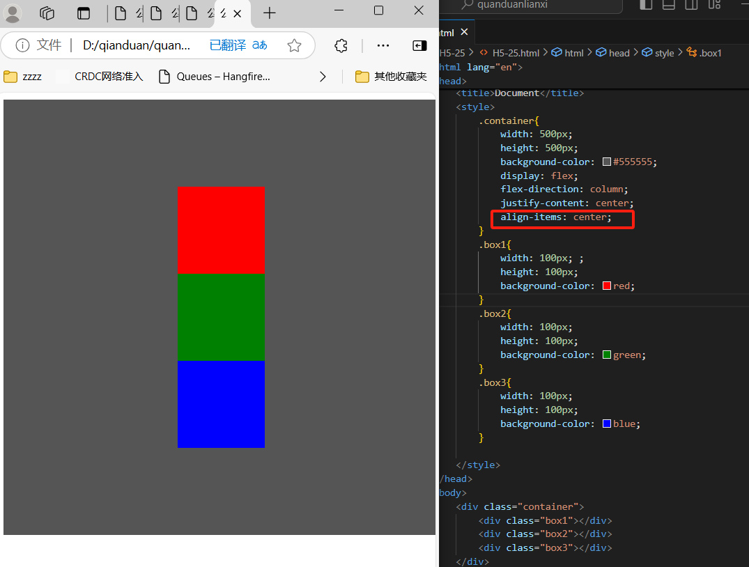
  

 .container{
            width: 500px;
            height: 500px;
            background-color: #555555;
            display: flex;
            flex-direction: column;
            justify-content: center;
        }


 align-items属性(水平方向)

  定义:align-items设置或检索引盒子元素在侧轴(纵轴)方向上的对齐方式

  语法:align-tems:flex-start(居左)、flex-end(居右)、center(居中)

  flex-start:弹性盒子元素的侧轴(纵轴)起始位置的边界仅靠住该行的侧轴起始边界

  flex-end:弹性盒子元素的侧轴(纵轴)起始位置的边界仅靠住该行的侧轴结束边界

  center:弹性盒子元素在该行的侧轴(纵轴)上居中放置。(如果该行的尺寸小于弹性盒子元素的尺寸,则会向两个方向溢出相同的长度)
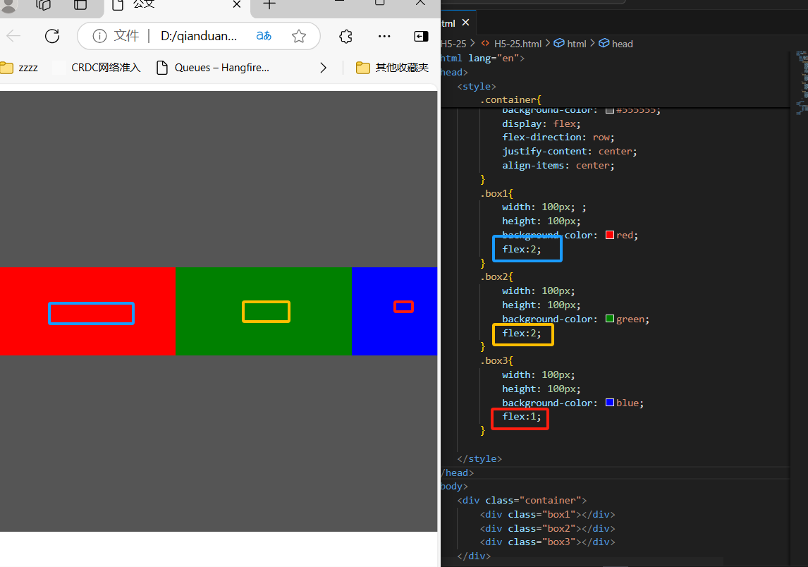


4、子元素上的属性

flex-grow/flex

  flex-grow根据弹性盒子元素所设置的扩展因子作为比率来分配剩余空间

  默认为0,即如果存在剩余空间,也不大

  如果只有一个子元素设置,那么按扩展因子转化的百分比对其分配剩余空间。0.1即10%,1即100%,超出按100%

 <div class="container">
        <div class="box1"></div>
        <div class="box2"></div>
        <div class="box3"></div>
    </div>
 <style>
        .container{
            width: 500px;
            height: 500px;
            background-color: #555555;
            display: flex;
            flex-direction: row;
            justify-content: center;
            align-items: center;
        }
        .box1{
            width: 100px; ;
            height: 100px;
            background-color: red;
            flex:2;
        }
        .box2{
            width: 100px;
            height: 100px;
            background-color: green;
            flex:2;
        }
        .box3{
            width: 100px;
            height: 100px;
            background-color: blue;
            flex:1;
        }


posted @ 2024-12-04 11:08  张筱菓  阅读(124)  评论(0)    收藏  举报