14 uniapp-我的好友列表开发(修订下角标组件)
14 我的好友列表开发(修订下角标组件)
纵览效果图:
一 page.json配置
效果:
代码:
,{
            "path" : "pages/user-list/user-list",
            "style" : {
				"app-plus":{
					// 动画效果出现退出方向
					"animationType":"slide-in-left",
					// 导航栏配置
					"titleNView":{
						// 取消返回按钮(只有app端有效)
						"autoBackButton":false,
						// 搜索框配置
						"searchInput":{
							"align":"center",
							"backgroundColor":"#F5F4F2",
							"borderRadius":"4px",
							"disabled":true,
							"placeholder":"搜索用户",
							"placeholderColor":"#6D6C67"
						},
						// 右侧按钮
						"buttons":[
							{
								"color":"#333333",
								"colorPressed":"#FD597C",
								"float":"right",
								"fontSize":"15px",
								"text":"取消"
							}
						]

					}

				}
			}
        }
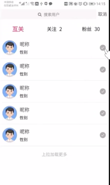
二 好友列表组件开发(涉及uniapp图标)
效果:
代码(选取topic-detail的选项卡部分+index.vue的swiper部分:)
局部列表组件代码:
ps:uniapp图标在uniapp里扩展组件里面有
<!-- 列表样式 -->
							<view class="p-2 flex align-center border-bottom">
								<image class="mr-2" src="/static/default.jpg" style="height: 100rpx; width: 100rpx;"></image>
								<view class="flex flex-column justify-center flex-1">
									<text class="font-md text-dark">昵称</text>
									<text>性别</text>
								</view>
								<view class="uni-icon uni-icon-checkbox-filled text-light-muted">

								</view>
							</view>
全部代码:
<template>
	<view>
		<!-- 默认最新选项卡 -->
		<view class="p-2 flex">
			<view class="font flex-1 flex align-center justify-center font-weight-bold"
			v-for="(item,index) in tabBars" :key="index"
			:class="index===tabIndex?'text-main font-lg':''"
			@click="changeTab(index)"
			>{{item.name}}</view>
		</view>

		<swiper :duration="150" :current="tabIndex" @change="onChangeTab"
		:style="'height:'+scrollH+'px'">
		<!-- 会默认分配索引 0 1 2 3 4 5  -->
			<swiper-item v-for="(item,index) in newsList" :key="index">

				<scroll-view scroll-y="true" :style="'height:'+scrollH+'px;'" @scrolltolower="loadmore(index)">
					<template v-if="item.list.length>0">
						<!-- 列表 -->
						<block v-for="(item2,index2) in item.list" :key="index2">

							<!-- 列表样式 -->
							<view class="p-2 flex align-center border-bottom">
								<image class="mr-2" src="/static/default.jpg" style="height: 100rpx; width: 100rpx;"></image>
								<view class="flex flex-column justify-center flex-1">
									<text class="font-md text-dark">昵称</text>
									<text>性别</text>
								</view>
								<view class="uni-icon uni-icon-checkbox-filled text-light-muted">

								</view>
							</view>

						</block>
						<!-- 上拉加载 -->
						<load-more :loadmore="item.loadmore"></load-more>
					</template>
					<template v-else>
						<!-- 无数据渲染页面 -->
						<no-thing>来了啊老弟</no-thing>

					</template>


				</scroll-view>

			</swiper-item>

		</swiper>

	</view>
</template>

<script>
	import loadMore from '@/components/common/load-more.vue'
	export default {
		components:{
			loadMore
		},
		data() {
			return {
				tabIndex:0,
				tabBars:[{
					name:"互关"
				},{
					name:"关注"
				},{
					name:"粉丝"
				}]
			}
		},
		onLoad() {
			uni.getSystemInfo({
				success:res=>{
								// 可用窗口高度(屏幕高度-导航栏高度-底部栏高度。) -  选项卡高度
					this.scrollH = res.windowHeight - uni.upx2px(101)
					// console.log(this.scrollH)
				}
			})
			// 根据选项生成列表
			this.getData()
		},
		methods: {
			changeTab(index){
				this.tabIndex = index

			},
			// 监听选项内容滑动
			onChangeTab(e){
				this.changeTab(e.detail.current)
			},
			// 上拉加载更多
			loadmore(index){
				// 拿到当前列表
				let item = this.newsList[index]
				// 修改当前加载状态
				item.loadmore = '加载中。。。'
				// 模拟数据请求
				setTimeout(()=>{
					// 加载数据
								// ... 相当于取出来当前对象可以遍历出来的内容放到了当前对象里面。
								// 这个可以粗糙的理解为把合并了两个一摸一样的列表,列表里面原来的内容*2了
					item.list = [...item.list,...item.list]
					item.loadmore = '上拉加载更多'
				},2000)
			},
			// 制作列表+上拉加载数据初始值
			getData(){
				var arr=[]
				for (let i = 0; i < this.tabBars.length;i++ ){
					let obj ={
						loadmore:"上拉加载更多",
						list:[]
					}
					if (i < 2) {
						obj.list = [1,2,2,3,4,2,23,32,23,23,23,23,23,23,12]
					}
					arr.push(obj)
				}
				this.newsList = arr
			},
		}
	}
</script>

<style>

</style>
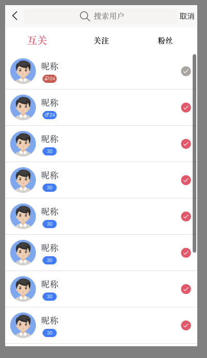
三 修改性别组件并使用(定制原有的下角标组件)
效果:
代码:(修改原有代码加入插槽和图标宽度功能)
user-list.vue
...
<view class="flex flex-column justify-center flex-1">
									<text class="font-md text-dark">昵称</text>
									<uni-badge :text="18" type="error" size="small" :iconwidth="13">
										<text class="iconfont icon-nv text-white font-sm" style="margin-right: 3rpx;"></text>
									</uni-badge>
								</view>
...
import uniBadge from '@/components/uni-ui/uni-badge/uni-badge.vue'
	export default {
		components:{
			uniBadge
		},
...
uni-badge.vue 观察注释的改动处
<template>
	<text v-if="text" :class="inverted ? 'uni-badge--' + type + ' uni-badge--' + size + ' uni-badge--' + type + '-inverted' : 'uni-badge--' + type + ' uni-badge--' + size" class="uni-badge" :style="width" @click="onClick()">
		<!-- 改动处 -->
		<slot></slot>{{ text }}
		</text>
</template>

<script>
	export default {
		name: 'UniBadge',
		props: {
			type: {
				type: String,
				default: 'default'
			},
			inverted: {
				type: Boolean,
				default: false
			},
			text: {
				type: [String, Number],
				default: ''
			},
			size: {
				// small.normal
				type: String,
				default: 'normal'
			},
			// 改动处
			iconwidth:{
				type:Number,
				default:0
			}
		},
		data() {
			return {
				// 改动处
				width: `display: inline-block;width: ${String(this.text).length * 15 + 25+this.iconwidth}rpx`
			};
		},
		methods: {
			onClick() {
				this.$emit('click');
			}
		}
	};
</script>

<style scoped>
	.uni-badge {
		/* #ifndef APP-PLUS */
		display: flex;
		/* #endif */
		flex-direction: row;
		height: 40rpx;
		line-height: 40rpx;
		color: #333;
		border-radius: 100px;
		background-color: #f1f1f1;
		background-color: transparent;
		text-align: center;
		font-family: 'Helvetica Neue', Helvetica, sans-serif;
		font-size: 12px;
		padding: 0;
	}

	.uni-badge--inverted {
		padding: 0 5px 0 0;
		color: #f1f1f1;
	}

	.uni-badge--default {
		color: #333;
		background-color: #f1f1f1;
	}

	.uni-badge--default-inverted {
		color: #999;
		background-color: transparent;
	}

	.uni-badge--primary {
		color: #fff;
		background-color: #007aff;
	}

	.uni-badge--primary-inverted {
		color: #007aff;
		background-color: transparent;
	}

	.uni-badge--success {
		color: #fff;
		background-color: #4cd964;
	}

	.uni-badge--success-inverted {
		color: #4cd964;
		background-color: transparent;
	}

	.uni-badge--warning {
		color: #fff;
		background-color: #f0ad4e;
	}

	.uni-badge--warning-inverted {
		color: #f0ad4e;
		background-color: transparent;
	}

	.uni-badge--error {
		color: #fff;
		background-color: #dd524d;
	}

	.uni-badge--error-inverted {
		color: #dd524d;
		background-color: transparent;
	}

	.uni-badge--small {
		transform: scale(0.8);
		transform-origin: center center;
	}
</style>
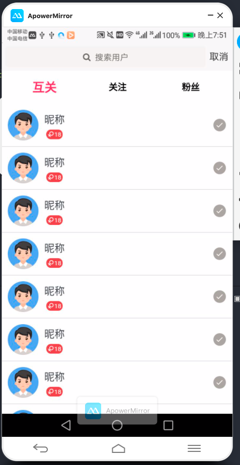
四 封装好友列表组件
其他正常封装,优化了高度问题,以免出现不该有的滚动条
代码:
pages/user-list/user-list.vue
<template>
	<view>
		<!-- 默认最新选项卡 -->
		<!-- 注意padding会把高度撑高,botter下边框要多给点距离。在下面剪掉这个距离-->
		<!-- 总元素的宽度=宽度+左填充+右填充+左边框+右边框+左边距+右边距 -->
		<!-- 总元素的高度=高度+顶部填充+底部填充+上边框+下边框+上边距+下边距 -->
		<view class=" flex align-center" style="height: 100rpx;">
			<view class="font flex-1 flex align-center justify-center font-weight-bold"
			v-for="(item,index) in tabBars" :key="index"

			:class="index===tabIndex?'text-main font-lg':''"
			@click="changeTab(index)"
			>{{item.name}}</view>
		</view>

		<swiper :duration="150" :current="tabIndex" @change="onChangeTab"
		:style="'height:'+scrollH+'px'">
		<!-- 会默认分配索引 0 1 2 3 4 5  -->
			<swiper-item v-for="(item,index) in newsList" :key="index">

				<scroll-view scroll-y="true" :style="'height:'+scrollH+'px;'" @scrolltolower="loadmore(index)">
					<template v-if="item.list.length>0">
						<!-- 列表 -->
						<block v-for="(item2,index2) in item.list" :key="index2">
							<user-list :item="item2" :index="index2">

							</user-list>

						</block>
						<!-- 上拉加载 -->
						<load-more v-if="item.list.length>10"
						:loadmore="item.loadmore"></load-more>
					</template>
					<template v-else>
						<!-- 无数据渲染页面 -->
						<no-thing>来了啊老弟</no-thing>

					</template>


				</scroll-view>

			</swiper-item>

		</swiper>

	</view>
</template>

<script>

	const demo = [{
		avatar:"/static/default.jpg",
		username:"昵称",
		sex:1, // 0未知,1女性,2男性
		age:24,
		isFollow:true
	},{
		avatar:"/static/default.jpg",
		username:"昵称",
		sex:2, // 0未知,1女性,2男性
		age:24,
		isFollow:false
	},{
		avatar:"/static/default.jpg",
		username:"昵称",
		sex:0, // 0未知,1女性,2男性
		age:30,
		isFollow:false
	},{
		avatar:"/static/default.jpg",
		username:"昵称",
		sex:0, // 0未知,1女性,2男性
		age:30,
		isFollow:false
	},{
		avatar:"/static/default.jpg",
		username:"昵称",
		sex:0, // 0未知,1女性,2男性
		age:30,
		isFollow:false
	},{
		avatar:"/static/default.jpg",
		username:"昵称",
		sex:0, // 0未知,1女性,2男性
		age:30,
		isFollow:false
	},{
		avatar:"/static/default.jpg",
		username:"昵称",
		sex:0, // 0未知,1女性,2男性
		age:30,
		isFollow:false
	},{
		avatar:"/static/default.jpg",
		username:"昵称",
		sex:0, // 0未知,1女性,2男性
		age:30,
		isFollow:false
	},{
		avatar:"/static/default.jpg",
		username:"昵称",
		sex:0, // 0未知,1女性,2男性
		age:30,
		isFollow:false
	},{
		avatar:"/static/default.jpg",
		username:"昵称",
		sex:0, // 0未知,1女性,2男性
		age:30,
		isFollow:false
	},{
		avatar:"/static/default.jpg",
		username:"昵称",
		sex:0, // 0未知,1女性,2男性
		age:30,
		isFollow:false
	}
	];

	import loadMore from '@/components/common/load-more.vue'
	import userList from '@/components/user-list/user-list.vue'
	export default {
		components:{
			loadMore,
			userList
		},
		data() {
			return {
				tabIndex:0,
				tabBars:[{
					name:"互关"
				},{
					name:"关注"
				},{
					name:"粉丝"
				}],
				scrollH:600,
			}
		},
		onLoad() {
			uni.getSystemInfo({
				success:res=>{
								// 可用窗口高度(屏幕高度-导航栏高度-底部栏高度。) -  选项卡高度
					this.scrollH = res.windowHeight - uni.upx2px(101)
					console.log(this.scrollH)

				}
			})
			// 根据选项生成列表
			this.getData()
		},
		methods: {
			changeTab(index){
				this.tabIndex = index

			},
			// 监听选项内容滑动
			onChangeTab(e){
				this.changeTab(e.detail.current)
			},
			// 上拉加载更多
			loadmore(index){
				// 拿到当前列表
				let item = this.newsList[index]
				// 修改当前加载状态
				item.loadmore = '加载中。。。'
				// 模拟数据请求
				setTimeout(()=>{
					// 加载数据
								// ... 相当于取出来当前对象可以遍历出来的内容放到了当前对象里面。
								// 这个可以粗糙的理解为把合并了两个一摸一样的列表,列表里面原来的内容*2了
					item.list = [...item.list,...item.list]
					item.loadmore = '上拉加载更多'
				},2000)
			},
			// 制作列表+上拉加载数据初始值
			getData(){
				var arr=[]
				for (let i = 0; i < this.tabBars.length;i++ ){
					let obj ={
						loadmore:"上拉加载更多",
						list:[]
					}
					if (i < 2) {
						obj.list = demo
					}
					arr.push(obj)
				}
				this.newsList = arr
			},
		}
	}
</script>

<style>

</style>
componets/user-list/user-list.vue
<template>

	<!-- 列表样式 -->
	<view class="p-2 flex align-center border-bottom">
		<image class="mr-2" :src="item.avatar" style="height: 100rpx; width: 100rpx;"></image>
		<view class="flex flex-column justify-center flex-1">
			<text class="font-md text-dark">{{item.username}}</text>
			<uni-badge :text="item.age"
			:type="item.sex===1? 'error':'primary'" size="small" :iconwidth="13">
				<text v-if="item.sex>0"
				 class="iconfont  text-white font-sm" style="margin-right: 3rpx;"
				:class="item.sex===1? 'icon-nv':'icon-nan'"></text>
			</uni-badge>
		</view>
		<view class="uni-icon uni-icon-checkbox-filled"
		:class="item.isFollow?'text-light-muted':'text-main'">

		</view>
	</view>

</template>

<script>
	import uniBadge from '@/components/uni-ui/uni-badge/uni-badge.vue'
	export default {
		components:{
			uniBadge
		},
		props:['item','index'],
		data() {
			return {

			}
		},
		methods: {

		}
	}
</script>

<style>

</style>

 浙公网安备 33010602011771号