03 顶部选项卡+顶部选项卡内容(scroll-view+swiper组合用法)
03 顶部选项卡+顶部选项卡内容(scroll-view+swiper组合用法)
一 顶部选项卡(定制横向滑动内容)
扩展free.css
/* #ifndef APP-PLUS-NVUE */
/* scroll-view */
.scroll-row{ width: 100%;white-space: nowrap; }
.scroll-row-item{ display: inline-block!important; }
/* #endif */
涉及的数据
data() {
			return {
				scrollIndex:"",
				tabIndex: 0,
				tabBars: [{
				    name: '关注',
				}, {
				    name: '推荐',
				}, {
				    name: '体育',
				}, {
				    name: '热点',
				}, {
				    name: '财经',
				}, {
				    name: '娱乐',
				}, {
				    name: '军事',
				}, {
				    name: '历史',
				}, {
				    name: '本地',
				}, {
				    name: '历史',
				}, {
				    name: '历史',
				}, {
				    name: '历史',
				}, {
				    name: '历史',
				}, {
				    name: '历史',
				}, {
				    name: '历史',
				}, {
				    name: '历史',
				},],
涉及的标签和方法。
// 标签
<scroll-view scroll-x="true" :scroll-into-view="scrollIndex" scroll-with-animation
		class="scroll-row"
		style="height: 100rpx;">
			<view v-for="(item,index) in tabBars"
			:key="index"
			:id="'tab'+index"
			class="scroll-row-item px-2 py-2 font-md"
			:class="tabIndex === index? 'text-main font-lg font-weight-bold':''"
			@click="changeTab(index)">
				{{item.name}}
			</view>
		</scroll-view>

# 方法
// 切换选项
			changeTab(index){
				if (this.tabIndex === index){
					return;
				}
				this.tabIndex = index
				// 视角滚动到指定元素
				this.scrollIndex = 'tab'+index
			},
// 解读
        :scroll-into-view 定位视角
        scroll-with-animation 滑动动画效果
        :id 每个字元素的id,注意不能以数字开头。
        croll-row-item 自己定制css 改为inlinblock 不换行
        绑定点击事件。
        判断点击的元素是否是当前元素,如果是高亮。
详细参考官网链接 点我
二 顶部选项卡对应的内容(swiper容器使用)
swiper介绍:
滑块视图容器。一般用于左右滑动或上下滑动,比如banner轮播图,注意是滑动切换而不是滚动。swiper下的每个swiper-item是一个滑动切换区域,不能停留在2个滑动区域之间
官网链接:点我
思路:
1 定制一个swiper容器,用于类似轮播图作用滑动的功能。
2 sweiper容器里面每个字元素中,定制竖排滑动内容。
标签和方法(数据同上不列举了)
<!-- 定制选项卡对应的内容 -->
							<!-- current	聚焦在当前子滑块实例的 index 默认会从0 1 2 3。。。依次排列 -->
		<swiper :duration="5" :current="tabIndex" @change="onChangeTab"
		:style="'height:'+scrollH+'px'">
		<!-- 会默认分配索引 0 1 2 3 4 5  -->
			<swiper-item v-for="(item,index) in tabBars" :key="index">
				{{item.name}}
				<scroll-view scroll-y="true" :style="'height:'+scrollH+'px;'">
					<view v-for="i in 100" :key="i">
						{{i}}
					</view>
				</scroll-view>
				<!-- <block v-fr="(item2,index2) in list" :key="index2"> -->
					<!-- 列表样式 -->
					<!-- <common-list :item="item2" :index="index2" @follow="follow" @doSupport="doSupport"></common-list> -->
					<!-- 全局分割线 -->
					<!-- <divider></divider> -->
				<!-- </block> -->

			</swiper-item>

# 涉及的方法
onLoad() {
			uni.getSystemInfo({
				success:res=>{
								// 可用窗口高度(屏幕高度-导航栏高度-底部栏高度。) -  选项卡高度
					this.scrollH = res.windowHeight - uni.upx2px(100)
					console.log(this.scrollH)
				}
			})

methods(){
  // 切换选项
			changeTab(index){
				if (this.tabIndex === index){
					return;
				}
				this.tabIndex = index
				// 视角滚动到指定元素
				this.scrollIndex = 'tab'+index
			},
			// 监听选项内容滑动
			onChangeTab(e){
				this.changeTab(e.detail.current)
			},
}
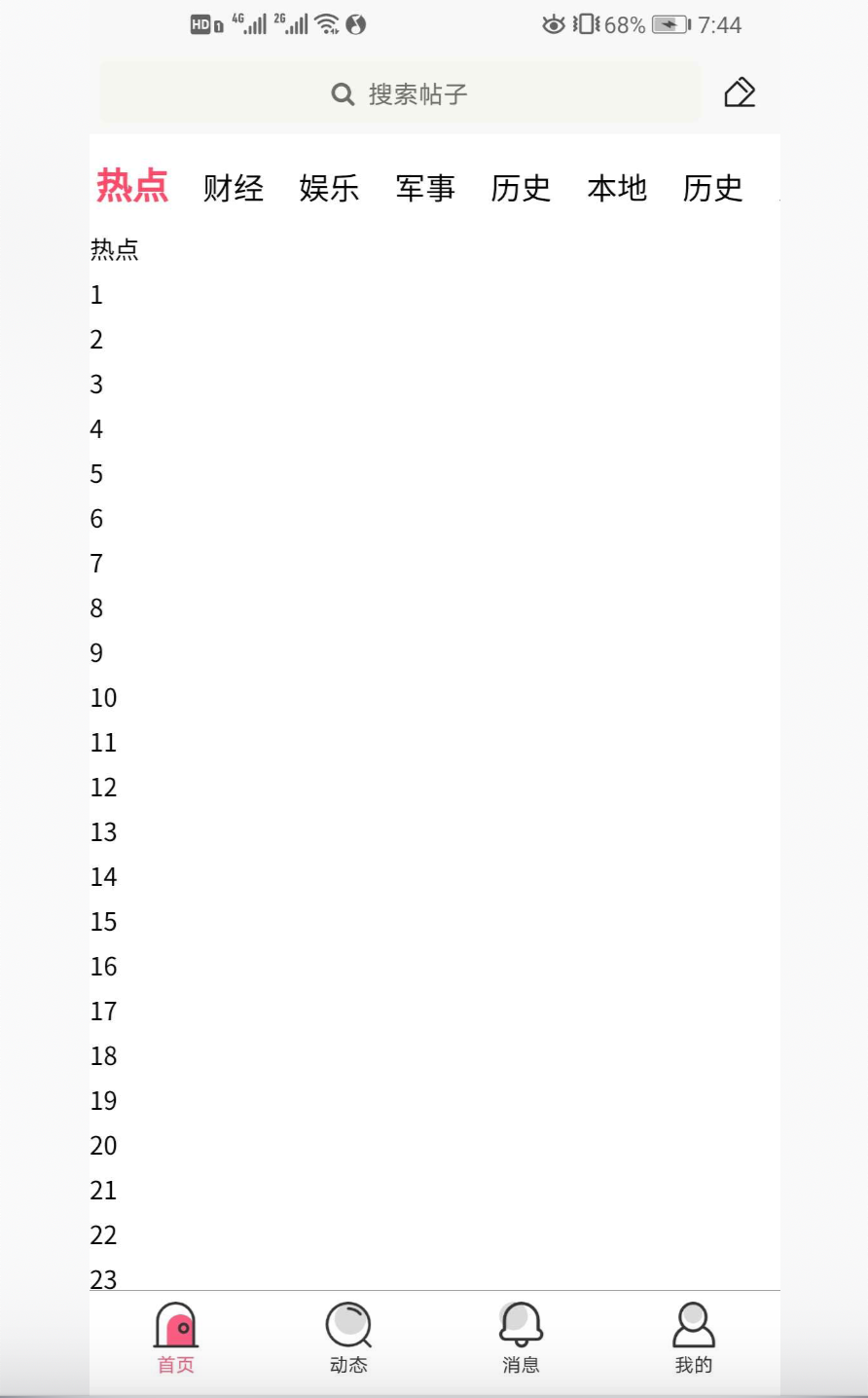
效果图:

 浙公网安备 33010602011771号