
vue2封装echart报表实现柱状图和曲线图颜色随机变化
研究了一天,终于实现了柱状图和曲线图的颜色随机变化,立马上代码。
柱状图颜色随机:
<template>
  <div :style="{ padding: '0 0 32px 32px' }">
    <h4 :style="{ marginBottom: '20px' }">{{ title }}</h4>
    <v-chart :data="data" :height="height" :force-fit="true" :scale="scale" :onClick="handleClick" >
      <v-tooltip/>
      <v-axis/>
      <v-legend/>
      <v-bar position="x*y" :color="colorType" :adjust="adjust" label="y"/>
      <!-- <v-bar position="x*y" :color="['type',['#27727B','#E52A1C','#F4E001']]" :adjust="adjust"/> -->
    </v-chart>
  </div>
</template>

<script>
  import { DataSet } from '@antv/data-set'
  import { ChartEventMixins } from './mixins/ChartMixins'
// 先自定义一些颜色可选择
  const colorList = ["#C1232B","#B5C334","#FCCE10","#E87C25","#27727B",
          "#FE8463","#9BCA63","#FAD860","#F3A43B","#60C0DD",'#E52A1C',
          "#D7504B","#C6E579","#F4E001","#F0805A","#26C0C0"];

  export default {
    name: 'BarMultid',
    mixins: [ChartEventMixins],
    props: {
      title: {
        type: String,
        default: ''
      },

      dataSource: {
        type: Array,
        default: () => [
          { type: '已处理', 'Jan.': 18.9, 'Feb.': 28.8, 'Mar.': 39.3, 'Apr.': 81.4, 'May': 47, 'Jun.': 20.3, 'Jul.': 24, 'Aug.': 35.6 },
          { type: '未处理', 'Jan.': 12.4, 'Feb.': 23.2, 'Mar.': 34.5, 'Apr.': 99.7, 'May': 52.6, 'Jun.': 35.5, 'Jul.': 37.4, 'Aug.': 42.4 },
          { type: '已上报', 'Jan.': 12.4, 'Feb.': 23.2, 'Mar.': 34.5, 'Apr.': 99.7, 'May': 52.6, 'Jun.': 35.5, 'Jul.': 37.4, 'Aug.': 42.4 }
        ]
      },
      fields: {
        type: Array,
        default: () => ['Jan.', 'Feb.', 'Mar.', 'Apr.', 'May', 'Jun.', 'Jul.', 'Aug.']
        //default: () => []
      },
      // 别名,需要的格式:[{field:'name',alias:'姓名'}, {field:'sex',alias:'性别'}]
      aliases: {
        type: Array,
        default: () => []
      },
      height: {
        type: Number,
        default: 254
      },

    },

    data() {
      return {
        adjust: [{
          type: 'dodge',
          marginRatio: 1 / 32
        }]
      }
    },
    created() {
      this.colorType = this.getColorType()

    },
    computed: {
      data() {
        const dv = new DataSet.View().source(this.dataSource)
        dv.transform({
          type: 'fold',
          fields: this.fields,
          key: 'x',
          value: 'y'
        })

        // bar 使用不了 - 和 / 所以替换下
        let rows = dv.rows.map(row => {
          if (typeof row.x === 'string') {
            row.x = row.x.replace(/[-/]/g, '_')
          }
          return row
        })
        // 替换别名
        rows.forEach(row => {
          for (let item of this.aliases) {
            if (item.field === row.type) {
              row.type = item.alias
              break
            }
          }
        })
        return rows
      },
      scale() {
        return [
          {
            type: 'cat',
            dataKey: 'x'
          }
        ]
      }
    },
    methods: {
    // 获取随机选中三种颜色
      getColorType(){
        var arrNew=[];
        var returnArrNew=[];
        for(var i=0;i<3;i++)
        {
              var _num = Math.floor(Math.random()*colorList.length)
              var mm = colorList[_num];
              colorList.splice(_num,1)
              arrNew.push(mm)
        }
        returnArrNew.push("type")
        returnArrNew.push(arrNew)
        console.log("returnArrNew===",returnArrNew)
        return returnArrNew
      },
      handleClick(val){
        let type = val.data._origin.type
        if(this.title){
          if(this.title==='预警统计'){
            if(type && type==='已处理'){
              this.$router.push({
                path: '/monitor/warningHandleLog'
              });
            }else{
              this.$router.push({
                path: '/monitor/warningMessage'
              });
            }

          }else if(this.title==='周报统计'){
            if(type && type==='已处理'){
              this.$router.push({
                path: '/monitor/weeklyFinish'
              });
            }else{
              this.$router.push({
                path: '/monitor/weeklyMessage'
              });
            }
          }

        }


      }

    }
  }
</script>

<style scoped>

</style>
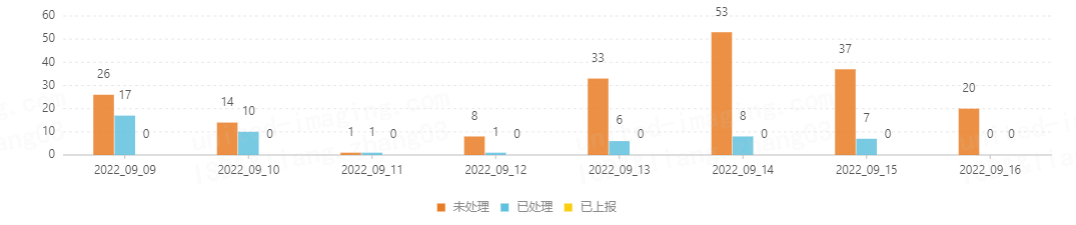
效果如下图所示
曲线或者折线图设置随机颜色:
<template>
  <div :style="{ padding: '0 0 32px 32px' }">
    <h4>
      <div style="text-align: left;">{{ title }}</div>
      <div style="text-align: right;">总数:{{ total }}</div>
    </h4>
    <v-chart :force-fit="true" :height="height" :data="data" :scale="scale" :onClick="handleClick" >
      <v-tooltip />
      <v-axis />
      <v-legend />
      <!-- shape="smooth"   设置是平滑曲线,如果没有,默认折线图 -->
      <v-line position="days*y" color="x" label="y" shape="smooth" :color="color"/>
      <v-point position="days*y" color="x" :size="4" :v-style="style" :shape="'circle'" :color="color"/>
    </v-chart>
  </div>
</template>

<script>
  import { DataSet } from '@antv/data-set'
  import { ChartEventMixins } from './mixins/ChartMixins'
  import moment from 'dayjs'


  export default {
    name: 'LineChartSingle',
    mixins: [ChartEventMixins],
    props: {
      title: {
        type: String,
        default: ''
      },
      total: {
        type: String,
        default: ''
      },
      dataSource: {
        type: Array,
        default: () => [
          {days:moment(new Date()).format('YYYY-MM-DD'),num:0}
        ]
      },
      type: {
        type: String,
        default: 'type'
      },
      fields: {
        type: Array,
        default: () => []
      },

      // 别名,需要的格式:[{field:'name',alias:'姓名'}, {field:'sex',alias:'性别'}]
      aliases:{
        type: Array,
        default: () => []
      },
      height: {
        type: Number,
        default: 254
      },
    },
    data() {
      return {
        sourceData:[],
        scale: [{
          type: 'cat',
          dataKey: 'x',
          min: 0,
          max: 1
        }],
        style: { stroke: '#fff', lineWidth: 1 }
      }
    },
    created() {
      // 获取随机颜色
      this.color = this.randomRgb()

    },
    computed: {

      data() {
        if(this.dataSource.length == 0){
          this.sourceData = [{days:moment(new Date()).format('YYYY-MM-DD'),num:0}]
        }else{
          this.sourceData = this.dataSource
        }
        const dv = new DataSet.View().source(this.sourceData)
        dv.transform({
          type: 'fold',
          fields: this.fields,
          key: 'x',
          value: 'y'
        })
        let rows =  dv.rows
        // // 替换别名
        rows.forEach(row => {
          for (let item of this.aliases) {
            if (item.field === row.x) {
              row.x = item.alias
              break
            }
          }
        })
        return rows
      }
    },
    methods: {
      // 随机颜色设置
      randomRgb() {
          let R = Math.floor(Math.random() * 255);
          let G = Math.floor(Math.random() * 255);
          let B = Math.floor(Math.random() * 255);
          return "rgb("+ R + "," + G + "," + B + ")";
      }


    }
  }
</script>

<style scoped>

</style>
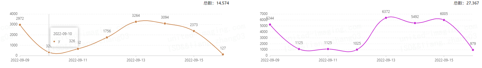
效果如下图所示
每天学习一点点,你就进步一点点。

 浙公网安备 33010602011771号