
8.28学习笔记
3d
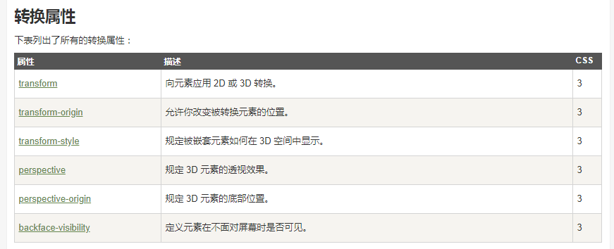
transform:rotate()
perspective:透视的虚拟距离。 number
这个属性给3d效果元素的父级
transform-style:preserve-3d;元素的子集呈3d效果。
backface-visibility:hidden/visible;背面可见 和背面不可见。
正面体 3d 旋转的源码
<!DOCTYPE html>
<html>
    <head>
        <meta charset="UTF-8">
        <title></title>
        <style type="text/css">
            body{
                perspective: 2000px;
            }
            .aa{
                width: 400px;
                height: 400px;
                margin: 200px auto;
                position: relative;
                transform-style: preserve-3d;
                animation: zkl 4s linear infinite;
            }
            .aa>div{
                position: absolute;
                top: 0px;
                left: 0px;
            }
            .aa>div:nth-of-type(1){
                width: 400px;
                height: 400px;
                background: pink;
                transform: rotateX(90deg) translateZ(200px);
            }
            .aa>div:nth-of-type(2){
                width: 400px;
                height: 400px;
                background: yellow;
                transform: rotateX(90deg) translateZ(-200px);
            }
            .aa>div:nth-of-type(3){
                width: 400px;
                height: 400px;
                background: brown;
                transform: rotateY(90deg) translateZ(200px);
            }
            .aa>div:nth-of-type(4){
                width: 400px;
                height: 400px;
                background: gray;
                transform: rotateY(90deg) translateZ(-200px);
            }
            .aa>div:nth-of-type(5){
                width: 400px;
                height: 400px;
                background: green;
                transform:translateZ(200px);
            }
            .aa>div:nth-of-type(6){
                width: 400px;
                height: 400px;
                background: red;
                transform:translateZ(-200px);
            }
            @-webkit-keyframes zkl{
                from{transform: rotateX(0) rotateY(0) rotateZ(0);}
                to{transform: rotateX(360deg) rotateY(360deg) rotateZ(360deg);}
            }
        </style>
    </head>
    <body>
        <div class="aa">
            <div>1</div>
            <div>2</div>
            <div>3</div>
            <div>4</div>
            <div>5</div>
            <div>6</div>

        </div>
    </body>
</html>
1
2
3
4
5
6


 浙公网安备 33010602011771号