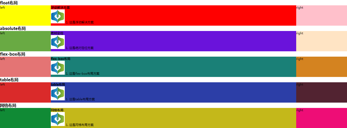
实现三栏布局的五种方法
假设高度已知,请写出三栏布局,其中左栏、右栏宽度各为 300 px,中间自适应。
中间自适应就是说中间的盒子可以随着浏览器窗口的大小或子元素的大小自动调整大小,中间盒子不能是定宽的,它的大小是由子元素撑开的。
接下来用五种方法来实现题目中的要求。
1. float 布局
    <!-- float 布局 -->
    <section class="layout float">
      <style media="screen">
        /* 清除浮动 */
        .left-right-center::after {
          content: '';
          clear: both; /* 使两边没有浮动元素 */
          display: block;
          height: 0;
          visibility: hidden;
        }

        /* float布局 */
        .float .left {
          float: left;
          width: 300px;
          background-color: yellow;
        }
        .float .right {
          float: right;
          width: 300px;
          background-color: pink;
        }
        .float .center {
          background-color: red;
        }
      </style>
      <h1>float布局</h1>
      <!-- article作为容器将左中右三块包裹起来 -->
      <article class="left-right-center">
        <!-- 划分左中右三个模块 -->
        <div class="left">left</div>
        <div class="right">right</div>
        <!-- 中间写一些内容撑开盒子 -->
        <div class="center">
          <h1>浮动解决方案</h1>
          <img src="./慧思图标.png" alt="">
          1. 这是浮动解决方案
        </div>
      </article>
    </section
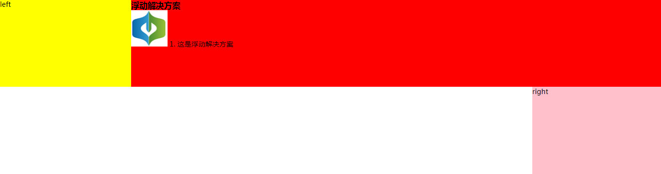
这里要强调的一点 .left 和 .right 的元素的顺序不能颠倒,如果颠倒了会出现下面的结果。
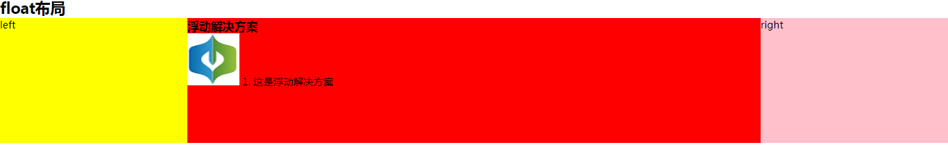
这是因为向右浮动的元素会尽量靠右和靠上,但是现在由于 center 元素将上面的整行都占据了,所以它没法靠上去了,所以尽量靠上只能靠到 center 元素的下面,然后再尽量靠右,因此显示在了图中所示的位置。
如果将 right 元素放在 center 元素的上面,这时候没有 center 元素尽量靠上靠右就会就会显示在最上面然后靠右的位置。当有了 center 元素之后,由于 float 元素是脱离文档流的,所以 center 可以靠在最上面占据一整行。又因为 float 元素不脱离文本流,所以 center 元素的子元素不能出现在 left 元素的下面,而是出现在了 left 元素的左边。(注意并不只是文字,就算是 center 元素中加载了一张图片也不会出现在 left 元素的下面,总之所有的子元素都不会出现在 left 元素的下面)
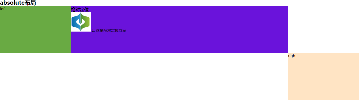
2. 绝对定位
    <!-- absolute 布局 -->
    <section class="layout absolute">
      <style media="screen">
        .absolute .left-right-center {
          position: relative;
        }
        .absolute .left {
          position: absolute;
          width: 300px;
          left: 0;
          background-color: rgb(105, 170, 67);
        }
        .absolute .right {
          position: absolute;
          width: 300px;
          right: 0;
          background-color: bisque;
        }
        .absolute .center {
          position: absolute;
          left: 300px;
          right: 300px;
          background-color:rgb(106, 19, 219);
        }
      </style>
      <h1>absolute布局</h1>
      <!-- article作为容器将左中右三块包裹起来 -->
      <article class="left-right-center">
        <!-- 划分左中右三个模块 -->
        <div class="left">left</div>
        <!-- 中间写一些内容撑开盒子 -->
        <div class="center">
          <h1>绝对定位</h1>
          <img src="./慧思图标.png" alt="">
          1. 这是绝对定位方案
        </div>
        <div class="right">right</div>
      </article>
    </section>
由于两边的元素宽度是固定的,因此中间元素不定位而是设置 margin: 0 300px; 会出现下面的情况,不清楚是为什么,如果有知道的麻烦讲解一下,谢谢。
3. flex-box 布局
    <!-- flexbox 布局 -->
    <section class="layout flex-box">
      <style>
        .flex-box .left-right-center {
          display: flex;
        }
        .flex-box .left {
          flex: none;
          width: 300px;
          background-color: rgb(228, 116, 116);
        }
        .flex-box .right {
          flex: none;
          width: 300px;
          background-color: rgb(212, 131, 32);
        }
        .flex-box .center {
          flex: 1;
          background-color:rgb(26, 128, 119);
        }
      </style>
      <h1>flex-box布局</h1>
      <!-- article作为容器将左中右三块包裹起来 -->
      <article class="left-right-center">
        <!-- 划分左中右三个模块 -->
        <div class="left">left</div>
        <!-- 中间写一些内容撑开盒子 -->
        <div class="center">
          <h1>flex-box布局</h1>
          <img src="./慧思图标.png" alt="">
          1. 这是flex-box布局方案
        </div>
        <div class="right">right</div>
      </article>
    </section>
两边固定宽度,中间元素自适应。
4. table 布局
    <!-- table 布局 -->
    <section class="layout table">
      <style>
        .table .left-right-center {
          width: 100%;
          display: table;
        }
        .table .left-right-center>div {
          display: table-cell;
        }
        .table .left {
          width: 300px;
          background-color: rgb(218, 42, 42);
        }
        .table .right {
          width: 300px;
          background-color: rgb(82, 35, 49);
        }
        .table .center {
          background-color:rgb(44, 62, 167);
        }
      </style>
      <h1>table布局</h1>
      <!-- article作为容器将左中右三块包裹起来 -->
      <article class="left-right-center">
        <!-- 划分左中右三个模块 -->
        <div class="left">left</div>
        <!-- 中间写一些内容撑开盒子 -->
        <div class="center">
          <h1>table布局</h1>
          <img src="./慧思图标.png" alt="">
          1. 这是table布局方案
        </div>
        <div class="right">right</div>
      </article>
    </section>
将 article 元素设置为表格,并且宽度与页面宽度相等,通过设置 display: table-cell 设置左中右元素为单元格,其中 left 元素宽度 300 px,right 元素宽度为 300 px,center 元素宽度不设置宽度,宽度自适应。
5. 网格布局
    <!-- 网格布局 -->
    <section class="layout grid">
      <style>
        .grid .left-right-center {
          display: grid;
          /* 网格每行的宽度与页面宽度相等 */
          width: 100%;
          /* 网格每行的高度 */
          grid-template-rows: 120px;
          /* 左侧宽度300px,中间自适应,右侧宽度300px */
          grid-template-columns: 300px auto 300px;
        }
        .grid .left {
          background-color: rgb(16, 138, 53);
        }
        .grid .right {
          background-color: rgb(238, 13, 118);
        }
        .grid .center {
          background-color:rgb(196, 184, 26);
        }
      </style>
      <h1>网格布局</h1>
      <!-- article作为容器将左中右三块包裹起来 -->
      <article class="left-right-center">
        <!-- 划分左中右三个模块 -->
        <div class="left">left</div>
        <!-- 中间写一些内容撑开盒子 -->
        <div class="center">
          <h1>网格布局</h1>
          <img src="./慧思图标.png" alt="">
          1. 这是网格布局方案
        </div>
        <div class="right">right</div>
      </article>
    </section>
通过 display: grid 将 article 元素设置为网格显示,通过 grid-template-columns: 300px auto 300px; 设置一行中有三个网格,左边的网格宽度为 300 px,中间自适应,右边网格的宽度为 300px。
6. inline-block 布局
inline-block 也可以作为一种布局方式,但是不适合这种中间需要自适应的情况,适合定宽条件下的布局。
完整代码:实现三栏布局的五种方法源代码
执行结果:
完,如有不恰当之处,欢迎指正。
-------------------------------------------
个性签名:梦想不只是梦与想
如果您觉得这篇文章哪个地方不恰当甚至有错误的话,麻烦告诉一下博主哦,感激不尽。
如果您觉得这篇文章对你有一点小小的帮助的话,希望能在右下角点个“推荐”哦。

 浙公网安备 33010602011771号