前端学习 Day05
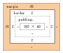
4. 盒子模型
结合仿京东登录页面学习https://www.cnblogs.com/zero13/p/14567071.html
一、 什么是盒子
margin:外边距
padding:内边距
border:边框
二、 边框
边框的粗细
边框的样式
边框的颜色
1 <!DOCTYPE html> 2 <html lang="en"> 3 <head> 4 <meta charset="UTF-8"> 5 <title>Title</title> 6 <style> 7 h2{ 8 font-size: 16px; 9 background-color: red; 10 line-height: 30px; 11 margin: 0; 12 color: white; 13 } 14 /*border: 粗细 样式 颜色*/ 15 #box{ 16 width: 300px; 17 border:1px solid red; 18 } 19 /*body有一个默认的外边距8,要学会初始化ul li body h1....*/ 20 body{ 21 margin: 0; 22 } 23 form{ 24 background: #edffae; 25 } 26 div:nth-of-type(1) input{ 27 border: 3px solid black; 28 } 29 </style> 30 </head> 31 <body> 32 <div id="box"> 33 <h2>会员登陆</h2> 34 35 <form action="#"> 36 <div> 37 <span>姓名:</span> 38 <input type="text"> 39 </div> 40 <div> 41 <span>密码:</span> 42 <input type="text"> 43 </div> 44 <div> 45 <span>邮箱:</span> 46 <input type="text"> 47 </div> 48 </form> 49 50 </div> 51 </body> 52 </html>
三、 内外边距
盒子计算方式:你这个元素到底多大 美工+前端
margin + border + padding + 内容宽度
margin:上下 左右; auto是居中
四、 圆角边框和盒子阴影
1 <!DOCTYPE html> 2 <html lang="en"> 3 <head> 4 <meta charset="UTF-8"> 5 <title>Title</title> 6 7 <!--左上 右上 右下 左下,顺时针方向--> 8 <!--圆圈:圆角 = 宽度的半径--> 9 <style> 10 div{ 11 width:100px; 12 height: 100px; 13 border: 10px solid red; 14 border-radius: 100px 100px; 15 } 16 </style> 17 </head> 18 <body> 19 <div></div> 20 </body> 21 </html> 22 <!DOCTYPE html> 23 <html lang="en"> 24 <head> 25 <meta charset="UTF-8"> 26 <title>Title</title> 27 <style> 28 div{ 29 width: 100px; 30 height: 100px; 31 border: 10px solid red; 32 box-shadow:10px 10px 1px blue; 33 } 34 </style> 35 </head> 36 <body> 37 <div></div> 38 </body> 39 </html>
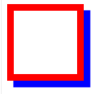
shadow 里第三个值 1 px 是模糊 ,可以尝试做一个图片模糊阴影
tips:
源码之家 后台管理系统模板之家 门户网站模板之家
element-ui 大前端 https://element.eleme.cn/#/zh-CN
飞冰 ice.work https://ice.work/docs/guide/about
五、 浮动
(1)标准文档流:
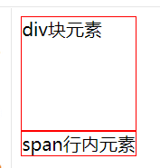
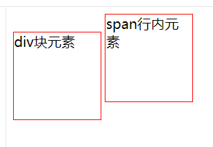
块级元素: 独占一行 h1~h6 p div 列表
行内元素: span a img strong
行内元素 可以被包含在块级元素中,反之不可以
(2)display: 结合ul li 做头部的导航条! 是实现行内元素排列的方式,但是我们更多情况下使用float
block inline inline-block
1 <!DOCTYPE html> 2 <html lang="en"> 3 <head> 4 <meta charset="UTF-8"> 5 <title>Title</title> 6 <style> 7 div{ 8 width:100px; 9 height: 100px; 10 border: 1px solid red; 11 } 12 span{ 13 width:100px; 14 height: 100px; 15 border: 1px solid red; 16 } 17 </style> 18 </head> 19 <body> 20 21 <div>div块元素</div> 22 <span>span行内元素</span> 23 24 </body> 25 </html>
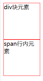
1  span{
2      width:100px;
3      height: 100px;
4      border: 1px solid red;
5      display: block;
6  }
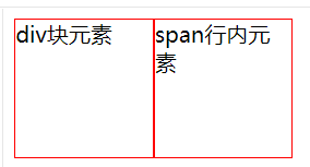
 1  div{
 2      width:100px;
 3      height: 100px;
 4      border: 1px solid red;
 5      display: inline-block;
 6  }
 7  span{
 8      width:100px;
 9      height: 100px;
10      border: 1px solid red;
11      display: inline-block;
12  }
(3)float浮动:
1  div{
2      width:100px;
3      height: 100px;
4      border: 1px solid red;
5      display: inline-block;
6      float: left;
7  }
浮动的盒子可以向左浮动,可以向右浮动,直到它的边缘碰到包壁
(4)父级边框塌陷问题:
clear
1  clear:right;  右侧不允许有浮动元素
2  clear:left;  左侧不允许有浮动元素
3  clear:both;  两侧不允许有浮动元素
4  clear:none;
解决方案:
-
增加父级元素高度
-
增加一个空的div标签,清除浮动
1  .clear{
2      clear:both;
3      margin:0;
4      padding:0;
5  }
6  <div class="clear"></div>
-
在父级元素中增加一个 overflow:hidden
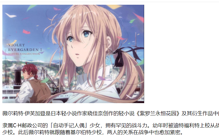
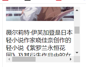
 1  <!DOCTYPE html>
 2  <html lang="en">
 3  <head>
 4      <meta charset="UTF-8">
 5      <title>Title</title>
 6  </head>
 7  <body>
 8  <div id="content">
 9      <img src="images/violet1.png" alt="" height="300px">
10  <p>薇尔莉特·伊芙加登是日本轻小说作家晓佳奈创作的轻小说《紫罗兰永恒花园》及其衍生作品中的女主角。</p>
11      <p>隶属C·H邮政公司的「自动手记人偶」少女,拥有罕见的战斗力。幼年时被迪特福利特上校从战争中捡到,在发觉薇尔莉特有着非凡的战斗天赋后将其作为「战斗兵器」赠送给他的弟弟——基尔伯特·布甘比利亚少校。此后薇尔莉特就跟随着基尔伯特少校,两人的关系在战争中也愈加紧密。</p>
12  </div>
13  </body>
14  </html>
1      #content{
2          width: 200px;
3          height: 150px;
4          overflow: hidden;
5      }
1 #content{
2     width: 200px;
3     height: 150px;
4     overflow: scroll;
5 }
-
父类添加一个伪类:after 其实就是通过代码的方式加了个div(推荐使用)
1  #father:after{
2      content:'';
3      display:block;
4      clear:both;
5  }
小结:
-
浮动元素后面增加空的div
简单,代码中尽量避免空div
-
设置父元素高度
简单,元素假设有了固定的高度,就会被限制
-
overflow
简单,下拉的一些场景避免使用
-
在父类添加伪类after(推荐)
写法稍微复杂一点,但是没有副作用,推荐使用!!
(5)对比
display:方向不可控制
float:浮动起来的话会脱离标准文档流,所以要解决父级边框塌陷的问题
六、 定位 position
(1)相对定位
(2)绝对定位
(3)z-index
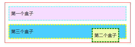
初始:
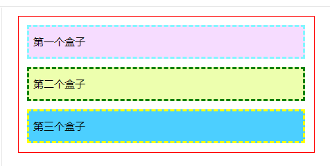
1 <!DOCTYPE html> 2 <html lang="en"> 3 <head> 4 <meta charset="UTF-8"> 5 <title>Title</title> 6 7 <style> 8 div{ 9 margin: 10px; 10 padding: 5px; 11 font-size: 12px; 12 line-height: 25px; 13 } 14 #father{ 15 border: 1px solid red; 16 padding: 0; 17 } 18 #first{ 19 background-color:#f6dcff; 20 border: 2px dashed #81f7ff; 21 } 22 #second{ 23 background-color: #edffae; 24 border: 2px dashed green; 25 } 26 #third{ 27 background-color: #4ccfff; 28 border: 2px dashed yellow;; 29 } 30 </style> 31 </head> 32 <body> 33 34 <div id="father"> 35 <div id="first">第一个盒子</div> 36 <div id="second">第二个盒子</div> 37 <div id="third">第三个盒子</div> 38 </div> 39 40 </body> 41 </html>
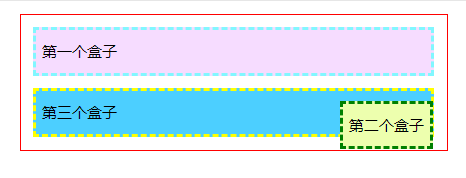
1 相对定位: position: relative 它仍然在标准文档流中!!!!原来的位置回被保留
1  #first{
2      background-color:#f6dcff;
3      border: 2px dashed #81f7ff;
4 ; /*相对定位 :上下左右*/
5      top:-20px;
6      left: 20px;   向距离原先位置20px的左偏移
7  }

定位练习:生成如下图
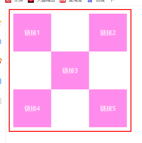
1 <!DOCTYPE html> 2 <html lang="en"> 3 <head> 4 <meta charset="UTF-8"> 5 <title>Title</title> 6 <style> 7 #box{ 8 width: 300px; 9 height: 300px; 10 border:2px solid red; 11 padding: 10px; 12 } 13 a{ 14 width: 100px; 15 height: 100px; 16 text-decoration: none; 17 background: #ff8cec; 18 line-height: 100px; 19 text-align: center; 20 color: white; 21 display: block; 22 } 23 a:hover{ 24 background: blue; 25 } 26 .a2{ 27 position: relative; 28 right: -200px; 29 top:-100px 30 } 31 .a3{ 32 position: relative; 33 right: -100px; 34 top:-100px 35 } 36 .a4{ 37 position: relative; 38 top:-100px 39 } 40 .a5{ 41 position: relative; 42 right: -200px; 43 top:-200px 44 } 45 </style> 46 </head> 47 <body> 48 49 <div id="box"> 50 <a class="a1" href="#">链接1</a> 51 <a class="a2" href="#">链接2</a> 52 <a class="a3" href="#">链接3</a> 53 <a class="a4" href="#">链接4</a> 54 <a class="a5" href="#">链接5</a> 55 </div> 56 57 </body> 58 </html>
2 绝对定位: position: relative 基于xxx定位,上下左右
-
没有父级元素定位的前提下,相对于浏览器定位
1  #second{
2      background-color: #edffae;
3      border: 2px dashed green;
4      position: absolute;
5      right: 20px;
6  }
2.假设父级元素存在定位,会相对于父级元素进行偏移
1  #father{
2      border: 1px solid red;
3      padding: 0;
4      position: relative;
5  }
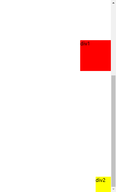
3 固定定位: fixed 跟着动,不像绝对定位,只是相对于初始位置,可用于导航条返回顶部
 1  <!DOCTYPE html>
 2  <html lang="en">
 3  <head>
 4      <meta charset="UTF-8">
 5      <title>Title</title>
 6      <style>
 7          body{
 8              height: 1000px;
 9          }
10          div:nth-of-type(1){/*{绝对定位*/
11              width: 100px;
12              height: 100px;
13              background: red;
14              position: absolute;
15              right: 0;
16              bottom: 0;
17          }
18          div:nth-of-type(2){/*{固定定位*/
19              width: 50px;
20              height: 50px;
21              background: yellow;
22              position: fixed;
23              right: 0;
24              bottom: 0;
25          }
26      </style>
27  </head>
28  <body>
29  <div>div1</div>
30  <div>div2</div>
31  </body>
32  </html>

4 z-index: 图层
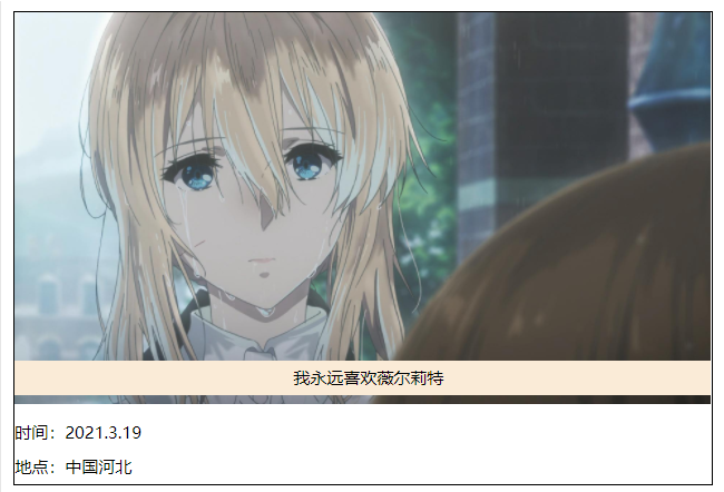
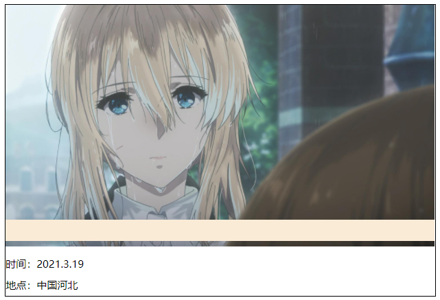
<!DOCTYPE html>
 <html lang="en">
 <head>
     <meta charset="UTF-8">
     <title>Title</title>
     <link rel="stylesheet" href="css/style.css">
 </head>
 <body>
 <div id="content">
     <ul>
         <li><img src="images/violet3.png" width="500px" alt=""></li>
         <li class="tipText">我永远喜欢薇尔莉特</li>
         <li class="tipBg"></li>
         <li>时间:2021.3.19</li>
         <li>地点:中国河北</li>
     </ul>
 </div>
 </body>
 </html>
 1  #content{
 2      padding: 0px;
 3      margin: 0px;
 4      overflow: hidden;
 5      font-size:12px;
 6      line-height: 25px;
 7      border: 1px #000 solid;
 8      width: 500px;
 9  }
10  ul,li{
11      padding: 0px;
12      margin: 0px;
13      list-style: none;
14  }
15  /*父级元素相对定位*/
16  #content ul{
17      position: relative;
18  }
19  .tipText {
20      position: absolute;
21      top: 250px;
22      left: 200px;
23      height: 25px;
24      z-index: 999;
25  }
26  .tipBg{
27      position: absolute;
28      top:250px;
29      height: 25px;
30      background: antiquewhite;
31      width: 500px;
32  }
z-index: 0;
5 背景透明度:
 opacity:0.5;
 fileter:alpha(opacity=50);/*历史了*/
菜鸟教程上去看,主要是js上去做,css很难实现

 浙公网安备 33010602011771号