

顶刊NCC带自定义标记的散点图复现(Python)
结果对比
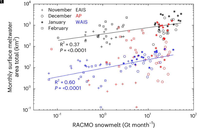
本文复现的这张图是今年发表在Nature Climate Change中的一个散点图。本次复现其中的第一个子图,看起来简单但是纯Python绘制难度较大。完整代码获取方法在文末。
论文原图:
复现结果:
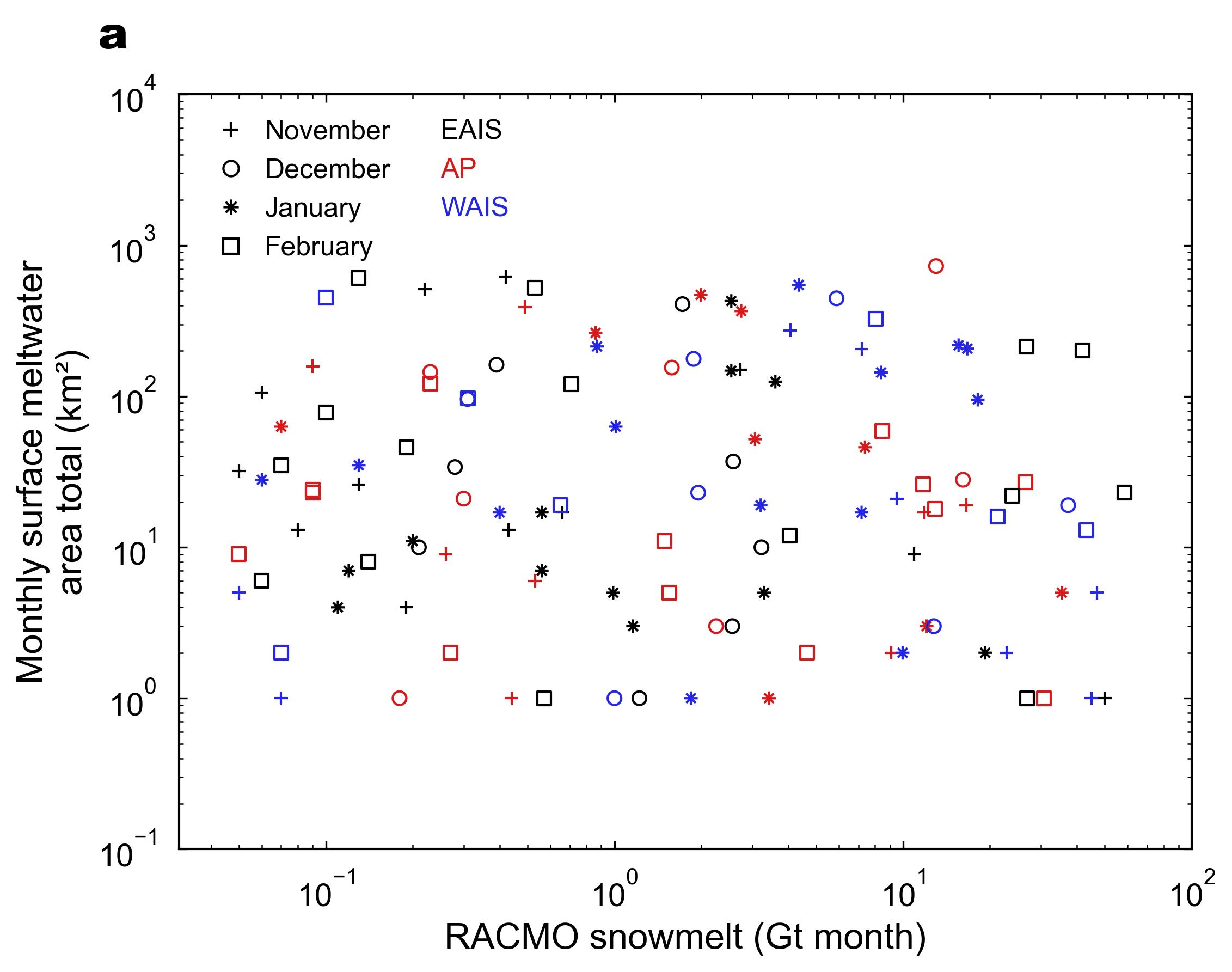
拟合线没画,因为用的模拟数据太差拟合不了啥,需要的再把代码喂给大模型添加一下就行。
绘制思路
这个图就是先按照普通的散点图,再调整一个对数轴,就能画出图的主体。比较有挑战性的部分在于标记的绘制和图例的绘制。
标记:其中的*和+标记,貌似用Matplotlib无法直接绘制(也可以是我没搜到)。且如果直接用text进行添加后续无法统一,所以写了个函数放在了utils文件夹,用于绘制一些自定义标记,需要的时候直接调用即可。
图例:因为这个图的绘制涉及到了多组数据,因此直接使用legend绘制会出现很多个组合。当然也可以通过text一个个添加,但是原因一样,就是没办法统一,而且一个个添加有点麻烦。所以就得结合Line2D创建出新的图例,再添加到legend中。
主要代码如下:
"""
Author: https://github.com/zbhgis
Paper source: https://doi.org/10.1038/s41558-025-02363-5
Paper Figure source: https://www.nature.com/articles/s41558-025-02363-5/figures/5
Last Modified: 2025-12-10
Data: The data used in the code is generated randomly
"""

import matplotlib.pyplot as plt
import numpy as np
import pandas as pd
import utils
from matplotlib.lines import Line2D

def create_scatter_plot(
    ax,
    csv_path,
    x_label="RACMO snowmelt (Gt month)",
    y_label="Monthly surface meltwater\narea total (km²)",
):
    df = pd.read_csv(csv_path)

    # 新标记
    plus_marker = utils.custom_marker("n+")
    star_marker = utils.custom_marker("n*")
    month_markers = {
        "November": plus_marker,
        "December": "o",
        "January": star_marker,
        "February": "s",
    }

    type_colors = {
        "EAIS": "#010101",
        "AP": "#D7191B",
        "WAIS": "#2525E6",
    }

    # 用于后续调整大小
    scatter_point_size = 36
    # 绘制每组数据
    for (type_, time_), group in df.groupby(["type", "time"]):
        plt.scatter(
            group["snowmelt"],
            group["area total"],
            marker=month_markers[time_],
            facecolor="none",
            s=scatter_point_size,
            alpha=1,
            edgecolor=type_colors[type_],
            linewidth=1,
            label=f"{type_} ({time_})",
        )

    # 添加轴标签与对数变换
    ax.set_xlabel(x_label)
    ax.set_ylabel(y_label)
    ax.set_xscale("log")
    ax.set_yscale("log")

    # 设置x轴范围
    ax.set_xlim(0.031, 100)
    # 设置y轴范围
    ax.set_ylim(0.1, 10000)
    # 设置刻度线
    ax.tick_params(
        axis="both", which="both", top=True, right=True, pad=10, direction="in"
    )

    # 先绘制月份图例
    legend_elements_month = []
    for month, marker in month_markers.items():
        legend_elements_month.append(
            Line2D(
                [0],
                [0],  # 用于占位
                marker=marker,
                color="w",  # 隐藏多余线条
                label=month,
                markerfacecolor="none",  # 不填充
                markeredgecolor="k",
                markersize=np.sqrt(4 / 3.14 * scatter_point_size),  # 大致转换关系
            )
        )

    # 添加在图片中
    month_legend = ax.legend(
        handles=legend_elements_month,
        loc="upper left",
        handletextpad=1,  # label和marker的距离
        frameon=False,
        fontsize=12,
        bbox_to_anchor=(0.02, 1.0),
    )

    # 绘制地区图例
    legend_elements_type = []
    for t in type_colors.keys():
        legend_elements_type.append(Line2D([0], [0], color="w", marker=None, label=t))

    # 添加到图片中
    type_legend = ax.legend(
        handles=legend_elements_type,
        loc="upper right",
        frameon=False,
        fontsize=12,
        bbox_to_anchor=(0.35, 1.0),
    )

    # 修改地区图例颜色
    for text in type_legend.get_texts():
        label_text = text.get_text()
        if label_text in type_colors:
            text.set_color(type_colors[label_text])

    # 再次添加月份图例,避免覆盖
    ax.add_artist(month_legend)

if __name__ == "__main__":
    # 统一绘图样式
    plt.rcdefaults()
    plt.rcParams.update(
        {
            "font.family": "Arial",  # 字体
            "axes.titlesize": 16,  # 子图标题大小
            "axes.labelsize": 16,  # 坐标轴标签大小
            "xtick.labelsize": 14,  # x轴刻度标签大小
            "ytick.labelsize": 14,  # y轴刻度标签大小
            "legend.fontsize": 16,  # 图例字体大小
            "axes.linewidth": 1,  # 坐标轴线宽
            "lines.linewidth": 1,  # 线宽
            "legend.handlelength": 0.5,  # 图例长度
            "legend.handleheight": 0.5,  # 图例高度
            "legend.handletextpad": 0.3,  # 图例与图例文字距离
        }
    )

    # 出图总体大小
    _, ax_list = utils.add_subplots(
        th=6, tw=8, ncols=1, nrows=1, text_type="a", text_offsets=[-0.05, 1.05]
    )

    create_scatter_plot(ax_list[0], "../data/scatter_data.csv")

    # 导出为jpg文件,默认在当前路径下
    utils.export_fig()
    # 导出为指定路径下的指定文件名的tiff文件,dpi为500
    # utils.export_fig(
    #     formats="tiff", output_path=r"C:\Users\dell\Desktop\test.tiff", dpi=500
    # )

    # # 直接用plt.show()会导致比例失常,所以得看最终导出的图。
    # plt.show()
完整代码
github仓库链接
https://github.com/zbhgis/QuickPlot
或者公众号后台回复 图表复现
在QuickPlot仓库 plot 文件夹的 scatter 文件夹下,过程中使用的其他封装工具函数在utils文件夹下。

参考
https://www.nature.com/articles/s41558-025-02363-5/figures/5

 浙公网安备 33010602011771号