vue使用rem实现 移动端屏幕适配
要想移动端适配 并使用 rem 您需要先看这篇文章,配置好less ➡️ 在vue 中使用 less,就可以使用rem了
如果项目已经开发的差不多了,没有用到rem 又要使用rem,您用这招。
postcss-pxtorem:转换px为rem的插件
安装 postcss-pxtorem
前端精品教程:百度网盘下载
npm install postcss-pxtorem --save
新建rem.js文件
|
1
2
3
4
5
6
7
8
9
10
11
12
13
14
|
const baseSize = 32// 设置 rem 函数function setRem () { // 当前页面宽度相对于 750 宽的缩放比例,可根据自己需要修改。 const scale = document.documentElement.clientWidth / 750 // 设置页面根节点字体大小 document.documentElement.style.fontSize = (baseSize * Math.min(scale, 2)) + 'px'}// 初始化setRem()// 改变窗口大小时重新设置 remwindow.onresize = function () { setRem()} |
并引用进main.js文件内
import './rem'
修改.postcssrc.js 文件
前端精品教程:百度网盘下载
在.postcssrc.js文件内的 plugins 添加以下配置,配后就可以在开发中直接使用 px 单位开发了
|
1
2
3
4
|
"postcss-pxtorem": { "rootValue": 32, "propList": ["*"]} |
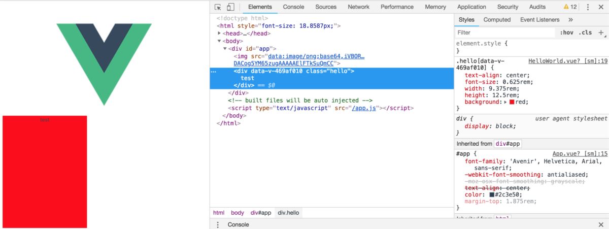
helloworld.vue
|
1
2
3
4
5
6
7
8
9
10
11
12
13
14
15
16
17
18
19
20
21
22
23
24
25
26
|
<template> <div class="hello"> test </div></template><script> export default { name: 'HelloWorld', data() { return { msg: 'Welcome to Your Vue.js App' } } }</script><style scoped> .hello { text-align: center; font-size: 20px; width: 300px; height: 400px; background:red; }</style> |
效果
前端精品教程:百度网盘下载
补充:下面看下Vue用rem布局
前端精品教程:百度网盘下载
使用vue.js搭建一个移动端项目,怎样做到自适应呢?当然选择rem布局是比较方便快捷的。
在使用vue-cli搭建好项目框架后,在目录结构的index.html文件中添加一段代码:
|
1
2
3
4
5
6
7
8
9
10
11
12
13
14
15
16
|
<script>fnResize()window.onresize = function () {fnResize()}function fnResize() {var deviceWidth = document.documentElement.clientWidth || window.innerWidthif (deviceWidth >= 750) {deviceWidth = 750}if (deviceWidth <= 320) {deviceWidth = 320}document.documentElement.style.fontSize = (deviceWidth / 7.5) + 'px'}</script> |
之后,在写css时,只要将px单位替换成rem,这里设置的比例是100px=1rem,例如,宽度为100px时,可以直接写成1rem。
posted on 2018-10-18 16:09 zanguixuan 阅读(8848) 评论(0) 收藏 举报


 浙公网安备 33010602011771号