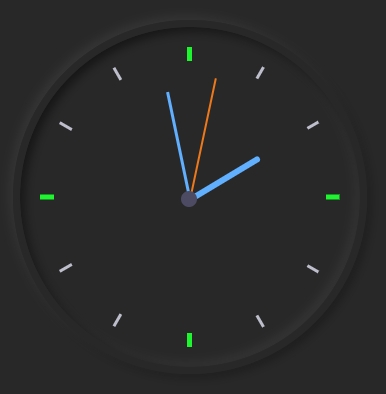
实现转动的时钟
HTML:
     <div class="clock">
       <div class="outer-clock-face">
          <div class="marking marking-one"></div>
           <div class="marking marking-two"></div>
           <div class="marking marking-three"></div>
            <div class="marking marking-four"></div>
        </div>
         <div class="inner-clock-face">
           <div class="hand hour-hand"></div>
            <div class="hand min-hand"></div>
              <div class="hand second-hand"></div>
           </div>
        </div>
CSS:
     html {
          background: #282828;
          text-align: center;
          font-size: 10px;
        }

        body {
          margin: 0;
          font-size: 2rem;
          display: flex;
          flex: 1;
          min-height: 100vh;
          align-items: center;
        }

        .clock {
          width: 30rem;
          height: 30rem;
          position: relative;
          padding: 2rem;
          border: 7px solid #282828;
          box-shadow: -4px -4px 10px rgba(67,67,67,0.5),
                        inset 4px 4px 10px rgba(0,0,0,0.5),
                        inset -4px -4px 10px rgba(67,67,67,0.5),
                        4px 4px 10px rgba(0,0,0,0.3);
          border-radius: 50%;
          margin: 50px auto;
        }
        .outer-clock-face {
          position: relative;
          background: #282828;
          overflow: hidden;
          width: 100%;
          height: 100%;
          border-radius: 100%;
        }

        .outer-clock-face::after {
          -webkit-transform: rotate(90deg);
          -moz-transform: rotate(90deg);
          transform: rotate(90deg)
        }

        .outer-clock-face::after,
        .outer-clock-face::before,
        .outer-clock-face .marking{
          content: '';
          position: absolute;
          width: 5px;
          height: 100%;
          background: #1df52f;
          z-index: 0;
          left: 49%;
        }
        .outer-clock-face .marking {
          background: #bdbdcb;
          width: 3px;
        }

        .outer-clock-face .marking.marking-one {
          -webkit-transform: rotate(30deg);
          -moz-transform: rotate(30deg);
          transform: rotate(30deg)
        }

        .outer-clock-face .marking.marking-two {
          -webkit-transform: rotate(60deg);
          -moz-transform: rotate(60deg);
          transform: rotate(60deg)
        }

        .outer-clock-face .marking.marking-three {
          -webkit-transform: rotate(120deg);
          -moz-transform: rotate(120deg);
          transform: rotate(120deg)
        }

        .outer-clock-face .marking.marking-four {
          -webkit-transform: rotate(150deg);
          -moz-transform: rotate(150deg);
          transform: rotate(150deg)
        }
        .inner-clock-face {
          position: absolute;
          top: 10%;
          left: 10%;
          width: 80%;
          height: 80%;
          background: #282828;
          -webkit-border-radius: 100%;
          -moz-border-radius: 100%;
          border-radius: 100%;
          z-index: 1;
        }

        .inner-clock-face::before {
          content: '';
          position: absolute;
          top: 50%;
          left: 50%;
          width: 16px;
          height: 16px;
          border-radius: 18px;
          margin-left: -9px;
          margin-top: -6px;
          background: #4d4b63;
          z-index: 11;
        }
        .hand {
          width: 50%;
          right: 50%;
          height: 6px;
          background: #61afff;
          position: absolute;
          top: 50%;
          border-radius: 6px;
          transform-origin: 100%;
          transform: rotate(90deg);
          transition-timing-function: cubic-bezier(0.1, 2.7, 0.58, 1);
        }

        .hand.hour-hand {
          width: 30%;
          z-index: 3;
        }

        .hand.min-hand {
          height: 3px;
          z-index: 10;
          width: 40%;
        }

        .hand.second-hand {
          background: #ee791a;
          width: 45%;
          height: 2px;
        }
JAVASCRIPT:
        const secondHand = document.querySelector('.second-hand');
        const minsHand = document.querySelector('.min-hand');
        const hourHand = document.querySelector('.hour-hand');
        function setDate() {
              const now = new Date();
              const seconds = now.getSeconds();
              const secondsDegrees = ((seconds / 60) * 360) + 90;
              secondHand.style.transform = `rotate(${secondsDegrees}deg)`;
              const mins = now.getMinutes();
              const minsDegrees = ((mins / 60) * 360) + ((seconds / 60) * 6) + 90;
              minsHand.style.transform = `rotate(${minsDegrees}deg)`;
              const hour = now.getHours();
              const hourDegrees = ((hour / 12) * 360) + ((mins/60)*30) + 90;
              hourHand.style.transform = `rotate(${hourDegrees}deg)`;
        }
        setInterval(setDate, 1000);
        setDate();
希望大佬看到有不对的地方,提出博主予以改正!

 浙公网安备 33010602011771号