css坐摩天轮的小人
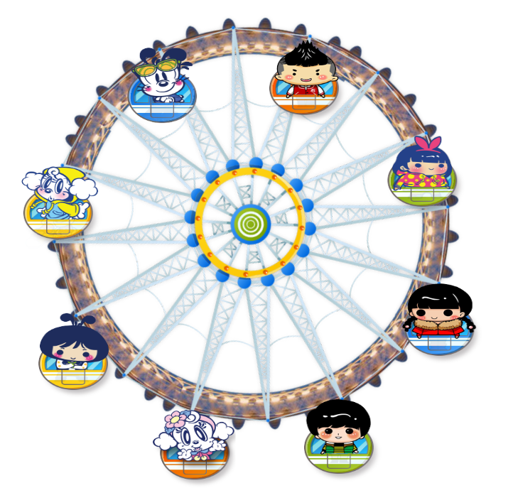
制作一个小人坐摩天轮的效果。
基本思路:背景摩天轮是张图片,让其顺时针旋转,然后绝定定位把小人图片放在相应位置上,如果让小人也顺时针旋转,则会出现违背牛顿定律的事(哈哈哈),所以,让其符合真实,应该让小人图片按照摩天轮相反方向旋转。
html:
<div id="yuan">
    <img src="images/boy.png" alt="">
    <img src="images/girl.png" alt="">
    <img src="images/girls.png" alt="">
    <img src="images/hairboy.png" alt="">
    <img src="images/dog.png" alt="">
    <img src="images/mimi.png" alt="">
    <img src="images/shamegirl.png" alt="">
    <img src="images/mudog.png" alt="">
</div>
css:
@keyframes zhuan{
            from{
                transform: rotateZ(0);
            }to{
                transform: rotateZ(360deg);
            }
        }
        @keyframes tuPian {
            from {
                transform: rotateZ(360deg);
            }
            to{
                transform: rotateZ(0deg);
            }
        }
        #yuan{
            width: 400px;
            height: 400px;
            border-radius: 50%;
            margin: 100px auto;
            animation: zhuan 20s linear infinite;
            background-image: url('images/fsw.png');
            background-position: center center;
            background-size: 100% 100%;
        }
        img{
            width: 80px;
            height: 80px;
            position: absolute;
            animation: tuPian 20s linear infinite;
            transform-origin: top center;
        }
        img:nth-child(1){
            left: 160px;
            top: 15px;
        }
        img:nth-child(2){
            left: 30px;
            top: 70px;
        }
        img:nth-child(3){
            left: -20px;
            top: 200px;
        }
        img:nth-child(4){
            left: 35px;
            top: 330px;
        }
        img:nth-child(5){
            left: 160px;
            top: 385px;
        }
        img:nth-child(6){
            left: 295px;
            top: 330px;
        }
        img:nth-child(7){
            left: 345px;
            top: 200px;
        }
        img:nth-child(8){
            left: 290px;
            top: 70px;
        }

 浙公网安备 33010602011771号