

echarts环形图
对于一个从毕业之后就没写过前端代码的渣渣来说,弄个环形图还是挺吃力的,用此博文记录一下。如有不正确的地方,希望各位大佬多多指正。
代码如下:
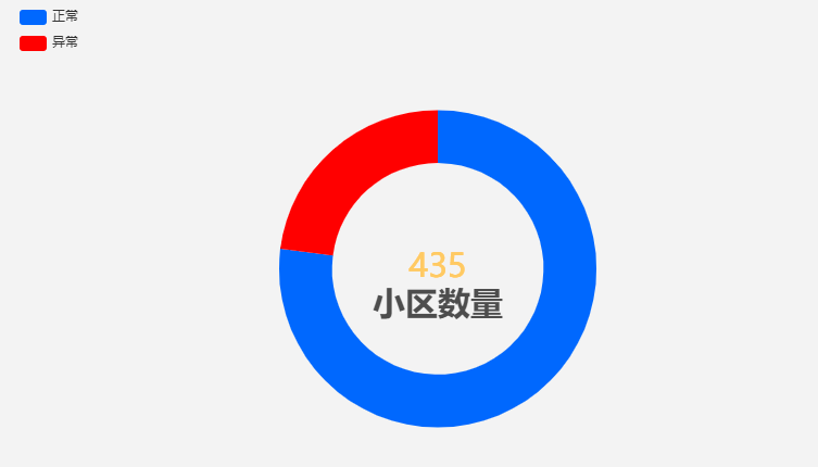
 1 var echartData = [{value: 335, name: '正常',itemStyle:{color:'#0066FF'}},
 2                 {value: 100, name: '异常',itemStyle:{color:'#FF0000'}}]
 3 option = {
 4     title: {
 5         text:'小区数量',
 6         left:'center',
 7         top:'53%',
 8         padding:[5,0],
 9         textStyle:{
10             color:'#4D4D4D',
11             fontSize:'30'},
12         show:true,
13         position:'center'
14     },
15     tooltip: {
16         trigger: 'item',
17         formatter: '{a} <br/>{b}: {c} ({d}%)'
18     },
19     legend: {
20         orient: 'vertical',
21         left: 10,
22         data: ['正常', '异常']
23     },
24     series: [
25         {
26             name: '小区状态',
27             type: 'pie',
28             radius: ['40%', '60%'],
29             avoidLabelOverlap: false,
30             label: {
31                 formatter:function(name){
32                     var total = 0; //总和
33                 echartData.forEach(function(value, index, array) {
34                 total += value.value;
35                 });
36                 return total;
37                 },
38                 textStyle:{color:'#ffcc66'},
39                 show:true,
40                 position:'center',
41                 fontSize:'30'
42             },
43             emphasis: {
44                 label: {
45                     show: true,
46                     fontSize: '30',
47                     fontWeight: 'bold'
48                 }
49             },
50             labelLine: {
51                 show: false
52             },
53             data: echartData
54         }
55     ]
56 };
效果图:
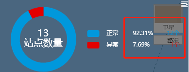
疑问:
不知道下面这种咋弄
业精于勤,大家加油鸭

 浙公网安备 33010602011771号