
matplotlib 画图
matplotlib 画图
1. 画曲线图
-
-
Tompson = np.array([0, 0, 0, 0, 0.011, 0.051, 0.15, 0.251, 0.35, 0.44, 0.51, 0.59, 0.65, 0.68, 0.725, 0.752, 0.8])
-
ours = np.array([0.00000000e+00, 1.21182744e-04, 4.26563257e-02,
-
1.76078526e-01, 3.51187591e-01, 5.02666020e-01,
-
6.18274358e-01, 7.03102278e-01, 7.61754726e-01,
-
8.12893844e-01, 8.63427048e-01, 9.02205526e-01,
-
9.30198740e-01, 9.51284537e-01, 9.61706253e-01,
-
9.74066893e-01, 9.79641299e-01])
-
Deep_prior = np.array([0, 0, 0.03, 0.09, 0.15, 0.251, 0.34, 0.415, 0.49, 0.55, 0.62, 0.69, 0.74, 0.79, 0.83, 0.86, 0.9])
-
Zhou = np.array([0, 0, 0.023, 0.1, 0.21, 0.325, 0.415, 0.52, 0.59, 0.661, 0.73, 0.78, 0.85, 0.885, 0.91, 0.94, 0.95])
-
Feedback_loop = np.array(
-
[0, 0, 0.022, 0.09, 0.20, 0.32, 0.415, 0.53, 0.642, 0.72, 0.79, 0.85, 0.88, 0.91, 0.951, 0.96, 0.965])
-
Crossing_net = np.array(
-
[0, 0, 0.07, 0.17, 0.25, 0.36, 0.485, 0.62, 0.715, 0.79, 0.865, 0.906, 0.92, 0.95, 0.952, 0.970, 0.97])
-
qinghua = np.array([ 0. , 0.00121183, 0.06386331, 0.17886573, 0.3427048 ,
-
0.4655841 , 0.57828405, 0.67716917, 0.76223946, 0.82222492,
-
0.87433349, 0.91250606, 0.94122637, 0.96122152, 0.9726127 ,
-
0.9831556 , 0.98679108])
-
def draw_map(errs1, errs2, errs3, errs4, errs5, errs6, errs7):
-
# err_flat = errs.ravel() # Return a flattened array, 相同功能的函数为np.flat
-
thresholds = np.arange(0, 85, 5) # 不包含85
-
fig=plt.figure(figsize=(10, 8)) # 设置figsize的大小
-
ax = fig.add_subplot(111)
-
ax.plot(thresholds, errs1, '-.', thresholds, errs2, '-_',
-
thresholds, errs3, '--', thresholds, errs4, '--*', thresholds, errs5, ':*',
-
thresholds, errs6, ':x', linewidth=2)
-
ax.plot(thresholds, errs7, '-', linewidth=2.25, color='b')
-
ax.set_xlabel('Maximum joint error threshold (mm)', fontsize=15)
-
ax.set_ylabel('Fraction of frames within threshold', fontsize=15)
-
ax.tick_params(axis='x', labelsize=15)
-
ax.tick_params(axis='y', labelsize=15)
-
# 设置x, y轴的数字字号
-
# plt.rcParams['xtick.labelsize']=15
-
# plt.rcParams['ytick.labelsize']=15
-
# 或者
-
# plt.set_xticks(fontsize=15) # 设置坐标轴刻度字体大小
-
# plt.set_yticks(fontsize=15)
-
ax.legend(['Tompson et al.', 'Prior', 'Zhou et al.', 'Feedback', 'REN', 'Crossing Nets','ours'], loc='lower right',
-
prop={'size': 15})
-
ax.grid(True)
-
-
fig=draw_map(Tompson, Deep_prior, Zhou, Feedback_loop, qinghua, Crossing_net, ours)
-
-
- <span style="font-size:18px">
- plt.savefig('D:\\filename.svg',format='svg') #保持为eps格式或者svg格式
- plt.show()</span>

前面依然使用plt句柄,只是最后获取当前图像
-
# plt调用gcf函数取得当前绘制的figure并调用savefig函数
-
foo_fig = plt.gcf() # 'get current figure'
-
foo_fig.savefig('foo.eps', format='eps', dpi=1000)
-
plt.show()
2. 画柱状图
-
def draw_error(errs1, errs2, errs3, errs4, errs5, errs6, dataset='nyu'):
-
bar_width = 0.23
-
opacity = 0.4
-
# 将总体的mean计算出来也放进去!!
-
if dataset == 'icvl':
-
joint_idx = [0, 1, 3, 4, 6, 7, 9, 10, 12, 13, 15, 16]
-
names = ['Palm', 'Thumb.R', 'Thumb.T', 'Index.R', 'Index.T', 'Mid.R', 'Mid.T', 'Ring.R', 'Ring.T', 'Pinky.R',
-
'Pinky.T', 'Mean']
-
elif dataset == 'nyu':
-
joint_idx = [0, 1, 2, 3, 4, 5, 6, 7, 13, 11, 12, 8, 9, 10, 14]
-
names = ['P1', 'P2', 'R1', 'R2', 'M1', 'M2', 'I1', 'I2', 'C', 'W1', 'W2', 'T1', 'T2', 'T3', 'AVG']
-
-
x = np.arange(len(joint_idx))
-
plt.figure(figsize=(12, 8))
-
# plt.bar(x, errs1[joint_idx]) # 选中indx为joint_idx的元素
-
# plt.title('error')
-
plt.xticks(x + 0.5, names, fontsize=15) # set the locations and labels of the xticks , rotation='vertical'
-
plt.yticks(fontsize=15) # 设置坐标轴刻度字体大小
-
plt.ylabel('Mean Error (mm)', fontsize=15)
-
# plt.grid(True)
-
-
rects1 = plt.bar(x, errs1, bar_width / 2, alpha=opacity, color='y', label='Tompson et al.')
-
rects2 = plt.bar(x + bar_width / 2, errs2, bar_width / 2, alpha=opacity, color='k', label='Prior')
-
-
rects3 = plt.bar(x + bar_width, errs3, bar_width / 2, alpha=opacity, color='c', label='Zhou et al.')
-
rects4 = plt.bar(x + 1.5 * bar_width, errs4, bar_width / 2, alpha=opacity, color='m', label='Feedback')
-
rects5 = plt.bar(x + 2 * bar_width, errs5[joint_idx], bar_width / 2, alpha=opacity, color='g', label='REN')
-
rects6 = plt.bar(x + 2.5 * bar_width, errs6[joint_idx], bar_width / 2, alpha=opacity, color='b', label='ours')
-
-
plt.legend(loc='upper left', prop={'size': 12})
-
plt.tight_layout()
-
foo_fig = plt.gcf() # 'get current figure'
-
foo_fig.savefig('柱状图.eps', format='eps', dpi=1000)
-
plt.show()

3. 转载的一个教程: 点击打开链接
官网介绍:
一个很详细的博客:
基础知识:
首先一幅Matplotlib的图像组成部分介绍。
在matplotlib中,整个图像为一个Figure对象。在Figure对象中可以包含一个或者多个Axes对象。每个Axes(ax)对象都是一个拥有自己坐标系统的绘图区域。所属关系如下:

下面以一个直线图来详解图像内部各个组件内容:

其中:title为图像标题,Axis为坐标轴, Label为坐标轴标注,Tick为刻度线,Tick Label为刻度注释。各个对象关系可以梳理成以下内容:

图像中所有对象均来自于Artist的基类。
上面基本介绍清楚了图像中各个部分的基本关系,下面着重讲一下几个部分的详细的设置。
一个"Figure"意味着用户交互的整个窗口。在这个figure中容纳着"subplots"。
当我们调用plot时,matplotlib会调用gca()获取当前的axes绘图区域,而且gca反过来调用gcf()来获得当前的figure。如果figure为空,它会自动调用figure()生成一个figure, 严格的讲,是生成subplots(111)。
Figures

Subplots
注意:其中各个参数也可以用逗号,分隔开。第一个参数代表子图的行数;第二个参数代表该行图像的列数; 第三个参数代表每行的第几个图像。

另外:fig, ax = plt.subplots(2,2),其中参数分别代表子图的行数和列数,一共有 2x2 个图像。函数返回一个figure图像和一个子图ax的array列表。
补充:gridspec命令可以对子图区域划分提供更灵活的配置。
中文显示方框问题
这是由于matplotlib文件夹内没有中文字体包导致的,实际上函数包本身是支持中文的,常见解决方案是拷贝字体文件到matplotlib中,不过我感觉太麻烦,找到了另外的方式,
|
1
2
3
4
|
from pylab import mplmpl.rcParams['font.sans-serif'] = ['FangSong'] # 指定默认字体mpl.rcParams['axes.unicode_minus'] = False # 解决保存图像是负号'-'显示为方块的问题 |
加上这三行代码指定一下字体就行了(实际上最后一行可以不加)
常用绘制流程
1.axes列表中包含各个子图句柄
|
1
2
3
4
5
6
7
|
# 3x3子图fig, axes = plt.subplots(3, 3)# 子图间距设定fig.subplots_adjust(hspace=0.3, wspace=0.3)# 在分别绘制各个子图for i, ax in enumerate(axes.flat): pass |
2.每个子图句柄需要单独生成
|
1
2
3
4
5
6
7
8
|
# 画布fig = plt.figure()# 添加子图ax = fig.add_subplot(211)pass# 添加子图ax2 = fig.add_subplot(212)pass |
3.使用plt包命名空间代指多个子图句柄
【注】这种方法的句柄含在plt中,与上面的ax的方法属性并不相同,下面会详解
|
1
2
3
4
5
6
7
8
9
|
# 添加子图plt.subplot(311)pass# 添加子图plt.subplot(312)pass# 添加子图plt.subplot(313)pass |
绘图功能
【注】使用ax代指子图方法1、2的句柄,plt代指方法3中的命名空间。坐标生成:
|
1
2
3
4
5
6
|
# 一维坐标生成x = np.linspace(0,10,100)# 二维网格生成u = np.linspace(-1,1,100)x,y = np.meshgrid(u,u) |
坐标轴标签:
|
1
2
3
4
5
6
7
8
|
xlabel = "True: {0}, Pred: {1}".format(cls_true[i], cls_pred[i])xlabel = "y"ax.set_xlabel(xlabel)ax.set_ylabel(ylabel)plt.xlabel('x')plt.ylabel('y') |
坐标轴刻度:
|
1
2
3
4
5
|
ax.set_xticks([])ax.set_yticks([])plt.xticks(range(len(x)), ['a', 'b', 'c', 'd', 'e', 'f'])plt.yticks(range(1, 8, 2)) |
坐标网格:
|
1
2
3
4
5
6
7
|
# 横纵坐标单位长度统一plt.axis('equal')# 网格plt.grid(True)# 网格ax.grid(True) |
图表标题:
|
1
|
plt.title('Second Derivative') |
对数坐标:
|
1
2
3
4
5
|
'''对数坐标'''plt.semilogx(x,y) # 对x取对数plt.semilogy(x,y) # 对y取对数plt.loglog(x,y) # 同时取对数 |
绘图:
|
1
2
3
4
5
6
7
8
9
10
|
# 色彩填充ax.fill(x,y1,facecolor='g',alpha=0.3)ax.fill_between(x,y,y1,facecolor='b')# 等高线ax.contourf(x,y,z)# 显示数组,因为是数组所以才会有vmin和vmax的关键字ax.imshow()# 线性绘图plt.plot(x,y1,c='b',linestyle='',marker='^') |
经典实现
饼状图
|
1
2
3
4
5
6
7
8
9
10
11
12
13
14
15
16
17
18
19
20
21
22
23
24
25
26
27
|
import matplotlib.pyplot as pltplt.figure(figsize=(12,9))labels = ['part1', 'part2', 'part3']# 各个饼的比例sizes = [30, 20, 50]colors = ['yellowgreen', 'gold', 'lightskyblue']# 各个模块离圆心的距离,参数为距离explode = (0.05, 0.0, 0.0) # 图 label的text 比例的textpatches, l_texts, p_texts = plt.pie(sizes, explode=explode, labels=labels, colors=colors, labeldistance=0.8, autopct='%3.1f%%', shadow=True, startangle=90, pctdistance=0.6)# 设置x,y轴刻度一致,这样饼图才能是圆的plt.axis('equal')plt.legend()# 设置label的字体大小for t in l_texts: t.set_size(20)# 设置比例数字的字体大小for t in p_texts: t.set_size(20)plt.show() |

柱状图
|
1
2
3
4
5
6
7
8
9
10
11
12
13
14
15
16
17
18
19
20
21
22
23
24
25
26
|
import numpy as npfrom matplotlib import pyplot as pltplt.figure(figsize=(9,6))n = 12X = np.arange(n)+1# numpy.random.uniform(low=0.0, high=1.0, size=None), normalY1 = (1-X/float(n+1)) * np.random.uniform(0.5,1.0,n)Y2 = (1-X/float(n+1)) * np.random.uniform(0.5,1.0,n)# bar and barhwidth = 0.35plt.bar(X, Y1, width=width, facecolor='#9999ff', edgecolor='white')plt.bar(X+width, Y2, width=width, facecolor='#ff9999', edgecolor='white')plt.bar(X, -Y2, width=width, facecolor='#ff9999', edgecolor='white')# 柱状图添加说明文字for x,y in zip(X,Y1): plt.text(x, y+0.05, '%.2f' % y, ha='center', va= 'bottom') for x,y in zip(X,-Y2): plt.text(x+0.4, y-0.15, '%.2f' % y, ha='center', va= 'bottom')#plt.ylim(-1.25,+1.25)plt.show() |

|
1
2
3
4
5
6
7
8
9
10
11
12
13
14
15
16
17
|
import numpy as npfrom matplotlib import pyplot as pltplt.figure(figsize=(9,6))n = 12X = np.arange(n)+1# numpy.random.uniform(low=0.0, high=1.0, size=None), normalY1 = (1-X/float(n+1)) * np.random.uniform(0.5,1.0,n)Y2 = (1-X/float(n+1)) * np.random.uniform(0.5,1.0,n)# bar and barhwidth = 0.35# 方法barh和参数height可以实现横向的柱状图plt.barh(X, Y1, height=width, facecolor='#9999ff', edgecolor='white')plt.show() |

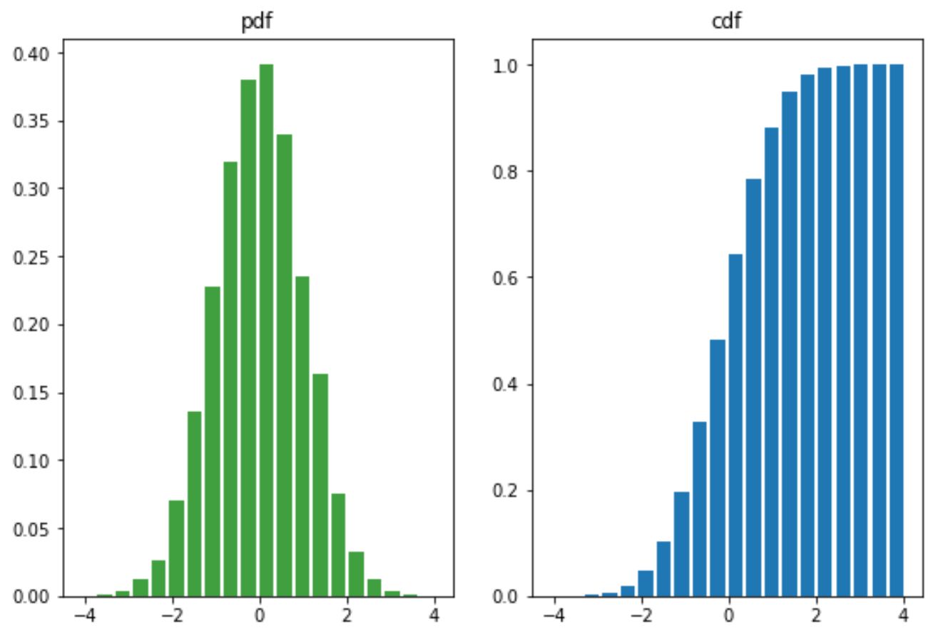
概率分布图
|
1
2
3
4
5
6
7
8
9
10
11
12
13
14
15
16
|
from matplotlib import pyplot as pltimport numpy as npmu = 0sigma = 1x = mu + sigma*np.random.randn(10000)fig,(ax0,ax1)=plt.subplots(ncols=2, figsize=(9,6))ax0.hist(x, 20, normed=1, histtype='bar', facecolor='g', rwidth=0.8, alpha=0.75)ax0.set_title('pdf')# 累积概率密度分布ax1.hist(x, 20, normed=1, histtype='bar', rwidth=0.8, cumulative=True)ax1.set_title('cdf')plt.show() |
散点图
atan2(a,b)是4象限反正切,它的取值不仅取决于正切值a/b,还取决于点 (b, a) 落入哪个象限: 当点(b, a) 落入第一象限时,atan2(a,b)的范围是 0 ~ pi/2; 当点(b, a) 落入第二象限时,atan2(a,b)的范围是 pi/2 ~ pi; 当点(b, a) 落入第三象限时,atan2(a,b)的范围是 -pi~-pi/2; 当点(b, a) 落入第四象限时,atan2(a,b)的范围是 -pi/2~0
而 atan(a/b) 仅仅根据正切值为a/b求出对应的角度 (可以看作仅仅是2象限反正切): 当 a/b > 0 时,atan(a/b)取值范围是 0 ~ pi/2; 当 a/b < 0 时,atan(a/b)取值范围是 -pi/2~0
故 atan2(a,b) = atan(a/b) 仅仅发生在 点 (b, a) 落入第一象限 (b>0, a>0)或 第四象限(b>0, a0 , 故 atan(a/b) 取值范围是 0 ~ pi/2,2atan(a/b) 的取值范围是 0 ~ pi,而此时atan2(a,b)的范围是 -pi~-pi/2,很显然,atan2(a,b) = 2atan(a/b)
举个最简单的例子,a = 1, b = -1,则 atan(a/b) = atan(-1) = -pi/4, 而 atan2(a,b) = 3*pi/4
|
1
2
3
4
5
6
7
8
9
10
11
12
13
14
15
16
17
18
19
20
21
|
from matplotlib import pyplot as pltimport numpy as npplt.figure(figsize=(9,6))n = 1024# 均匀分布 高斯分布# rand 和 randnX = np.random.rand(1,n)Y = np.random.rand(1,n)# 设定颜色T = np.arctan2(Y,X)plt.scatter(X,Y, s=75, c=T, alpha=.4, marker='o')#plt.xlim(-1.5,1.5), plt.xticks([])#plt.ylim(-1.5,1.5), plt.yticks([])plt.show() |

不规则组合图
# 定义子图区域
left, width = 0.1, 0.65
bottom, height = 0.1, 0.65
bottom_h = left_h = left + width + 0.02
rect_scatter = [left, bottom, width, height]
rect_histx = [left, bottom_h, width, 0.2]
rect_histy = [left_h, bottom, 0.2, height]
plt.figure(1, figsize=(6, 6))# 需要传入[左边起始位置,下边起始位置,宽,高]
# 根据子图区域来生成子图
axScatter = plt.axes(rect_scatter)
axHistx = plt.axes(rect_histx)
axHisty = plt.axes(rect_histy)
|
1
2
3
4
5
6
7
8
9
10
11
12
13
14
15
16
17
18
19
20
21
22
23
24
25
26
27
28
29
30
31
32
33
34
35
36
37
38
39
40
41
42
43
44
45
46
47
48
49
50
|
# ref : http://matplotlib.org/examples/pylab_examples/scatter_hist.htmlimport numpy as npimport matplotlib.pyplot as plt# the random datax = np.random.randn(1000)y = np.random.randn(1000)# 定义子图区域left, width = 0.1, 0.65bottom, height = 0.1, 0.65bottom_h = left_h = left + width + 0.02rect_scatter = [left, bottom, width, height]rect_histx = [left, bottom_h, width, 0.2]rect_histy = [left_h, bottom, 0.2, height]plt.figure(1, figsize=(6, 6))# 根据子图区域来生成子图axScatter = plt.axes(rect_scatter)axHistx = plt.axes(rect_histx)axHisty = plt.axes(rect_histy)# no labels#axHistx.xaxis.set_ticks([])#axHisty.yaxis.set_ticks([])# now determine nice limits by hand:N_bins=20xymax = np.max([np.max(np.fabs(x)), np.max(np.fabs(y))])binwidth = xymax/N_binslim = (int(xymax/binwidth) + 1) * binwidthnlim = -lim# 画散点图,概率分布图axScatter.scatter(x, y)axScatter.set_xlim((nlim, lim))axScatter.set_ylim((nlim, lim))bins = np.arange(nlim, lim + binwidth, binwidth)axHistx.hist(x, bins=bins)axHisty.hist(y, bins=bins, orientation='horizontal')# 共享刻度axHistx.set_xlim(axScatter.get_xlim())axHisty.set_ylim(axScatter.get_ylim())plt.show() |

三维数据图
使用散点图的点大小、颜色、透明度表示高维数据:
|
1
2
3
4
5
6
7
8
9
10
11
12
13
14
15
16
17
18
19
20
21
22
23
24
25
26
27
28
29
|
import numpy as npimport matplotlib.pyplot as pltfig = plt.figure(figsize=(9,6),facecolor='white')# Number of ringn = 50size_min = 50size_max = 50*50# Ring positionP = np.random.rand(n,2)# Ring colors R,G,B,AC = np.ones((n,4)) * (0.5,0.5,0,1)# Alpha color channel goes from 0 (transparent) to 1 (opaque),很厉害的实现C[:,3] = np.linspace(0,1,n)# Ring sizesS = np.linspace(size_min, size_max, n)# Scatter plotplt.scatter(P[:,0], P[:,1], s=S, lw = 0.5, edgecolors = C, facecolors=C)plt.xlim(0,1), plt.xticks([])plt.ylim(0,1), plt.yticks([])plt.show() |

美化
|
1
2
3
4
5
6
7
8
|
# 美化matplotlib绘出的图,导入后自动美化import seaborn as sns# matplotlib自带美化风格# 打印可选风格print(plt.style.available #ggplot, bmh, dark_background, fivethirtyeight, grayscale)# 激活风格plt.style.use('bmh') |
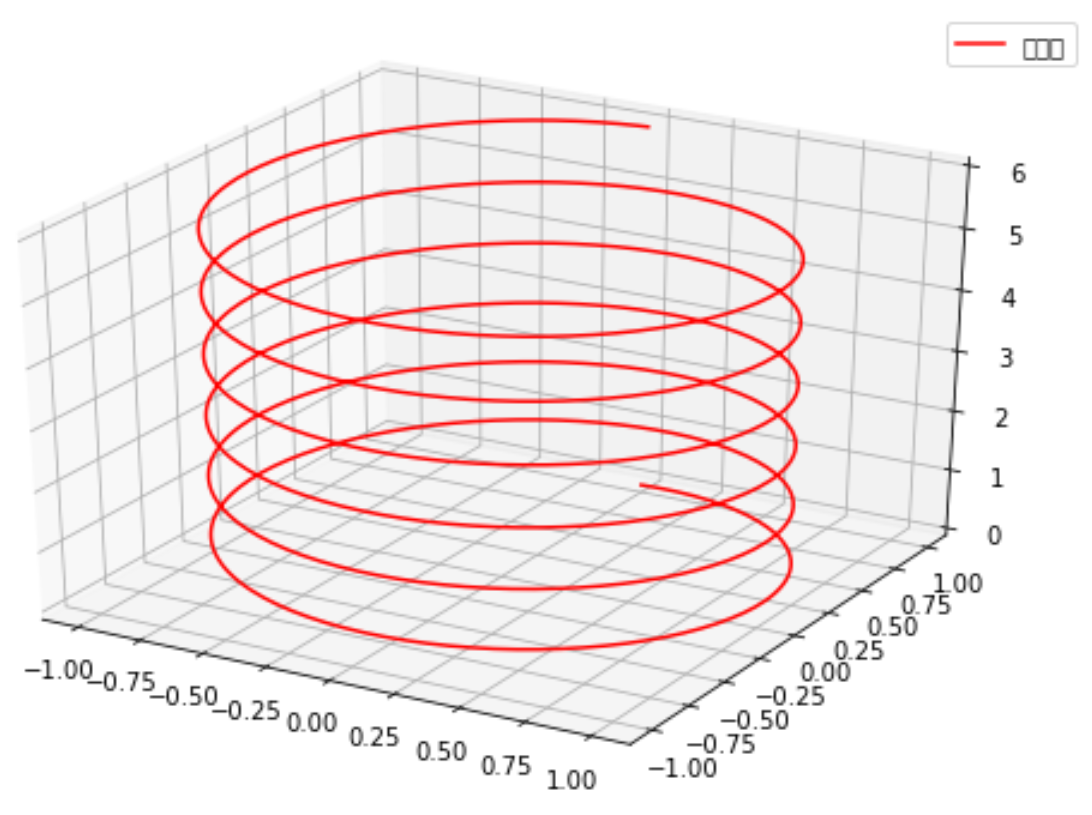
一维颜色填充 & 三维绘图 & 三维等高线图
『Python』Numpy学习指南第九章_使用Matplotlib绘图
from mpl_toolkits.mplot3d import Axes3D
ax = fig.add_subplot(111,projection='3d')
ax.plot() 绘制3维线
ax.plot_surface绘制三维网格(面)
|
1
2
3
4
5
6
7
8
9
10
11
12
13
14
15
16
17
18
|
from mpl_toolkits.mplot3d import Axes3D #<-----导入3D包import numpy as npimport matplotlib.pyplot as pltfig = plt.figure(figsize=(9,6))ax = fig.add_subplot(111,projection='3d') #<-----设置3D模式子图<br># 新思路,之前都是生成x和y绘制z=f(x,y)的函数,这次绘制x=f1(z),y=f2(z)z = np.linspace(0, 6, 1000)r = 1x = r * np.sin(np.pi*2*z)y = r * np.cos(np.pi*2*z)ax.plot(x, y, z, label=u'螺旋线', c='r')ax.legend()# dpi每英寸长度的点数plt.savefig('3d_fig.png',dpi=200)plt.show() |
# ax.plot 绘制的是3维线,ax.plot_surface绘制的是三维网格(也就是面)
|
1
2
3
4
5
6
7
8
9
10
11
12
13
14
15
16
17
18
19
20
21
22
23
|
from mpl_toolkits.mplot3d import axes3dimport matplotlib.pyplot as pltfrom matplotlib import cmfig = plt.figure()ax = fig.add_subplot(111,projection='3d')X, Y, Z = axes3d.get_test_data(0.05)print(X,Y,Z)# ax.plot 绘制的是3维线,ax.plot_surface绘制的是三维网格(也就是面)ax.plot_surface(X, Y, Z, rstride=5, cstride=5, alpha=0.3)# 三维图投影制作,zdir选择投影方向坐标轴cset = ax.contour(X, Y, Z, 10, zdir='z', offset=-100, cmap=cm.coolwarm)cset = ax.contour(X, Y, Z, zdir='x', offset=-40, cmap=cm.coolwarm)cset = ax.contour(X, Y, Z, zdir='y', offset=40, cmap=cm.coolwarm)ax.set_xlabel('X')ax.set_xlim(-40, 40)ax.set_ylabel('Y')ax.set_ylim(-40, 40)ax.set_zlabel('Z')ax.set_zlim(-100, 100)plt.show() |
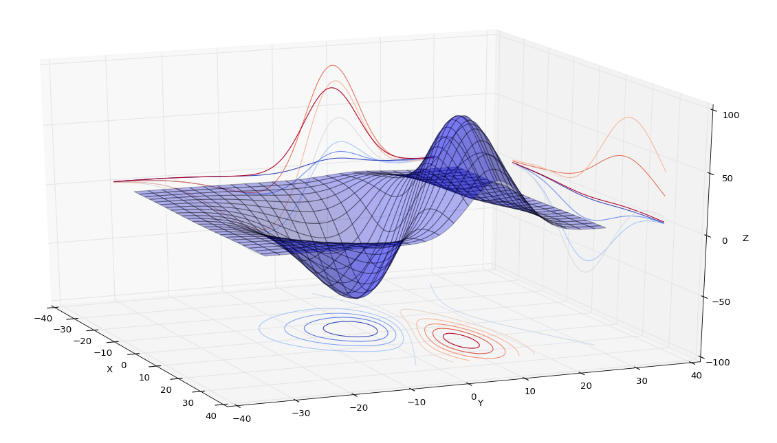
# 为等高线图添加标注
|
1
2
|
cs = ax2.contour(X,Y,Z)ax2.clabel(cs, inline=1, fontsize=5) |

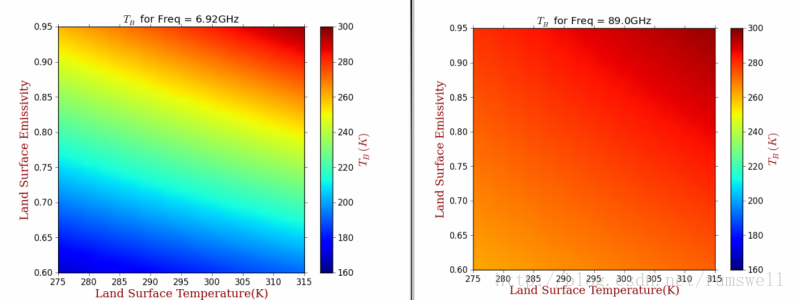
配置Colorbar
|
1
2
3
4
5
6
7
8
9
10
11
12
13
14
15
16
17
18
19
20
21
22
23
24
25
26
27
28
29
30
31
32
33
34
35
36
37
38
39
40
41
42
43
44
45
46
47
48
49
50
51
52
53
54
55
56
57
58
59
60
61
62
63
64
65
66
67
68
69
70
71
72
73
74
75
76
77
78
79
80
81
82
83
|
# -*- coding: utf-8 -*- #********************************************************** import os import numpy as np import wlab #pip install wlab import matplotlib import matplotlib.cm as cm import matplotlib.pyplot as plt from matplotlib.ticker import MultipleLocator from scipy.interpolate import griddata matplotlib.rcParams['xtick.direction'] = 'out' matplotlib.rcParams['ytick.direction'] = 'out' #********************************************************** FreqPLUS=['F06925','F10650','F23800','F18700','F36500','F89000'] # FindPath='/d3/MWRT/R20130805/' #********************************************************** fig = plt.figure(figsize=(8,6), dpi=72, facecolor="white") axes = plt.subplot(111) axes.cla()#清空坐标轴内的所有内容 #指定图形的字体 font = {'family' : 'serif', 'color' : 'darkred', 'weight' : 'normal', 'size' : 16, } #********************************************************** # 查找目录总文件名中保护F06925,EMS和txt字符的文件 for fp in FreqPLUS: FlagStr=[fp,'EMS','txt'] FileList=wlab.GetFileList(FindPath,FlagStr) # LST=[]#地表温度 EMS=[]#地表发射率 TBH=[]#水平极化亮温 TBV=[]#垂直极化亮温 # findex=0 for fn in FileList: findex=findex+1 if (os.path.isfile(fn)): print(str(findex)+'-->'+fn) #fn='/d3/MWRT/R20130805/F06925_EMS60.txt' data=wlab.dlmread(fn) EMS=EMS+list(data[:,1])#地表发射率 LST=LST+list(data[:,2])#温度 TBH=TBH+list(data[:,8])#水平亮温 TBV=TBV+list(data[:,9])#垂直亮温 #----------------------------------------------------------- #生成格点数据,利用griddata插值 grid_x, grid_y = np.mgrid[275:315:1, 0.60:0.95:0.01] grid_z = griddata((LST,EMS), TBH, (grid_x, grid_y), method='cubic') #将横纵坐标都映射到(0,1)的范围内 extent=(0,1,0,1) #指定colormap cmap = matplotlib.cm.jet #设定每个图的colormap和colorbar所表示范围是一样的,即归一化 norm = matplotlib.colors.Normalize(vmin=160, vmax=300) #显示图形,此处没有使用contourf #>>>ctf=plt.contourf(grid_x,grid_y,grid_z) gci=plt.imshow(grid_z.T, extent=extent, origin='lower',cmap=cmap, norm=norm) #配置一下坐标刻度等 ax=plt.gca() ax.set_xticks(np.linspace(0,1,9)) ax.set_xticklabels( ('275', '280', '285', '290', '295', '300', '305', '310', '315')) ax.set_yticks(np.linspace(0,1,8)) ax.set_yticklabels( ('0.60', '0.65', '0.70', '0.75', '0.80','0.85','0.90','0.95')) #显示colorbar cbar = plt.colorbar(gci) cbar.set_label('$T_B(K)$',fontdict=font) cbar.set_ticks(np.linspace(160,300,8)) cbar.set_ticklabels( ('160', '180', '200', '220', '240', '260', '280', '300')) #设置label ax.set_ylabel('Land Surface Emissivity',fontdict=font) ax.set_xlabel('Land Surface Temperature(K)',fontdict=font) #陆地地表温度LST #设置title titleStr='$T_B$ for Freq = '+str(float(fp[1:-1])*0.01)+'GHz' plt.title(titleStr) figname=fp+'.png' plt.savefig(figname) plt.clf()#清除图形 #plt.show() print('ALL -> Finished OK') |
上面的例子中,每个保存的图,都是用同样的colormap,并且每个图的颜色映射值都是一样的,也就是说第一个图中如果200表示蓝色,那么其他图中的200也表示蓝色。
示例的图形如下:
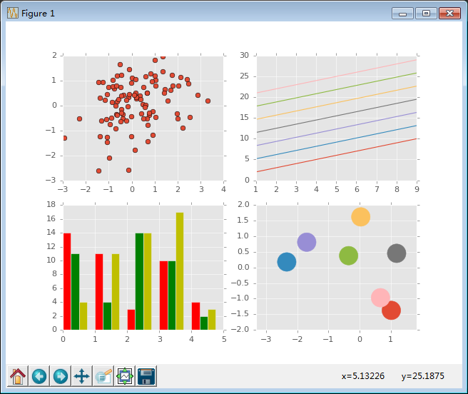
4. 样式美化(matplotlib.pyplot.style.use) 点击打开链接
使用matplotlib自带的几种美化样式,就可以很轻松的对生成的图形进行美化。
可以使用matplotlib.pyplot.style.available获取所有的美化样式
- #!/usr/bin/python
- #coding: utf-8
- import numpy as np
- import matplotlib.pyplot as plt
- # 获取所有的自带样式
- print plt.style.available
- # 使用自带的样式进行美化
- plt.style.use("ggplot")
- fig, axes = plt.subplots(ncols = 2, nrows = 2)
- # 四个子图的坐标轴赋予四个对象
- ax1, ax2, ax3, ax4 = axes.ravel()
- x, y = np.random.normal(size = (2, 100))
- ax1.plot(x, y, "o")
- x = np.arange(1, 10)
- y = np.arange(1, 10)
- # plt.rcParams['axes.prop_cycle']获取颜色的字典
- # 会在这个范围内依次循环
- ncolors = len(plt.rcParams['axes.prop_cycle'])
- # print ncolors
- # print plt.rcParams['axes.prop_cycle']
- shift = np.linspace(1, 20, ncolors)
- for s in shift:
- # print s
- ax2.plot(x, y + s, "-")
- x = np.arange(5)
- y1, y2, y3 = np.random.randint(1, 25, size = (3, 5))
- width = 0.25
- # 柱状图中要显式的指定颜色
- ax3.bar(x, y1, width, color = "r")
- ax3.bar(x + width, y2, width, color = "g")
- ax3.bar(x + 2 * width, y3, width, color = "y")
- for i, color in enumerate(plt.rcParams['axes.prop_cycle']):
- xy = np.random.normal(size= 2)
- for c in color.values():
- ax4.add_patch(plt.Circle(xy, radius = 0.3, color= c))
- ax4.axis("equal")
- plt.show()
使用ggplot进行美化后的结果

 浙公网安备 33010602011771号