CSS实现3D动画
**本篇文章给大家带来的内容是关于css实现3d动画特效的代码实例,有一定的参考价值,有需要的朋友可以参考一下,希望对你有所帮助!**
-------------------------------------------------------------------------------------------
**一、动画属性**
**1.transform-style: flat | preserve-3d 动画的形式**
flat:默认值平面,也就是没有3d效果
preserve-3d:3d效果展示
如果要用3D表现,这个属性是必须启用的,当然注意属性要加各种前缀。
(这个属性可以把一个处于2维的div变为3d空间,把这个属性比作一个相机的摄像头,这个div内的内容会以3d的形式通过摄像头的形式反馈给你,他的子元素才会享受3d效果,子元素以下的元素就不会有3d效果。)
**2.transform-origin:50% 50%;**
旋转移动围绕的轴线,默认是中心,可以设left,right,top,bottom,也可以设值数值,这样可以调整旋转移动所围绕的轴线,完成诸如翻页,开门等动作。
(这就相当于你的眼镜啦,位置不同效果也就不同了)
**3.perspective 视角**
**值越小,透视距离越近,效果越明显**
该属性为定义3D变换的元素与视图的距离,也就是透视距离。这个属性应添加到视图元素(变换元素的父元素)上。
这是3d动画必备的属性,如果不添加这个属性,则动画会变成平面效果。
一般用在舞台元素也就是容器上,这样会让该容器中所用动画元素使用一个视角,这个属性还可以单独用在每个元素中,自然元素也就只呈现自己的视角样式。
**4.backface-visibility:hidden** 是否隐藏元素背面
**二、动画实现**
下面我用部分代码实际阐述一下3D效果的实现。
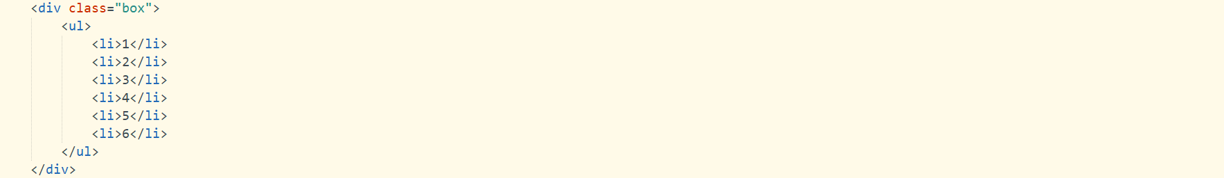
**1.卡片翻转**
**html**

**css**
**效果**

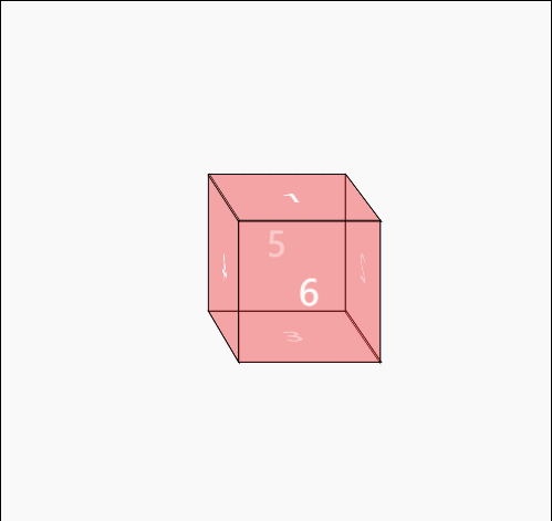
**2.立方体**
**html**
**css**
.box{
width: 500px;
height: 500px;
margin: 50px auto;
border: 1px solid;
perspective: 3000px;
perspective-origin: -90% -160%;
}
.box ul{
width: 100px;
height: 100px;
position: relative;
top: 200px;
margin: 0 auto;
transform-style:preserve-3d;
}
.box ul li{
width: 100px;
height: 100px;
text-align: center;
line-height: 100px;
font-size: 25px;
color: white;
position: absolute;
background: rgba(225,0,0,0.2);
border: 1px solid black;
transition: all 1s linear;
}
/*上面*/
li:nth-child(1){
transform: translateY(-50px) rotateX(90deg);
}
.box ul:hover li:nth-child(1){
transform: translateY(-100px) rotateX(90deg);
background: palevioletred;
border: 0;
border-radius: 50%;
}
/*后面*/
li:nth-child(2){
transform: translateX(50px) rotateY(90deg);
}
.box ul:hover li:nth-child(2){
transform: translateX(100px) rotateY(90deg);
background: #92ecae;
border: 0;
border-radius: 50%;
}
/*下面*/
li:nth-child(3){
transform: translateY(50px) rotateX(90deg);
}
.box ul:hover li:nth-child(3){
transform: translateY(100px) rotateX(90deg);
background: #ff916a;
border: 0;
border-radius: 50%;
}
/*左面*/
li:nth-child(4){
transform: translateX(-50px) rotateY(90deg);
}
.box ul:hover li:nth-child(4){
transform: translateX(-100px) rotateY(90deg);
background: greenyellow;
border: 0;
border-radius: 50%;
}
/*右面*/
li:nth-child(5){
transform: translateZ(-50px);
}
.box ul:hover li:nth-child(5){
transform: translateZ(-100px);
background: lightskyblue;
border: 0;
border-radius: 50%;
}
/*正面*/
li:nth-child(6){
transform: translateZ(50px);
}
.box ul:hover li:nth-child(6){
transform: translateZ(100px);
background: #be46d8;
border: 0;
border-radius: 50%;
}
.box ul:hover{
transform: rotateX(9000deg) rotateY(5000deg);
transition: all 100s linear;
}
**效果**
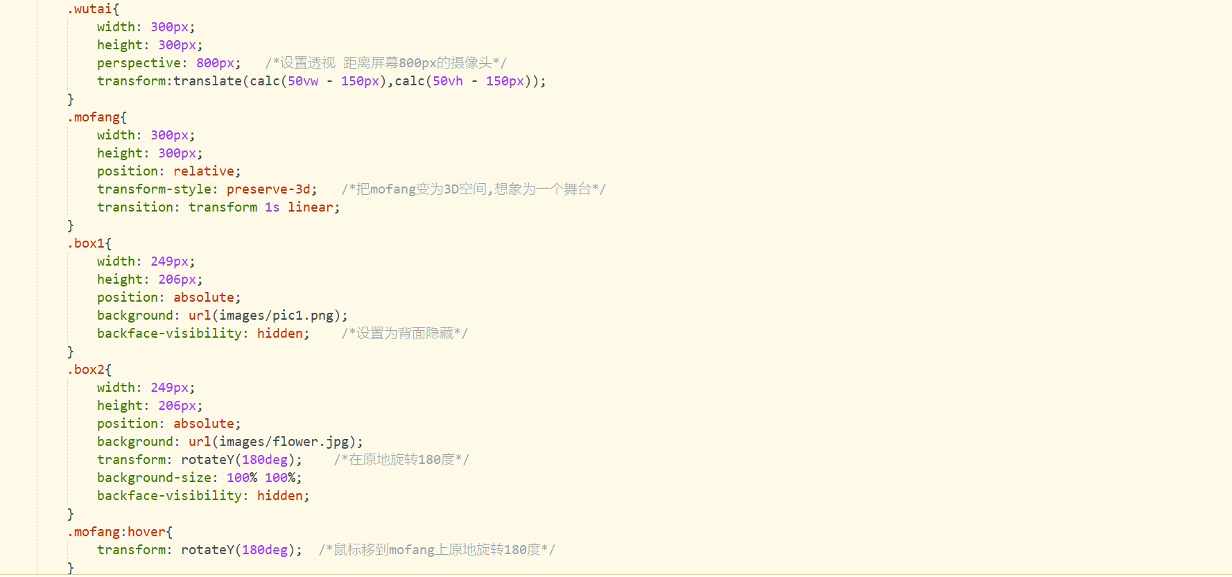
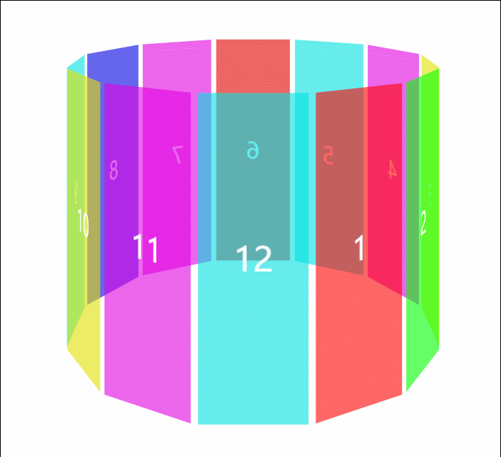
**3.长方体**
**html**
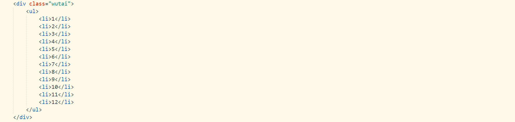
**css**
*{
padding: 0;
margin: 0;
list-style: none;
}
.wutai{
width: 900px;
height: 600px;
border: 1px solid;
margin: 0 auto;
perspective: 1000px;
perspective-origin: 50% 1%;
}
.wutai ul{
width: 100px;
height: 300px;
position: relative;
margin: 0 auto;
top: 150px;
transform-style:preserve-3d;
}
.wutai:hover ul{
transform: rotateY(36000000deg);
transition: all 1000000s linear;
}
.wutai li{
width: 100px;
height: 300px;
position: absolute;
text-align: center;
line-height: 300px;
font-size: 30px;
color: white;
}
li:nth-child(1){
background: rgba(255,0,0,0.6);
transform: rotateY(30deg) translateZ(200px);
}
li:nth-child(2){
background: rgba(0,255,0,0.6);
transform: rotateY(60deg) translateZ(200px);
}
li:nth-child(3){
background: rgba(225,225,0,0.6);
transform: rotateY(90deg) translateZ(200px);
}
li:nth-child(4){
background: rgba(225,0,225,0.6);
transform: rotateY(120deg) translateZ(200px);
}
li:nth-child(5){
background: rgba(0,225,225,0.6);
transform: rotateY(150deg) translateZ(200px);
}
li:nth-child(6){
background: rgba(225,0,0,0.6);
transform: rotateY(180deg) translateZ(200px);
}
li:nth-child(7){
background: rgba(225,0,225,0.6);
transform: rotateY(210deg) translateZ(200px);
}
li:nth-child(8){
background: rgba(0,0,225,0.6);
transform: rotateY(240deg) translateZ(200px);
}
li:nth-child(9){
background: rgba(0,225,225,0.6);
transform: rotateY(270deg) translateZ(200px);
}
li:nth-child(10){
background: rgba(225,225,0,0.6);
transform: rotateY(300deg) translateZ(200px);
}
li:nth-child(11){
background: rgba(225,0,225,0.6);
transform: rotateY(330deg) translateZ(200px);
}
li:nth-child(12){
background: rgba(0,225,225,0.6);
transform: rotateY(360deg) translateZ(200px);
}
**效果**
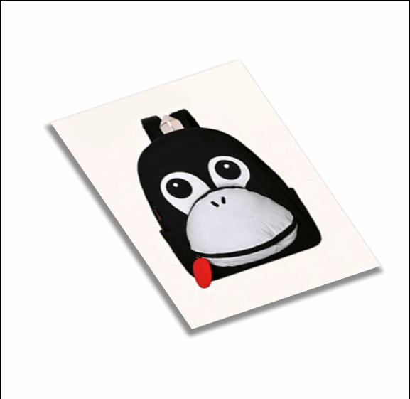
**4.图片旋转**
**html**

**css**
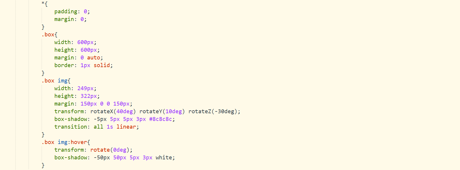
**效果**
**小结:**
总的来说,主要就是配合使用各个动画属性,分清楚自己要写的主容器和动画元素,可以使用定时器来帮助加载各种类样式。最主要的就是:知道自己的动画层次,头脑清晰的去部署完成动画需要的一切。
**3D动画 更多源码在这里哦 有兴趣的朋友可以参考一下! https://liyingyingweb.github.io/3d-animation/ **
**如果大家觉得我的文章写的还不错的话,就关注 收藏一下哦!**
**大家可以一起探讨下前端问题呀!**
**rgz987**
