Google库 来实现 按钮图片等控件的圆角形状 告别shape、各种 drawable
<com.google.android.material.imageview.ShapeableImageView
android:layout_width="wrap_content"
android:layout_height="wrap_content"
android:layout_margin="10dp"
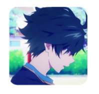
android:src="@mipmap/ic_avatar" />
<com.google.android.material.imageview.ShapeableImageView

    android:layout_width="wrap_content"

    android:layout_height="wrap_content"

    android:layout_margin="10dp"

    android:src="@mipmap/ic_avatar"

    app:shapeAppearance="@style/RoundedStyle" />
<!--ShapeableImageView 圆角-->

<style name="RoundedStyle">

    <item name="cornerFamily">rounded</item>

    <item name="cornerSize">10dp</item>

</style>
没有直接设置圆角的属性,需要用到app:shapeAppearance,后面会说。
cornerFamily 角的处理方式,rounded圆角,cut裁剪。
cornerSize 圆角大小。
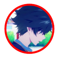
圆
<com.google.android.material.imageview.ShapeableImageView

    android:layout_width="wrap_content"

    android:layout_height="wrap_content"

    android:layout_margin="10dp"

    android:src="@mipmap/ic_avatar"

    app:shapeAppearance="@style/CircleStyle" />
<!--ShapeableImageView 圆 -->

<style name="CircleStyle">

    <item name="cornerFamily">rounded</item>

    <item name="cornerSize">50%</item>

</style>
圆角的大小可以用百分比,也可以自己计算,比如宽高100dp,圆角50dp。
描边
<com.google.android.material.imageview.ShapeableImageView

    android:layout_width="wrap_content"

    android:layout_height="wrap_content"

    android:layout_margin="10dp"

    android:padding="2dp"

    android:src="@mipmap/ic_avatar"

    app:shapeAppearance="@style/CircleStyle"

    app:strokeColor="@color/red"

    app:strokeWidth="4dp" />
app:strokeColor 描边颜色。
app:strokeWidth 描边宽度。
注意这里padding的数值是描边宽度的一半,后面会说。
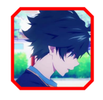
切角
<com.google.android.material.imageview.ShapeableImageView

    android:layout_width="wrap_content"

    android:layout_height="wrap_content"

    android:layout_margin="10dp"

    android:padding="2dp"

    android:src="@mipmap/ic_avatar"

    app:shapeAppearance="@style/CutStyle"

    app:strokeColor="@color/red"

    app:strokeWidth="4dp" />
<!--ShapeableImageView 切角 -->

<style name="CutStyle">

    <item name="cornerFamily">cut</item>

    <item name="cornerSize">10dp</item>

</style>
cornerFamily:cut 处理模式变为裁剪。
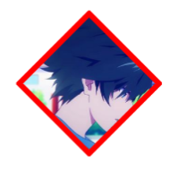
菱形
<com.google.android.material.imageview.ShapeableImageView

    android:layout_width="wrap_content"

    android:layout_height="wrap_content"

    android:layout_margin="10dp"

    android:padding="2dp"

    android:src="@mipmap/ic_avatar"

    app:shapeAppearance="@style/RhombusStyle"

    app:strokeColor="@color/red"

    app:strokeWidth="4dp" />
<!--ShapeableImageView 菱形 -->

<style name="RhombusStyle">

    <item name="cornerFamily">cut</item>

    <item name="cornerSize">50%</item>

</style>
同样,裁剪模式下圆角大小也可以计算。
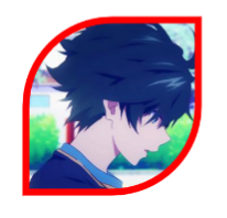
叶子
<com.google.android.material.imageview.ShapeableImageView

    android:layout_width="wrap_content"

    android:layout_height="wrap_content"

    android:layout_margin="10dp"

    android:padding="2dp"

    android:src="@mipmap/ic_avatar"

    app:shapeAppearance="@style/LeafStyle"

    app:strokeColor="@color/red"

    app:strokeWidth="4dp" />
<!--ShapeableImageView 叶子 -->

<style name="LeafStyle">

    <item name="cornerFamily">rounded</item>

    <item name="cornerSizeTopLeft">50%</item>

    <item name="cornerSizeBottomRight">50%</item>

</style>
cornerSizeTopLeft 左上圆角。
cornerSizeBottomRight 右下圆角。
以此类推,左上、左下、右上、右下等。
半圆
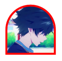
<com.google.android.material.imageview.ShapeableImageView

    android:layout_width="wrap_content"

    android:layout_height="wrap_content"

    android:layout_margin="10dp"

    android:padding="2dp"

    android:src="@mipmap/ic_avatar"

    app:shapeAppearance="@style/SemicircleStyle"

    app:strokeColor="@color/red"

    app:strokeWidth="4dp" />
<!--ShapeableImageView 半圆 -->

<style name="SemicircleStyle">

    <item name="cornerFamily">rounded</item>

    <item name="cornerSizeTopLeft">50%</item>

    <item name="cornerSizeTopRight">50%</item>

</style>
使用方法:导入
implementation 'com.google.android.material:material:1.2.0'
MaterialButton继承AppCompatButton,在原来Button的基础上做了一些扩展,如圆角、描边等
属性 描述
app:backgroundTint 背景着色
app:backgroundTintMode 着色模式
app:strokeColor 描边颜色
app:strokeWidth 描边宽度
app:cornerRadius 圆角大小
app:rippleColor 按压水波纹颜色
app:icon 图标icon
app:iconSize 图标大小
app:iconGravity 图标重心
app:iconTint 图标着色
app:iconTintMode 图标着色模式
app:iconPadding 图标和文本之间的间距
关于background
在1.2版本以前,MaterialButton只能通过app:backgroundTint属性设置背景色,该属性接收color state list。不能通过android:background设置自定义drawable。
1.2版本后,官方已修复此问题。如果未设置自定义背景,则 MaterialShapeDrawable 仍将用作默认背景。
也就是说,如果按钮背景是纯色,可以通过app:backgroundTint指定;如果按钮背景是渐变色,则需要自己定义drawable,然后通过android:background设置。
注意:如果要使用android:background设置背景,则需要将backgroundTint设置为@empty,否则background不会生效。
<com.google.android.material.button.MaterialButton
    android:background=”@drawable/custom_background”
    app:backgroundTint=”@empty” />
指定@empty后,Android Studio会出现红色警告,可以正常运行,忽略就好。不过既然已经自定义drawable,就没必要使用MaterialButton,直接用普通的Button甚至用TextView就好了。
关于insetTop、insetBottom
看下面的代码:
<com.google.android.material.button.MaterialButton
	android:id="@+id/btn1"
    android:layout_width="150dp"
    android:layout_height="50dp"
    android:textColor="@android:color/white"
    android:textSize="18sp"
/>
xml预览图: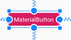
有没有感觉怪怪的?貌似button上下多了一个padding!咦!代码里面明明没有设置padding啊!看了源码发现,MaterialButton默认在style指定了insetTop和insetBottom为6dp,使得height看起来并没有Button实际设置值一样高,可以在xml将MaterialButton的insetTop和insetBottom都设置为0dp,这样MaterialButton的高度就和实际设置的高度一致了。
关于阴影
MD组件默认都是自带阴影的,MaterialButton也不例外。但是有时候我们并不想要按钮有阴影,那么这时候可以指定style为
style="@style/Widget.MaterialComponents.Button.UnelevatedButton",这样就能去掉阴影,让视图看起来扁平化。
关于theme
在MDC1.1.0以后,使用MaterialButton可能会出现闪退的问题,原因就是使用了MD控件,但是未将them设置为MaterialComponents。解决方法可以有几种:
先在style.xml自定义MaterialComponents_Theme
 <style name="MaterialComponents_Theme" parent="Theme.MaterialComponents.Light.NoActionBar">
        <!-- Customize your theme here. -->
        ...
    </style>
方法一:
AndroidManifest里application节点下配置,作用域为整个应用
<application
        ...
        android:theme="@style/MaterialComponents_Theme"
方法二:
只在当前activity配置,作用域为当前activity
<activity
        ...
        android:theme="@style/MaterialComponents_Theme"
预览
如下代码
<com.google.android.material.button.MaterialButton
        android:id="@+id/btn_send"
        style="@style/Widget.MaterialComponents.Button.UnelevatedButton"
        android:layout_width="@dimen/dp_80"
        android:layout_height="@dimen/dp_30"
        android:layout_marginStart="@dimen/dp_12"
        android:insetTop="0dp"
        android:insetBottom="0dp"
        android:padding="0dp"
        android:text="@string/dispatch_room_text_upper_mic"
        android:textColor="@color/white"
        android:textSize="@dimen/font_12"
        app:backgroundTint="@color/c_6D56FF"
        app:cornerRadius="@dimen/dp_15"
        app:layout_constraintBottom_toBottomOf="@id/iv_head"
        app:layout_constraintStart_toEndOf="@id/iv_head" />
以往我们实现图片圆角、描边等需求,多数时候是使用第三方或者自定义,Glide也有个扩展库,能很轻松帮我们实现。不过在MDC1.2.0中,已经有了一套官方的实现方案。那就是ShapeableImageView。
ShapeableImageView继承自ImageView,可以为image添加描边大小、颜色,以及圆角、裁切等,这得益于它新增了一个属性shapeAppearance,具体实现在ShapeAppearanceModel,可以通过style来配置,也可以通过代码实现。
style配置:
<style name="StyleShapeAppearanceImage" parent="">
    <item name="cornerFamily">rounded</item>
    <item name="cornerSize">16dp</item>
    <item name="cornerSizeTopRight">10dp</item>
    <item name="cornerSizeBottomRight">0dp</item>
</style>
  ...
<com.google.android.material.imageview.ShapeableImageView
    app:shapeAppearance="@style/StyleShapeAppearanceImage"
    ...
    />
代码设置:
imageView?.shapeAppearanceModel = ShapeAppearanceModel.builder()
            .setAllCorners(CornerFamily.ROUNDED,20f)
            .setTopLeftCorner(CornerFamily.CUT,RelativeCornerSize(0.3f))
            .setTopRightCorner(CornerFamily.CUT,RelativeCornerSize(0.3f))
            .setBottomRightCorner(CornerFamily.CUT,RelativeCornerSize(0.3f))
            .setBottomLeftCorner(CornerFamily.CUT,RelativeCornerSize(0.3f))
            .setAllCornerSizes(ShapeAppearanceModel.PILL)
            .setTopLeftCornerSize(20f)
            .setTopRightCornerSize(RelativeCornerSize(0.5f))
            .setBottomLeftCornerSize(10f)
            .setBottomRightCornerSize(AbsoluteCornerSize(30f))
            .build()
代码接收一个ShapeAppearanceModel,通过构建者模式实现,setTopLeft表示处理左上角,其他同理。
cornerSize表示设置的大小,有RelativeCornerSize和AbsoluteCornerSize,RelativeCornerSize构造方法接收一个百分比,范围0-1;AbsoluteCornerSize构造方法接收一个具体数值,这个数值就是圆角的数值。
这里还有个CornerFamily,它表示处理的方式,有ROUNDED和CUT两种,ROUNDED是圆角,CUT是直接将圆角部分裁切掉。setAllCornerSizes(ShapeAppearanceModel.PILL)可以直接实现圆形效果。
关于Stroke
ShapeableImageView指定strokeWidth描边的时候,其描边会被覆盖掉一半,如strokeWidth=4dp,上下左右会被覆盖,实际的效果是只有2dp被显示。如图,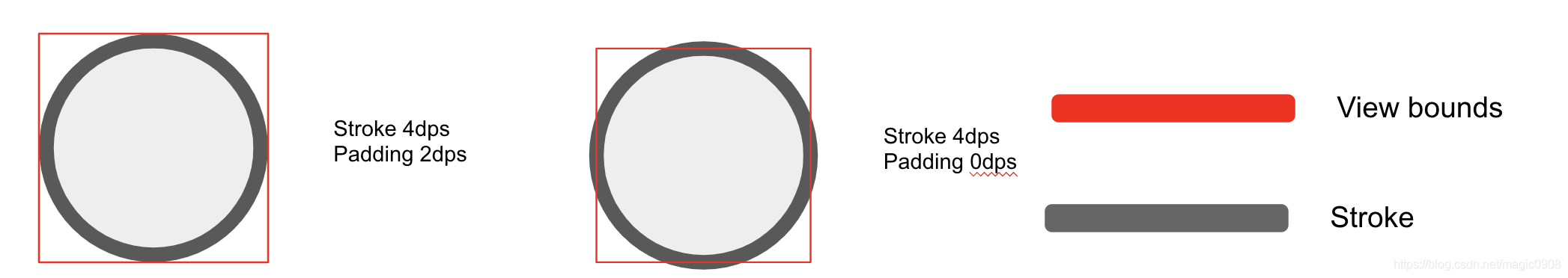
Slider(加强版的SeekBar)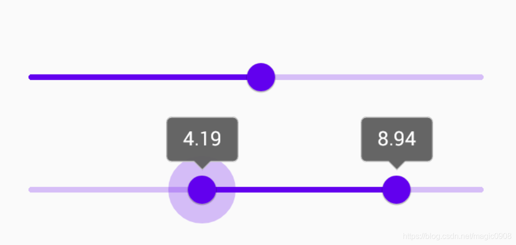
Slider的父类BaseSlider,直接继承View,重新实现逻辑。此外BaseSlider还有个子类RangeSlider,用它来实现图1效果2
Slider可以实现滑块头部数字变化效果,还可以实现类似刻度尺效果,比原生的SeekBar加强了不少。
常用属性如下:
属性 描述
android:valueFrom 进度起点
android:valueTo 进度终点
android:value 当前进度点
android:stepSize 步长(必须大于0)
app:values 配置多个slider节点
app:labelBehavior slider 滑动时顶部是否显示变化效果
app:labelStyle 配置slider节点顶部view style
其他属性还有haloColor、haloRadius、thumbColor等,用来配置一些外观

 浙公网安备 33010602011771号