Kaggle_Data Visulazation of seaborn
exercise1
首先下载.csv文件的数据集,该数据集是基于如下背景:
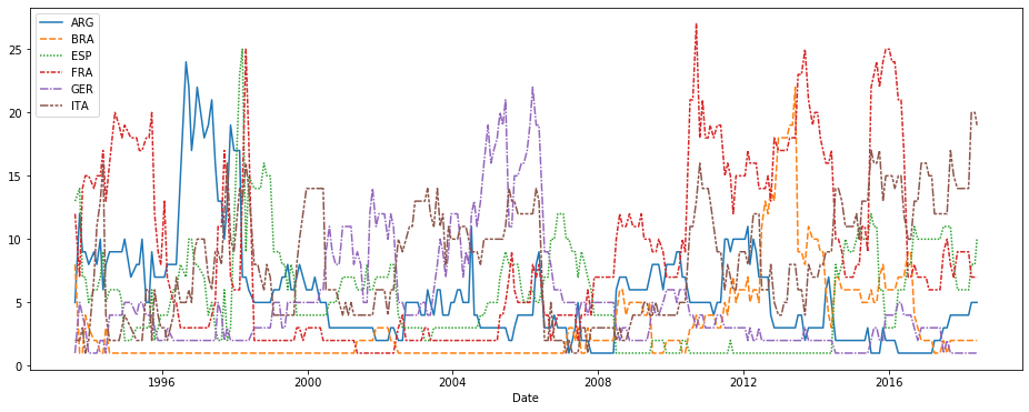
In this notebook, we'll work with a dataset of historical FIFA rankings for six countries: Argentina (ARG), Brazil (BRA), Spain (ESP), France (FRA), Germany (GER), and Italy (ITA). The dataset is stored as a CSV file (short for comma-separated values file. Opening the CSV file in Excel shows a row for each date, along with a column for each country.
step1头文件导入
import pandas as pd
pd.plotting.register_matplotlib_converters()
import matplotlib.pyplot as plt
%matplotlib inline
import seaborn as sns

# Set up code checking
import os
if not os.path.exists("../input/fifa.csv"):
    os.symlink("../input/data-for-datavis/fifa.csv", "../input/fifa.csv")
from learntools.core import binder
binder.bind(globals())
from learntools.data_viz_to_coder.ex1 import *
print("Setup Complete")
验证数字正确性
# Fill in the line below
one = 1

# Check your answer
step_1.check()
step2载入数据集
# Path of the file to read
fifa_filepath = "../input/fifa.csv"

# Read the file into a variable fifa_data
fifa_data = pd.read_csv(fifa_filepath, index_col="Date", parse_dates=True)

# Check your answer
step_2.check()
其中无数次地检测 hint() and solution()
step3 画数据图
# Set the width and height of the figure
plt.figure(figsize=(16,6))

# Line chart showing how FIFA rankings evolved over time
sns.lineplot(data=fifa_data)

# Check your answer
step_3.a.check()
get the result
kaggle上的例子,在博客均用于练习和后期为Data science做准备,请大家不要商业化。


 浙公网安备 33010602011771号