

五环
五环
今年夏天我守在电视旁边看了所有能看的奥运比赛,到现在我都记得孙杨那场比赛.卧槽老娘简直被孙杨燃炸了!!!最近又在朋友圈里看到了孙杨来录制节目,想想做个五环玩玩吧.
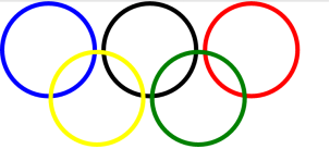
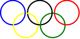
首先,五环的特点是五个圆,并且是一个套着一个,看图

通过立体图能看出来五环某些边的层叠关系,怎么用css实现?思路是这样的,第一步做5个圆,但是这种一个套着一个的样式不可能是一个div就可以实现的,所以再弄五个一模一样的圆放在上面,通过改变z-index和透明度来实现.
第一步:做五个圆
HTML部分代码
<div class="circle blue"></div>
<div class="circle black"></div>
<div class="circle red"></div>
<div class="circle yellow"></div>
<div class="circle green"></div>
CSS样式部分代码
.circle{
width: 200px;
height: 200px;
border-radius: 50%;
border-width: 10px;
border-style: solid;
position: absolute;
}
.blue{
border-color: blue;
top: 0;
left: 0;
}
.black{
border-color: black;
top: 0;
left: 230px;
}
.red{
border-color: red;
top: 0;
left: 460px;
}
.yellow{
border-color: yellow;
top: 110px;
left: 110px;
}
.green{
border-color: green;
top: 110px;
left: 340px;
}
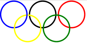
运行结果
此时的五环是没有一个套一个的样式的,我们向每一个圆里插入一个一样的圆,用到的是css3中的::after
CSS代码
.circle, .circle::after{
width: 200px;
height: 200px;
border-radius: 50%;
border-width: 10px;
border-style: solid;
position: absolute;
}
.circle::after{
content: "";
}
.blue{
border-color: blue;
top: 0;
left: 0;
}
.blue.circle::after{
border-color: blue;
}
.black{
border-color: black;
top: 0;
left: 230px;
}
.black.circle::after{
border-color: black;
}
.red{
border-color: red;
top: 0;
left: 460px;
}
.red.circle::after{
border-color: red;
}
.yellow{
border-color: yellow;
top: 110px;
left: 110px;
}
.yellow.circle::after{
border-color: yellow;
}
.green{
border-color: green;
top: 110px;
left: 340px;
}
.green.circle::after{
border-color: green;
}
运行结果:
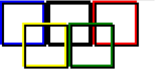
在插入同样元素的时候,发现并没有与原来的元素重合,我们把边框圆角去掉,并且把所有的后插入的元素边框设置为黑色,再看一下.
这是因为在内容中插入.所以让所有后插入的元素定位left和top都为-10px.代码如下
.circle::after{
content: "";
left: -10px;
top: -10px;
}
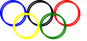
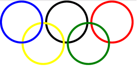
然后开始改变层叠关系,下图为改变后的五环图
对比后,首先改变蓝色右边和黄色交叉的地方,让后插入的蓝色的右边框z-index变为1,然后运行
再改变蓝色下方和黄色交叉的地方,把后插入的蓝色下边框设为透明,语法为border-bottom-color,透明的属性为transparent.运行
同理,可以设置后面的圆环样式,完整css样式代码如下
.circle, .circle::after{
width: 200px;
height: 200px;
border-radius: 50%;
border-width: 10px;
border-color: black;
border-style: solid;
position: absolute;
}
.circle::after{
content: "";
left: -10px;
top: -10px;
}
.blue{
border-color: blue;
top: 0;
left: 0;
}
.blue.circle::after{
border-color: blue;
z-index: 1;
border-bottom-color: transparent;
}
.black{
border-color: black;
top: 0;
left: 230px;
}
.black.circle::after{
border-color: black;
z-index: 1;
border-left-color: transparent;
}
.red{
border-color: red;
top: 0;
left: 460px;
}
.red.circle::after{
border-color: red;
z-index: 2;
border-left-color: transparent;
}
.yellow{
border-color: yellow;
top: 110px;
left: 110px;
}
.yellow.circle::after{
border-color: yellow;
}
.green{
border-color: green;
top: 110px;
left: 340px;
}
.green.circle::after{
border-color: green;
z-index: 1;
border-top-color: transparent;
}
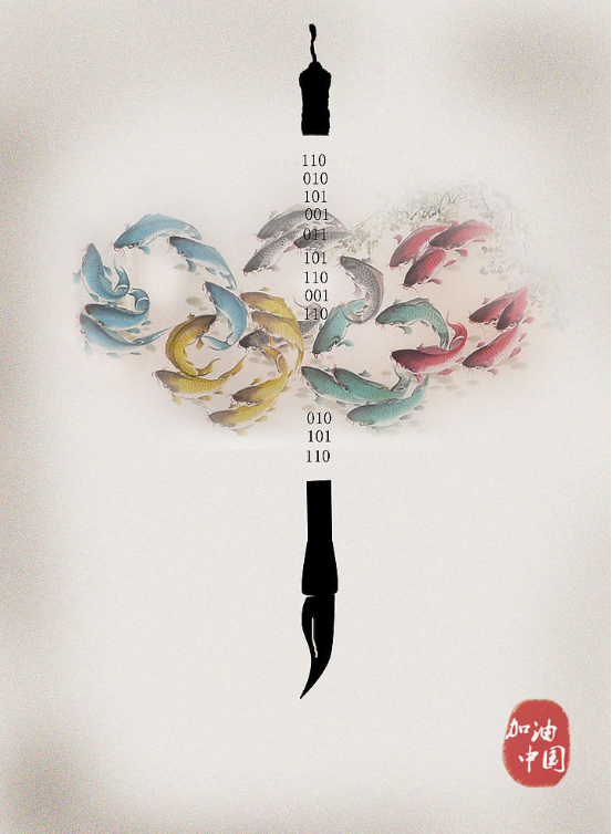
结尾送上一张中国风大五环

 浙公网安备 33010602011771号