WPF 自定义控件学习一,前期工作准备与初步使用
官方文档:控件自定义 - WPF | Microsoft Learn
学习缘由:当内置控件无法完全满足自身的需求,可以通过设计自定义控件以满足对某些UI界面的显示特性以及数据交互。
其中:丰富的内容模型、样式、模板和触发器可最大程度地减少创建新控件的需求。
模型主要分为3类:UserControl, Control以及 FrameworkElement,只介绍Control
用户控件 (UserControl)优势:
1、生成控件的方式与生成应用程序的方式类似。
2、控件仅包含现有组件。
3、无需支持复杂的自定义。
控件 (Control)优势:
1、控制的外观能够通过ControlTemplate进行自定义。
2、控件支持不同的主题。
框架元素(FrameworkElement)优势:
1、不仅限于简单元素组合,精确控制控件组件的视觉外观。
2、通过定义自己的呈现逻辑来定义控件的外观。
3、你想要以新颖的方式组合现有元素,超越UserControl和Control所能实现的可能。
样式(Style):
是表示控件属性的值的集合。创建所需控件外观和行为的可重用表示形式,而无需编写新控件。
模型:
数据模板(DataTemplate):自定义如何在控件上显示数据。 例如,一个 DataTemplate 可用于指定如何在一个 ListBox.中显示数据。
控件模板(ControlTemplate):定义控件的结构和外观。
为正式介绍控件内容,先介绍一下对应的前期要准备的工作(只是许多方式中的一种)
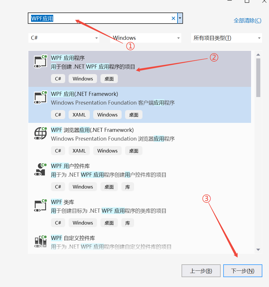
1、创建一个WPF应用
1.1、选择项目模板
在输入框中写入WPF 然后点击WPF应用程序
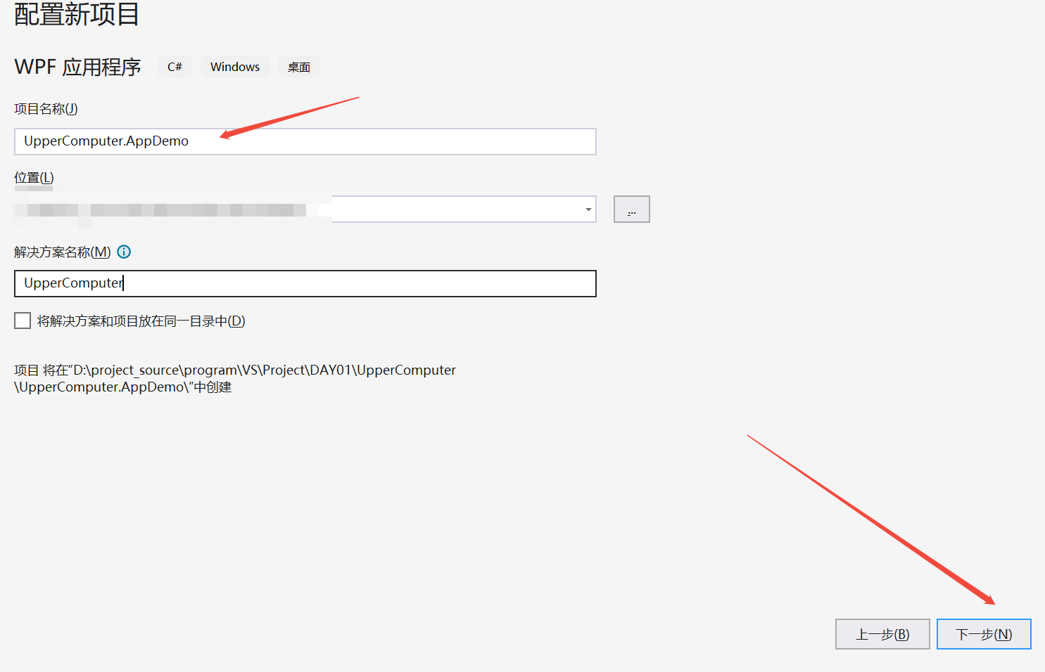
1.2、设置wpf应用程序项目,名字、位置、解决方案等
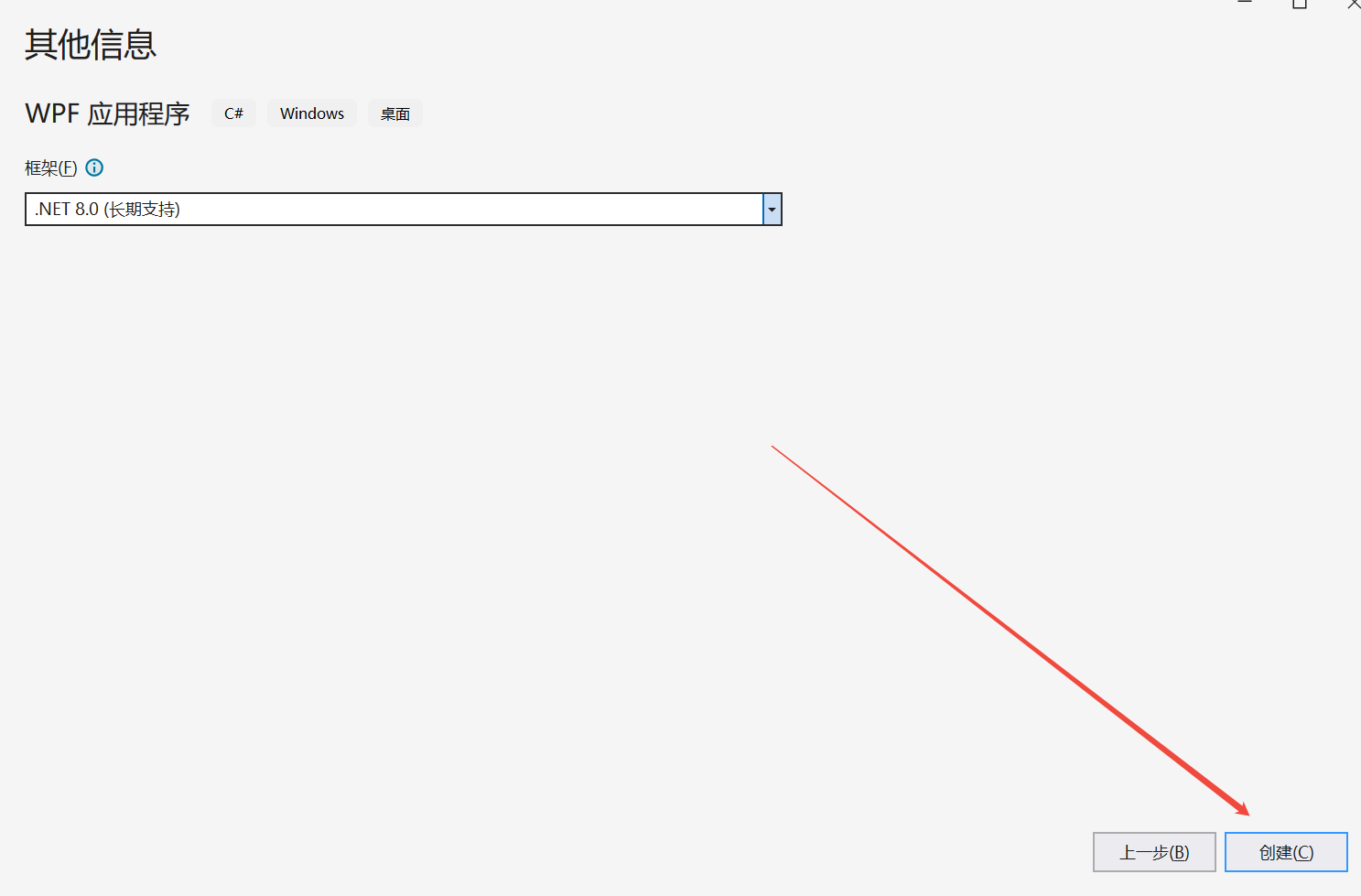
1.3、创建
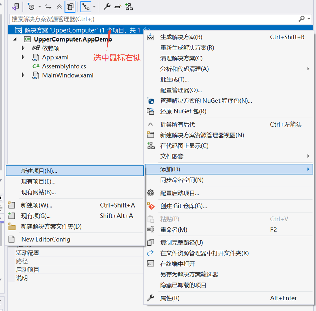
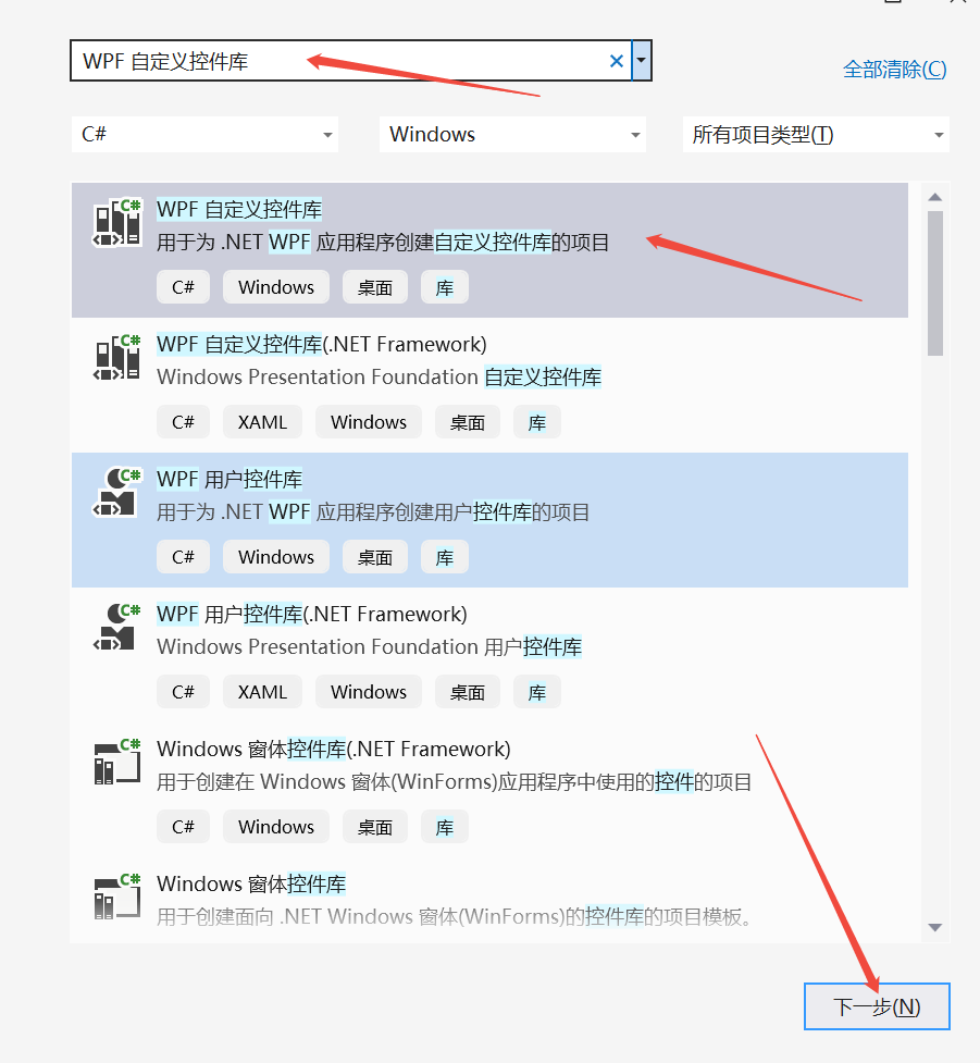
2、创建控件库
2.1、添加新建项目
2.2、选择项目模板
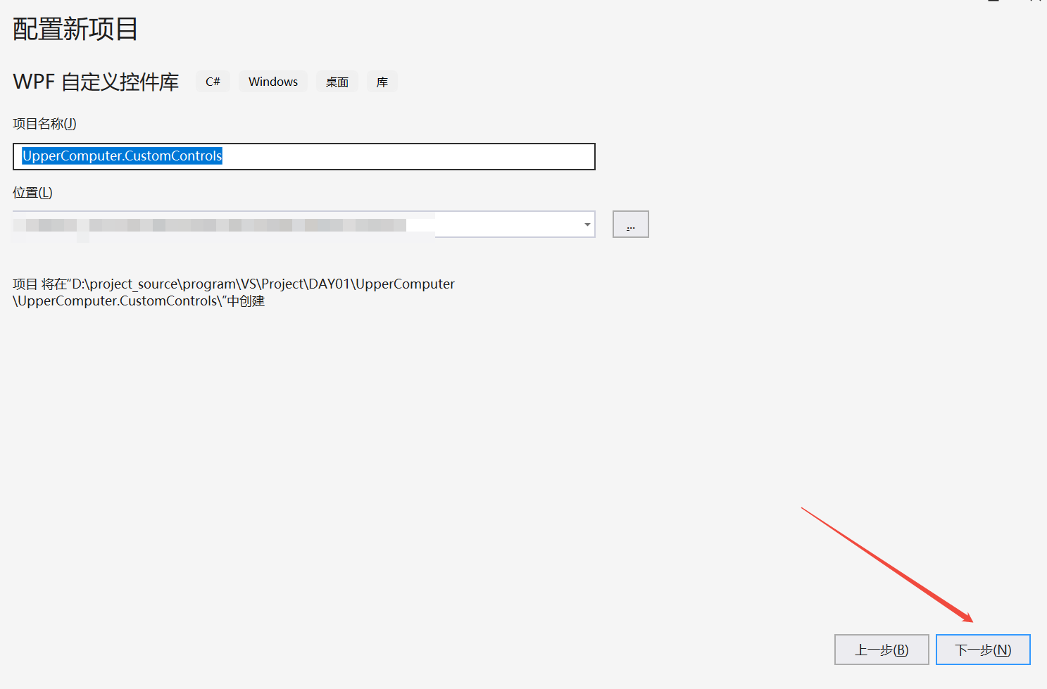
2.3 设置项目信息
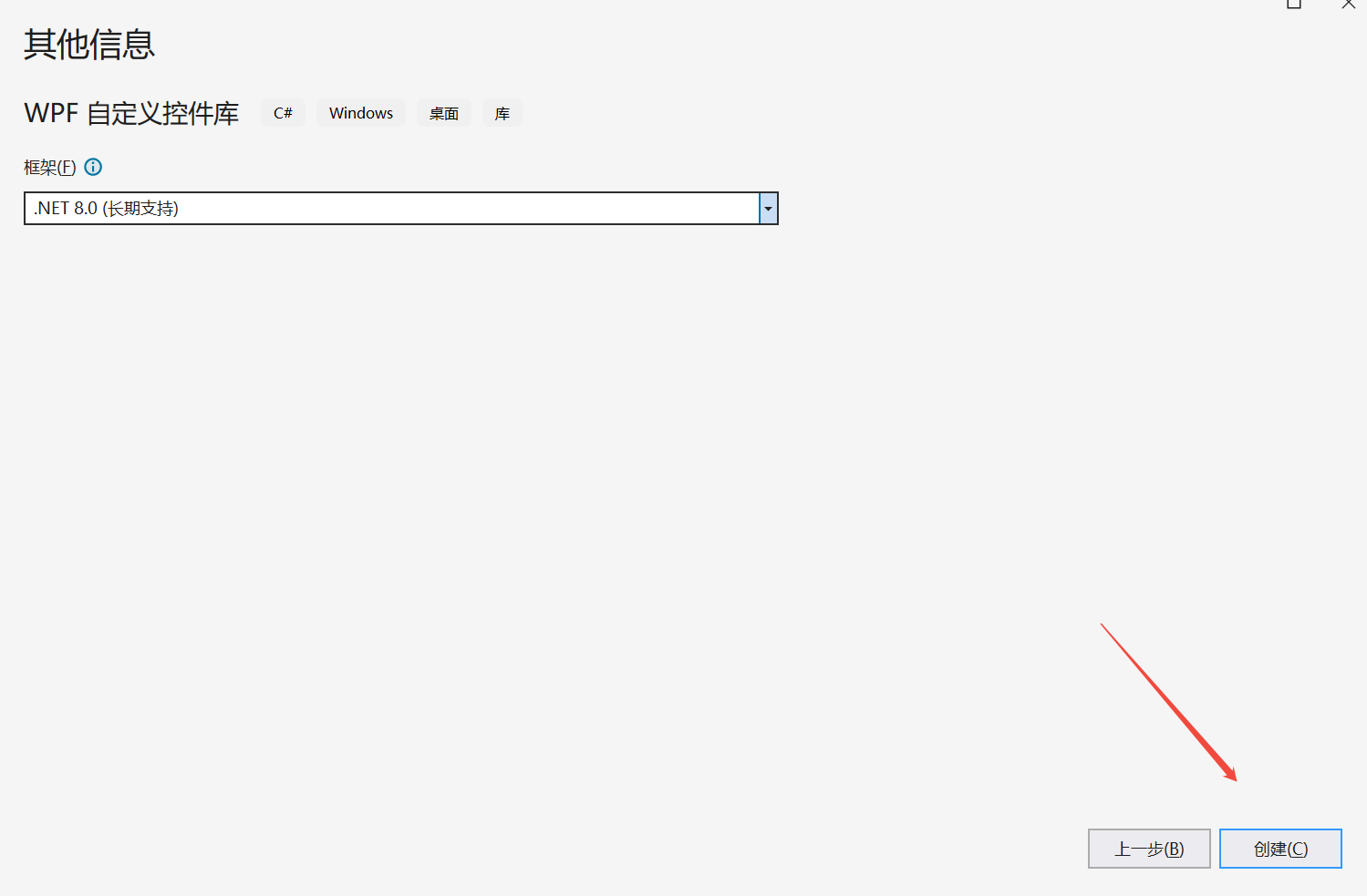
2.4、创建
3、项目架构搭建
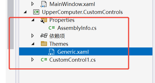
3.1、删除以下图片对应的文件
3.2、 根据功能与习惯新建文件夹(我这里要做一个自定义按键CCButton)
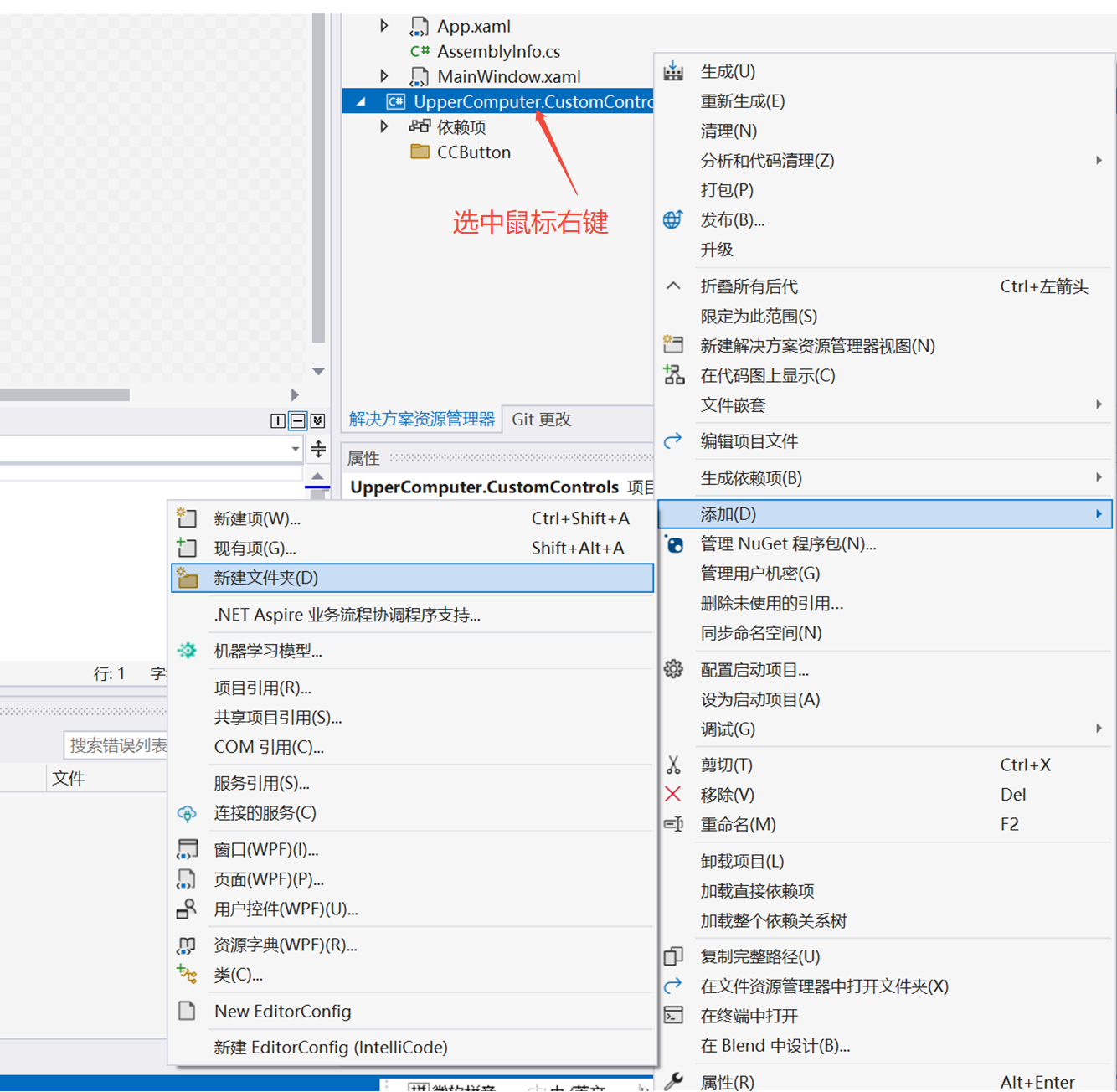
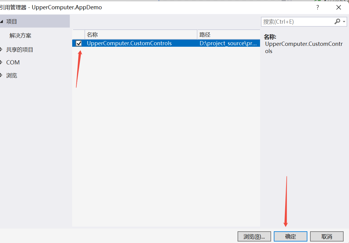
3.3、添加项目引用
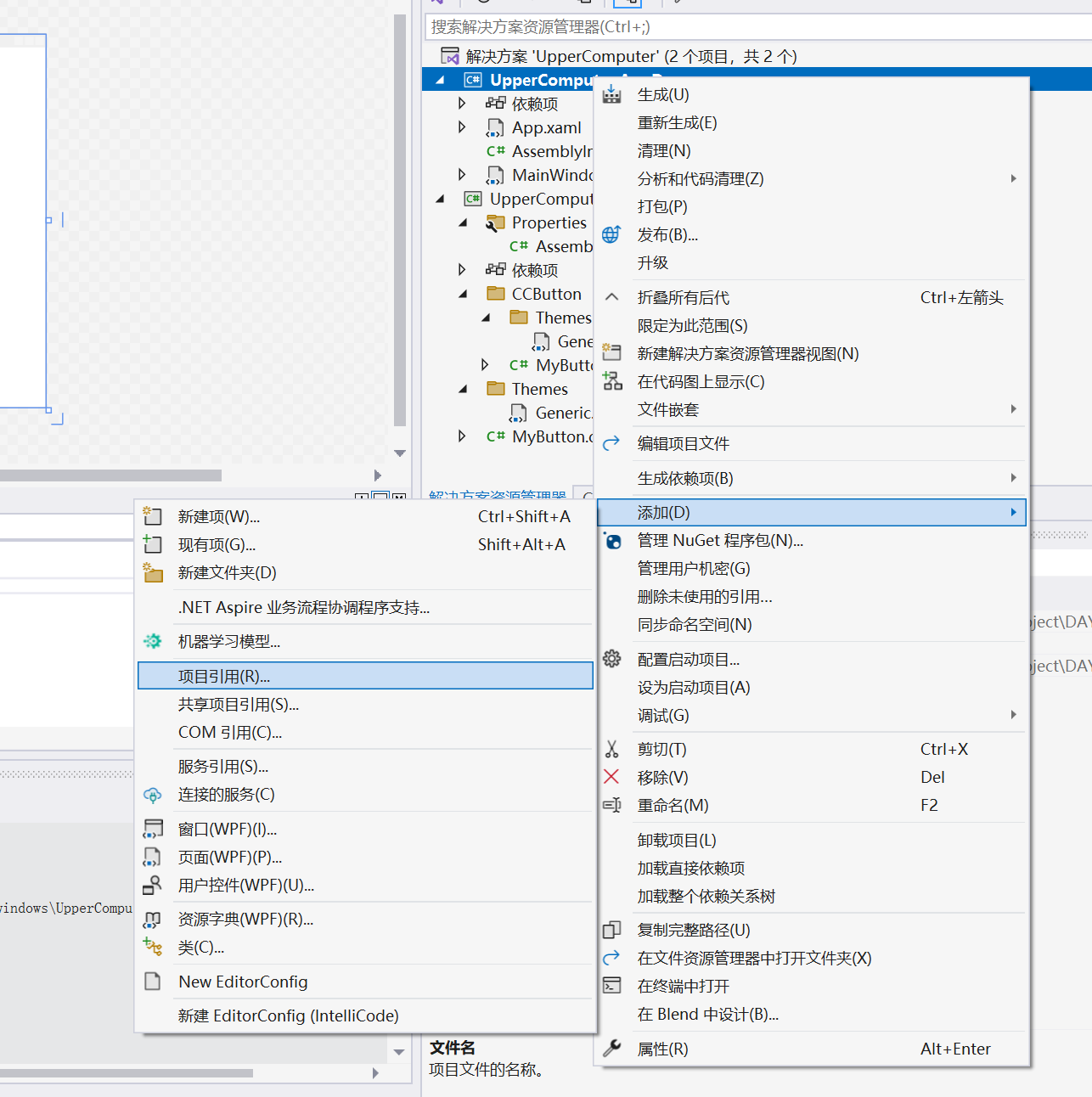
3.4、 添加
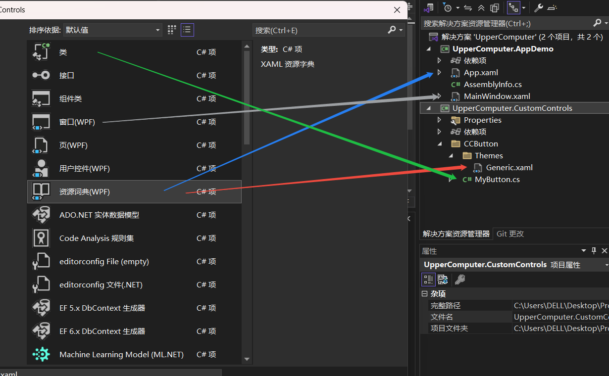
3.5、 项目架构以及文件对应类型
4、设计一个自定义按键
设计一个简单按键,只需要能给一个显示内容的属性。
4.1、创建控件类(MyButton.cs)
并添加一个内容依赖属性
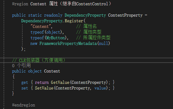
完整代码


using System;
using System.Collections.Generic;
using System.Linq;
using System.Text;
using System.Threading.Tasks;
using System.Windows;
using System.Windows.Controls;
using System;
using System.Collections.Generic;
using System.Linq;
using System.Threading.Tasks;
using System.Windows.Data;
using System.Windows.Documents;
using System.Windows.Input;
using System.Windows.Media;
using System.Windows.Media.Imaging;
using System.Windows.Navigation;
using System.Windows.Shapes;

namespace UpperComputer.CustomControls.CCButton
{
    /// <summary>
    /// 按照步骤 1a 或 1b 操作,然后执行步骤 2 以在 XAML 文件中使用此自定义控件。
    ///
    /// 步骤 1a) 在当前项目中存在的 XAML 文件中使用该自定义控件。
    /// 将此 XmlNamespace 特性添加到要使用该特性的标记文件的根
    /// 元素中:
    ///
    ///     xmlns:MyNamespace="clr-namespace:UpperComputer.CustomControls"
    ///
    ///
    /// 步骤 1b) 在其他项目中存在的 XAML 文件中使用该自定义控件。
    /// 将此 XmlNamespace 特性添加到要使用该特性的标记文件的根
    /// 元素中:
    ///
    ///     xmlns:MyNamespace="clr-namespace:UpperComputer.CustomControls;assembly=UpperComputer.CustomControls"
    ///
    /// 您还需要添加一个从 XAML 文件所在的项目到此项目的项目引用,
    /// 并重新生成以避免编译错误:
    ///
    ///     在解决方案资源管理器中右击目标项目,然后依次单击
    ///     “添加引用”->“项目”->[浏览查找并选择此项目]
    ///
    ///
    /// 步骤 2)
    /// 继续操作并在 XAML 文件中使用控件。
    ///
    ///     <MyNamespace:MyButton/>
    ///
    /// </summary>
    public class MyButton : Control
    {
        static MyButton()
        {
            // 是一个用于查找控件默认样式的键,通常在控件的元数据中设置
            DefaultStyleKeyProperty.OverrideMetadata(typeof(MyButton), new FrameworkPropertyMetadata(typeof(MyButton)));
        }

        #region Content 属性(继承自ContentControl)

        public static readonly DependencyProperty ContentProperty =
            DependencyProperty.Register(
                "Content",          // 属性名
                typeof(object),     // 属性类型
                typeof(MyButton),   // 所属控件类型
                new FrameworkPropertyMetadata(null)
            );

        // CLR包装器(方便调用)
        public object Content
        {
            get { return GetValue(ContentProperty); }
            set { SetValue(ContentProperty, value); }
        }

        #endregion
    }
}
4.2、写按键默认样式(Generic.xaml)
<ResourceDictionary xmlns="http://schemas.microsoft.com/winfx/2006/xaml/presentation"
                    xmlns:x="http://schemas.microsoft.com/winfx/2006/xaml"
                    xmlns:localContorl="clr-namespace:UpperComputer.CustomControls.CCButton">
                    <!---->
    <!--自定义按键样式-->
    <Style TargetType="{x:Type localContorl:MyButton}">
        <!--长宽高,以及颜色-->
        <Setter Property="Width" Value="270"/>
        <Setter Property="Height" Value="100"/>
        <Setter Property="Foreground" Value="Red"/>
        <Setter Property="BorderThickness" Value="10"/>
        <Setter Property="Background" Value="#43a9c7"/>
        <Setter Property="Template">
            <Setter.Value>
                <ControlTemplate TargetType="{x:Type localContorl:MyButton}">
                    <Border Background="{TemplateBinding Background}"
                            BorderBrush="{TemplateBinding BorderBrush}"
                            BorderThickness="{TemplateBinding BorderThickness}">
                        <!-- 最简单的显示方式:直接显示Content -->
                        <TextBlock x:Name="Txt" Text="{TemplateBinding Content}" Foreground="{TemplateBinding Foreground}" VerticalAlignment="Center" HorizontalAlignment="Center"/>
                    </Border>
                    <!--触发器,当鼠标移动到TextBlock时候,改变颜色-->
                    <ControlTemplate.Triggers>
                        <Trigger Property="IsMouseOver" Value="True">
                            <Setter TargetName="Txt" Property="Background" Value="#00FF00"/>
                        </Trigger>
                    </ControlTemplate.Triggers>
                </ControlTemplate>
            </Setter.Value>
        </Setter>
    </Style>
</ResourceDictionary>
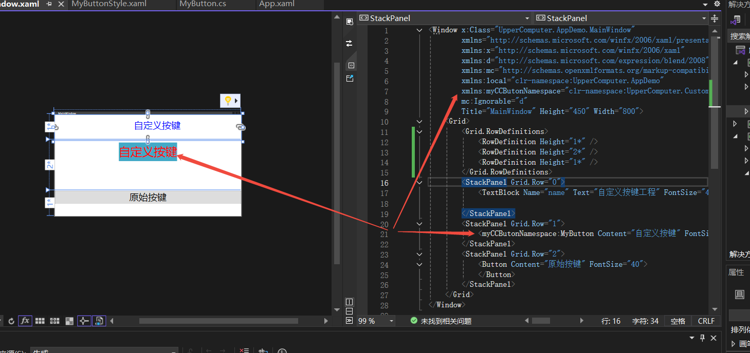
4.3、在项目中添加样式资源(App.xaml)
如下图箭头所示,使用了自定义控件
完整代码
<Application x:Class="UpperComputer.AppDemo.App"
             xmlns="http://schemas.microsoft.com/winfx/2006/xaml/presentation"
             xmlns:x="http://schemas.microsoft.com/winfx/2006/xaml"
             xmlns:local="clr-namespace:UpperComputer.AppDemo"
             StartupUri="MainWindow.xaml">
    <Application.Resources>
        <ResourceDictionary>
            <ResourceDictionary.MergedDictionaries>
                <ResourceDictionary Source="/UpperComputer.CustomControls;component/CCButton/Themes/MyButtonStyle.xaml"/>
            </ResourceDictionary.MergedDictionaries>
        </ResourceDictionary>
    </Application.Resources>
</Application>
4.4、在窗体中使用自定义控件(MainWindow.xaml)
完整代码
<Window x:Class="UpperComputer.AppDemo.MainWindow"
        xmlns="http://schemas.microsoft.com/winfx/2006/xaml/presentation"
        xmlns:x="http://schemas.microsoft.com/winfx/2006/xaml"
        xmlns:d="http://schemas.microsoft.com/expression/blend/2008"
        xmlns:mc="http://schemas.openxmlformats.org/markup-compatibility/2006"
        xmlns:local="clr-namespace:UpperComputer.AppDemo"
        xmlns:myCCButonNamespace="clr-namespace:UpperComputer.CustomControls.CCButton;assembly=UpperComputer.CustomControls"
        mc:Ignorable="d"
        Title="MainWindow" Height="450" Width="800">
    <Grid>
        <Grid.RowDefinitions>
            <RowDefinition Height="1*" />
            <RowDefinition Height="2*" />
            <RowDefinition Height="1*" />
        </Grid.RowDefinitions>
        <StackPanel Grid.Row="0">
            <TextBlock Name="name" Text="自定义按键工程" FontSize="40" Foreground="Blue" Height="61" Width="200" Margin="100 20 20 50"/>

        </StackPanel>
        <StackPanel Grid.Row="1">
            <myCCButonNamespace:MyButton Content="自定义按键" FontSize="50" Margin="5 0"/>
        </StackPanel>
        <StackPanel Grid.Row="2">
            <Button Content="原始按键" FontSize="40">
            </Button>
        </StackPanel>
    </Grid>
</Window>
5、运行结果
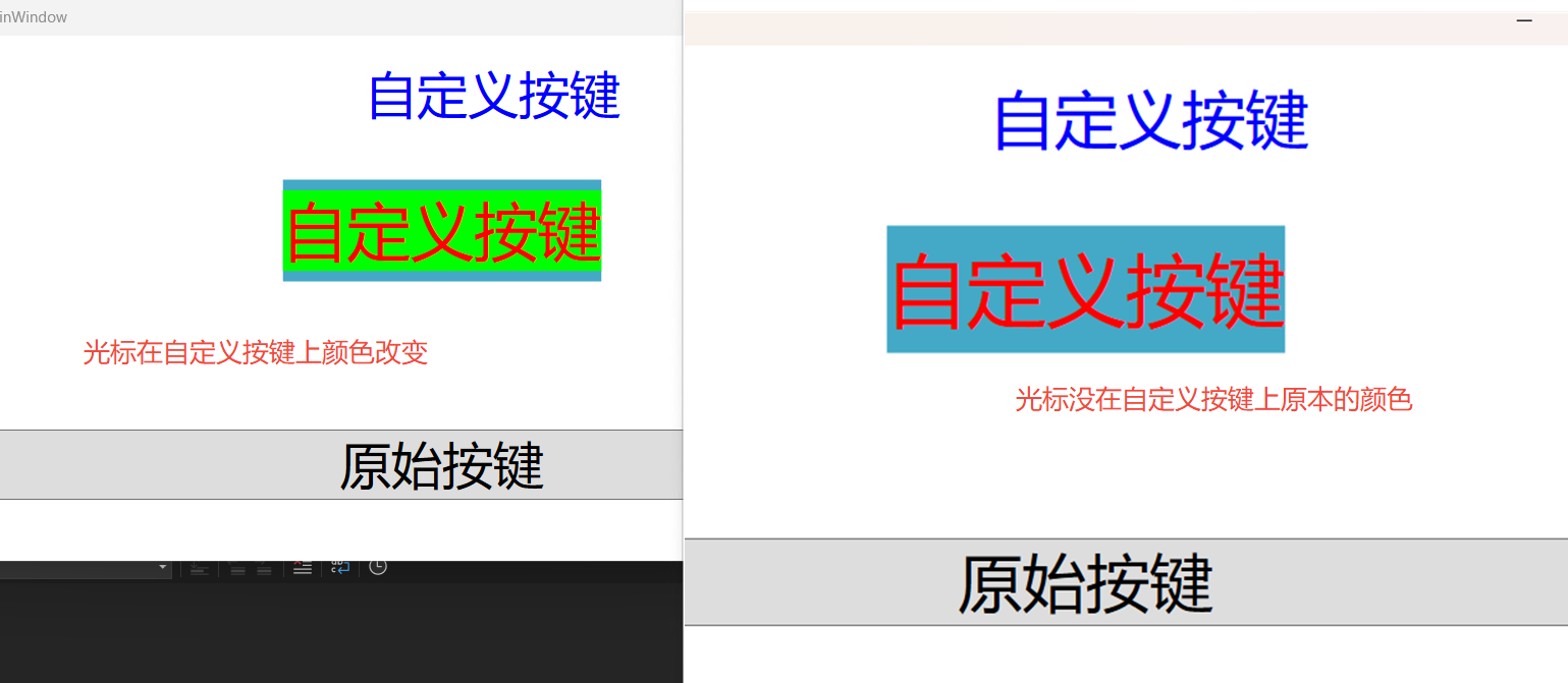
到这里的准备工作就已经完成,对自定义控件的创建以、设计、以及使用初步做了一个介绍。后面会进一步更加全面的进行一个说明。

 浙公网安备 33010602011771号