WPF学习之handycontrol用法
HandyControl是一套WPF控件库,它几乎重写了所有原生样式,同时包含80余款自定义控件。
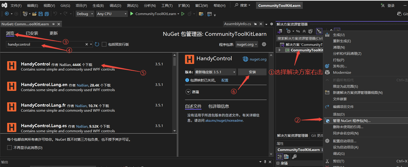
1、uget安装:
根据下图步骤进行安装
2、使用的前期准备
2.1 在App.xaml中添加引用:
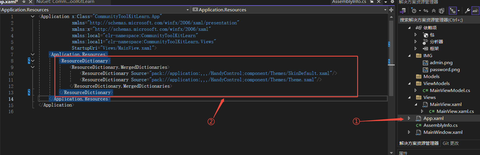
 1 <!-- 第一行改成自己的 -->
 2 <Application x:Class="CommunityToolKitLearn.App"
 3              xmlns="http://schemas.microsoft.com/winfx/2006/xaml/presentation"
 4              xmlns:x="http://schemas.microsoft.com/winfx/2006/xaml"
 5              xmlns:local="clr-namespace:CommunityToolKitLearn"
 6              xmlns:local1="clr-namespace:CommunityToolKitLearn.Views"
 7              StartupUri="Views/MainView.xaml">
 8     <Application.Resources>
 9         <ResourceDictionary>
10             <ResourceDictionary.MergedDictionaries>
11                 <ResourceDictionary Source="pack://application:,,,/HandyControl;component/Themes/SkinDefault.xaml"/>
12                 <ResourceDictionary Source="pack://application:,,,/HandyControl;component/Themes/Theme.xaml"/>
13             </ResourceDictionary.MergedDictionaries>
14         </ResourceDictionary>
15     </Application.Resources>
16 </Application>
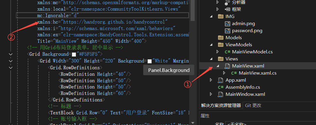
2.2 在控件视图中添加引用命名空间:
1 xmlns:hc="https://handyorg.github.io/handycontrol"
3、HandyControl介绍
3.1 官方文档查找相关知识
进入官网之后,点击原生控件
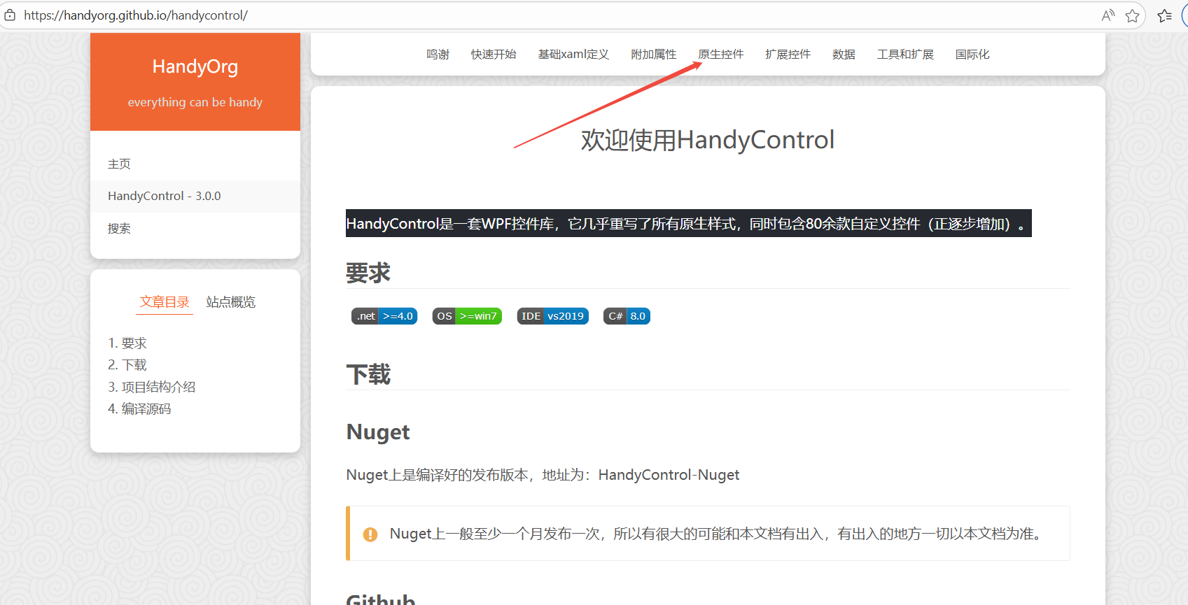
就能看到比较常用到的控件
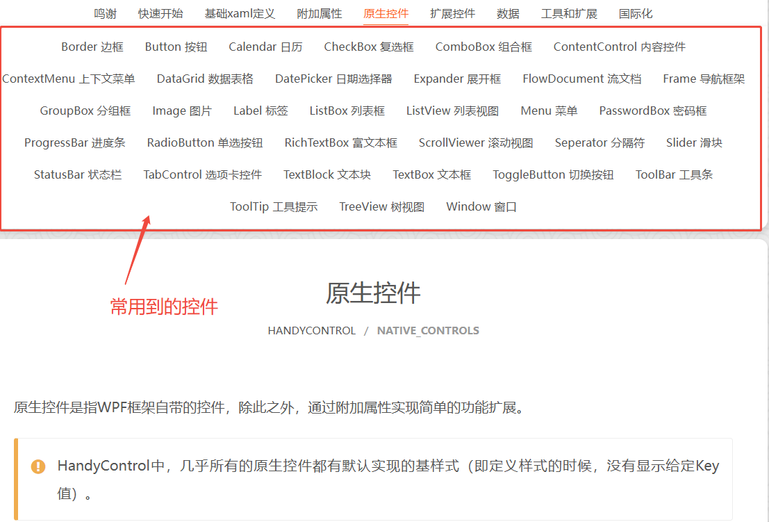
我们这里以TextBox文本框与PasswordBox密码框为例进行介绍,其他的就由各个小伙伴们自己探索啦。
3.2 TextBox的属性介绍
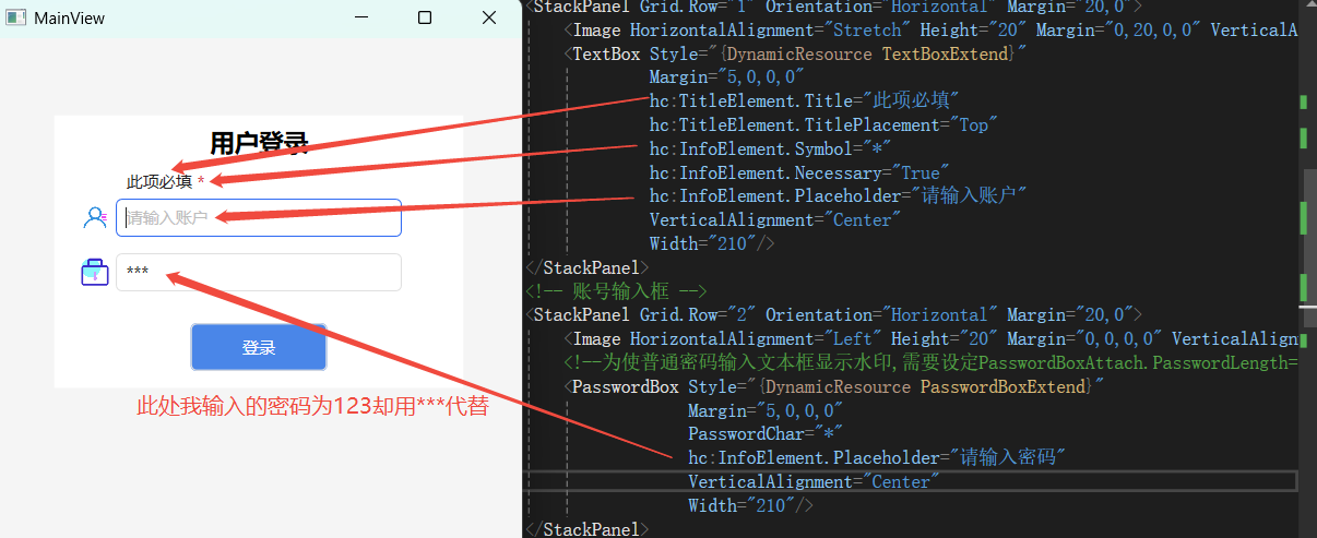
| 属性名 | 值 | 属性含义 |
| InfoElement.Title | "此项必填" | 标题,给文本密码框控件添加标题 |
| TitleElement.TitlePlacement | Left或Top | 标题位置,在文本密码框的上边或左边,不写默认为上边 |
| InfoElement.Symbol | "*" | 自定义必填提示符,在标题后面添加的标识符 |
| InfoElement.Necessary | True或False | 必填的使能 |
| InfoElement.Placeholder | "请输入账户" | 水印文字 |
3.3 PasswordBox的属性介绍
对比TextBox的属性介绍多了一个输入密码时候的代替字符
3.4 示例
代码
 1 <!-- 第一行改成自己的 -->
 2 <Window x:Class="CommunityToolKitLearn.Views.MainView"
 3         xmlns="http://schemas.microsoft.com/winfx/2006/xaml/presentation"
 4         xmlns:x="http://schemas.microsoft.com/winfx/2006/xaml"
 5         xmlns:d="http://schemas.microsoft.com/expression/blend/2008"
 6         xmlns:mc="http://schemas.openxmlformats.org/markup-compatibility/2006"
 7         xmlns:local="clr-namespace:CommunityToolKitLearn.Views"
 8         mc:Ignorable="d"
 9         xmlns:hc="https://handyorg.github.io/handycontrol"
10         xmlns:i="http://schemas.microsoft.com/xaml/behaviors"
11         xmlns:ex="clr-namespace:HandyControl.Tools.Extension;assembly=HandyControl"
12         Title="MainView" Height="450" Width="400">
13     <!-- 用Grid布局登录表单,居中显示 -->
14     <Grid Background="#F5F5F5">
15         <Grid Width="300" Height="200" Background="White" Margin="0,0,0,100" HorizontalAlignment="Center" VerticalAlignment="Center">
16             <Grid.RowDefinitions>
17                 <RowDefinition Height="40"/>
18                 <RowDefinition Height="50"/>
19                 <RowDefinition Height="50"/>
20                 <RowDefinition Height="60"/>
21                 <RowDefinition Height="60"/>
22             </Grid.RowDefinitions>
23             <!-- 标题 -->
24             <TextBlock Grid.Row="0" Text="用户登录" FontSize="18" HorizontalAlignment="Center" VerticalAlignment="Center" FontWeight="Bold"/>
25             <!-- 账号输入框 -->
26             <StackPanel Grid.Row="1" Orientation="Horizontal" Margin="20,0">
27                 <Image HorizontalAlignment="Stretch" Height="20" Margin="0,20,0,0" VerticalAlignment="Center" Width="20" Source="/IMG/admin.png"/>
28                 <TextBox Style="{DynamicResource TextBoxExtend}"
29                          Margin="5,0,0,0"
30                          hc:TitleElement.Title="此项必填"
31                          hc:TitleElement.TitlePlacement="Top"
32                          hc:InfoElement.Symbol="*"
33                          hc:InfoElement.Necessary="True"
34                          hc:InfoElement.Placeholder="请输入账户"
35                          VerticalAlignment="Center"
36                          Width="210"/>
37             </StackPanel>
38             <!-- 账号输入框 -->
39             <StackPanel Grid.Row="2" Orientation="Horizontal" Margin="20,0">
40                 <Image HorizontalAlignment="Left" Height="20" Margin="0,0,0,0" VerticalAlignment="Center" Width="20" Source="/IMG/password.png"/>
41                 <!--为使普通密码输入文本框显示水印,需要设定PasswordBoxAttach.PasswordLength="0" -->
42                 <PasswordBox Style="{DynamicResource PasswordBoxExtend}"
43                              Margin="5,0,0,0"
44                              PasswordChar="*"
45                              hc:InfoElement.Placeholder="请输入密码"
46                              VerticalAlignment="Center"
47                              Width="210"/>
48             </StackPanel>
49             <!-- 登录按钮 -->
50             <Button Grid.Row="3" Content="登录" Width="100" Height="35" Margin="0,10"
51                     Background="#4A86E8" Foreground="White" />
52         </Grid>
53     </Grid>
54 </Window>
最终示例图
到此介绍完成,官方有更多有趣的用法,这里只是做一个怎么使用的介绍,等待你的发现

 浙公网安备 33010602011771号