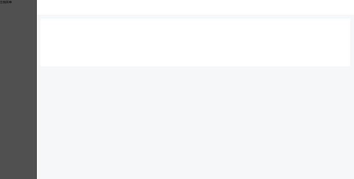
1. 常见左上下布局
css:
  <style type="text/css">
      * {
          padding: 0;
          margin: 0;
      }
      html {
          width: 100vw;
          height: 100vh;
          min-width: 1200px;
      }
    .menu-wrapper {
        display: flex;
    }
    .left {
        width: 200px;
        max-width: 200px;
        min-width: 200px;
        height: 100vh;
        background: #505050;
    }
    .right {
        flex: 1;
        height: 100vh;
    }
    .right-wrapper {
        height: 100vh;
        background: #f5f7f9;
    }
    .header {
        width: 100%;
        height: 80px;
        background: #fff;
    }
    .content {
        background: #fff;
        margin: 20px;
        min-height: 260px;
    }
 </style>
html
  <div class="menu-wrapper">
    <div class="left">左侧菜单</div>
    <div class="right">
      <div class="right-wrapper">
        <div class="header">
        </div>
        <div class="content"></div>
      </div>
    </div>
  </div>
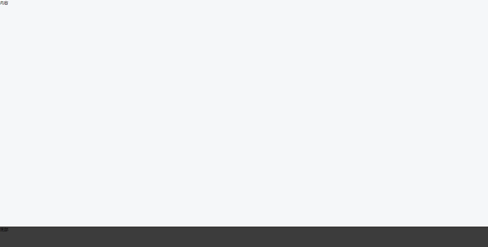
2. 门户网站布局(页脚紧贴底部)(IE兼容性不好,慎用)
css
  <style type="text/css">
    .menu-wrapper {
        display: flex;
        flex-direction: column;
        min-height: 100vh;
    }
    .content {
        flex: 1;
        background: #f5f7f9;
    }
    .footer {
        height: 80px;
        background: #3c3c3c;
    }
  </style>
html
  <div class="menu-wrapper">
    <div class="content">内容</div>
    <div class="footer">底部</div>
  </div>
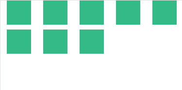
3. 常用的一行几个布局
<div class="flex-container">
      <div class="flex-inner" v-for="i in 8" :key="i">
        <div class="flex-item"></div>
      </div>
    </div>


.flex-container {
  display: flex;
  flex-wrap: wrap;
  .flex-inner {
    flex: 0 0 20%; // 一行几个在这里设置
    margin-bottom: 10px;
    .flex-item {
      width: 50px;
      height: 50px;
      margin: 0 auto;
      background: #42b983;
    }
  }
}
flex: 0 0 20%; 相当于 flex-grow: 0; flex-shrink: 0; flex-basis: 20%; flex-basis 属性用于设置或检索弹性盒伸缩基准值。就是伸缩盒子里面每一块的初始值
 posted on

 浙公网安备 33010602011771号