


CSS实现文字滑动亮光效果
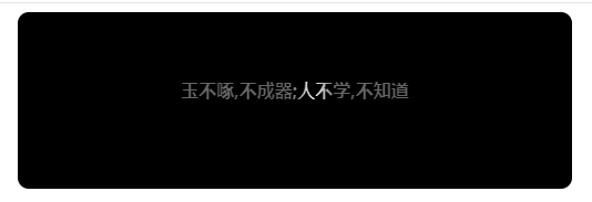
使用CSS属性,文字背景渐变,结合animation实现滑动亮光
话不多说,直接上代码
<!DOCTYPE html>
<html lang="en">

<head>
    <meta charset="UTF-8">
    <meta name="viewport" content="width=device-width, initial-scale=1.0">
    <title>Document</title>

    <style>
        .shine-box {
            width: 500px;
            height: 100px;
            margin: auto;
            padding-top: 60px;
            border-radius: 10px;
            text-align: center;
            background-color: black;
            font-weight: bolder;
        }

        .shine-span {
            background: #656565 linear-gradient(to left, transparent, #fff, transparent) no-repeat 0 0;
            background-size: 20% 100%;
            background-position: 0 0;
            background-clip: text;
            -webkit-background-clip: text;
            color: transparent;
            animation: shine 2s infinite;
        }

        @keyframes shine {
            from {
                background-position: 0% 0%;
            }

            to {
                background-position: 100% 100%;
            }
        }
    </style>
</head>

<body>
    <div class="box">
        <div class="shine-box">
            <span class="shine-span">玉不啄,不成器;人不学,不知道</span>
        </div>

</body>

</html>
效果如下:

 浙公网安备 33010602011771号