
多种风格导航菜单 HTML 实现(附源码) - 详解
下面我将为您展示 6 种不同风格的导航菜单实现,每种都包含完整 HTML、CSS 和 JavaScript 代码。
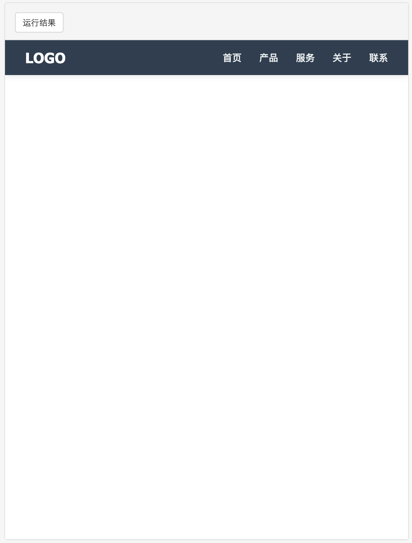
1. 简约水平导航栏
html>
html lang="zh-CN">
head>
meta charset="UTF-8">
meta name="viewport" content="width=device-width, initial-scale=1.0">
title>简约水平导航title>
style>
* {
margin: 0;
padding: 0;
box-sizing: border-box;
font-family: 'Segoe UI', Tahoma, Geneva, Verdana, sans-serif;
}
nav {
background: #2c3e50;
padding: 15px 0;
box-shadow: 0 2px 10px rgba(0, 0, 0, 0.1);
}
.nav-container {
width: 90%;
max-width: 1200px;
margin: 0 auto;
display: flex;
justify-content: space-between;
align-items: center;
}
.logo {
color: white;
font-size: 1.5rem;
font-weight: bold;
text-decoration: none;
}
.nav-links {
display: flex;
list-style: none;
}
.nav-links li {
margin-left: 30px;
}
.nav-links a {
color: #ecf0f1;
text-decoration: none;
font-size: 1rem;
font-weight: 500;
transition: color 0.3s;
position: relative;
}
.nav-links a:hover {
color: #3498db;
}
.nav-links a::after {
content: '';
position: absolute;
width: 0;
height: 2px;
background: #3498db;
bottom: -5px;
left: 0;
transition: width 0.3s;
}
.nav-links a:hover::after {
width: 100%;
}
style>
head>
body>
nav>
div class="nav-container">
a href="#" class="logo">LOGOa>
ul class="nav-links">
li>a href="#">首页a>li>
li>a href="#">产品a>li>
li>a href="#">服务a>li>
li>a href="#">关于a>li>
li>a href="#">联系a>li>
ul>
div>
nav>
body>
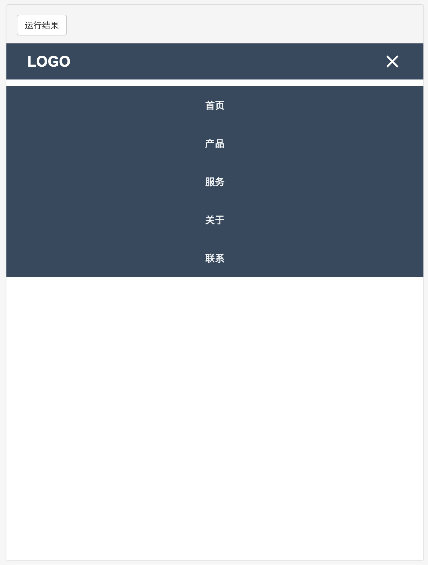
html>2. 响应式汉堡菜单
html>
html lang="zh-CN">
head>
meta charset="UTF-8">
meta name="viewport" content="width=device-width, initial-scale=1.0">
title>响应式汉堡菜单title>
style>
* {
margin: 0;
padding: 0;
box-sizing: border-box;
font-family: 'Arial', sans-serif;
}
nav {
background: #34495e;
padding: 15px 0;
position: relative;
}
.nav-container {
width: 90%;
max-width: 1200px;
margin: 0 auto;
display: flex;
justify-content: space-between;
align-items: center;
}
.logo {
color: white;
font-size: 1.5rem;
font-weight: bold;
text-decoration: none;
}
.nav-links {
display: flex;
list-style: none;
}
.nav-links li {
margin-left: 30px;
}
.nav-links a {
color: #ecf0f1;
text-decoration: none;
font-size: 1rem;
font-weight: 500;
transition: color 0.3s;
}
.nav-links a:hover {
color: #1abc9c;
}
.hamburger {
display: none;
cursor: pointer;
}
.hamburger div {
width: 25px;
height: 3px;
background: white;
margin: 5px;
transition: all 0.3s ease;
}
@media screen and (max-width: 768px) {
.hamburger {
display: block;
}
.nav-links {
position: absolute;
right: 0;
top: 70px;
background: #34495e;
width: 100%;
flex-direction: column;
align-items: center;
clip-path: circle(0px at 90% -10%);
transition: all 0.5s ease-out;
pointer-events: none;
}
.nav-links li {
margin: 20px 0;
opacity: 0;
}
.nav-links.open {
clip-path: circle(1000px at 90% -10%);
pointer-events: all;
}
.nav-links li.fade {
opacity: 1;
}
}
/* 汉堡菜单动画 */
.toggle .line1 {
transform: rotate(-45deg) translate(-5px, 6px);
}
.toggle .line2 {
opacity: 0;
}
.toggle .line3 {
transform: rotate(45deg) translate(-5px, -6px);
}
style>
head>
body>
nav>
div class="nav-container">
a href="#" class="logo">LOGOa>
ul class="nav-links">
li>a href="#">首页a>li>
li>a href="#">产品a>li>
li>a href="#">服务a>li>
li>a href="#">关于a>li>
li>a href="#">联系a>li>
ul>
div class="hamburger">
div class="line1">div>
div class="line2">div>
div class="line3">div>
div>
div>
nav>
script>
const hamburger = document.querySelector('.hamburger');
const navLinks = document.querySelector('.nav-links');
const links = document.querySelectorAll('.nav-links li');
hamburger.addEventListener('click', () => {
navLinks.classList.toggle('open');
hamburger.classList.toggle('toggle');
links.forEach(link => {
link.classList.toggle('fade');
});
});
script>
body>
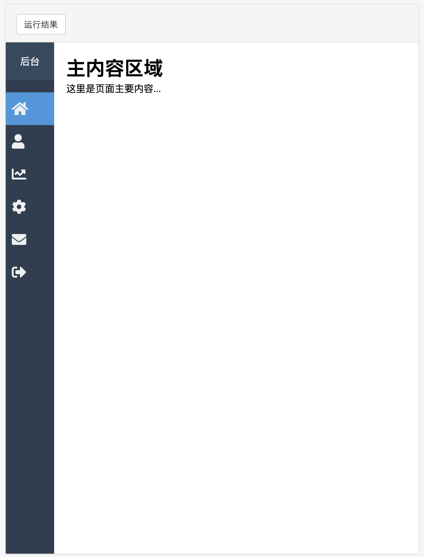
html>3. 垂直侧边栏导航
html>
html lang="zh-CN">
head>
meta charset="UTF-8">
meta name="viewport" content="width=device-width, initial-scale=1.0">
title>垂直侧边栏导航title>
style>
* {
margin: 0;
padding: 0;
box-sizing: border-box;
font-family: 'Roboto', sans-serif;
}
body {
display: flex;
min-height: 100vh;
}
.sidebar {
width: 250px;
background: #2c3e50;
color: white;
height: 100vh;
position: fixed;
transition: all 0.3s;
}
.sidebar-header {
padding: 20px;
background: #34495e;
text-align: center;
}
.sidebar-header h3 {
margin-bottom: 0;
font-weight: 500;
}
.sidebar-menu {
padding: 20px 0;
}
.sidebar-menu li {
list-style: none;
padding: 15px 20px;
transition: all 0.3s;
}
.sidebar-menu li:hover {
background: #34495e;
}
.sidebar-menu li.active {
background: #3498db;
}
.sidebar-menu a {
color: #ecf0f1;
text-decoration: none;
display: flex;
align-items: center;
}
.sidebar-menu i {
margin-right: 10px;
font-size: 1.2rem;
}
.main-content {
margin-left: 250px;
padding: 20px;
width: calc(100% - 250px);
transition: all 0.3s;
}
@media (max-width: 768px) {
.sidebar {
width: 80px;
}
.sidebar-header h3,
.sidebar-menu span {
display: none;
}
.sidebar-menu i {
margin-right: 0;
font-size: 1.5rem;
}
.sidebar-menu li {
text-align: center;
padding: 15px 10px;
}
.main-content {
margin-left: 80px;
width: calc(100% - 80px);
}
}
style>
link rel="stylesheet" href="https://cdnjs.cloudflare.com/ajax/libs/font-awesome/5.15.4/css/all.min.css">
head>
body>
div class="sidebar">
div class="sidebar-header">
h3>管理后台h3>
div>
ul class="sidebar-menu">
li class="active">
a href="#">
i class="fas fa-home">i>
span>仪表盘span>
a>
li>
li>
a href="#">
i class="fas fa-user">i>
span>用户管理span>
a>
li>
li>
a href="#">
i class="fas fa-chart-line">i>
span>数据分析span>
a>
li>
li>
a href="#">
i class="fas fa-cog">i>
span>系统设置span>
a>
li>
li>
a href="#">
i class="fas fa-envelope">i>
span>消息中心span>
a>
li>
li>
a href="#">
i class="fas fa-sign-out-alt">i>
span>退出登录span>
a>
li>
ul>
div>
div class="main-content">
h1>主内容区域h1>
p>这里是页面主要内容...p>
div>
body>
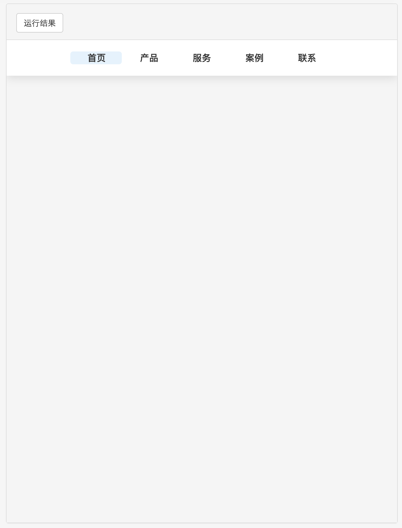
html>4. 悬浮下划线导航
html>
html lang="zh-CN">
head>
meta charset="UTF-8">
meta name="viewport" content="width=device-width, initial-scale=1.0">
title>悬浮下划线导航title>
style>
* {
margin: 0;
padding: 0;
box-sizing: border-box;
font-family: 'Poppins', sans-serif;
}
body {
background: #f5f5f5;
}
nav {
background: white;
box-shadow: 0 5px 15px rgba(0, 0, 0, 0.1);
padding: 20px;
}
.nav-container {
max-width: 1200px;
margin: 0 auto;
display: flex;
justify-content: center;
}
.nav-links {
display: flex;
list-style: none;
position: relative;
}
.nav-links li {
margin: 0 15px;
}
.nav-links a {
color: #333;
text-decoration: none;
font-size: 1rem;
font-weight: 500;
padding: 8px 15px;
position: relative;
z-index: 1;
}
.nav-links .underline {
position: absolute;
height: 100%;
width: 100px;
background: #e3f2fd;
top: 0;
left: 0;
border-radius: 5px;
transition: all 0.3s;
z-index: 0;
}
.nav-links li:nth-child(1):hover ~ .underline {
left: 0;
width: 90px;
}
.nav-links li:nth-child(2):hover ~ .underline {
left: 105px;
width: 90px;
}
.nav-links li:nth-child(3):hover ~ .underline {
left: 210px;
width: 90px;
}
.nav-links li:nth-child(4):hover ~ .underline {
left: 315px;
width: 90px;
}
.nav-links li:nth-child(5):hover ~ .underline {
left: 420px;
width: 90px;
}
style>
head>
body>
nav>
div class="nav-container">
ul class="nav-links">
li>a href="#">首页a>li>
li>a href="#">产品a>li>
li>a href="#">服务a>li>
li>a href="#">案例a>li>
li>a href="#">联系a>li>
div class="underline">div>
ul>
div>
nav>
body>
html>
5. 圆角标签式导航
html>
html lang="zh-CN">
head>
meta charset="UTF-8">
meta name="viewport" content="width=device-width, initial-scale=1.0">
title>圆角标签式导航title>
style>
* {
margin: 0;
padding: 0;
box-sizing: border-box;
font-family: 'Arial', sans-serif;
}
body {
background: #f8f9fa;
padding-top: 50px;
}
.tabs-container {
max-width: 800px;
margin: 0 auto;
background: white;
border-radius: 10px;
box-shadow: 0 5px 15px rgba(0, 0, 0, 0.1);
overflow: hidden;
}
.tabs-nav {
display: flex;
background: #f1f3f5;
border-bottom: 1px solid #dee2e6;
}
.tab-button {
padding: 12px 20px;
background: none;
border: none;
cursor: pointer;
font-size: 1rem;
font-weight: 500;
color: #495057;
position: relative;
transition: all 0.3s;
}
.tab-button:first-child {
border-top-left-radius: 10px;
}
.tab-button:last-child {
border-top-right-radius: 10px;
}
.tab-button:hover {
color: #212529;
background: rgba(0, 0, 0, 0.05);
}
.tab-button.active {
color: #0d6efd;
background: white;
}
.tab-button.active::after {
content: '';
position: absolute;
bottom: -1px;
left: 0;
width: 100%;
height: 2px;
background: #0d6efd;
}
.tab-content {
padding: 20px;
display: none;
}
.tab-content.active {
display: block;
}
.tab-content h3 {
margin-bottom: 15px;
color: #212529;
}
.tab-content p {
color: #495057;
line-height: 1.6;
}
style>
head>
body>
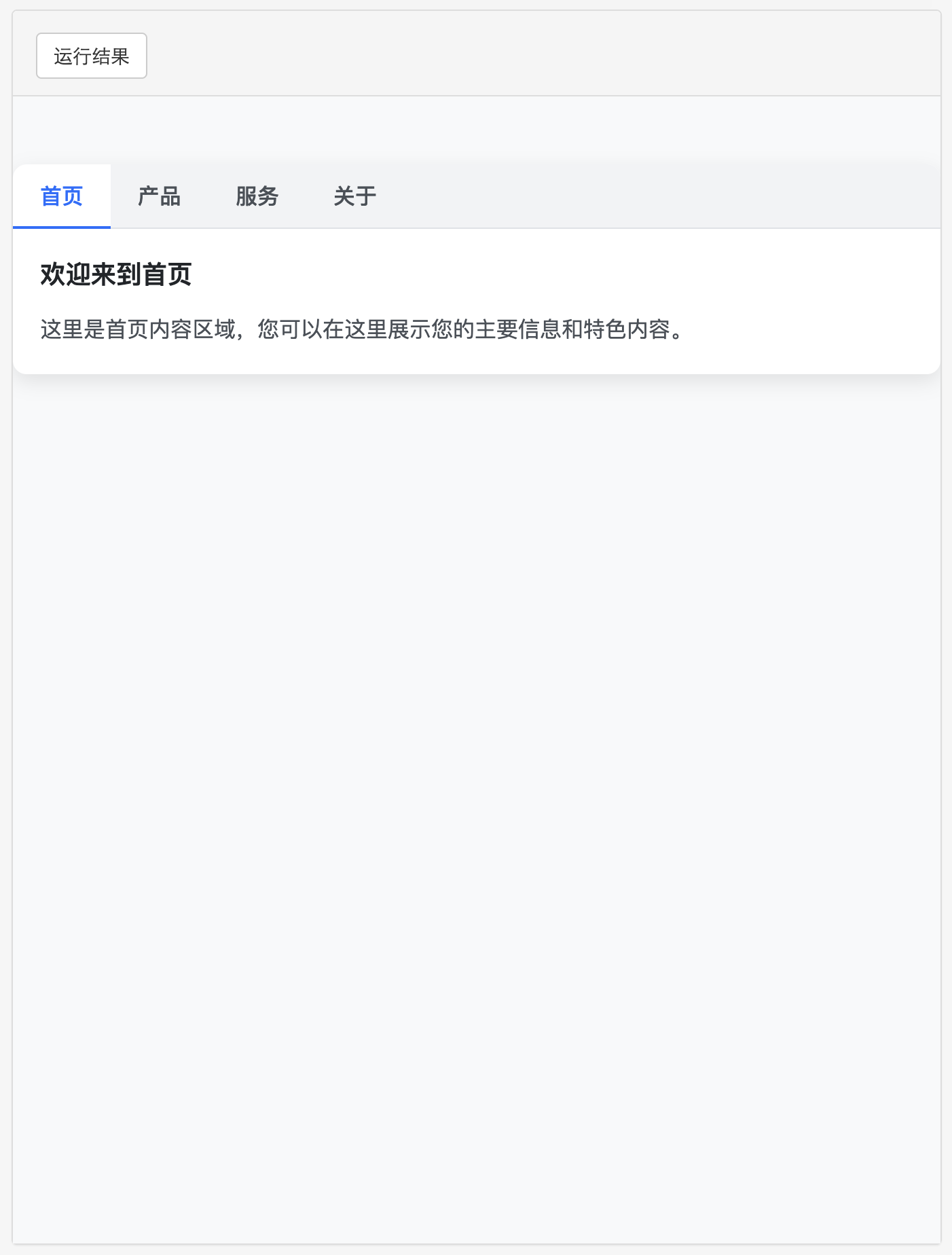
div class="tabs-container">
div class="tabs-nav">
button class="tab-button active" data-tab="tab1">首页button>
button class="tab-button" data-tab="tab2">产品button>
button class="tab-button" data-tab="tab3">服务button>
button class="tab-button" data-tab="tab4">关于button>
div>
div class="tabs-content">
div class="tab-content active" id="tab1">
h3>欢迎来到首页h3>
p>这里是首页内容区域,您可以在这里展示您的主要信息和特色内容。p>
div>
div class="tab-content" id="tab2">
h3>我们的产品h3>
p>这里展示您的产品信息,包括产品特点、优势和使用场景等。p>
div>
div class="tab-content" id="tab3">
h3>专业服务h3>
p>详细介绍您提供的服务内容、服务流程和客户案例等。p>
div>
div class="tab-content" id="tab4">
h3>关于我们h3>
p>介绍您的公司背景、发展历程、团队文化和联系方式等信息。p>
div>
div>
div>
script>
const tabButtons = document.querySelectorAll('.tab-button');
const tabContents = document.querySelectorAll('.tab-content');
tabButtons.forEach(button => {
button.addEventListener('click', () => {
// 移除所有active类
tabButtons.forEach(btn => btn.classList.remove('active'));
tabContents.forEach(content => content.classList.remove('active'));
// 添加active类到当前按钮和对应内容
button.classList.add('active');
const tabId = button.getAttribute('data-tab');
document.getElementById(tabId).classList.add('active');
});
});
script>
body>
html>6. 3D立体悬浮导航
html>
html lang="zh-CN">
head>
meta charset="UTF-8">
meta name="viewport" content="width=device-width, initial-scale=1.0">
title>3D立体悬浮导航title>
style>
* {
margin: 0;
padding: 0;
box-sizing: border-box;
font-family: 'Arial', sans-serif;
}
body {
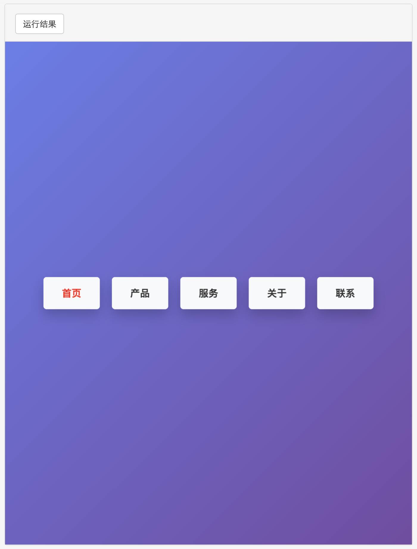
background: linear-gradient(135deg, #667eea 0%, #764ba2 100%);
min-height: 100vh;
display: flex;
justify-content: center;
align-items: center;
}
.nav-3d {
display: flex;
position: relative;
perspective: 1000px;
}
.nav-item {
margin: 0 10px;
position: relative;
transform-style: preserve-3d;
transition: transform 0.3s;
}
.nav-item:hover {
transform: translateZ(20px);
}
.nav-item a {
display: block;
padding: 15px 30px;
background: white;
color: #333; /* 确保文字颜色可见 */
text-decoration: none;
font-weight: bold;
border-radius: 5px;
box-shadow: 0 10px 20px rgba(0, 0, 0, 0.2);
position: relative;
transform: translateZ(25px);
transition: all 0.3s;
z-index: 2; /* 确保文字在顶层 */
}
.nav-item a::before {
content: '';
position: absolute;
width: 100%;
height: 100%;
background: #f8f9fa;
border-radius: 5px;
top: 0;
left: 0;
transform: translateZ(-25px);
transition: all 0.3s;
z-index: -1; /* 确保背景在文字下方 */
}
.nav-item:hover a {
background: #0d6efd;
color: white;
transform: translateZ(45px);
}
.nav-item:hover a::before {
background: #0b5ed7;
transform: translateZ(-45px);
}
.test {
color: red !important; /* 确保红色文字可见 */
}
style>
head>
body>
div class="nav-3d">
div class="nav-item">
a href="#" class="test">首页a>
div>
div class="nav-item">
a href="#">产品a>
div>
div class="nav-item">
a href="#">服务a>
div>
div class="nav-item">
a href="#">关于a>
div>
div class="nav-item">
a href="#">联系a>
div>
div>
body>
html>总结
以上提供了 6 种不同风格的导航菜单实现:
- 简约水平导航栏 - 适合大多数网站的基本导航需求
- 响应式汉堡菜单 - 移动设备友好的响应式导航
- 垂直侧边栏导航 - 适合管理后台或文档网站
- 悬浮下划线导航 - 具有流畅动画效果的导航
- 圆角标签式导航 - 适合内容分类展示
- 3D立体悬浮导航 - 具有视觉冲击力的创意导航
每种导航都包含完整的 HTML、CSS 和必要的 JavaScript 代码,您可以直接复制使用或根据需要进行修改。这些导航菜单都遵循现代 Web 设计原则,具有良好的视觉效果和用户体验。

 浙公网安备 33010602011771号