css 边框镶角
一、background-image
效果图:
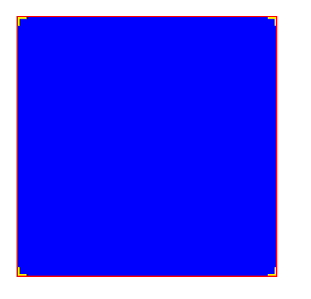
background: linear-gradient(to left, yellow, yellow) left top no-repeat,
  linear-gradient(to bottom, yellow, yellow) left top no-repeat,
  linear-gradient(to left, yellow, yellow) right top no-repeat,
  linear-gradient(to bottom, yellow, yellow) right top no-repeat,
  linear-gradient(to left, yellow, yellow) left bottom no-repeat,
  linear-gradient(to bottom, yellow,yellow) left bottom no-repeat,
  linear-gradient(to left, yellow, yellow) right bottom no-repeat,
  linear-gradient(to left, yellow, yellow) right bottom no-repeat;
  background-size: 2px 10px, 10px 2px, 2px 10px, 10px 2px;
  background-color: blue;
  border: 2px solid red;
要点:
- linear-gradient塑造了background-image(具体渐变方向不影响结果和细节不重要,换做真实的矢量图片也可)
- 为每一个image都指定对应的位置
- background-size定义image的大小
也可写作:
background:linear-gradient(to left, yellow, yellow) left top / 2px 10px no-repeat,
  linear-gradient(to bottom, yellow, yellow) left top / 10px 2px no-repeat,
  linear-gradient(to left, yellow, yellow) right top  / 2px 10px no-repeat,
  linear-gradient(to bottom, yellow, yellow) right top/ 10px 2px no-repeat,
  linear-gradient(to left, yellow, yellow) left bottom  / 2px 10px no-repeat,
  linear-gradient(to bottom, yellow,yellow) left bottom / 10px 2px no-repeat,
  linear-gradient(to left, yellow, yellow) right bottom / 2px 10px no-repeat,
  linear-gradient(to left, yellow, yellow) right bottom/ 10px 2px no-repeat;
  background-color: blue;
  border: 2px solid red;
二、border-image
效果图:

border-image: url('./bg.png');
border-image-slice: 80 80 fill;
border-image-width: 40px 40px;
width: 500px;
height: 200px;
注:此处用的二倍图
要点:
- border-image给定:边可延伸的背景图片
- border-image-slice设置边框裁切:角不变,边延伸

- border-image-width设置边框四角的宽高


 浙公网安备 33010602011771号