CSS
css的几种引入方式
-
行内样式
行内式是在标记style属性中设定css样式.不推荐大规模使用
/*写在body标签里面*/ <p style="color: red">hello word</p> -
内嵌样式
嵌入式是将css样式集中写在网页的
<head></head>标签对应的<style></style>标签中<style> div{ color: aqua; } </style> -
外接式
外部样式就是将css写在一个单独的文件中然后在页面进行引入即可. 推荐使用此方式
# 在一个 aa.css 文件中写入以下内容
div{
    background-color: aquamarine;
    height:100px;
    width:200px
}

# 在另一个文件引入
<!DOCTYPE html>
<html lang="en">
<head>
    <meta charset="UTF-8">
    <title></title>
        <link rel="stylesheet" href="aa.css">
</head>
<body>
    <div> </div>
</body>
</html>
优先级:行内>外接=内嵌
基本选择器
-
元素选择器
<style> div{ color:deepskyblue; } </style> /*渲染div标签中的内容*/ -
id选择器 id值不能重复
<style> #name{ color:red; } </style> <body> <div id="name">张三</div> <div>李四</div> </body> /*只将张三的名字变成红色*/ -
类选择器: 类值可以重复,可加多个
<style> /*div.c1{*/ # 仅将div标签中含有class值为c1的文字内容变为绿色 /*color:green;*/ /*}*/ .c1{ # 将所有标签中含有class值为c1的文字内容变为绿色 color:green; } </style> <body> <div class="c1">深圳</div> <div class="c1">北京</div> <span class="c1">上海</span> </body> -
通用选择器 *
*{    # 找到所有的标签
	color: green;
}
高级选择器
-
后代选择器 空格
<style> div a{ # 找到div标签后代里面的所有的a标签 color:red; } </style> <body> <div> <a href="">天猫</a> <p> <a href="">百度</a> </p> </div> </body> # 天猫和百度的颜色变成红色 -
子代选择器 >
<style> div>a{ # 找到div的儿子标签这一代的a标签 color:red; } </style> <body> <div> <a href="">天猫</a> <p> <a href="">百度</a> </p> </div> </body> # 只有天猫的颜色变为红色 -
相邻选择器
<style> div+a{ # 找到紧挨着div标签的下一个标签(是兄弟标签) color:red; } </style> <body> <p>淘宝</p> <div> <a href="">天猫</a> <p> <a href="">百度</a> </p> </div> <a href="">小米</a> <a href="">华为</a> </body> # 只有小米的颜色变为红色 -
兄弟选择器 ~
<style> div~a{ # 找到同级后面的所有兄弟标签 color:red; } </style> <body> <p>淘宝</p> <div> <a href="">天猫</a> <p> <a href="">百度</a> </p> </div> <a href="">小米</a> <a href="">华为</a> </body> # 小米和华为的颜色变红 -
组合选择器
多个选择器选择的标签设置相同css样式的时候,就可以用分组

div,p{  # div和p选择器共同设置相同的样式,可以用逗号分隔
    color:red;
}
属性选择器
<style>
    [title]{  # 找到所有含有title属性的标签
        color: red;
    }

    div[title]{  # 找到含有title属性的div标签
        color: red;
    }

    [title=a]{  # 通过属性名对应的值来查找
        color: red;
    }

    [title='1']{  # 当属性名对应的值为数字时,数字要加上引号
        color: red;
    }

    input[type=text]{  # 含有type属性,并且type属性值为text的input标签
        background-color: red;
    }
</style>

<body>
    <div title="a">你好</div>
    <span title="1">我好</span>
    <p title="a">他好</p>
    <input type="text">
    <input type="password">
</body>
伪类选择器
a标签自带的效果:未访问过的时候是蓝色的字体颜色,访问过之后是紫色的,自带下划线
<style>
	/* 未访问的链接 */
	a:link{
        color: red;
    }

 	/* 已访问的链接 */
    a:visited{
        color: blue;
    }

	/* 鼠标移动到链接上变色 */  这个用的比较多,可以应用在其他标签上
    a:hover{
        color: green;
    }

	/* 选定的链接 */ 就是鼠标点下去还没有抬起来的那个瞬间,可以让它变颜色
    a:active{
        color:red
    }

	/*input输入框获取焦点时样式*/
    input:focus{  # input默认的有个样式,鼠标点进去的时候,input框会变天蓝色
        #outline:none;
        background-color: deepskyblue;  # 框里面的背景色
    }
</style>
伪元素选择器
-
通过伪元素选择器添加的内容为行内元素,必须添加content属性
-
伪元素选择器是解决布局浮动的常用方法
<style>
p::first-letter{
    color:red;
    font-size:20px;
    font-weight:bold;
}
p::before{              /*before和first-letter只有一个生效,后出现的生效*/
    content:'@';
}
p::after{
    content:'#'
}
</style>

<body>
 	<p>null</p>
</body>
选择器的优先级
优先级数字越大,越优先显示其效果,优先级相同的,显示后面定义的选择器对应的样式

继承的优先级为 0
元素选择器的优先级为 1
类选择器的优先级为 10
id选择器的优先级为 100
行内样式的优先级为 1000
! important 优先级最高,为最重要的  示例: color:red !important;
字体
- font-family:"楷体","微软雅黑" --> 为网页中的文字设置字体为楷体,备选字体为微软雅黑
- font-size: 20px --> 字体大小为px em rem为单位
- font-style: normal --> 字体样式:normal:普通字体, italic:斜体,oblique:将普通文本倾斜的样式应用到文本中*,bolder:粗体
- font-weight: bolder --> normal:普通的字体粗细,默认,bold:加粗的字体粗细 ,lighter:比普通字体更细的字体,bolder:比bold更粗的字体
文本
-
text-decoration: underline --> none:无文本的修饰,underline:文本下划线,overline:文本上划线,line-through:删除线
-
text-indent: 40px --> 文本缩进
-
text-align: center --> 文本对齐 left:本左对齐,默认,right:文本右对齐,center:文本居中,中心对齐
-
line-height: 20px --> 设置行间距:行间距,也叫行高,表示行与行之间的距离
-
border: 1px solid blue --> 为父级标签设置一个边框,表示这是一行
-
letter-spacing: 40px --> 文字之间的距离
-
word-spacing: 60px --> 调整英文单词之间的距离,注意:是调整'英文单词'间得举例
背景属性
图片位置
- 左上:left top
- 上中: center top
- 右上: right top
- 左中: left center
- 正中心: center center
- 右中: right center
- 左下: left bottom
- 下中: center bottom
- 右下: right bottom
div{
    width: 600px;
    height: 600px;
    background-color: pink;
    /*background-repeat: no-repeat;*/  no-repeat:背景图片不平铺 ,不写默认是平铺的
    /*background-image: url('lan.png');*/  图片的地址
    /*background-position: center center;*/  图片摆放的位置
    background:url('lan.png') no-repeat right center; 以上三句话可以写成这一句话
    /*background-position: 100px 50px;*/  相对于div标签的,距离左边100px,距离上面50px
}

# 简写方式
background:pink url('1.png') no-repeat right top;
    颜色          图片路径     是否平铺   图片位置

其他:
background-attachment:fiexed;   固定在屏幕的某个位置
边框
边框样式:
| 值 | 描述 |
|---|---|
| none | 无边框 |
| dotted | 点状虚线边框 |
| dashed | 矩形虚线边框 |
| solid | 实线边框 |
div{
    width: 200px;
    height:200px;
    border-style:solid;
    border-color:red;
    border-width:10px;
    # 上面三句的简写方式简写方式
    border: 10px solid red;

    border-top-style:dashed;    # 单独设置上边框
    border-bottom-style:dashed; # 单独设置下边框
    border-left-style:dashed;   # 单独设置左边框
    border-right-style:dashed;  # 单独设置右边框
    border-left:10px solid red;  单独设置边框的简写方式
    border-radius: 50%;  # 控制圆角,50%以上的都是圆形
}
display 属性
用于控制HTML元素的显示效果
| 值 | 意义 |
|---|---|
| display:none | HTML文档中元素存在,但在浏览器中不显示 |
| display:block | 默认占满整个页面的宽度,如果设置了指定宽度,则会用margin填充剩下的部分 |
| display:inline | 按行内元素显示,此时设置元素的width height margin-top和float属性都不会生效 |
| display:inline-block | 使元素同时具有行内元素和块级元素的特点,不独占一行 |
- display:none 和 visibility:hidden 的区别
- visibility:hidden: 可以隐藏某个元素,但隐藏的元素仍需占用与未隐藏之前一样的空间。也就是说,该元素虽然被隐藏了,但仍然会影响布局。
- display:none: 可以隐藏某个元素,且隐藏的元素不会占用任何空间。也就是说,该元素不但被隐藏了,而且该元素原本占用的空间也会从页面布局中消失。
<head>
    <meta charset="UTF-8">
    <title>Title</title>
    <style>
        div{
            width:200px;
            height:200px;
            border:5px solid red;
            display:inline;  # 将div标签设置成内敛标签,不独占一行
        }
        span{
            border:5px solid orange;
        }
        .c1{
            width:200px;
            height:200px;
            /*display:block;*/      # 将span标签设置成块标签,独占一行
            display:none;           # 隐藏类c1中的元素,不占用空间
            /*visibility:hidden;*/  # 隐藏类c1中的元素,占用空间
        }
    </style>
</head>
<body>
    <div>人生苦短n</div>
    <span class="c1">开心就好</span>
    <span class="c2">快乐最重要</span>
</body>
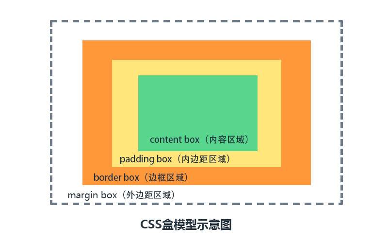
盒子模型
在css里面,每个标签可以称为一个盒子模型
-
margin : 外边距,用于控制元素与元素之间的距离,margin的最基本用途就是控制元素周围的间隔,从视觉角度上达到相互隔开的目的
-
border : 围绕在内边距和内容外的边框
-
padding : 内边距,用于控制内容和边框之间的距离
-
content : 盒子的内容,显示文本和图像
-
padding : 内边距
<style> .d1{ border:2px solid red; width:200px; height:100px; padding-top:10px; 上边距: 10 padding-left:3px; 左边距: 3 padding-right:5px; 右边距: 5 padding-bottom:6px; 下边距: 6 # 简写方式 padding:10px; 上下左右边距都为10 padding:10px 15px; 上下边距10,左右边距15 padding:10px 15px 20px; 上边距10,左右边距15,下边距20 padding:5px 10px 15px 20px; 顺时针表示: 上 右 下 左 padding:5px 10px 15px 0; 如果不设置内边距,则写 0 即可 } </style> -
margin 外边距
-
top : 距离上面标签的距离
-
bottom : 距离下面标签的距离
-
left : 距离左边标签的距离
-
right : 距离右边标签的距离
<head>
    <meta charset="UTF-8">
    <title>Title</title>
    <style>
        .c1{
            border: 5px solid red;
            width: 200px;
            height:100px;
            margin-bottom:100px;  # 距离下面标签的距离为100
        }
        .c2{
            border:5px solid green;
            width:200px;
            height:100px;
            margin-left:50px;   # 距离上面标签的距离为50,由于100大于50,所有上下标签的距离为100
        }
        .s1{
            margin-right:100px;  # 距离右标签的距离为100
        }
        .s2{
            margin-left:200px;   # 距离左标签的距离为200,跟上面结合一起,两者的距离就是300
        }
    </style>
</head>
<body>
    <div class="c1">人生苦短</div>
    <div class="c2">用毛python</div>
    <span class="s1">生于忧患</span>
    <span class="s2">死于安乐</span>
</body>

两种简写方式
margin: 10px 20px  -->跟上下标签的距离为10,左右标签的距离为20
margin:2px 5px 8px 10px  --> 顺时针表示: 上 右 下 左

两种情况:
1.垂直方向如果上下两个标签都设置了margin外边距,则取两者的最大值
2.水平方向两个标签设置了外边距,则取这两者的边距之和
-
浮动: float
- 布局用的,设置了浮动的标签会脱离正常文档流
-
三种取值:
- left : 向左取值
- right : 向右取值
- none : 默认值,不浮动
-
clear : 规定元素的哪一侧不允许其他浮动元素
值 描述 left 在左侧不允许浮动元素 right 在右侧不允许浮动元素 both 在左右两侧均不允许出现浮动元素 none 默认值,允许浮动元素出现在两侧 inherit 规定应该从父元素继承clear属性的值 <head> <meta charset="UTF-8"> <title>Title</title> <style> .c1{ background-color:red; width:100px; height:100px; float:right; # 向右浮动 } .c2{ background-color: orange; width:100px; height:100px; float:left; # 向左浮动 } .c3{ background-color: green; height:100px; # 不设置宽度,让其充满屏幕 } # 浮动会造成父级标签塌陷的问题 # 解决方法 1. 给父级标签设置高度 .cc{ height: 200px; } 2. 伪元素选择器清除浮动,给父级标签加上下面这个类值 .clearfix:after{ content:''; display:block; clear:both; # 清除浮动clear } </style> </head> <body> <div class="cc clearfix"> <div class="c1"></div> <div class="c2"></div> </div> <div class="c3"></div> </body>
清除浮动
-
父盒子设置固定高度
-
内墙法
- 在浮动元素的后面加一个空的块级元素(通常是div),并且该元素设置
clear:both;属性
- 在浮动元素的后面加一个空的块级元素(通常是div),并且该元素设置
-
伪元素清除法
-
overflow:hidden
.clearfix:after{
    content:'.';
    display: block;
    clear: both;
    overflow: hidden;
    height: 0;
}/*给父元素添加clearfix即可*/
overflow 溢出属性
| 值 | 描述 |
|---|---|
| visible | 默认值,内容不会被修剪,会呈现在元素框之外 |
| hidden | 内容会被修剪,并且其余内容是不可见的 |
| scroll | 内容会被修剪.但是浏览器会显示滚动以便查看其余的内容,也可以左右滚动 |
| auto | 如果内容被修剪,则浏览器会显示滚动条以便查看其余的内容。 |
<head>
    <meta charset="UTF-8">
    <title>Title</title>
    <style>
        div{
            width:200px;
            height:200px;
            border: 3px solid red;
            /*overflow:hidden;*/  # 内容会被修剪,其余内容不可见
            overflow:auto;    # 内容被修剪,浏览器会显示滚动条以便查看其余的内容
        }
    </style>
</head>
<body>
    <div>
        你的理想是诗,理想是梦,理想是远方的田野,理想是穿越世界的旅行。但现在你能做的所有,只是把手握紧,厚积薄发,你只有付出,付出你的时间,赌上你的尊严,拿出你的全部,你的everything。当别人打游戏时,你在学习;当别人睡懒觉时,你在学习;你含着泪在深夜里舞蹈,在回忆里奔跑,没有人在年少时想成为一个普通人。尽管生活它会剥夺你的所爱,践踏你的尊严,把你踩在脚下,遍体鳞伤,但你,怎能倒下!你的身后,是挚爱的人。
    </div>
</body>
圆形头像示例
<head>
    <meta charset="UTF-8">
    <meta http-equiv="x-ua-compatible" content="IE=edge">
    <title>圆形头像</title>
    <style>
        .c{
            width:300px;
            height:300px;
            border:5px solid wheat;
            border-radius: 50%;
            overflow: hidden;  # 设置为修剪不可见
        }
        .c>img{
            width:100%;   # 让img标签按照外层div标签的宽度来显示
        }
    </style>
</head>
<body>
    <div class="c">
        <img src="xiaohua.png" alt="" title="校花">
    </div>
</body>
- 总结一点:width宽度设置的时候,直接可以写100px,30% 这种百分比的写法,它的宽度按照父级标签的宽度的百分比来计算
定位
| 属性值 | 描述 |
|---|---|
| static | 默认。静态定位, 指定元素使用正常的布局行为,即元素在文档常规流中当前的布局位置。此时 top, right, bottom, left 和 z-index属性无效。 |
| relative | 相对定位。 元素先放置在未添加定位时的位置,在不改变页面布局的前提下调整元素位置(因此会在此元素未添加定位时所在位置留下空白) |
| absolute | 绝对定位。不为元素预留空间,通过指定元素相对于最近的非 static 定位祖先元素的偏移,来确定元素位置。绝对定位的元素可以设置外边距(margins),且不会与其他边距合并 |
| fixed | 固定定位。 不为元素预留空间,而是通过指定元素相对于屏幕视口(viewport)的位置来指定元素位置。元素的位置在屏幕滚动时不会改变 |
相对定位
参考点
以自身原来的位置进行定位,可以使用top,left,right,bottom对元素进行偏移
现象
- 不脱离标准文档流,单独设置盒子相对定位之后,如果不用
top,left,right,bottom对元素进行偏移,那么与普通的盒子没什么区别。 - 有压盖现象。用
top,left,right,bottom对元素进行偏移之后,明显定位的元素的层级高于没有定位的元素
应用
相对定位的盒子,一般用于子绝父相布局模式的参考
绝对定位
参考点
相对于最近的非static祖先元素定位,如果没有非static祖先元素,那么以页面左上角进行定位。
现象
- 脱离了标准文档流,不在页面中占位置
- 层级提高,做网页压盖效果
应用
网页中常见的布局方案:子绝父相。
<head>
    <meta charset="UTF-8">
    <title>Title</title>
    <style>
        .c1{
            background-color: red;
            height: 100px;
            width: 100px;
        }
        .c2{
            background-color: blue;
            height: 100px;
            width: 100px;
            position:relative;  相对定位
            bottom:100px;  往上移100px
            left:100px;    往左移100px
            top:100px;     往下移100px(距离原来位置的上边框100px)
            top:-100px;    往上移100px

            position:absolute;   绝对定位
            top:100px;   下移100px
            left:100px;   左移100px
        }
        .c3{
            background-color: green;
            height: 100px;
            width: 100px;
        }
        .ccc{
            background-color: purple;
            width: 200px;
            height: 100px;
        }
        .cc{
            position:relative;
            left:200px
        }
    </style>
</head>
<body>
    <div class="ccc"></div>
    <div class="cc">
        <div class="c1"></div>
        <div class="c2"></div>
        <div class="c3"></div>
    </div>
</body>
固定定位
它跟绝对定位基本相似,只有一个主要区别:绝对定位固定元素是相对于html根元素或其最近的定位祖先元素,而固定定位固定元素则是相对于浏览器视口本身。这意味着你可以创建固定的有用的网页效果,比如固定导航栏、回到顶部按钮,小广告等。
<head>
    <meta charset="UTF-8">
    <title>Title</title>
    <style>
        .c1{
            background-color: red;
            height: 500px;
            width: 200px;
        }

        .c2{
            background-color: green;
            height: 500px;
            width: 200px;
        }

        .s1{
            position:fixed;   /*固定位置,位置是根据浏览器窗口来的*/
            left:20px;
            bottom:40px;
            background-color: aqua;
            height: 40px;
            width: 80px;
            text-align: center;
            line-height: 40px;   /* 和标签高度一致,标签内容就是垂直居中*/
        }
        .s1 a{
            color:white;
            text-decoration: none;
        }
    </style>
</head>
<body>
    <!--<a name="top">这是顶部 honey</a>  锚点,另一种写法-->
    <div id="top">这是顶部</div>   <!-- 锚点 -->
    <div class="c1"></div>
    <div class="c2"></div>
    <span class="s1">
        <a href="#top">回到顶部</a>  <!--触发锚点-->
    </span>
</body>
-
锚点设置的两种方式:
<a name="top">这里是顶部</a><div id="top">这是顶部</div>
-
触发锚点的a标签写法
<a href='#top'>回到顶部</a>
z-index 控制层级
上述讲解的绝对定位很有趣,会产生压盖的效果,但还有另外一件事我们还没有考虑到———当元素出现压盖时,是什么决定哪些元素出现在其他元素的上面呢?那么使用css属性的z-index能解决我们的疑问。但是使用z-index有以下几个规则:
- z-index只应用在定位的元素,默认z-index:auto;
- z-index取值为整数,数值越大,它的层级越高
- 如果元素设置了定位,没有设置z-index,那么谁写在最后面的,表示谁的层级越高。
- 从父现象。通常布局方案我们采用
子绝父相,比较的是父元素的z-index值,哪个父元素的z-index值越大,表示子元素的层级越高。
-
模态对话框示例
<head>
    <meta charset="UTF-8">
    <title>Title</title>
    <style>
        .shadow{
            position: fixed;
            top:0;
            bottom:0;
            left:0;
            right:0;
            background-color: rgba(0,0,0,0.5);
            z-index: 10;
        }
        .mode{
            position: fixed;
            height: 400px;
            width: 300px;
            background-color: white;
            z-index: 11;    /* 数值越大越在上层显示 */
            left:50%;       /* 按照窗口宽度的50%来移动 */
            top:50%;        /* 按照窗口高度的50%来移动 */
            margin-left:-150px;
            margin-top:-200px;
        }
    </style>
</head>
<body>
    <div>
        <h1>
            亚洲最大男性交流平台
        </h1>
    </div>
    <div class="mode"></div>
    <div class="shadow"></div>
</body>
opacity 透明度
.c1{
    background-color: rgba(255,0,0,0.3); /* 背景颜色或者字体颜色等单独的透明度 */
    height: 100px;
    width: 100px;
}
.c2{
    background-color: rgb(255,0,0);
    height: 100px;
    width: 100px;
    opacity: 0.3;  /* 整个标签透明度 */
}
<div class="c1">
    你好
</div>
<div class="c2">
    我好
</div>
行内元素水平居中显示
-
第一种line-height+text-align
-
第二种 给父元素设置
display:table-cell;,并且设置vertical-align:middle
块级元素水平垂直居中
-
position+margin
 <style type="text/css">
        .father{
            width: 200px;
            height: 200px;
            background-color: red;
            position: relative;
        }
        .child{
            position: absolute;
            width: 100px;
            height: 100px;
            background-color: green;
            margin: auto;
            left:0;
            right: 0;
            top: 0;
            bottom: 0;
        }
    </style>
</head>
<body>
    <div class="father">
        <div class="child">我是个居中的盒子</div>
    </div>
</body>
</html>

 浙公网安备 33010602011771号