
Jetpack Compose
声明式UI
特点:
- 关注于UI的描述,当需要渲染的数据发生变化时,框架会自动完成UI更新
- 基于Kotlin DSL,开发效率高
与传统XML布局相比:
- 传统XML布局是静态的,无法根据状态变化而变化,我们需要通过findViewById等方式获取到View,然后通过代码驱动更新
- Compose使用声明式UI,我们只需要根据状态描述UI,当状态变化时,Compose会自动更新UI
@Composable
使用@Composable修饰的函数,可以理解为UI组件,用于代替传统的xml布局文件
@Composable修饰的函数,可以嵌套使用来实现复杂的UI结构
Compose中自带的组件都是用@Composable修饰的函数,如Text
@Composable
fun Text(..){
    ...
}
我们自己写的组件,也需要用@Composable修饰
Activity的变化
使用View体系时,默认使用AppCompatActivity,在Activity中使用setContentView()来设置布局文件
在Compose中,默认使用的是ComposeActivity,使用setContent()来设置Composable组件
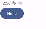
class TestActivity : ComponentActivity() {
    override fun onCreate(savedInstanceState: Bundle?) {
        super.onCreate(savedInstanceState)
        setContent {
            Text("Hello World")
        }
    }
}
组合优于继承
传统的View体系中,Button是继承自TextView,这意味着它继承了 TextView 的所有功能,但其中一些功能可能对 Button 并不适用
并且如果TextView 的设计发生变化,可能会影响到 Button 的行为,这造成了设计上的耦合
在Compose中,按钮被设计为具有点击事件的组件(查看源码,onClick和content没有默认值,需要实现)
@Composable
fun Button(
    onClick: () -> Unit,
    modifier: Modifier = Modifier,
    enabled: Boolean = true,
    shape: Shape = ButtonDefaults.shape,
    colors: ButtonColors = ButtonDefaults.buttonColors(),
    elevation: ButtonElevation? = ButtonDefaults.buttonElevation(),
    border: BorderStroke? = null,
    contentPadding: PaddingValues = ButtonDefaults.ContentPadding,
    interactionSource: MutableInteractionSource = remember { MutableInteractionSource() },
    content: @Composable RowScope.() -> Unit
) {
    ...
}
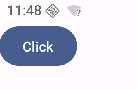
如果想要显示文本,不是通过使用text之类的属性,而是通过content参数来显示文本
Button(onClick = { /*TODO*/ }) {
    Text(text = "Click")
}
另外,Text默认是不可以复制文字的,想要复制文字,需要使用SelectionContainer包装
SelectionContainer(modifier = Modifier.padding(20.dp)) {
    Text("Hello")
}
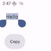
这些设计使得组件的职责更加单一,也不会出现可以复制文字的按钮,这也是为什么组合优于继承
Compose和View互操作
Compose中使用View
需要添加依赖
implementation("androidx.compose.ui:ui-viewbinding:1.7.8")
定义xml布局
<?xml version="1.0" encoding="utf-8"?>
<LinearLayout xmlns:android="http://schemas.android.com/apk/res/android"
    android:orientation="vertical"
    android:layout_width="match_parent"
    android:layout_height="match_parent">

    <Button
        android:id="@+id/btn"
        android:layout_width="wrap_content"
        android:layout_height="wrap_content"
        android:text="Click"/>

</LinearLayout>
定义Compose组件,使用AndroidViewBinding实现添加View
@Composable
fun UseXmlLayout() {
    AndroidViewBinding(TestLayoutBinding::inflate) {
        btn.setOnClickListener {
            Log.d("yimin", "Clicked")
        }
    }
}
View中使用Compose
定义xml布局,使用ComposeView作为桥梁
<?xml version="1.0" encoding="utf-8"?>
<LinearLayout xmlns:android="http://schemas.android.com/apk/res/android"
    xmlns:app="http://schemas.android.com/apk/res-auto"
    xmlns:tools="http://schemas.android.com/tools"
    android:id="@+id/main"
    android:orientation="vertical"
    android:layout_width="match_parent"
    android:layout_height="match_parent"
    tools:context=".MainActivity2">

    <androidx.compose.ui.platform.ComposeView
        android:id="@+id/compose_view"
        android:layout_width="match_parent"
        android:layout_height="match_parent" />

</LinearLayout>
在Activity中获取ComposeView,通过setContent使用Compose组件
class MainActivity2 : AppCompatActivity() {
    override fun onCreate(savedInstanceState: Bundle?) {
        super.onCreate(savedInstanceState)
        setContentView(R.layout.activity_main2)
        // ...
        findViewById<ComposeView>(R.id.compose_view).setContent {
            androidx.compose.material3.Text("Hello World")
        }
    }
}
总结
- Compose 中使用 View, 借助 AndroidViewBinding
- View 中使用 Compose,借助 ComposeView
主题
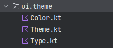
创建Compose项目,会自动生成一个文件夹:ui.theme,里面有三个文件:Color.kt,Type.kt和Theme.kt,其中Color.kt定义了颜色,Type.kt定义了字体,Theme.kt定义了主题
自动生成的主题如下
@Composable
fun MyComposeTheme(
    darkTheme: Boolean = isSystemInDarkTheme(),
    // Dynamic color is available on Android 12+
    dynamicColor: Boolean = true,
    content: @Composable () -> Unit
) {
    val colorScheme = when {
        dynamicColor && Build.VERSION.SDK_INT >= Build.VERSION_CODES.S -> {
            val context = LocalContext.current
            if (darkTheme) dynamicDarkColorScheme(context) else dynamicLightColorScheme(context)
        }

        darkTheme -> DarkColorScheme
        else -> LightColorScheme
    }

    MaterialTheme(
        colorScheme = colorScheme,
        typography = Typography,
        content = content
    )
}
- 安卓12及以上添加了动态配色功能,会使用dynamicColorScheme
- 当系统处于暗色模式时,会使用DarkColorScheme
- 当系统处于亮色模式时,会使用LightColorScheme
其中DarkColorScheme和LightColorScheme我们可以自定义,如果重写了颜色则会使用自定义的颜色,否则会使用系统默认的颜色
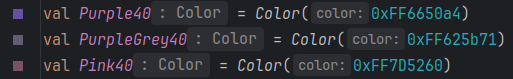
private val LightColorScheme = lightColorScheme(
    // 自定义
    primary = Purple40,
    secondary = PurpleGrey40,
    tertiary = Pink40,
    primaryContainer = Purple40

    /* Other default colors to override
    background = Color(0xFFFFFBFE),
    surface = Color(0xFFFFFBFE),
    onPrimary = Color.White,
    onSecondary = Color.White,
    onTertiary = Color.White,
    onBackground = Color(0xFF1C1B1F),
    onSurface = Color(0xFF1C1B1F),
    */
)
所有的颜色都有一个对应的onXXX,比如primary和onPrimary
- primary为主要颜色,比如按钮的背景色
- onPrimary为在primary颜色上显示的内容的颜色,比如按钮上的文本颜色
主题同样是一个组件,一般在setContent的顶层调用
class TestActivity : ComponentActivity() {
    override fun onCreate(savedInstanceState: Bundle?) {
        super.onCreate(savedInstanceState)
        enableEdgeToEdge()
        setContent {
            MyComposeTheme { // 应用自定义的主题
                Scaffold { // Scaffold和Column在这里的作用是为了配合enableEdgeToEdge(),让内容避开状态栏和导航栏
                    Column(modifier = Modifier.padding(it)) {
                        Button(onClick = {}) {
                            Text("Hello")
                        }
                    }
                }
            }
        }
    }
}
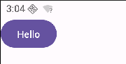
此时并没有使用自定义的颜色,因为当前系统支持动态配色
如果把动态配色代码删除,就能看到效果了
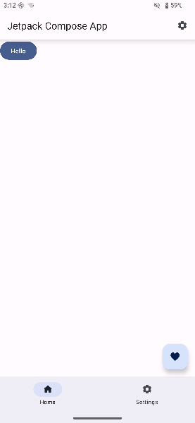
Scaffold
以上测试主题时,使用了Scaffold(脚手架),这个组件可以很方便地创建一个具有顶部导航栏、底部导航栏、悬浮按钮等样式的页面
MyComposeTheme {
    Scaffold(
        modifier = Modifier.fillMaxSize(),
        topBar = {
            TopAppBar(
                title = { Text("Jetpack Compose App") },
                modifier = Modifier.shadow(10.dp), // 阴影
                colors = TopAppBarDefaults.topAppBarColors(
                    // containerColor = Purple80
                ),// 背景色
                actions = {
                    IconButton(onClick = { /* TODO: handle action */ }) {
                        Icon(Icons.Default.Settings, contentDescription = "Settings")
                    }
                }
            )
        },
        bottomBar = {
            // BottomAppBar {
            //     Text("Bottom Bar Content")
            // }
            // 底部导航栏
            NavigationBar {
                // Tab
                NavigationBarItem(
                    selected = true,
                    onClick = { },
                    icon = { Icon(Icons.Default.Home, contentDescription = null) },
                    label = { Text("Home") }
                )
                // Tab
                NavigationBarItem(
                    selected = false,
                    onClick = { },
                    icon = { Icon(Icons.Default.Settings, contentDescription = null) },
                    label = { Text("Settings") }
                )
            }
        },
        floatingActionButton = { // 右下角的悬浮按钮
            FloatingActionButton(onClick = { /*do something*/ }) {
                Icon(
                    Icons.Filled.Favorite,
                    contentDescription = "Localized description"
                )
            }
        }
    ) { innerPadding ->
        Column(
            modifier = Modifier.padding(innerPadding),
        ) {
            Button(onClick = {}) {
                Text("Hello")
            }
        }

    }
}
布局
Clonum
相当于纵向的LinearLayout
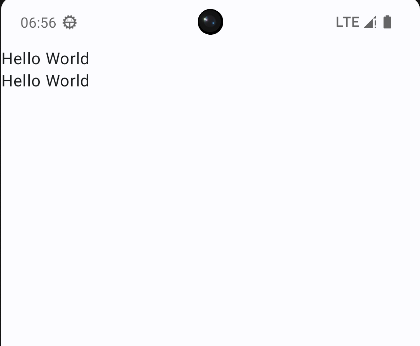
@Composable
fun ColumnLayout() {
    Column {
        Text("Hello World")
        Text("Hello World")
    }
}
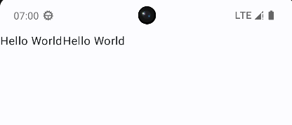
Row
相当于横向的LinearLayout
@Composable
fun RowLayout(){
    Row {
        Text("Hello World")
        Text("Hello World")
    }
}
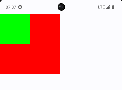
Box
相当于FragmentLayout,组件会叠加在一起
modifier用来修改组件的的尺寸、外观或添加交互(如点击事件),比如这里用来修改了Box的宽度,背景颜色
@Composable
fun BoxLayout() {
    Box {
        Box(
            modifier = Modifier
                .width(200.dp)
                .aspectRatio(1f) // 保持宽高比为1:1
                .background(color = Color.Red)
        ) {
        }
        Box(modifier = Modifier
            .width(100.dp)
            .aspectRatio(1f)
            .background(Color.Green)) {
        }
    }
}
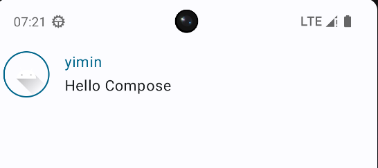
案例
其中用到的组件
- Image
- painterResource:加载资源图片
- contentDescription:用于无障碍
- Spacer:空白组件,用于填充空间
@Composable
fun MessageCard(msg: Message){
    Row(
        modifier = Modifier.padding(all = 8.dp) // 添加 padding
    ) {
        Image(
            painterResource(id = R.drawable.ic_launcher_foreground),
            contentDescription = "profile picture", // 无障碍
            modifier = Modifier
                .size(50.dp) // 图片大小
                .clip(RoundedCornerShape(20)) // 剪裁圆角
                .border(1.5.dp, MaterialTheme.colorScheme.primary, shape = CircleShape) // 添加边框
        )
        Spacer(modifier = Modifier.padding(horizontal = 8.dp)) // 用于填充空间
        Column {
            Text(
                text = msg.author,
                color = MaterialTheme.colorScheme.primary
            )
            Spacer(modifier = Modifier.padding(vertical = 2.dp))
            Text(
                text = msg.body
            )
        }
    }
}
data class Message(val author: String, val body: String)
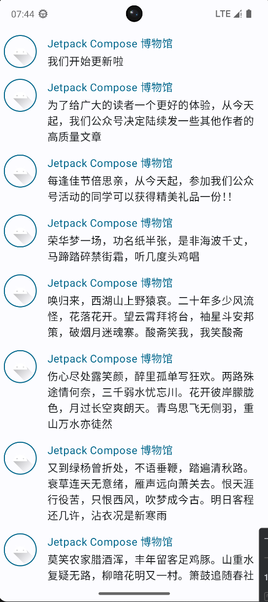
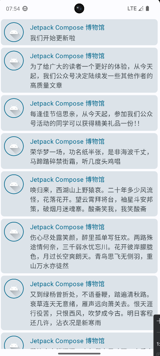
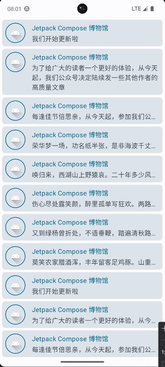
列表 LazyColumn
列表分为可滚动列表和不可滚动列表,不可滚动列表使用Column,可滚动列表使用LazyColumn
LazyColumn只会加载屏幕上可见的项目,而不是一次性加载所有项。使用 items 函数来显示列表中的每一项。
@Composable
fun MessageCardList(messages: List<Message>) {
    LazyColumn {
        items(messages.size) {
            MessageCard(msg = messages[it])
        }
    }
}
object MsgData {
    private const val author = "Jetpack Compose 博物馆"
    val messages = listOf(
        Message(author, "我们开始更新啦"),
        Message(
            author,
            "为了给广大的读者一个更好的体验,从今天起,我们公众号决定陆续发一些其他作者的高质量文章"
        ),
        Message(author, "每逢佳节倍思亲,从今天起,参加我们公众号活动的同学可以获得精美礼品一份!!"),
        Message(author, "荣华梦一场,功名纸半张,是非海波千丈,马蹄踏碎禁街霜,听几度头鸡唱"),
        Message(
            author,
            "唤归来,西湖山上野猿哀。二十年多少风流怪,花落花开。望云霄拜将台,袖星斗安邦策,破烟月迷魂寨。酸斋笑我,我笑酸斋"
        ),
        Message(
            author,
            "伤心尽处露笑颜,醉里孤单写狂欢。两路殊途情何奈,三千弱水忧忘川。花开彼岸朦胧色,月过长空爽朗天。青鸟思飞无侧羽,重山万水亦徒然"
        ),
        Message(
            author,
            "又到绿杨曾折处,不语垂鞭,踏遍清秋路。衰草连天无意绪,雁声远向萧关去。恨天涯行役苦,只恨西风,吹梦成今古。明日客程还几许,沾衣况是新寒雨"
        ),
        Message(
            author,
            "莫笑农家腊酒浑,丰年留客足鸡豚。山重水复疑无路,柳暗花明又一村。箫鼓追随春社近,衣冠简朴古风存。从今若许闲乘月,拄杖无时夜叩门"
        )
    ).run {
        val mList = this.toMutableList()
        mList.addAll(this)
        mList
    }
}
Card
可以使用Card组件进一步封装,实现卡片效果
@Composable
fun MessageCardWrapper(msg: Message) {
    Card(
        shape = RoundedCornerShape(8.dp), // 圆角
        modifier = Modifier
            .fillMaxWidth() // 宽度填满
            .padding(horizontal = 6.dp, vertical = 3.dp), // 内边距
        elevation =CardDefaults.cardElevation(
            // defaultElevation = 5.dp,
        ) // 设置阴影
    ) {
        MessageCard(msg)
    }
}
@Composable
fun MessageCardList(messages: List<Message>) {
    LazyColumn {
        items(messages.size) {
            MessageCardWrapper(msg = messages[it])
        }
    }
}
要实现卡片内容默认只显示一行,当点击时展开,并且带有动画效果
- 每个card都需要持有一个状态,判断是否展开
- 给最外层的Row添加点击事件,点击时改变状态
- 使用maxLines属性控制文本显示的行数
- 使用overflow属性控制文本溢出时的显示方式
- 使用animateContentSize实现展开动画
@Composable
fun MessageCard(msg: Message) {

    var isExpanded by remember { mutableStateOf(false) } // 创建一个能够检测卡片是否被展开的变量

    Row(
        modifier = Modifier
            .padding(all = 8.dp) // 在我们的 Card 周围添加 padding
            .clickable { isExpanded = !isExpanded }
    ) {
        Image(
            painterResource(id = R.drawable.ic_launcher_foreground),
            contentDescription = "profile picture", // 无障碍
            modifier = Modifier
                .size(50.dp)
                .clip(RoundedCornerShape(20)) // 剪裁圆角
                .border(1.5.dp, MaterialTheme.colorScheme.primary, shape = CircleShape) // 添加边框
        )
        Spacer(modifier = Modifier.padding(horizontal = 8.dp)) // 用于填充空间
        Column {
            Text(
                text = msg.author,
                color = MaterialTheme.colorScheme.primary
            )
            Spacer(modifier = Modifier.padding(vertical = 2.dp))
            Text(
                text = msg.body,
                maxLines = if (isExpanded) Int.MAX_VALUE else 1, // 最大行
                overflow = TextOverflow.Ellipsis,
                modifier = Modifier.animateContentSize() // 动画
            )
        }
    }
}
这里用到了remember函数,它能够记住一个可组合项(组件)的状态,即使可组合项被重新组合(渲染),它也会保持状态不变。通常配合mutableStateOf函数一起使用,构造状态变量。
重组
重组指的是当Compose可组合项的状态发生变化时,Compose会重新计算并重新渲染该可组合项,这个过程称为重组。
@Composable
fun CounterExample() {
    // 定义一个可变状态,初始值为0
    var count by remember { mutableIntStateOf(0)  }

    Column {
        // 显示当前计数值
        Text("Clicked $count times")

        // 当点击时增加计数器的值
        Text(
            text = "点击这里",
            modifier = Modifier.clickable {
                count++
            }
        )
    }
}
在这个例子中,定义了一个可变状态count,初始值为0。当点击文本时,count的值会增加1,这会触发CounterExample的重组。
因为第一个Text组件依赖了count,所以会重新渲染,显示新的count值。
状态
状态也就是数据,Compose组件根据状态显示UI,状态变化更新UI。
在View体系中,要实现一个计数器,很容易写出以下代码
val textView = findViewById<TextView>(R.id.tv)
val btnInc = findViewById<Button>(R.id.btn_inc)
val btnDec = findViewById<Button>(R.id.btn_dec)

btnInc.setOnClickListener {
    textView.text = (textView.text.toString().toInt() + 1).toString()
}

btnDec.setOnClickListener {
    textView.text = (textView.text.toString().toInt() - 1).toString()
}
但是存在一个问题,逻辑和UI高度耦合
于是后面出现了ViewModel,用ViewModel优化上面的代码
class CountViewModel: ViewModel() {
    // 修改私有可变的Flow
    private var _count: MutableStateFlow<Int> = MutableStateFlow(0)
    // 暴露不可变的Flow
    val count: StateFlow<Int> get() = _count

    fun increase() {
        _count.value++
    }

    fun decrease() {
        _count.value--
    }
}
class MainActivity2 : AppCompatActivity() {

    private val countViewModel by viewModels<CountViewModel>()

    override fun onCreate(savedInstanceState: Bundle?) {
        super.onCreate(savedInstanceState)
        enableEdgeToEdge()
        setContentView(R.layout.activity_main2)

        // ...

        btnInc.setOnClickListener {
            countViewModel.increase()
        }

        btnDec.setOnClickListener {
            countViewModel.decrease()
        }

        lifecycleScope.launch {
            repeatOnLifecycle(Lifecycle.State.STARTED) {
                countViewModel.count.collect {
                    textView.text = it.toString()
                }
            }
        }

    }
}
此时逻辑被放到了ViewMode中,相应地,数据也被放到了ViewModel中,这本质上是一种状态提升,用来解耦。
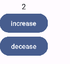
按照这个思路,实现Compose版本的计数器,可以得到以下实现:
@Composable
fun Counter() {

    Column(horizontalAlignment = Alignment.CenterHorizontally) {
        var count = 0

        Log.d(TAG, "into Counter => ${count}")

        Text(text = "$count")
        Button(onClick = {
            count++
            Log.d(TAG, "count++ => ${count}")
        }) {
            Text(text = "increase")
        }
        Button(onClick = {
            count--
            Log.d(TAG, "count-- => ${count}")
        }) {
            Text(text = "decease")
        }
    }
}
但是点击并没有效果,查看日志,点击事件是生效的,但是没有触发重组(只有一次into Counter日志)
所以原因很显然就是普通变量的变化不能被Compose感知,需要将其包装为状态变量
15:30:53.524  D  into Counter => 0
15:30:58.033  D  count++ => 1
15:30:59.402  D  count++ => 2
15:31:00.713  D  count++ => 3
15:31:02.060  D  count++ => 4
15:32:52.307  D  count-- => 3
类似于StateFlow 或者 LiveData 将变量包装成一个可观察类型的对象,Compose提供了mutableStateOf将一个普通变量包装为状态变量
这样当这个变量发生变化时,使用了这个变量的组件都会自动更新。
fun Counter() {

    Column(horizontalAlignment = Alignment.CenterHorizontally) {
        val count = mutableStateOf(0)

        Log.d(TAG, "into Counter => ${count}")

        Text(text = "${count.value}")
        Button(onClick = {
            count.value++
            Log.d(TAG, "count++ => ${count.value}")
        }) {
            Text(text = "increase")
        }
        Button(onClick = {
            count.value--
            Log.d(TAG, "count-- => ${count.value}")
        }) {
            Text(text = "decease")
        }
    }
}
这时点击按钮,界面依然不会更新
但是看日志确实是发生重组了,每次点按钮都会有into Counter日志,只是count的值每次都重置了
12:56:52.312  D  into Counter => 0
12:56:54.825  D  count++ => 1
12:56:54.829  D  into Counter => 0
12:56:56.269  D  count++ => 1
12:56:56.273  D  into Counter => 0
12:56:57.742  D  count-- => -1
12:56:57.746  D  into Counter => 0
所以还要解决如何让count的值不重置的问题,这需要用到另一个方法:remember
remember的作用是对状态变量进行缓存,在后续发生重组时,不会重新初始化
val count = remember { mutableStateOf(0) }
到此就实现了点击按钮改变数字的效果
以上写法,可以进一步使用kotlin的委托写法简化
最终版本如下
@Composable
fun Counter() {

    Column(horizontalAlignment = Alignment.CenterHorizontally) {
        var count by remember { mutableStateOf(0) }

        Text(text = "${count}")
        Button(onClick = {
            count++
        }) {
            Text(text = "increase")
        }
        Button(onClick = {
            count--
        }) {
            Text(text = "decease")
        }
    }
}
总结一下,Compose中的状态变量,使用remember和mutableStateOf定义
案例
- 想要将一个Image显示为圆形,一种方式是使用Surface组件包装,并设置其shape属性为CircleShape,另外也能控制大小,颜色等
- 将Column中的组件居中显示,可以使用Modifier.align(Alignment.CenterVertically)属性
- 使用CompositionLocalProvider可以修改作用域内的组件样式,实现隐式传参的效果
@Composable
fun PhotoCard() {
    Row(
        modifier = Modifier
            .clickable {} // 点击水波纹效果
            .padding(10.dp)
    ) {
        Surface( // 包装Image,使其为圆形
            modifier = Modifier.size(50.dp),
            shape = CircleShape,
            // 修改透明度,默认onSurface为黑色,这里设置为0.2f,显示效果为灰色
            color = MaterialTheme.colorScheme.onSurface.copy(alpha = 0.2f)
        ) {
            Image(
                painter = painterResource(id = com.example.mycompose.R.drawable.ic_launcher_foreground),
                contentDescription = null
            )
        }

        Spacer(modifier = Modifier.padding(horizontal = 10.dp))

        Column(
            // 内容垂直居中显示
            modifier = Modifier.align(Alignment.CenterVertically),
        ) {

            // 隐式传参
            // 将范围内的文本样式修改为粗体
            CompositionLocalProvider(LocalTextStyle provides MaterialTheme.typography.bodyMedium.copy(fontWeight = FontWeight.Bold)) {
                Text(text = "Alfred Sisley")

                // 隐式传参
                // 将范围内的文本颜色修改为onSurfaceVariant,透明度为0.6
                CompositionLocalProvider(LocalContentColor provides MaterialTheme.colorScheme.onSurfaceVariant.copy(alpha = 0.6f)) {
                    Text(
                        text = "3 minutes ago",
                        // style = MaterialTheme.typography.bodySmall
                    )
                }
            }
        }
    }
}

CompositionLocalProvider的实现原理,和修改全局变量类似
提供一个全局变量作为默认值
当需要修改默认值时,通过provider函数传入新的值修改全局变量,并使用try-finally在函数结束后恢复原来的值,这就实现了只在函数作用域内修改默认值,而不会影响其他地方
var color = "Red"

fun provider(value: String, content:()-> Unit) {
    val oldColor = color
    color = value
    try {
        content()
    } finally {
        color = oldColor
    }
}

fun Text(){
    println("Color is $color")
}

fun main(){
    Text()
    provider("Blue") {
        Text()
        Text()
    }
    Text()
}
Color is Red
Color is Blue
Color is Blue
Color is Red
基础组件
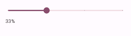
Slider
滑竿组件,可以用作进度条,音量、亮度调整等场景
@Composable
fun SliderDemo() {
    var process by remember {
        mutableFloatStateOf(0f)
    }
    Column(
        modifier = Modifier.padding(vertical = 10.dp, horizontal = 20.dp)
    ) {
        Slider(
            value = process,
            onValueChange = { process = it },
            steps = 2 // 分段,段数为steps+1
        )
        Text(text = (process * 100).roundToInt().toString() + "%")
    }
}
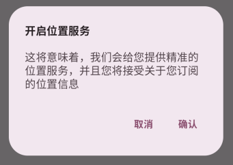
AlertDialog
一个 Material Design 风格的对话框
和传统对话框最大的区别是,需要通过状态控制显示和隐藏,而不是show,dismiss方法
@Composable
fun AlertDialogDemo(openDialog: MutableState<Boolean>){

    val ctx = LocalContext.current

    if (openDialog.value) { // 需要靠状态控制显示
        AlertDialog(
            onDismissRequest = { // 点击Dialog以外的区域
                Toast.makeText(ctx, "场外不可操作", Toast.LENGTH_SHORT).show()
            },
            title = { // 标题
                Text(
                    text = "开启位置服务",
                    fontWeight = FontWeight.W700,
                    style = MaterialTheme.typography.titleMedium
                )
            },
            text = { // 正文
                Text(
                    text = "这将意味着,我们会给您提供精准的位置服务,并且您将接受关于您订阅的位置信息",
                    fontSize = 16.sp
                )
            },
            confirmButton = { // 确定
                TextButton(
                    onClick = {
                        Toast.makeText(ctx, "Confirm", Toast.LENGTH_SHORT).show()
                        openDialog.value = false
                    },
                ) {
                    Text(
                        "确认",
                        fontWeight = FontWeight.W700,
                        style = MaterialTheme.typography.bodyMedium
                    )
                }
            },
            dismissButton = { //取消
                TextButton(
                    onClick = {
                        Toast.makeText(ctx, "Dismiss", Toast.LENGTH_SHORT).show()
                        openDialog.value = false
                    }
                ) {
                    Text(
                        "取消",
                        fontWeight = FontWeight.W700,
                        style = MaterialTheme.typography.bodyMedium
                    )
                }
            }
        )
    }
}
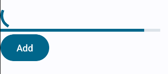
ProgressIndicator
进度条组件,分为圆形和线性两种
不设置值时,默认为无限循环
@Composable
fun ProcessDemo(){
    Column {
        CircularProgressIndicator() // 圆形进度条
        LinearProgressIndicator() // 线性进度条
    }
}
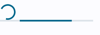
通过process属性可以控制进度条进度
这里的Button用于增加进度
@Composable
fun ProcessDemo() {

    var process by remember { mutableFloatStateOf(0f) }
    // 相比直接使用process,会有动画效果
    val animatedProcess by animateFloatAsState(
        targetValue = process,
    )

    Column {
        CircularProgressIndicator() // 圆形进度条
        LinearProgressIndicator(progress = animatedProcess) // 线性进度条

        Button(onClick = {
            if (process < 1f) { // 进度小于1f,则加0.1f
                process += 0.1f
            }
        }) {
            Text("Add")
        }
    }
}
Modifier
作用域
Compose基于kotlin的DSL,通常组件的最后一个参数为content,用于放置子组件
如Column
@Composable
inline fun Column(
    modifier: Modifier = Modifier,
    verticalArrangement: Arrangement.Vertical = Arrangement.Top,
    horizontalAlignment: Alignment.Horizontal = Alignment.Start,
    content: @Composable ColumnScope.() -> Unit
) {...}
并且,content会指定作用域,这里即ColumnScope,这就表示content中可以调用任何ColumnScope中的方法
@LayoutScopeMarker
@Immutable
@JvmDefaultWithCompatibility
interface ColumnScope {
    @Stable
    fun Modifier.weight(
        weight: Float,
        fill: Boolean = true
    ): Modifier

    @Stable
    fun Modifier.align(alignment: Alignment.Horizontal): Modifier

    @Stable
    fun Modifier.alignBy(alignmentLine: VerticalAlignmentLine): Modifier

    @Stable
    fun Modifier.alignBy(alignmentLineBlock: (Measured) -> Int): Modifier
}
Box也有类似的作用域:BoxScope
@Composable
inline fun Box(
    modifier: Modifier = Modifier,
    contentAlignment: Alignment = Alignment.TopStart,
    propagateMinConstraints: Boolean = false,
    content: @Composable BoxScope.() -> Unit
) {...}
@LayoutScopeMarker
@Immutable
interface BoxScope {

    @Stable
    fun Modifier.align(alignment: Alignment): Modifier


    @Stable
    fun Modifier.matchParentSize(): Modifier
}
可以看到BoxScope和ColumnScope中都有Modifier.align方法(参数不一样)
当在Column中嵌套使用Box时,如果需要用到Modifier.align,是不是意味着以上的两个作用域的Modifier.align都可以使用呢?
@Composable
fun ScopeDemo() {
    Column(horizontalAlignment = Alignment.CenterHorizontally) {
        Text("Hello1")
        Text("Hello2")

        Box(modifier = Modifier
            .size(100.dp)
            .background(Color.Cyan)) {
            Text("Hello3", modifier = Modifier.align(Alignment.TopStart)) // 这是BoxScope中的Modifier.align
            Text("Hello4", modifier = Modifier.align(Alignment.BottomEnd))
        }
    }
}
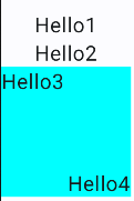
虽然IDE会同时提示两个方法,但是最终只能使用BoxScope中的Modifier.align,使用ColumnScope中的Modifier.align,IDE会报错编译不通过
原因是ColumnScope和BoxScope都继使用@LayoutScopeMarker修饰,@LayoutScopeMarker使用了@DslMarker注解,这个注解的作用就是为了在DSL中防止跨级访问
也就是说,在Box的作用域中,只能使用BoxScope中的Modifier.align,而不能跨级访问上一级ColumnScope中的Modifier.align,这就避免了跨级访问带来的混乱,保证类型安全。
关于@DslMarker的用法,可以通过以下例子理解
@MyAnnotation
class AScope {
    fun visitA(){}
}

@MyAnnotation
class Bscope {
    fun visitB(){}
}

fun funA(scope: AScope.()-> Unit) {
    scope(AScope())
}

fun funB(scope: Bscope.()-> Unit) {
    scope(Bscope())
}

// 自定义注解,使用 @DslMarker 标记
// 之后用此注解标注的类,在作用域中不能使用其他作用域的方法
@DslMarker
@LayoutScopeMarker
annotation class MyAnnotation

fun main(){
    funA {
        visitA()
        funB {
            // visitA() 报错,不能使用上一级作用域的方法
            visitB()
        }
    }
}
Compose组件渲染
- 组合:执行@Composable函数,生成LayoutNode
- 布局:LayoutNode执行measure、layout,确定位置和大小
- 绘制:LayoutNode执行draw,绘制内容
组合
在setContent的时候,执行代码块中所有的Composable函数体,生成LayoutNode视图树
如果Composable依赖的状态发生了变化,会触发当前Composable重新进行组合阶段,并且子Composable也会重新调用
但是子Composable不一定会重组,因为Compose有智能重组机制,只有参数变化时,才会重组,否则会复用之前的LayoutNode
所以通过重组,可以自动维护LayoutNode视图树,保持UI最新
布局
LayoutNode通过父LayoutNode的约束(constraints)进行自我测量(类似MeasureSpec),确定自身大小
可以定制组件的布局阶段实现自己的需求,比如要实现Text的Baseline到父布局顶部的距离,使用padding是无法实现的,这时可以尝试自定义布局阶段来实现
TODO Baseline图片示例
自定义布局通过Modifier.layout实现。使用layout时,传入两个回调参数,分别为measurable和constraints
- measurable:表示被测量的LayoutNode
- constraints:表示父LayoutNode的约束
定义一个Modifier的扩展函数BaselineToTop,表示Baseline到父布局顶部的距离
fun Modifier.firstBaselineToTop(firstBaselineToTop: Dp) =
    Modifier.layout { measurable, constraints ->
        // 测量后,可摆放,可以获取到宽高
        val placeable = measurable.measure(constraints)
        // 获取第一个基线
        val firstBaseline = placeable.get(FirstBaseline)
        // 计算在想要的firstBaselineToTop前提下,组件的y坐标
        val placeableY = firstBaselineToTop.roundToPx() - firstBaseline
        // 必须调用MeasureScope中的layout,否则Modifier.layout会报错
        // 重新定义组件的宽高
        layout(width = placeable.width, height = placeableY + placeable.height){
            // 重新定义组件的x,y坐标
            placeable.placeRelative(0, placeableY)
        }

    }
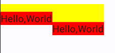
使用时可以和padding对比
Row {
    Box (modifier = Modifier.background(Color.Yellow)){
        Text(
            text = "Hello,World",
            modifier = Modifier
                .firstBaselineToTop(30.dp) // Baseline到父布局顶部的距离
                .background(Color.Red)
        )
    }

    Box (modifier = Modifier.background(Color.Yellow)){
        Text(
            text = "Hello,World",
            modifier = Modifier
                .padding(top = 30.dp)  // 自己顶部到父布局顶部的距离
                .background(Color.Red)
        )
    }
}
如果要自定义布局,比如自己实现一个Column组件,需要使用Layout实现
Layout本身也是一个@Composable函数,所以可以在自定义的@Composable函数中使用
和定义Modifier扩展函数时使用的layout很类似,layout是针对普通组件使用的,而Layout是针对布局使用的,回调参数中是一个子LayoutNode的集合
@Composable
fun MyColumn(
    modifier: Modifier = Modifier,
    content: @Composable () -> Unit
) {
    // 针对布局使用,回调参数中是一个子LayoutNode的集合
    Layout(modifier = modifier, content = content) {measurableList, constraints ->
        // 遍历测量子LayoutNode
        val placeableList = measurableList.map {
            it.measure(constraints)
        }

        var y = 0

        // 布局的宽高取父LayoutNode约束的最大值即可
        // 这里主要关注的是子LayoutNode如何摆放
        layout(constraints.maxWidth,constraints.maxHeight) {
            // 排放位置
            placeableList.forEach {
                it.placeRelative(x = 0, y = y)
                // 下一个子LayoutNode的y坐标,一定是要加上当前子LayoutNode的高度,才能实现Column效果
                y += it.height
            }
        }
    }
}
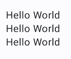
在使用时可以像Column那样摆放组件,同时也能修改Modifier
Column(
    modifier = Modifier.padding(innerPadding),
) {
    MyColumn(modifier = Modifier.padding(10.dp)) {
        Text("Hello World")
        Text("Hello World")
        Text("Hello World")
    }
}
Compose中的每个LayoutNode是不允许被多次测量的,但有些场景确实需要,比如以下这个场景:
@Composable
fun TwoText() {
    Row(
        verticalAlignment = Alignment.CenterVertically,
    ) {
        Text("Hello")
        Divider(
            color = Color.Black,
            modifier = Modifier
                .width(1.dp)
                .fillMaxHeight()
        )
        Text(
            "World",
            style = LocalTextStyle.current.copy(fontSize = 30.sp)
        )
    }
}
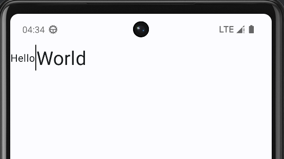
Row中放了两个文本和一个分割线,如果直接指定分割线的高度为fillMaxHeight(),会占用整个屏幕高度,因为测量和布局Divider时,并不知道这个高度应该为多少,就直接用了最大值
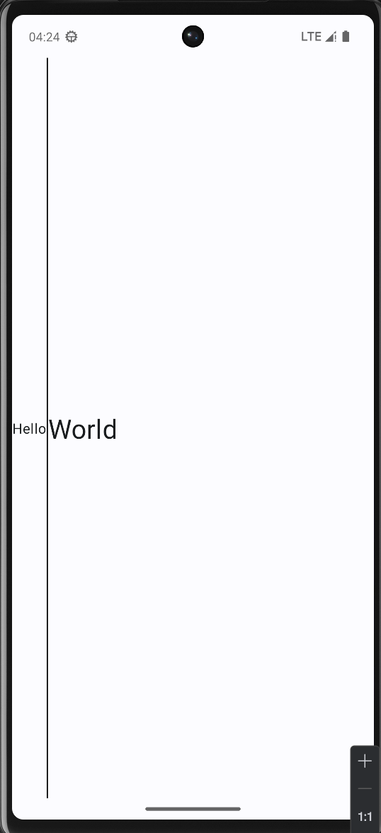
而现在希望的是分割线高度匹配两个文本的高度(取两者中的较大值),所以需要提前测量两个文本的高度,确定Row的高度,之后在使用fillMaxHeight()时,就是想要的效果了
为了实现这个需求,要用到固有特性测量Intrinsic,它可以预先测量所有子组件,确定自身的大小,并在正式测量阶段也会产生影响
对于内置的组件,大多已经实现了固有特性测量,比如上面使用的Row,只需要使用IntrinsicSize.Min或者IntrinsicSize.Max即可
现在修改代码,给Row添加固有特性测量,确定Row的高度
@Composable
fun TwoText() {
    Row(
        verticalAlignment = Alignment.CenterVertically,
        modifier = Modifier.height(IntrinsicSize.Min) // 添加固有特性测量
    ) {
        Text("Hello")
        Divider(
            color = Color.Black,
            modifier = Modifier
                .width(1.dp)
                .fillMaxHeight()
        )
        Text(
            "World",
            style = LocalTextStyle.current.copy(fontSize = 30.sp)
        )
    }
}
结果符合预期
绘制
TODO
动画
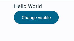
可见性动画AnimatedVisibility
通过visible属性控制content可见性,当content出现和消失时,会有过度动画效果
@Composable
fun AnimatedDemo() {
    var visible by remember {
        mutableStateOf(true)
    }
    Column {
        AnimatedVisibility(
            visible = visible,
            // 多种动画效果可以组合使用
            // 滑动进入,展开,缩放,淡入
            enter = slideInVertically() + expandVertically() + scaleIn()+ fadeIn(initialAlpha = 0.3f),
            exit = slideOutVertically() + shrinkVertically() + scaleOut() + fadeOut(),
        ) {
            Text("Hello World")
        }
        Button(onClick = { visible = !visible }) {
            Text("Change visible")
        }
    }
}
监听动画状态
AnimatedVisibility还有个重载的方法,可以通过MutableTransitionState监听动画状态,当当前状态和目标状态不同时,会触发动画执行
可以利用这个特性实现自动动画,如开屏动画之类
@Composable
fun AnimatedDemo() {

    var visibleState = remember {
        MutableTransitionState(false).apply {
            targetState = true
        }
    }

    Column {
        AnimatedVisibility(
            visibleState = visibleState,
            // 多种动画效果可以组合使用
            // 滑动进入,展开,缩放,淡入
            enter = slideInVertically() + expandVertically() + scaleIn() + fadeIn(initialAlpha = 0.3f),
            exit = slideOutVertically() + shrinkVertically() + scaleOut() + fadeOut(),
        ) {
            Text("Hello World")
        }
    }
}
自定义Enter/Exit动画
自定义动画使用transition,会和AnimatedVisibility动画同时进行
以下添加了一个背景色变化动画,当content出现时,背景色变为红色,消失时,背景色从红色变为绿色
@OptIn(ExperimentalAnimationApi::class)
@Composable
fun AnimatedDemo() {
    var visible by remember {
        mutableStateOf(true)
    }

    Column {
        AnimatedVisibility(
            visible = visible,
        ) {

            // 自定义动画
            // 需要在AnimatedVisibilityScope内使用
            val bg by transition.animateColor {
                if (it == EnterExitState.Visible) Color.Red else Color.Green
            }

            Box(modifier = Modifier.background(bg)) {
                Text("Hello World")
            }
        }
        Button(onClick = { visible = !visible }) {
            Text("Change visible")
        }
    }
}
AnimatedContent
AnimatedContent可以监听content的变化,当content变化时,会触发动画效果
需要注意的是,content中必须使用targetState,否则会报错
@OptIn(ExperimentalAnimationApi::class)
@Composable
fun AnimatedDemo() {

    var counter by remember {
        mutableStateOf(0)
    }

    Column {
        AnimatedContent(
            targetState = counter,
        ) {
            Text("Hello World ${it}") // 一定要使用targetState
        }
        Button(onClick = {counter++ }) {
            Text("Add")
        }
    }
}
默认的动画效果是淡入淡出,可以通过transitionSpec属性自定义动画效果
比如实现从下到上切换
@OptIn(ExperimentalAnimationApi::class)
@Composable
fun AnimatedDemo() {

    var counter by remember {
        mutableStateOf(0)
    }

    Column {
        AnimatedContent(
            targetState = counter,
            transitionSpec = {
                // 使用togetherWith组合Enter动画和Exit动画
                // 进场指定初始位置,出场指定结束位置
                // 这里实现的是从下到上切换的效果
                slideInVertically { height -> height } + fadeIn() togetherWith
                        slideOutVertically { height -> -height } + fadeOut()
            }
        ) {
            Text("Hello World ${it}")
        }
        Button(onClick = { counter++ }) {
            Text("Add")
        }
    }
}

类似的,也能实现从右到左切换
@OptIn(ExperimentalAnimationApi::class)
@Composable
fun AnimatedDemo() {

    var counter by remember {
        mutableStateOf(0)
    }

    Column {
        AnimatedContent(
            targetState = counter,
            transitionSpec = {
                // 这里实现的是从右到左切换的效果
                slideInHorizontally { width -> width } + fadeIn() togetherWith
                        slideOutHorizontally { width -> -width } + fadeOut()
            }
        ) {
            Text("Hello World ${it}")
        }
        Button(onClick = { counter++ }) {
            Text("Add")
        }
    }
}

使用SizeTranstion定义大小动画
当content的大小发生变化时,使用AnimatedContent也会有一个动画效果
@Composable
fun SizeTransitionDemo() {
    var isExpanded by remember { mutableStateOf(false) }

    Surface(
        color = MaterialTheme.colorScheme.primary,
        onClick = { isExpanded = !isExpanded },
        shape = RoundedCornerShape(16.dp),
    ) {
        AnimatedContent(
            targetState = isExpanded,
        ) {
            if (it) {
                Text(
                    text = "这是一个详细的展开内容区域,当组件尺寸变化时会触发 SizeTransform 动画。\n" +
                            "这是一个详细的展开内容区域,当组件尺寸变化时会触发 SizeTransform 动画。\n" +
                            "这是一个详细的展开内容区域,当组件尺寸变化时会触发 SizeTransform 动画。\n" +
                            "这是一个详细的展开内容区域,当组件尺寸变化时会触发 SizeTransform 动画。\n" +
                            "这是一个详细的展开内容区域,当组件尺寸变化时会触发 SizeTransform 动画。\n",
                    style = MaterialTheme.typography.bodyMedium,
                    modifier = Modifier.padding(16.dp)
                )
            } else {
                Text(
                    text = "点击展开/收缩",
                    style = MaterialTheme.typography.headlineSmall,
                    modifier = Modifier.padding(16.dp)
                )
            }
        }
    }
}

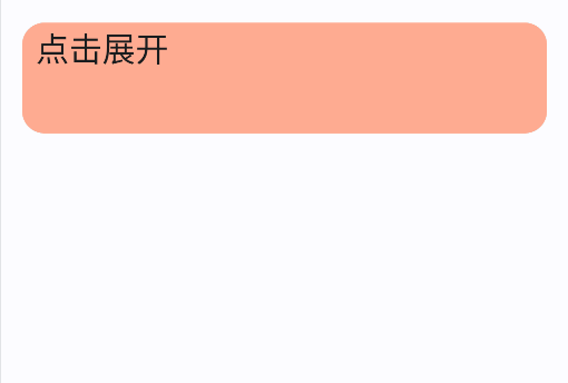
但有时候我们希望自定义大小变化动画,这时可以使用SizeTransition
@Composable
fun SizeTransitionDemo() {
    var isExpanded by remember { mutableStateOf(false) }

    Surface(
        color = MaterialTheme.colorScheme.primary,
        onClick = { isExpanded = !isExpanded },
        shape = RoundedCornerShape(16.dp),
    ) {
        AnimatedContent(
            targetState = isExpanded,
            transitionSpec = {
                fadeIn() togetherWith fadeOut() using
                        SizeTransform { initSize, targetSize ->
                    if (targetState) { // 展开时
                        // 关键帧,指定在某一个时间点的尺寸
                        // 持续时间为300ms
                        // 在150ms之前,高度保持不变,宽度逐渐变大
                        // 等宽度达到目标值时,高度再逐渐变大
                        keyframes {
                            IntSize(
                                targetSize.width,
                                initSize.height
                            ) at 150
                            durationMillis = 300
                        }
                    } else {
                        // 同理
                        keyframes {
                            IntSize(
                                initSize.width,
                                targetSize.height
                            ) at 150
                            durationMillis = 300
                        }
                    }
                }
            }
        ) {
            if (it) {
                Text(
                    text = "这是一个详细的展开内容区域,当组件尺寸变化时会触发 SizeTransform 动画。\n" +
                            "这是一个详细的展开内容区域,当组件尺寸变化时会触发 SizeTransform 动画。\n" +
                            "这是一个详细的展开内容区域,当组件尺寸变化时会触发 SizeTransform 动画。\n" +
                            "这是一个详细的展开内容区域,当组件尺寸变化时会触发 SizeTransform 动画。\n" +
                            "这是一个详细的展开内容区域,当组件尺寸变化时会触发 SizeTransform 动画。\n",
                    style = MaterialTheme.typography.bodyMedium,
                    modifier = Modifier.padding(16.dp)
                )
            } else {
                Text(
                    text = "点击展开/收缩",
                    style = MaterialTheme.typography.headlineSmall,
                    modifier = Modifier.padding(16.dp)
                )
            }
        }
    }
}
内容大小动画Modifier.animateContentSize
animateContentSize 是一个 Modifier方法,用于在组件内容尺寸变化时自动触发动画,开箱即用。在本文的MessageCardList中已经使用过它。
animateAsState
animateAsState 可以自动完成从当前值到目标值的过度计算,以animateColorAsState为例,targetValue表示目标值,animationSpec定义动画效果
@Composable
fun ColorAnimationDemo() {
var isGreenTheme by remember { mutableStateOf(true) }
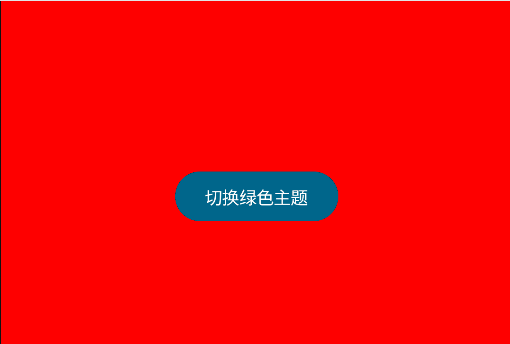
val backgroundColor by animateColorAsState(
targetValue = if (isGreenTheme) {
Color.Green
} else {
Color.Red
},
animationSpec = tween(
durationMillis = 1000, // 动画时长 1 秒
easing = FastOutSlowInEasing // 快速开始缓慢结束的效果
),
label = "background_color_animation"
)
Box(
modifier = Modifier
.fillMaxSize()
.background(backgroundColor)
) {
Button(
onClick = { isGreenTheme = !isGreenTheme },
modifier = Modifier
.align(Alignment.Center)
.padding(16.dp)
) {
Text(
text = if (isGreenTheme) "切换红色主题" else "切换绿色主题",
color = Color.White
)
}
}
}
多值动画Transition
animate*AsState 只能同时处理一个值,如果需要同时处理多个值,可以使用 updateTransition 函数,它接受一个踏入targetState,返回一个 Transition 对象,当targetState发生变化时,将执行其所有的子动画
Transition可以通过animateXXX添加子动画
例如,实现一个可以点击展开和收缩的卡片,在展开/收缩的时候,卡片的高度,颜色和卡片文字的左边距都会随之变化,并且带有过度动画效果
@Composable
fun ExpandableCard() {
    var expanded by remember { mutableStateOf(false) }

    // 过渡动画控制器
    val transition = updateTransition(targetState = expanded, label = "expandTransition")

    // 高度变化动画
    val cardHeight by transition.animateDp(
        transitionSpec = {
            if (targetState) {
                spring(stiffness = Spring.StiffnessLow) // 弹性动画
            } else {
                tween(durationMillis = 1000) // 持续时间为1000ms
            }
        }, label = "heightAnimation"
    ) { isExpanded ->
        if (isExpanded) 200.dp else 80.dp
    }

    // 颜色变化动画
    val cardColor by transition.animateColor(
        transitionSpec = { tween(800) },
        label = "colorAnimation"
    ) { isExpanded ->
        if (isExpanded) Color(0xFFB39DDB) else Color(0xFFFFAB91)
    }

    // 文字间距变化动画
    val textPadding by transition.animateDp(
        transitionSpec = {
            if (targetState) {
                spring(stiffness = Spring.StiffnessLow) // 弹性动画
            } else {
                tween(durationMillis = 1000) // 持续时间为1000ms
            }
        },
        label = "paddingAnimation"
    ) { isExpanded ->
        if (isExpanded) 100.dp else 10.dp
    }

    Column(
        modifier = Modifier
            .fillMaxWidth()
            .padding(16.dp)
    ) {
        Card(
            modifier = Modifier
                .fillMaxWidth()
                .height(cardHeight) // 使用带有动画的高度
                .clickable { expanded = !expanded },
            colors = CardDefaults.cardColors(containerColor = cardColor), // 使用带有动画的颜色
            shape = RoundedCornerShape(16.dp)
        ) {
            Text(
                text = if (expanded) "点击收起" else "点击展开",
                modifier = Modifier.padding(start = textPadding), // 使用带有动画的文字间距
                style = MaterialTheme.typography.headlineSmall
            )
        }
    }
}
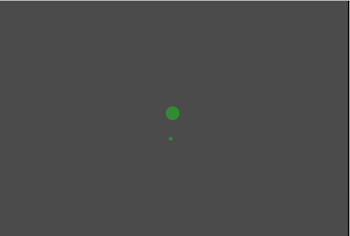
重复动画
通过rememberInfiniteTransition获取重复动画控制器,然后通过animateXXX添加子动画
重复动画会无限循环,通常需要指定两个值:initialValue和targetValue,分别表示初始值和目标值,当动画从初始值执行到目标值时,再根据设置的循环模式(RepeatMode)决定是回到初始值重复还是反过来执行
可以通过animationSpec参数设置动画效果
@Composable
fun InfiniteLoadingAnimation() {
    // 创建无限动画控制器
    val infiniteTransition = rememberInfiniteTransition(label = "infiniteLoader")

    // 无限动画会有两个值(initialValue,targetValue),在这两个值之间循环
    // 定义旋转动画(0°-360°无限循环)
    val rotation by infiniteTransition.animateFloat(
        initialValue = 0f,
        targetValue = 360f,
        animationSpec = infiniteRepeatable( // 无限循环的动画效果
            animation = tween(1500, easing = LinearEasing), // 1500ms内,线性(匀速)转动
            repeatMode = RepeatMode.Restart // 重复模式,Restart:从初始值开始
        ),
        label = "rotationAnimation"
    )

    // 定义透明度动画(脉冲效果)
    val alpha by infiniteTransition.animateFloat(
        initialValue = 0.3f,
        targetValue = 1f,
        animationSpec = infiniteRepeatable(
            // 关键帧,定义一个时间点内的动画效果
            animation = keyframes {
                durationMillis = 1000 // 一次动画时间为1s
                0f at 0 // 0s为0f
                1f at 1000 // 1s为1f
                // 即0-1s内由0f变为1f,后续设置重复模式为Reverse,表示1-2s内由1f变为0f
                // 这就实现了一个均匀消失和出现的动画效果
            },
            repeatMode = RepeatMode.Reverse // 重复模式,Reverse:反过来
        ),
        label = "alphaAnimation"
    )

    Box(
        modifier = Modifier
            .fillMaxSize()
            .background(Color.Black.copy(alpha = 0.7f)),
        contentAlignment = Alignment.Center
    ) {
        // 旋转的外圈
        CircularProgressIndicator(
            modifier = Modifier
                .size(64.dp)
                .rotate(rotation) // 带有动画的旋转
                .alpha(alpha), // 带有动画的透明度
            color = Color.Green,
            strokeWidth = 4.dp // 宽度
        )

        // 中心脉冲圆点
        Box(
            modifier = Modifier
                .size(16.dp)
                .alpha(alpha) // 带有动画的透明度
                .background(
                    color = Color.Green,
                    shape = CircleShape
                )
        )
    }
}
手势
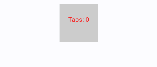
点击
简单的点击手势,通过Modifier.clickable实现
可以通过pointerInput实现监听更复杂的点击手势,例如长按、双击等
@Composable
fun PointerInputExample() {
    // 记录点击次数
    var tapCount by remember { mutableIntStateOf(0) }

    // 记录点击事件
    var str by remember { mutableStateOf("") }

    Box(
        modifier = Modifier
            .size(100.dp)
            .background(Color.LightGray)
            .clickable{}
            .pointerInput(Unit) { // 使用 Unit 表示不依赖任何 key,只初始化一次
                detectTapGestures(
                    onPress = {
                        // 按下还没抬起
                        str = "按下"
                    },
                    onDoubleTap = {
                        // 双击事件
                        tapCount += 2
                        str = "双击"
                    },
                    onTap = {
                        // 单击事件
                        tapCount += 1
                        str = "单击"
                    },
                    onLongPress = {
                        // 长按事件
                        str = "长按"
                    }
                )
            },
        contentAlignment = Alignment.Center,
    ) {
        Text(
            text = "Taps: $tapCount\n$str",
            color = Color.Red
        )
    }
}
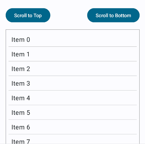
滑动
滑动用于显示列表场景,普通的Cloumn可以显示一个列表,但是默认情况下,列表无法滑动,需要通过Modifier.verticalScroll实现
@Composable
fun ScrollExample() {
    // 滚动状态
    val scrollState = rememberScrollState()
    // 协程作用域
    val scope = rememberCoroutineScope()

    Column(
        modifier = Modifier
            .fillMaxSize()
            .padding(16.dp)
    ) {
        // 控制滚动的按钮
        Row(
            modifier = Modifier
                .fillMaxWidth()
                .padding(bottom = 16.dp),
            horizontalArrangement = Arrangement.SpaceBetween // 两端对齐
        ) {
            Button(onClick = {
                // 滚动到顶部
                scope.launch {
                    scrollState.animateScrollTo(0)
                }
            }) {
                Text("Scroll to Top")
            }

            Button(onClick = {
                // 滚动到底部
                scope.launch {
                    scrollState.animateScrollTo(scrollState.maxValue)
                }
            }) {
                Text("Scroll to Bottom")
            }
        }

        // 可滚动内容区域
        Column(
            modifier = Modifier
                // 普通的Column可以通过添加滚动状态来实现滚动能力
                .verticalScroll(scrollState) // 绑定滚动状态
                .border(1.dp, Color.Gray)
                .padding(8.dp)
        ) {
            // 生成 50 个文本项作为滚动内容
            repeat(50) { index ->
                Text(
                    text = "Item $index",
                    modifier = Modifier
                        .padding(8.dp)
                        .fillMaxWidth(),
                    fontSize = 18.sp
                )
                Divider(color = Color.LightGray, thickness = 1.dp)
            }
        }
    }
}
拖动
拖动通过Modifier.draggable实现,本质上是通过获取拖动的偏移量,然后改变组件自身的偏移量
注意使用Modifier.draggable有局限性,只能在水平或垂直方向上拖动,不能随意拖动
@Composable
fun DraggableExample() {
    // 记录水平和垂直偏移量
    var horizontalOffset by remember { mutableFloatStateOf(0f) }
    var verticalOffset by remember { mutableFloatStateOf(0f) }
    var isDragging by remember { mutableStateOf(false) }


    // 可拖动方块
    Box(
        modifier = Modifier
            // 拖动的本质就是改变偏移量
            .offset {
                IntOffset(horizontalOffset.roundToInt(), verticalOffset.roundToInt())
            }
            .size(100.dp)
            .background(Color.Red)
            .draggable( // x轴拖动
                orientation = Orientation.Horizontal,
                state = rememberDraggableState { delta ->
                    horizontalOffset += delta
                }
            )
            .draggable( // y轴拖动
                orientation = Orientation.Vertical,
                state = rememberDraggableState { delta ->
                    verticalOffset += delta
                }
            ),
        contentAlignment = Alignment.Center,
    ) {
        // 显示坐标信息
        Text(
            text = "X: ${horizontalOffset.roundToInt()}px\nY: ${verticalOffset.roundToInt()}px",
            color = Color.White
        )
    }


}
如果需要实现任意方向的拖动,需要使用Modifier.pointerInput,配合detectDragGestures实现
@Composable
fun DraggableExample() {
    // 记录水平和垂直偏移量
    var horizontalOffset by remember { mutableFloatStateOf(0f) }
    var verticalOffset by remember { mutableFloatStateOf(0f) }

    // 记录是否正在拖动,给个颜色变化
    var isDragging by remember { mutableStateOf(false) }


    // 可拖动方块
    Box(
        modifier = Modifier
            // 拖动的本质就是改变偏移量
            .offset {
                IntOffset(horizontalOffset.roundToInt(), verticalOffset.roundToInt())
            }
            .size(100.dp)
            .background(if (isDragging) Color.Red else Color.Green)
            .background(Color.Red)
            // .draggable(
            //     orientation = Orientation.Horizontal,
            //     state = rememberDraggableState { delta ->
            //         horizontalOffset += delta
            //     }
            // )
            // .draggable(
            //     orientation = Orientation.Vertical,
            //     state = rememberDraggableState { delta ->
            //         verticalOffset += delta
            //     }
            // ),
            .pointerInput(Unit) {
                detectDragGestures( // 监听拖动事件
                    onDragStart = { isDragging = true },
                    onDragEnd = { isDragging = false },
                    onDragCancel = {},
                    onDrag = { change, offset ->
                        horizontalOffset += offset.x
                        verticalOffset += offset.y
                        change.consume() // 表示消费了事件
                    }
                )
            },
        contentAlignment = Alignment.Center,
    ) {
        // 显示坐标信息
        Text(
            text = "X: ${horizontalOffset.roundToInt()}px\nY: ${verticalOffset.roundToInt()}px",
            color = Color.White
        )
    }


}

 浙公网安备 33010602011771号