

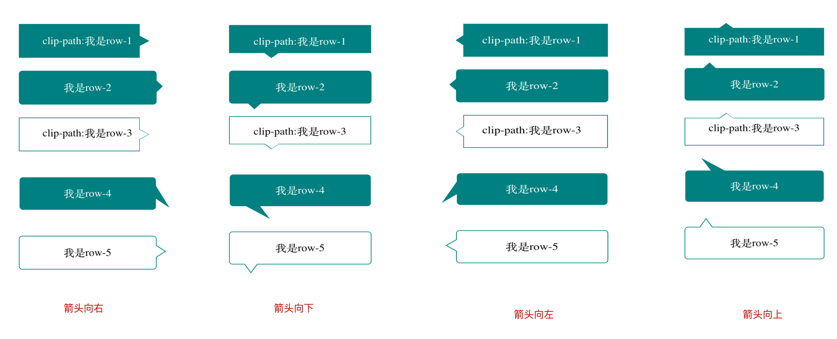
css 实现对话气泡框(四种箭头方向-多种方式实现)
我分别用了算是两种方法写了实心对话框,和边框对话框。具体方法如下
        <div class="row-1">clip-path:我是row-1</div>
        <div class="row-2">我是row-2</div>
        <div class="row-3">
            <div>clip-path:我是row-3</div>
        </div>
        <div class="row-4">我是row-4</div>
        <div class="row-5">我是row-5</div>
css代码,箭头方向被注释,需要的可以直接粘贴试试
            .row-1{
            margin: 20px auto;
            width: 200px;
            height: 50px;
            color: #fff;
            line-height: 50px;
            text-align: center;
            background: teal;
            /* 箭头靠右边 */
            clip-path: polygon(0 0, 88% 0, 88% 35%, 95% 50%, 88% 65%, 88% 100%, 0 100%);
                /* 箭头靠下边 */
            /* clip-path: polygon(0 0, 100% 0, 100% 85%,35% 85%, 30% 100%,25% 85%,0% 85%); */
            /* 箭头靠左边 */
            /* clip-path: polygon(5% 0, 100% 0, 100% 100%,5% 100%, 5% 65%,0 50%,5% 35%); */
            /* 箭头靠下边 */
            /* clip-path: polygon(0 15%, 25% 15%, 30% 0,35% 15%, 100% 15%,100% 100%,0% 100%); */
            border: 1px solid teal;
        }
        .row-2{
            margin: 20px auto;
            position: relative;
            width: 200px;
            height: 50px;
            color: #fff;
            line-height: 50px;
            text-align: center;
            border: 1px solid teal;
            border-radius: 5px;
            background: teal;
        }
        .row-2::after{
            content: '';
            position: absolute;
            width: 0;
            height: 0;
            /* 箭头靠右边 */
            top: 13px;
            right: -10px;
            border-top: 10px solid transparent;
            border-bottom: 10px solid transparent;
            border-left: 10px solid teal;
            /* 箭头靠下边 */
            /* left: 25px;
            bottom: -10px;
            border-left: 10px solid transparent;
            border-right: 10px solid transparent;
            border-top: 10px solid teal; */
            /* 箭头靠左边 */
            /* top: 13px;
            left: -10px;
            border-top: 10px solid transparent;
            border-bottom: 10px solid transparent;
            border-right: 10px solid teal; */
            /* 箭头靠下边 */
            /* top: -10px;
            left: 25px;
            border-left: 10px solid transparent;
            border-right: 10px solid transparent;
            border-bottom: 10px solid teal; */
        }
        .row-3{
            margin: 20px auto;
            width: 200px;
            height: 50px;
            background: teal;
            /* 箭头靠右边 */
            clip-path: polygon(0 0, 88% 0, 88% 35%, 95% 50%, 88% 65%, 88% 100%, 0 100%);
            /* 箭头靠下边 */
            /* clip-path: polygon(0 0, 100% 0, 100% 85%,35% 85%, 30% 100%,25% 85%,0% 85%); */
            /* 箭头靠左边 */
            /* clip-path: polygon(5% 0, 100% 0, 100% 100%,5% 100%, 5% 65%,0 50%,5% 35%); */
            /* 箭头靠下边 */
            /* clip-path: polygon(0 15%, 25% 15%, 30% 0,35% 15%, 100% 15%,100% 100%,0% 100%); */
            border: 1px solid teal;
        }
        .row-3 div{
            text-align: center;
            line-height: 45px;
            width: 198px;
            height: 48px;
            background: #fff;
            /* 箭头靠右边 */
            clip-path: polygon(0 0, 88% 0, 88% 35%, 95% 50%, 88% 65%, 88% 100%, 0 100%);
            /* 箭头靠下边 */
            /* clip-path: polygon(0 0, 100% 0, 100% 85%,35% 85%, 30% 100%,25% 85%,0% 85%); */
            /* 箭头靠左边 */
            /* clip-path: polygon(5% 0, 100% 0, 100% 100%,5% 100%, 5% 65%,0 50%,5% 35%); */
            /* 箭头靠下边 */
            /* clip-path: polygon(0 15%, 25% 15%, 30% 0,35% 15%, 100% 15%,100% 100%,0% 100%); */
            border: 1px solid #fff;
        }
        .row-4{
            margin: 40px auto;
            width: 200px;
            height: 50px;
            color: #fff;
            line-height: 50px;
            text-align: center;
            position: relative;
            background: teal;
            border-radius: 5px;
        }
        .row-4::after{
            content: '';
            position: absolute;
            width: 0;
            height: 0;
            /* 箭头靠右边 skewY(50deg)和skewY(-50deg)可以调节箭头方向*/
            top: 25px;
            right: -20px;
            border-top: 10px solid transparent;
            border-bottom: 10px solid transparent;
            border-left: 20px solid teal;
            transform: skewY(50deg);
            /* 箭头靠下边 skewX(50deg)和skewX(-50deg)可以调节箭头方向 */
            /* left: 35px;
            bottom: -20px;
            border-left: 10px solid transparent;
            border-right: 10px solid transparent;
            border-top: 20px solid teal;
            transform: skewX(50deg); */
            /* 箭头靠左边 skewY(50deg)和skewY(-50deg)可以调节箭头方向*/
            /* top: 25px;
            left: -20px;
            border-top: 10px solid transparent;
            border-bottom: 10px solid transparent;
            border-right: 20px solid teal;
            transform: skewY(-50deg); */
            /* 箭头靠下边 skewX(50deg)和skewX(-50deg)可以调节箭头方向*/
            /* left: 25px;
            top: -20px;
            border-left: 10px solid transparent;
            border-right: 10px solid transparent;
            border-bottom: 20px solid teal;
            transform: skewX(50deg); */

        }
        .row-5{
            margin: 20px auto;
            width: 200px;
            height: 50px;
            line-height: 50px;
            text-align: center;
            position: relative;
            border-radius: 5px;
            border: 1px solid teal;
        }
        .row-5::before{
            content: '';
            position: absolute;
            width: 0;
            height: 0;
            /* 箭头靠右边 */
            top: 13px;
            right: -15px;
            border-top: 10px solid transparent;
            border-bottom: 10px solid transparent;
            border-left: 15px solid teal;
            /* 箭头靠下边 */
            /* left: 20px;
            bottom: -15px;
            border-left: 10px solid transparent;
            border-right: 10px solid transparent;
            border-top: 15px solid teal; */
            /* 箭头靠左边 */
            /* top: 13px;
            left: -15px;
            border-top: 10px solid transparent;
            border-bottom: 10px solid transparent;
            border-right: 15px solid teal; */
            /* 箭头靠下边 */
            /* left: 20px;
            top: -15px;
            border-left: 10px solid transparent;
            border-right: 10px solid transparent;
            border-bottom: 15px solid teal; */
        }
        .row-5::after{
            content: '';
            position: absolute;
            width: 0;
            height: 0;
            /* 箭头靠右边 */
            top: 13px;
            right: -13px;
            border-top: 10px solid transparent;
            border-bottom: 10px solid transparent;
            border-left: 15px solid #fff;
            /* 箭头靠下边 */
            /* left: 20px;
            bottom: -13px;
            border-left: 10px solid transparent;
            border-right: 10px solid transparent;
            border-top: 15px solid #fff; */
            /* 箭头靠左边 */
            /* top: 13px;
            left: -13px;
            border-top: 10px solid transparent;
            border-bottom: 10px solid transparent;
            border-right: 15px solid #fff; */
            /* 箭头靠下边 */
            /* left: 20px;
            top: -13px;
            border-left: 10px solid transparent;
            border-right: 10px solid transparent;
            border-bottom: 15px solid #fff; */
        }
渲染页面

 浙公网安备 33010602011771号