

css 给图片添加滤镜效果,透明层毛玻璃效果
我们用的第一个滤镜是sepia(),他会给图片增加一整降饱和度的橙色染色效果
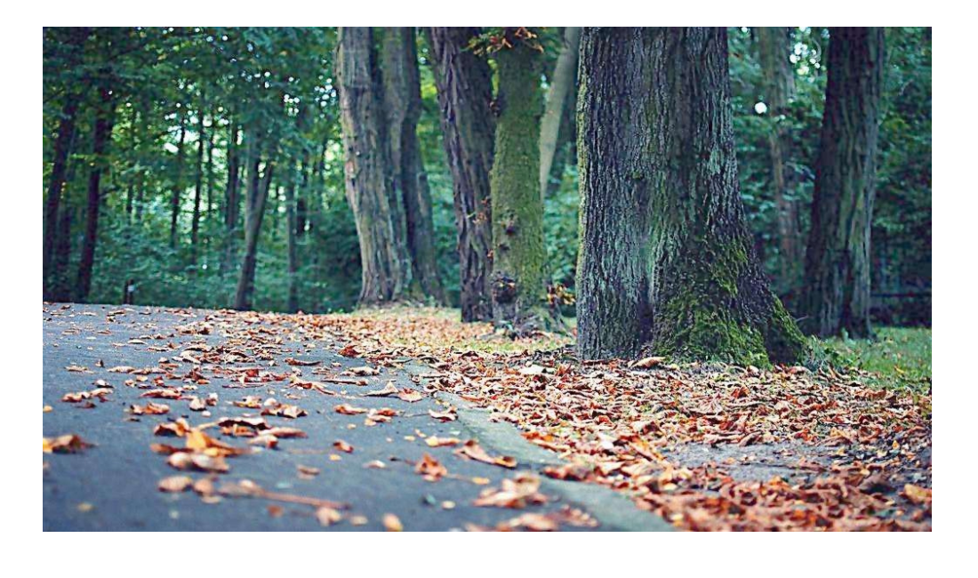
原图
添加sepia滤镜的效果
 img{
     width:100%;
     transition: .5s filter;
     filter:sepia(2);
   }
   img:hover{
     filter:none;
   }

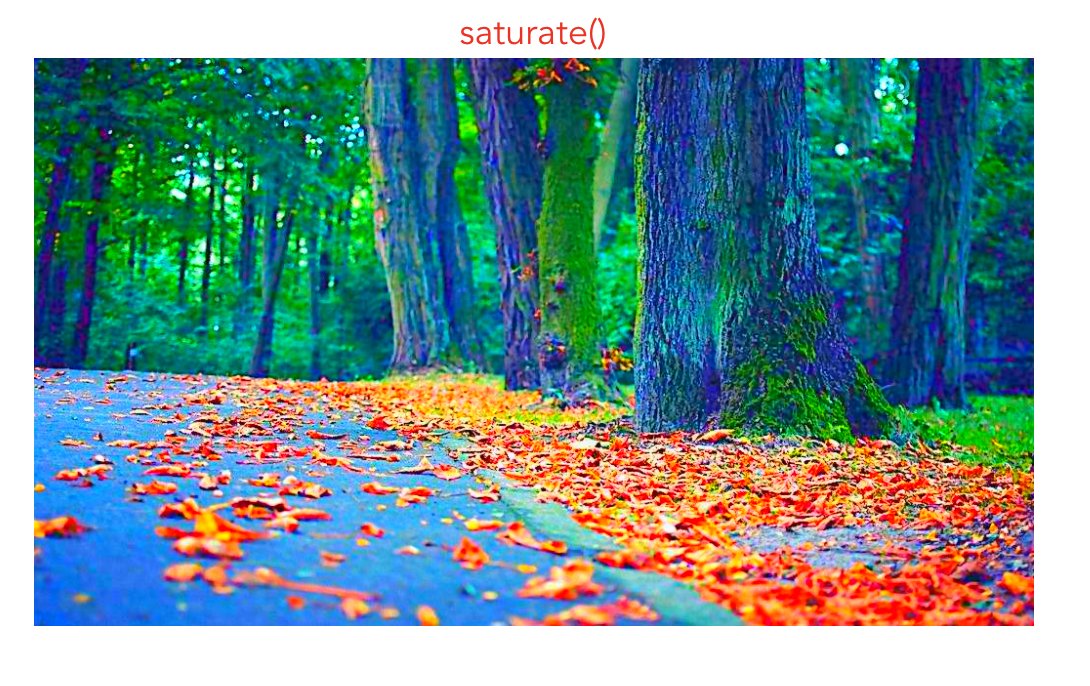
给色度添加饱和度可以用saturate()
filter: saturate(4);
两个同时添加的效果
filter:sepia(2) saturate(4);

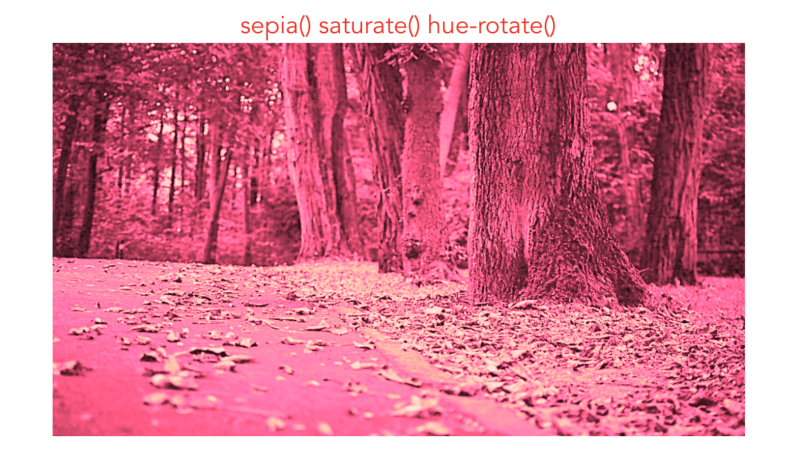
如果不希望把图片调成橙黄色调也可以添加hue-rotate滤镜,变成稍深的亮粉色,大约295度
filter:sepia(1) saturate(4) hue-rotate(295deg);
还有一种毛玻璃的效果如下
html
<div class="box">
      <p class='p'> An international forum for the world's major
         bay areas launched a new cooperation platform over
         the weekend to exchange resources and development
         ideas, with bay areas in China and the United States
         also standing to benefit.
      </p>
</div>
css
.box {
  margin: 0 auto;
  width: 500px;
  height: 300px;
  color: #fff;
  background: url('../assets/pic.jpg') 0 / cover;
  display: flex;
  justify-content: center;
  align-items: center;
}
.p{
  position:relative;
  padding: 15px;
  background:hsla(0 ,0% ,100%,.3);
  width: 350px;
  font-size:1.2em;
  overflow:hidden;
  z-index: 1;

}
.p::before{
  content:'';
  z-index:-1;
  position:absolute;
  top:0;left:0;right:0;bottom:0;
  filter:blur(20px);
  margin:-10px;
  background: url('../assets/pic.jpg') 0 / cover;
}
效果图


 浙公网安备 33010602011771号