grid网格的流动定位
<!DOCTYPE html>
<html lang="en">
<head>
<meta charset="UTF-8">
<title>Document</title>
<style>
.box {
background: orange;
height: 100px;
line-height: 100px;
text-align: center;
color: #fff;
font-size: 3em;
margin-right:15px;
}
.box:nth-child(even) {
background: green;
}
.wrapper {
width: 560px;
border: 1px solid orange;
padding: 15px;
display: grid;
grid-template-columns: repeat(5, 115px);
grid-template-rows: repeat(3,115px);
}
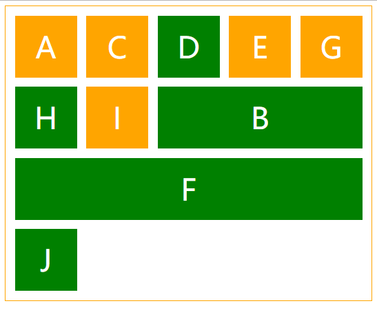
.b {
/*row-1,column-1,row-2,column-2*/
grid-area: 2 / 3 / 3 / 6;
/*相当于*/
/*grid-column: 3 / 6;*/
/*grid-row: 2 / 3;*/
}
.f {
/*行1,列1,行2,列2*/
grid-area:3 /1 / 4 / 6;
/*相当于*/
/*grid-column:1 / 6;*/
/*grid-row:3 / 4; */
}
</style>
</head>
<body>
<div class="wrapper">
<div class="box a">A</div>
<div class="box b">B</div>
<div class="box c">C</div>
<div class="box d">D</div>
<div class="box e">E</div>
<div class="box f">F</div>
<div class="box g">G</div>
<div class="box h">H</div>
<div class="box i">I</div>
<div class="box j">J</div>
</div>
</body>
</html>
胖胖熊笔记,笔记已迁移

 浙公网安备 33010602011771号