CSS布局之浮动原理
先来了解一下当前都有哪些网页布局方式
(说个悄悄话:我面试的时候有遇到过!!!!原题,一毛一样。当时只讲了一下flex。)
1.静态布局(Static Layout):即传统Web设计,网页上的所有元素的尺寸一律使用px作为单位。
优点:这种布局方式对设计师和CSS编写者来说都是最简单的,亦没有兼容性问题。
缺点:显而易见,即不能根据用户的屏幕尺寸做出不同的表现。
2.流式布局(Liquid Layout):网页中主要的划分区域的尺寸使用百分数(搭配min-*、max-*属性使用)。
3.弹性布局:flex(强大、上手快、主流)
4.响应式布局:媒体查询+流式布局
1、布局特点:每个屏幕分辨率下面会有一个布局样式,即元素位置和大小都会变。
2、设计方法:媒体查询+流式布局。通常使用 @media 媒体查询 和网格系统 (Grid System) 配合相对布局单位进行布局,实际上就是综合响应式、流动等上述技术通过 CSS 给单一网页不同设备返回不同样式的技术统称。
优点:适应pc和移动端,如果足够耐心,效果完美
缺点:(1)媒体查询是有限的,也就是可以枚举出来的,只能适应主流的宽高。(2)要匹配足够多的屏幕大小,工作量不小,设计也需要多个版本。
5.浮动布局:float:left/right
6.定位布局:position:absolute/relative/fixed/static
什么是浮动布局:
浮动的框可以向左或向右移动。直到它的外边缘碰到包含框或另一个浮动的边框为止
由于浮动框不在文档的普通流中,所以文档的普通流中的块框就像浮动框不存在一样
特点:脱离文档流(css布局三种机制:标准流 / 浮动 / 定位)
优点:图文混排可以实现文字环绕效果
可以使块级元素同行排列
兼容性好,通常和固定布局结合使用
缺点:父级元素高度坍塌 因为脱离了文档流,父级中没有东西了,高度无法撑开了”
float:元素实现浮动效果
none:不浮动(默认值)
left:向左浮动
right:向右移动
浮动原理
元素一旦浮动,脱离标准流
朝着向左或向右方向移动,直到自己的边界紧贴着包含块(一般是父级)或其他浮动元素
而且浮动元素的顶端也不能超过包含块的顶端及之前所有浮动元素的顶端
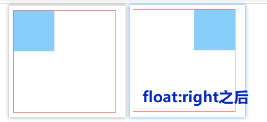
浮动效果
 <style>
    .parent{
      width:200px;
      height: 200px;
      border: 1px solid lightcoral;
    }
    .son{
      width: 80px;
      height: 80px;
      background-color: lightskyblue;
      float:right
    }
  </style>
</head>
<body>
  <div class="parent">
    <div class="son"></div>
  </div>
</body>
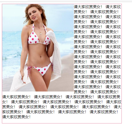
float应用之一:图文环绕
  <style>
    .parent{
      width: 500px;
      height: 500px;
      border:1px solid palevioletred;
    }
    img{
      width: 300px;
      float: left;
    }
  </style>
</head>
<body>
  <div class="parent">
    <img src="https://ss1.bdstatic.com/70cFvXSh_Q1YnxGkpoWK1HF6hhy/it/u=1277120522,1337367569&fm=26&gp=0.jpg" alt="">
    <span>
      请大家欣赏美女!
      请大家欣赏美女!
      请大家欣赏美女!
      请大家欣赏美女!
      请大家欣赏美女!
      请大家欣赏美女!
      请大家欣赏美女!
      请大家欣赏美女!
      请大家欣赏美女!
      请大家欣赏美女!
      请大家欣赏美女!
      请大家欣赏美女!
      请大家欣赏美女!
      请大家欣赏美女!
      请大家欣赏美女!
      请大家欣赏美女!
      请大家欣赏美女!
      请大家欣赏美女!
      请大家欣赏美女!
      请大家欣赏美女!
      请大家欣赏美女!
      请大家欣赏美女!
      请大家欣赏美女!
      请大家欣赏美女!
      请大家欣赏美女!
      请大家欣赏美女!
      请大家欣赏美女!
      请大家欣赏美女!
      请大家欣赏美女!
      请大家欣赏美女!
      请大家欣赏美女!
      请大家欣赏美女!
      请大家欣赏美女!
      请大家欣赏美女!
      请大家欣赏美女!
      请大家欣赏美女!
      请大家欣赏美女!
      请大家欣赏美女!
      请大家欣赏美女!
      请大家欣赏美女!
      请大家欣赏美女!
      请大家欣赏美女!
      请大家欣赏美女!
    </span>
  </div>
</body>
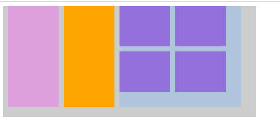
float应用二:浮动布局
  <style>
    .container{
      width:500px;
      height: 220px;
      background: #ccc;
    }
    .item1,.item2{
      width: 100px;
      height: 200px;
      margin-left: 10px;
      float: left;
    }
    .item1{
      background-color: plum;
    }
    .item2{
      background-color: orange;
    }
    .item3{
      width: 240px;
      height: 200px;
      background-color:lightsteelblue;
      float: left;
      margin-left: 10px;
    }
    .item3-box{
      width:100px;
      height: 80px;
      background-color: mediumpurple;
      float: left;
    }
    .item3-box1,.item3-box3{
      margin-right: 10px;
    }
    .item3-box3,.item3-box4{
      margin-top: 10px;
    }
  </style>
</head>
<body>
  <div class="container">
    <div class="item1"></div>
    <div class="item2"></div>
    <div class="item3">
      <div class="item3-box item3-box1"></div>
      <div class="item3-box"></div>
      <div class="item3-box item3-box3"></div>
      <div class="item3-box item3-box4"></div>
    </div>
  </div>
</body>
清除浮动的方式:
1.给父级元素设置高度(不推荐)
height:500px; 缺点:父元素高度固定了
2.添加额外标签,在要清除浮动元素最后添加一个空白标签(这个标签需要是块或行标签span和a无效)(不推荐)
<div style="clear:both"></div> 缺点“添加无意义标签,语义化差
3.在父元素内部的最后使用br标签和其自身的html属性(不推荐)
<br clear="all>
4.给父元素设置overfloe:hidden/auto(不推荐)
overflow:hidden 缺点:超出父元素的会被隐藏
overflow:auto 缺点:不能自定义高度
5.给父元素设置display:inline-block(不推荐)
display:inline-block 缺点:margin:0 auto失效了
6.父元素设置display:table(不推荐)
display:table 跟flex有点类似,仍不推荐使用
7.给父元素加after伪元素(伪元素默认是行内元素,建议设置height:0,否则会比实际高出若干元素)(推荐⭐⭐⭐⭐⭐)
 /* 清除浮动的终极版 */
    .container::after{
      content: '';
      clear: both;
      display: block;
      height: 0;
      visibility: hidden;
    }
    /* 兼容性问题,IE6不支持伪元素after */
    .container{
      zoom:1
    }
  <style>
    .container{
      width:500px;
      /* 清除浮动方法一:父元素设置高度 */
      /* height: 220px; */
      background: #ccc;
    }
    .item1,.item2{
      width: 100px;
      height: 200px;
      margin-left: 10px;
      float: left;
    }
    .item1{
      background-color: plum;
    }
    .item2{
      background-color: orange;
    }
    .item3{
      width: 240px;
      height: 200px;
      background-color:lightsteelblue;
      float: left;
      margin-left: 10px;
    }
    .item3-box{
      width:100px;
      height: 80px;
      background-color: mediumpurple;
      float: left;
    }
    .item3-box1,.item3-box3{
      margin-right: 10px;
    }
    .item3-box3,.item3-box4{
      margin-top: 10px;
    }
    /* 清除浮动的终极版 */
    .container::after{
      content: '';
      clear: both;
      display: block;
      height: 0;
      visibility: hidden;
    }
    /* 兼容性问题,IE6不支持伪元素after */
    .container{
      zoom:1
    }
  </style>
</head>
<body>
  <!-- 清除浮动方法四:给父元素设置overfloe:hidden/auto -->
  <!-- <div class="container" style="overflow:hidden/hidden"> -->
  <!-- 清除浮动方法五:给父元素设置display:inline-block-->
  <!-- <div class="container" style="display:inline-block"> -->
  <!-- 清除浮动方法六:给父元素设置display:table-->
  <!-- <div class="container" style="display:table"> -->
  <div class="container">
    <div class="item1"></div>
    <div class="item2"></div>
    <div class="item3">
      <div class="item3-box item3-box1"></div>
      <div class="item3-box"></div>
      <div class="item3-box item3-box3"></div>
      <div class="item3-box item3-box4"></div>
      <!-- 清除浮动方法三:添加额外标签,在要清除浮动元素最后添加一个空白标签 -->
      <!-- <div style="clear:both"></div> -->
    </div>
    <!-- 清除浮动方法二:在父元素内部的最后使用br标签和其自身的html属性 -->
    <!-- <br clear="all"> -->
  </div>
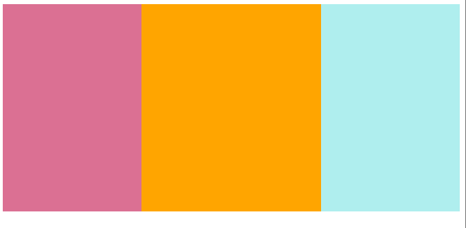
面试题:假设高度一定,请写出三栏布局,左右宽度200px;中间自适应
  <style>
    .left{
      width: 200px;
      height: 300px;
      background-color: palevioletred;
      float: left;
    }
    .right{
      width: 200px;
      height: 300px;
      background-color: paleturquoise;
      float: right;
    }
    .center{
      width: 100%;
      height: 300px;
      background-color: orange;
    }
  </style>
</head>
<body>
  <div class="container">
    <div class="left"></div>
    <div class="right"></div>
  //注意中间的块放在右边的块下面
    <div class="center"></div>
  </div>
总结:
浮动规则:
如果元素是左(右)浮动 ,则浮动元素的左(右)边界不能超过包含块的左(右边界),而且浮动元素的顶端也不能超过包含块的顶端及之前所有浮动元素的顶端
浮动元素不能与行内元素内容重叠,行内级内容将会被浮动元素推出(图文环绕)
浮动元素可以使块级元素在同一行显示,进行页面布局

 浙公网安备 33010602011771号