vue 使用echarts
0. 在vue内使用 echarts 可使用v-echart 这个魔改版本, 完全是可用的,但不在本次叙述范畴
1. 首先安装 npm install echarts --save 或者 yarn add echarts
2.先上结论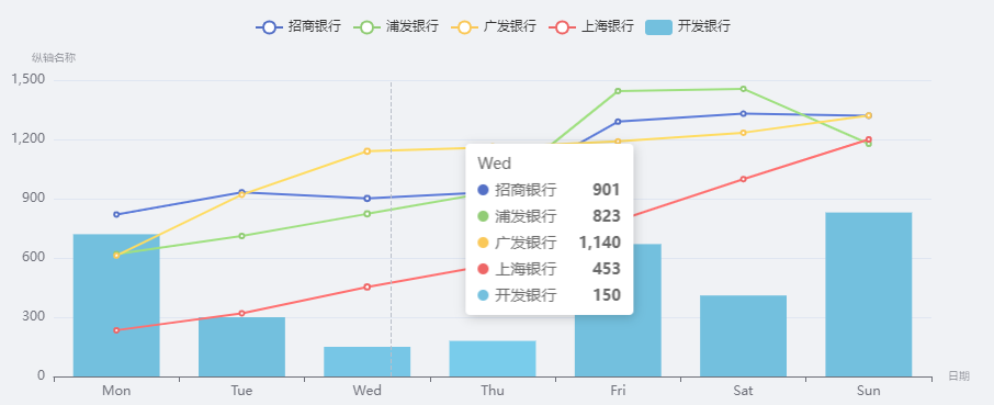
3.再上代码
<template>
  <div>
    <div id="chart" ref="chart" style="height:400px;width: 1000px;"></div>
  </div>
</template>

<script>
import { GridComponent } from 'echarts/components'
import { CanvasRenderer } from 'echarts/renderers'
const echarts = require('echarts/lib/echarts')
echarts.use([GridComponent, CanvasRenderer])
require('echarts/lib/chart/bar')
require('echarts/lib/chart/line')
require('echarts/lib/component/tooltip')
require('echarts/lib/component/title')
require('echarts/lib/component/legend')

export default {
  data () {
    return {
    }
  },
  created () {
    this.$nextTick(() => {
      this.drawLine()
    })
  },
  mounted () {
  },
  methods: {
    drawLine () {
      window.addEventListener('resize', () => this.chart.resize())
      this.chart = echarts.init(this.$refs.chart)
      const option = {
        legend: { data: ['招商银行', '浦发银行', '广发银行', '上海银行', '开发银行'] },
        xAxis: {
          type: 'category', // 还有其他的type,可以去官网喵两眼哦
          data: ['Mon', 'Tue', 'Wed', 'Thu', 'Fri', 'Sat', 'Sun'],
          name: '日期',
          nameTextStyle: { fontWeight: 100, fontSize: 10 }
        },
        yAxis: {
          type: 'value',
          name: '纵轴名称',
          nameTextStyle: { fontWeight: 100, fontSize: 10 }
        },
        tooltip: { trigger: 'axis' }, // axis   item   none三个值
        series: [
          { name: '招商银行', data: [820, 932, 901, 934, 1290, 1330, 1320], type: 'line' },
          { name: '浦发银行', data: [620, 711, 823, 934, 1445, 1456, 1178], type: 'line' },
          { name: '广发银行', data: [612, 920, 1140, 1160, 1190, 1234, 1321], type: 'line' },
          { name: '上海银行', data: [234, 320, 453, 567, 789, 999, 1200], type: 'line' },
          { name: '开发银行', data: [720, 300, 150, 180, 670, 410, 830], type: 'bar' }
        ]
      }
      this.chart.setOption(option)
    }
  }
}
</script>

<style lang="less" scoped>
</style>
4.以上方式,不需要再main.js中做提前引入,只需当前页加载即可
5.GridComponent, CanvasRenderer完成了一些渲染操作,如果删去,则不会有绘制了, resize目的是改变dom尺寸,chart也会同步刷新尺寸
6.在百度 搜索 it技术 时: 请 在搜索框尾部 加入 -csdn

 浙公网安备 33010602011771号