
数据大屏屏幕自适应
因为数据大屏一般在大的屏幕端进行展示。
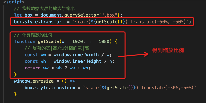
实现缩放的逻辑:给div设置固定的高度和宽度。通过innerWidth来获取当前屏幕的宽度和高度,得到缩放比例。通过scale来缩放当前div、
具体的实现代码如下:
<!DOCTYPE html>
<html>
<head>
<meta charset="utf-8">
<meta name="viewport" content="width=device-width, initial-scale=1">
<title>数据大屏scale</title>
</head>
<style type="text/css">
/* 去除默认样式 */
* {
margin: 0;
padding: 0;
}
.container {
width: 100wh;
height: 100vh;
background: orange;
background: url(/Users/hoge/Desktop/code/vueStudy/硅谷甄选/admin_template/project/src/views/screen/images/bg.png) no-repeat;
background-size: cover;
}
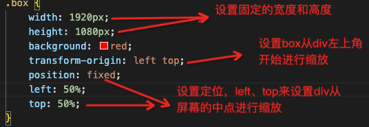
.box {
width: 1920px;
height: 1080px;
background: red;
transform-origin: left top;
position: fixed;
left: 50%;
top: 50%;
}
.top {
width: 100px;
height: 100px;
background: hotpink;
margin-left: 50px;
}
.bottom {
width: 100px;
height: 100px;
background: skyblue;
margin-left: 50px;
margin-top: 100px;
}
/* 放大缩小的倍数从设备的中心点开始进行放大 */
</style>
<body>
<!-- div box 为整个数据大屏的根节点,100vh 100wh的高度 -->
<div class="container">
<!-- 数据展示的区域 -->
<div class="box">
<div class="top">我是祖国的</div>
<div class="bottom">老花骨朵</div>
</div>
</div>
</body>
</html>
<script>
// 监控数据大屏的放大与缩小
let box = document.querySelector(".box");
box.style.transform = `scale(${getScale()}) translate(-50%)`;
// 计算缩放的比例
function getScale(w = 1920, h = 1080) {
// 屏幕的宽|高/设计稿的宽|高
const ww = window.innerWidth / w;
const wh = window.innerHeight / h;
return ww < wh ? ww : wh;
}
window.onresize = () => {
box.style.transform = `scale(${getScale()}) translate(-50%)`
}
</script>

 浙公网安备 33010602011771号