京东移动端首页(六)
做如下这个效果:
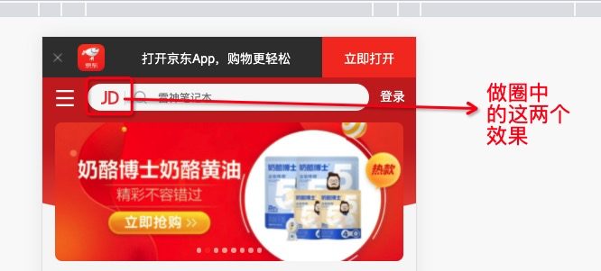
这两个使用before属性加上content来设置。
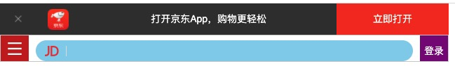
效果如下:
<!DOCTYPE html>
<html lang="en">
<head>
    <meta charset="UTF-8">
    <meta http-equiv="X-UA-Compatible" content="IE=edge">
     <!-- 设置视口标签以及引入初始化样式 -->
    <meta name="viewport" content="width=device-width, initial-scale=1.0,user-scalable=no,maximum-scale=1.0,minimum-scale=1.0">
    <title>Document</title>
    <!-- 引入css初始化文件 -->
    <link rel="stylesheet" href="./CSS/normalize.css">
    <!-- 引入首页的css -->
    <link rel="stylesheet" href="./CSS/index.css">
</head>
<body>
    <!-- 顶部 -->
   <header class="app">
       <ul>
           <li>
               <img src="./images/5ac9d730N04e6d766.png" alt="">
           </li>
           <li>
               <img src="./images/logo.png" alt="">
           </li>
           <li>打开京东App,购物更轻松</li>
           <li>立即打开</li>
       </ul>
   </header>

   <!-- 搜索 -->
   <div class="search-wrap">
       <div class="search-btn"></div>
       <div class="search">
           <div class="jd-icon"></div>
       </div>
       <div class="search-logo">登录</div>
   </div>
</body>
</html>
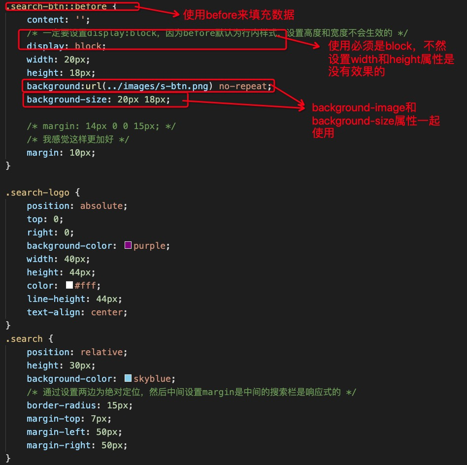
body {
    width: 100%;
    min-width: 320px;
    max-width: 640px;
    /* body居中 */
    margin: 0 auto;
    /* 移动端字体14px */
    font-size:14px;
    /* 设置字体类型 */
    font-family: -apple-system,  Helvetica, sans-serif;
    /* 设置行高 */
    line-height: 1.5;
}
/* 因为子元素是浮动的,父元素此时会高度塌陷,所以要设置一下高度 */
.app {
    height: 44px;
}

.app ul li {
    height: 45px;
    background-color: #333333;
    float: left;
    list-style-type: none;
    color: #fff;
}

/* 去掉ul的内外边距 */
.app ul {
    margin: 0;
    padding: 0;
    /* 所有内容垂直居中(包括图片、文字) */
    line-height: 45px;
    text-align: center;
}

/* 子元素选择器 设置宽度 */
.app ul li:nth-child(1) {
    width: 8%;
}
.app ul li:nth-child(1) img {
    width: 10px;
}

.app ul li:nth-child(2) {
    width: 10%;
}

.app ul li:nth-child(2) img {
    width: 30px;
    /* 图片经常要和文字垂直居中对齐,所以经常使用vertical-align属性来进行对齐 */
    vertical-align: middle;
}

.app ul li:nth-child(3) {
    width: 57%;
}

.app ul li:nth-child(4) {
    background-color: #F63516;
    width: 25%;
}

/* 搜索 */
.search-wrap {
    position: relative;
    overflow: hidden;
    border: 1px solid #ccc;
}
.search-btn {
    position: absolute;
    top: 0;
    left: 0;
    background-color: #C82519;
    width: 40px;
    height: 44px;
}

.search-btn::before {
    content: '';
    /* 一定要设置display:block,因为before默认为行内样式,设置高度和宽度不会生效的 */
    display: block;
    width: 20px;
    height: 18px;
    background:url(../images/s-btn.png) no-repeat;
    background-size: 20px 18px;

    /* margin: 14px 0 0 15px; */
    /* 我感觉这样更加好 */
    margin: 10px;
}

.search-logo {
    position: absolute;
    top: 0;
    right: 0;
    background-color: purple;
    width: 40px;
    height: 44px;
    color: #fff;
    line-height: 44px;
    text-align: center;
}
.search {
    position: relative;
    height: 30px;
    background-color: skyblue;
    /* 通过设置两边为绝对定位,然后中间设置margin是中间的搜索栏是响应式的 */
    border-radius: 15px;
    margin-top: 7px;
    margin-left: 50px;
    margin-right: 50px;
}

.jd-icon {
    width: 20px;
    height: 15px;
    position: absolute;
    top: 8px;
    left: 13px;
    background-color: pink;
    background: url(../images/jd.png) no-repeat;
    background-size: 20px 15px;
}

.jd-icon::after {
    content: '';
    display: block;
    width: 1px;
    height: 15px;
    margin-left: 30px;
    background-color: #DEDEDE;
}

 浙公网安备 33010602011771号