
【R语言】单细胞——多样本整合分析(Harmony):从0到1避坑指南(附完整代码)
之前对这个技术只是浅尝辄止,这次花了一周时间深入研究,收获很多,整理成文分享出来。
本期给大家介绍如何利用Harmony对多样本的单细胞数据进行去批次处理。
Harmony概念
Harmony是一种专门用于单细胞RNA测序(scRNA-seq)数据整合的算法,其核心目标是消除批次效应(batch effect),同时保留生物学上的真实差异。何谓批次效应,通常指由于实验条件(如不同实验室、仪器、试剂、时间等)引入的技术性差异,掩盖真实的生物学信号。
Harmony的工作原理
(1)PCA降维:首先对原始数据进行主成分分析(PCA),提取主要变异方向。
(2)模糊聚类:将细胞分配到多个聚类,通过惩罚项最大化每个聚类内数据的多样性。
(3)质心校正:计算每个聚类的全局质心和批次特异性质心,生成校正因子。
(4)迭代优化:通过线性组合校正因子调整细胞坐标,重复迭代直到批次效应最小化。
PS:若批次效应极强或数据质量差,Harmony可能无法完全校正,需结合其他方法(如CCA)综合处理。
一、单细胞分析流程——多样本
######000包载入######
library(Seurat) # 单细胞组学数据分析包
library(harmony)  # 用于批次校正
library(Matrix)
library(glmGamPoi)
library(dplyr)
library(patchwork)
library(SingleR)  # 添加细胞注释工具
library(celldex)  # 细胞注释参考数据集
library(clustree) # 用于聚类树分析
library(cowplot)  # 用于高级绘图
library(ggplot2) # 画图包
library(magrittr)
#####001多样本10xGenomics(mtx、.tsv)数据加载及Seurat对象创建、数据处理#####
remove(list = ls()) #清除 Global Environment
getwd() #查看当前工作路径
setwd("D:/Rdata/jc/单细胞演示数据/10xGenomics/多样本演示") #设置需要的工作路径
list.files() #查看当前工作目录下的文件
#创建样本元数据表
samples_meta <- data.frame(
sample_name = c("GSM8421890_2021_31", "GSM8421891_2021_36"),
group = c("Control", "Treatment"),
path = c("GSM8421890_2021_31", #加载数据,需去除数据前缀
"GSM8421891_2021_36"
),
stringsAsFactors = FALSE
)
##初始化一个空列表用于存放Seurat对象##
seurat_objects <- list()
##循环读取每个样本的数据并创建Seurat对象##
for (i in 1:nrow(samples_meta)) {
sample_name <- samples_meta$sample_name[i]
sample_path <- samples_meta$path[i]
group <- samples_meta$group[i]
cat("Processing sample:", sample_name, "\n")
#读取 10x 格式数据
counts <- Read10X(data.dir = sample_path)
#创建 Seurat 对象,并添加样本名作为元数据
seurat_obj <- CreateSeuratObject(counts = counts,
project = sample_name,
min.features = 200,
min.cells = 3,
)
# 添加元数据
seurat_obj$group <- samples_meta$group[i]
#计算线粒体基因比例
seurat_obj[["percent.mt"]] <- PercentageFeatureSet(
seurat_obj,
pattern = "^MT-" # 人类: "^MT-", 小鼠: "^mt-"
)
# 添加核糖体基因比例计算
#seurat_obj[["percent.rb"]] <- PercentageFeatureSet(
# seurat_obj,
# pattern = "^RP[SL]|^Rps|^Rpl" )# 覆盖人和小鼠
#质量控制过滤
seurat_obj <- subset(seurat_obj,
subset = nFeature_RNA > 200 &
nFeature_RNA < 6000 &
#percent.rb < 50& # 添加核糖体比例过滤
percent.mt < 10
)
print(seurat_obj)
seurat_objects[[sample_name]] <- seurat_obj #将Seurat对象存入列表
}
##合并数据集##
combined_seurat <- merge(
x = seurat_objects[[1]],
y = seurat_objects[-1], #获取剩余样本列表
add.cell.ids = samples_meta$sample_name, #所有样本的标识符
project = "Combined"
)
##检查合并结果##
print(combined_seurat)
cat("\n合并后细胞总数:", ncol(combined_seurat), "\n")
cat("前5个细胞ID:\n")
head(colnames(combined_seurat), 10)
##验证样本分布##
cat("\n样本分布:\n")
table(combined_seurat$orig.ident)
##可视化质控##
qc_plots <- VlnPlot(combined_seurat,
features = c("nFeature_RNA", "nCount_RNA", "percent.mt", "percent.rb"),
ncol = 4, group.by = "orig.ident")
ggsave("QC_Violin.png", qc_plots, width = 14, height = 8)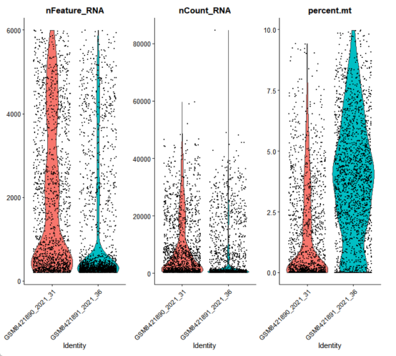
#####002标准预处理#####
###标准化###
combined_seurat <- NormalizeData(combined_seurat,
                                 normalization.method = "LogNormalize",
                                 scale.factor = 10000,
                                 verbose = FALSE
                                 )
###高变基因###
combined_seurat <- FindVariableFeatures(combined_seurat,
                                        selection.method = "vst",
                                        nfeatures = 3000,
                                        verbose = FALSE
                                        )
###数据缩放###
combined_seurat <- ScaleData(combined_seurat,
                             verbose = FALSE,
                             features = VariableFeatures(combined_seurat), #缩放高变基因;缩放所有基因用rownames(combined_seurat)
                             vars.to.regress = c("percent.mt", "nCount_RNA")  # 可选:回归技术因素
                             )
combined_seurat_BF <- combined_seurat #备份
###PCA降维###
combined_seurat <- RunPCA(combined_seurat,
                          npcs = 50,
                          verbose = FALSE
                          )
ElbowPlot(combined_seurat, ndims = 50) +  ##肘部图调整 npcs
  ggtitle("主成分重要性")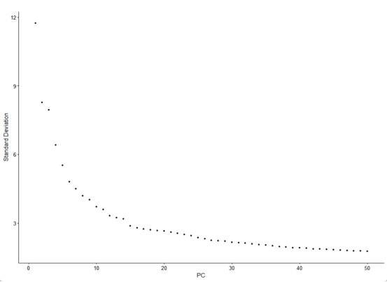
###可视化###
#高变基因可视化
top10 <- head(VariableFeatures(combined_seurat), 10)
p1 <- VariableFeaturePlot(combined_seurat)
p2 <- LabelPoints(plot = p1, points = top10, repel = TRUE)
p2 + ggtitle("高变基因")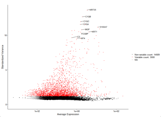
#可视化原始批次效应(PCA)
head(combined_seurat@meta.data)
p3 <- DimPlot(combined_seurat,
              reduction = "pca",
              group.by = "orig.ident") +
  ggtitle("PCA Before Harmony") + theme_bw()
ggsave("PCA_Before_Harmony.png", p3, width = 8, height = 6)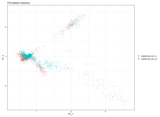
#####003Harmony批次校正#####
set.seed(123) # 确保可重复性
combined_seurat <- RunHarmony(
  object = combined_seurat,
  group.by.vars = "orig.ident", # 指定批次变量
  reduction = "pca",            # 基于PCA结果校正
  dims = 1:30,              # 使用前30个主成分dims.use
  plot_convergence = TRUE,      # 显示收敛曲线
  max.iter = 20,                 # 最大迭代次数
  reduction.save = "harmony"     # 保存结果的名称为"harmony"
   )
print(combined_seurat[["harmony"]]) #检查Harmony结果
names(combined_seurat@reductions) # 检查降维结果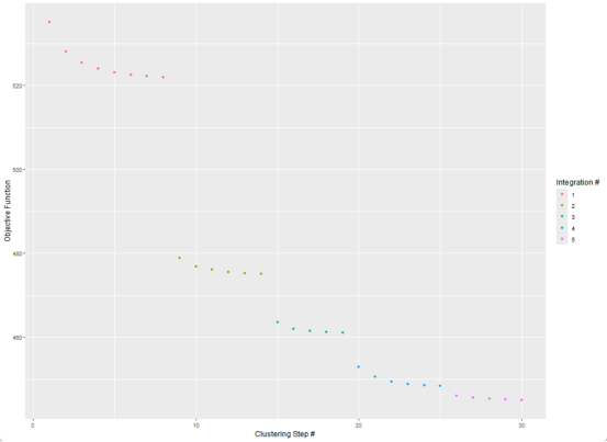
最佳实践:
经过多个项目的验证,我总结了几个关键点:1) 做好异常处理 2) 添加详细日志 3) 单元测试覆盖核心逻辑。 这些看似简单,但能避免很多生产环境问题。
###可视化###
##可视化批次校正前后对比
harmony_emb <- Embeddings(combined_seurat, "harmony") # 应包含"harmony"
head(harmony_emb) # 查看 Harmony 嵌入
p1 <- DimPlot(combined_seurat, reduction = "pca", group.by = "orig.ident") +
  ggtitle("PCA Before Harmony")
p2 <- DimPlot(combined_seurat, reduction = "harmony", group.by = "orig.ident") +
  ggtitle("Harmony Embedding")
p3 <- p1 + p2
ggsave("Harmony_Integration.png", p3, width = 10, height = 6)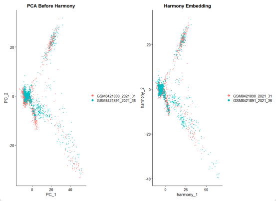
#####004降维与聚类#####
#使用Harmony嵌入进行UMAP/tSNE可视化#
combined_seurat <- RunUMAP(
  combined_seurat,
  reduction = "harmony",
  dims = 1:30,
  n.neighbors = 30,
  min.dist = 0.3,
  reduction.name = "umap_harmony"
  )
combined_seurat <- RunTSNE(
  combined_seurat,
  reduction = "harmony",
  dims = 1:30,
  n.neighbors = 30,
  min.dist = 0.3,
  reduction.name = "tsne_harmony"
  )
#邻域图与聚类#
combined_seurat <- FindNeighbors(
  combined_seurat,
  reduction = "harmony",
  dims = 1:30,
  verbose = FALSE
  )
#测序不同分辨率#
combined_seurat <- FindClusters(
  combined_seurat,
  resolution = seq(0.1, 1.2, by = 0.1),
  verbose = FALSE
  )
#聚类树分析(clustree)#
cluster_cols <- grep("_snn_res\\.",
                     colnames(combined_seurat@meta.data),
                     value = TRUE
                     )
prefix <- sub("\\d+\\.\\d+$", "",
              cluster_cols[1]
              )
clustree_plot <- clustree(combined_seurat, # 使用动态获取的前缀可视化
                          prefix = prefix
                          )
ggsave("clustree_plot.png", clustree_plot, width = 12, height = 10)
print(cluster_cols)
# 选择合适的分辨率(根据聚类树结果)#
Idents(combined_seurat) <- paste0(prefix, "0.6")
colnames(combined_seurat@meta.data)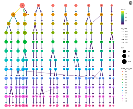
# 可视化结果 #
P1 <- DimPlot(combined_seurat,
              reduction = "umap_harmony",
              group.by = "orig.ident",
              label = TRUE,
              repel = TRUE,
              label.size = 4
              ) +
  ggtitle("Batch Distribution After Harmony")
P2 <- DimPlot(combined_seurat,
              reduction = "tsne_harmony",
              group.by = "orig.ident",
              label = TRUE,
              repel = TRUE
              ) +
  ggtitle("Batch Distribution After Harmony")
P5 <- P1 + P2
P3 <- DimPlot(combined_seurat,
              reduction = "umap_harmony",
                            label = TRUE) +
  ggtitle("Cell Clusters1")
P4 <- DimPlot(combined_seurat,
              reduction = "tsne_harmony",
              label = TRUE) +
  ggtitle("Cell Clusters2")
P6 <- P3 + P4
ggsave("Cluster_UMAP/tSNE.png", P6, width = 10, height = 8)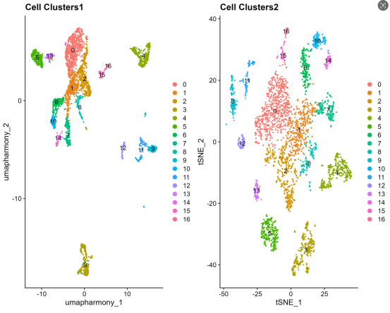
# 组合图 #
combined_plot <- (P1 + P2) / (P3 + P4)
ggsave("umap+tsne_combined.png", combined_plot, width = 16, height = 12)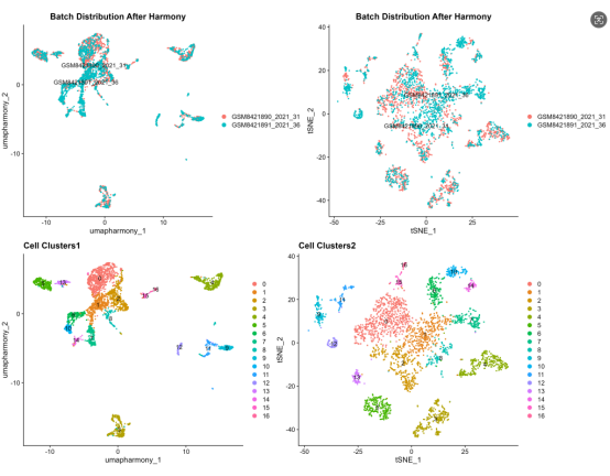
#####005差异表达分析(Marker基因识别)#####
###识别所有cluster的marker基因###
combined_seurat <- JoinLayers(combined_seurat) # 将所有数据层合并到主 Assay(通常为 "RNA")
DefaultAssay(combined_seurat) <- "RNA" # 切换到包含校正后数据的 Assay(假设为 "RNA")
cluster_markers <- FindAllMarkers(
  combined_seurat,
  only.pos = TRUE,
  min.pct = 0.25,
  logfc.threshold = 0.25,
  test.use = "wilcox"
  )
# 保存标记基因结果
write.csv(cluster_markers, "Cluster_Markers.csv", row.names = FALSE)
# 1.提取每个cluster的前5个标记基因 #
top_markers <- cluster_markers %>%
  group_by(cluster) %>%
  top_n(n = 5, wt = avg_log2FC) %>%
 arrange(cluster, desc(avg_log2FC))
heatmap_plot <- DoHeatmap(combined_seurat,
                            features = top_markers$gene,
                            group.colors = scales::hue_pal()(length(unique(Idents(combined_seurat))))
                            )
  ggsave("Top_Markers_Heatmap.png", heatmap_plot, width = 16, height = 12)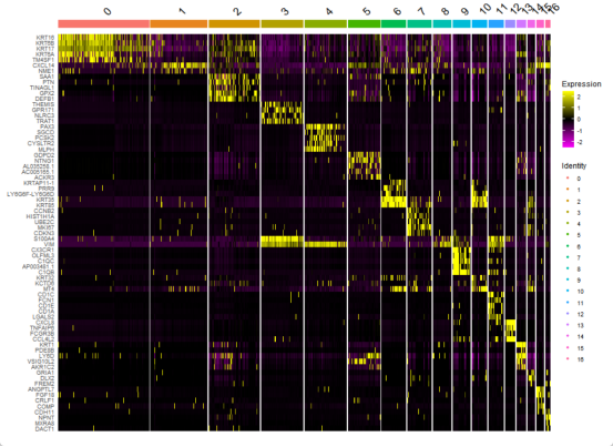
#2.点图可视化(带聚类排序)#
DotPlot(combined_seurat,
          features = unique(top_markers$gene),
          cols = c("lightgrey", "blue"), # 更好的颜色对比
          dot.scale = 6,  # 调整点大小
          cluster.idents = TRUE  # 按表达模式聚类
     ) +
    RotatedAxis() +
    labs(title = "Top Marker Genes by Cluster") +
    theme(axis.text.x = element_text(size = 8, angle = 45, hjust = 1),
          legend.position = "right")
  ggsave("dotplot_top_markers.png", width = 16, height = 8)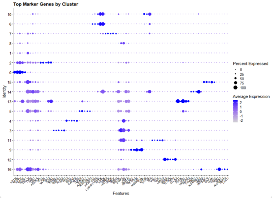
#3.小提琴图(每个cluster的top1基因)#
top1_markers <- cluster_markers %>%
    group_by(cluster) %>%
    slice_head(n = 1)
vln_plots <- VlnPlot(
  combined_seurat,
    features = unique(top1_markers$gene),
    pt.size = 0.1,
    ncol = 4,
    same.y.lims = TRUE
  ) +
    theme(legend.position = "none")
  ggsave("vlnplot_top_markers.png", vln_plots, width = 20, height = 25)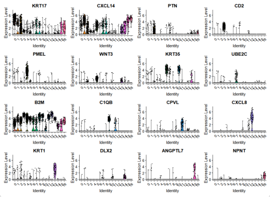
###组间差异分析###
group_markers <- FindMarkers(
    combined_seurat,
    ident.1 = "Treatment",
    ident.2 = "Control",
    group.by = "group",
    min.pct = 0.1,
    logfc.threshold = 0.25
    )
  # 保存组间差异结果
  write.csv(group_markers, "Treatment_vs_Control_Markers.csv")
##### 006细胞类型注释 #####
##方法1:基于已知标记基因的手动注释##
celltype_markers <- list(
cell1 = c("S100A2", "KRT5", "CDH11"),
cell2 = c("KRT17", "S100A8", "KRT6A"),
cell3 = c("CXCL14", "GPC3", "DERL3"),
cell4 = c("PTMA", "DLGAP5", "HMGB1"),
cell5 = c("KRT35", "SELENBP1", "KRT32"),
cell6 = c("NES", "RBP1", "PLS3")
#添加更多
)
# 标记基因可视化 #
DotPlot(combined_seurat, features = unlist(celltype_markers)) +
theme(axis.text.x = element_text(angle = 45, hjust = 1))
ggsave("CellType_Markers_DotPlot.png", width = 12, height = 8)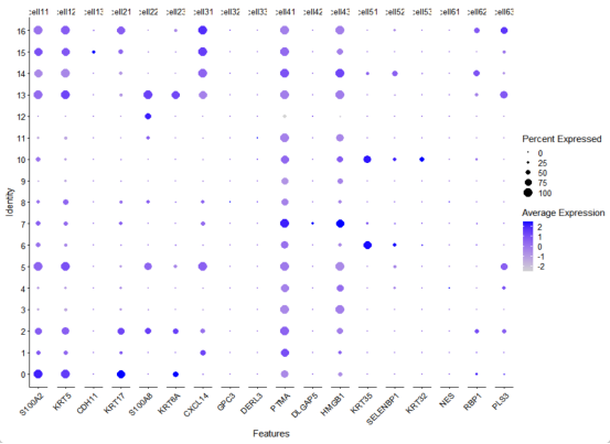
##手动注释(根据标记基因和自动注释结果)##
new_cluster_ids <- c(
    "0" = "cell1",
    "1" = "cell2",
    "2" = "cell3",
    "3" = "cell4",
    "4" = "cell5",
    "5" = "cell6",
    "6" = "cell7"
    )
  ##应用注释##
combined_seurat$cell_type <- plyr::mapvalues(
    x = Idents(combined_seurat),
    from = names(new_cluster_ids),
    to = new_cluster_ids
    )
  ##设置主要标识为细胞类型##
Idents(combined_seurat) <- "cell_type"
  ##最终注释结果可视化##
final_anno_p1 <- DimPlot(combined_seurat,
                                 reduction = "umap_harmony",
                                 label = TRUE,
                                 repel = TRUE) +
  ggtitle("Final Cell Type Annotation")
final_anno_p2 <- DimPlot(combined_seurat,
                                 reduction = "tsne_harmony",
                                 label = TRUE,
                                 repel = TRUE) +
  ggtitle("Final Cell Type Annotation")
final_annotation_plot <- final_anno_p1 + final_anno_p2
ggsave("Final_Cell_Types.png", final_annotation_plot, width = 20, height = 8)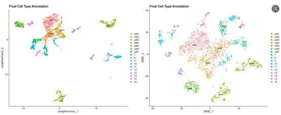
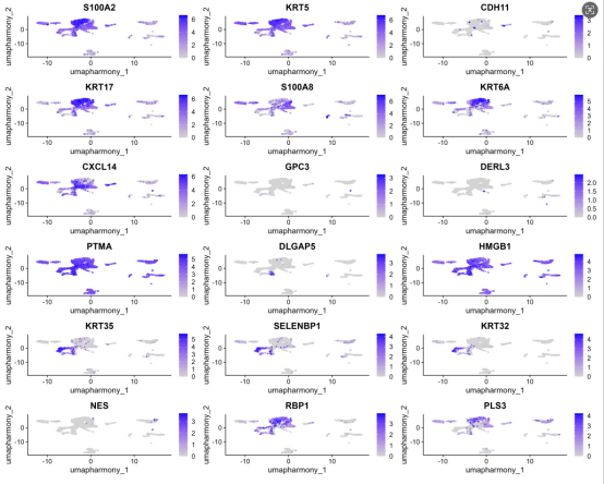
# 标记基因的umap结果图可视化
feature_plot <- FeaturePlot(
  combined_seurat,
  features = unlist(celltype_markers),
  reduction = "umap_harmony",
  ncol = 3,
  order = TRUE
)
# 添加分细胞类型的组间差异分析
Idents(combined_seurat) <- "cell_type"
cell_types <- unique(Idents(combined_seurat))
for(ct in cell_types) {
  subset_seurat <- subset(combined_seurat, idents = ct)
  Idents(subset_seurat) <- "group"
  markers <- FindMarkers(subset_seurat, ident.1 = "Treatment", ident.2 = "Control")
  write.csv(markers, paste0("Treatment_vs_Control_in_", ct, ".csv"))
  }
##### 007结果保存与导出 #####
# 保存完整Seurat对象
saveRDS(combined_seurat, "integrated_seurat_object.rds")
# 导出元数据和UMAP坐标
metadata <- combined_seurat@meta.data
umap_coords <- Embeddings(combined_seurat, "umap_harmony")
tsne_coords <- Embeddings(combined_seurat, "tsne_harmony")
write.csv(metadata, "cell_metadata.csv")
write.csv(umap_coords, "umap_coordinates.csv")
write.csv(tsne_coords, "tsne_coordinates.csv")
# 导出为h5ad格式(用于Python分析)
library(SeuratDisk)
SaveH5Seurat(combined_seurat, filename = "integrated_data.h5Seurat")
Convert("integrated_data.h5Seurat", dest = "h5ad")好了本次分享就到这里,下期将有更精彩单细胞分析内容,敬请期待。
关注"在打豆豆的小潘学长"微信公众号,还有更精彩内容。

 浙公网安备 33010602011771号