

CSS animation-timeline动画时间线 - 详解
CSS animation-timeline动画时间线
概述
CSS animation-timeline 将动画进度与特定事件(股东你、视口可见性)绑定。
语法
animation-timeline: 驱动方式;
- scroll():动画进度与页面或容器的滚动位置关联。
- view():动画进度与元素进入、离开视口的可见性关联。
使用
<!DOCTYPE html>
<html lang="en">
<head>
<meta charset="UTF-8">
<title>animation-timeline</title>
<style>
* {
padding: 0;
margin: 0;
box-sizing: border-box;
}
.navbar {
position: fixed;
top: 0;
left: 0;
width: 100%;
height: 100px;
background-color: #fff;
box-shadow: 0 0 10px rgba(0, 0, 0, 0.5);
}
.navbar .scrollbar {
width: 0%;
height: 3px;
background: linear-gradient(90deg, #96f, #bf70ff, #e67aff, #ff89dc, #ffa176, #ffb90f);
animation: anim 2s linear forwards;
animation-timeline: scroll();
}
.content {
width: 100%;
height: 1500px;
padding-top: 100px;
}
@keyframes anim {
from {
width: 0;
}
to {
width: 100%;
}
}
</style>
</head>
<body>
<div class="navbar">
<div class="scrollbar"></div>
</div>
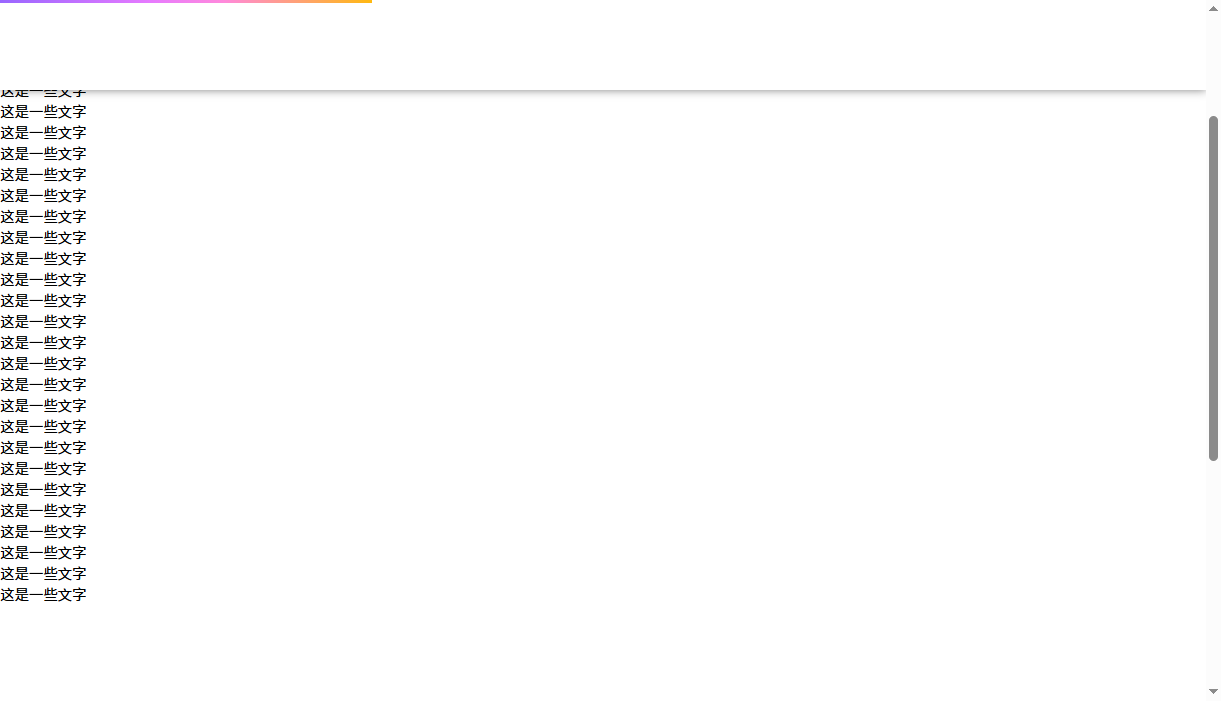
<div class="content">
<p>这是一些文字</p>
<p>这是一些文字</p>
<p>这是一些文字</p>
<p>这是一些文字</p>
<p>这是一些文字</p>
<p>这是一些文字</p>
<p>这是一些文字</p>
<p>这是一些文字</p>
<p>这是一些文字</p>
<p>这是一些文字</p>
<p>这是一些文字</p>
<p>这是一些文字</p>
<p>这是一些文字</p>
<p>这是一些文字</p>
<p>这是一些文字</p>
<p>这是一些文字</p>
<p>这是一些文字</p>
<p>这是一些文字</p>
<p>这是一些文字</p>
<p>这是一些文字</p>
<p>这是一些文字</p>
<p>这是一些文字</p>
<p>这是一些文字</p>
<p>这是一些文字</p>
<p>这是一些文字</p>
<p>这是一些文字</p>
<p>这是一些文字</p>
<p>这是一些文字</p>
<p>这是一些文字</p>
<p>这是一些文字</p>
<p>这是一些文字</p>
<p>这是一些文字</p>
<p>这是一些文字</p>
<p>这是一些文字</p>
</div>
</body>
</html>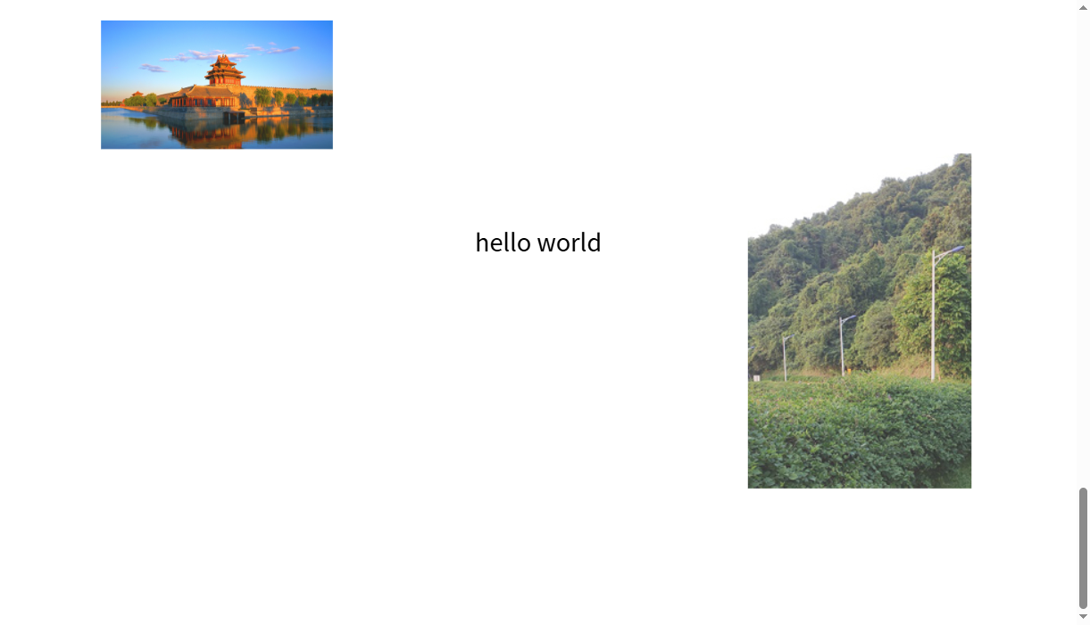
<!DOCTYPE html>
    <html lang="en">
    <head>
        <meta charset="UTF-8">
      <title>animation-timeline 视图时间线</title>
        <style>
          * {
          padding: 0;
          margin: 0;
          box-sizing: border-box;
          }
          body {
          height: 3000px;
          }
          .box {
          position: sticky;
          top: 50px;
          width: 1000px;
          height: 500px;
          margin: 800px auto 0;
          }
          .box p {
          position: absolute;
          top: 50%;
          left: 50%;
          transform: translate(-50%, -50%);
          font-size: 30px;
          }
          .box img {
          position: absolute;
          opacity: 0.2;
          animation: anim 1s linear forwards;
          animation-timeline: view();
          }
          .box .pic1 {
          top: 0;
          left: 0;
          width: 200px;
          }
          .box .pic2 {
          right: 0;
          bottom: 0;
          width: 200px;
          }
          @keyframes anim {
          from {
          transform: scale(1);
          opacity: 0.2;
          }
          to {
          transform: scale(1.5);
          opacity: 1;
          }
          }
        </style>
      </head>
      <body>
          <div class="box">
        <p>hello world</p>
            <img class="pic1" src="../../../assets/images/0.jpg" alt="">
              <img class="pic2" src="../../../assets/images/pic1.png" alt="">
            </div>
          </body>
        </html>
 浙公网安备 33010602011771号