bootstrap中popover.js(弹出框)使用总结+案例
*bootstrap官方说明:http://v3.bootcss.com/javascript/#popovers
一. popover常用配置参数:
 1 //常用配置参数:
 2 $(document).ready(function() {
 3             $('#temp').popover(
 4                 {
 5                     trigger:'click', //触发方式
 6                     template: '', //你自定义的模板
 7                     title:"标题",//设置 弹出框 的标题
 8                     html: true, // 为true的话,data-content里就能放html代码了
 9                     content:"",//这里可以直接写字符串,也可以 是一个函数,该函数返回一个字符串;
10                 }
11             );
12         }
13 //常用方法:
14 $('#element').popover('show');
15 $('#element').popover('hide');
16 $('#element').popover('destroy')
二. 案例分析:
1. 案例要求:动态产生一个按钮,并给页面中所有具有data-toggle="popover"属性的元素绑定popover(弹出框)效果,触发方式:当鼠标指针放到元素上时弹出弹出框,离开元素时,弹出框消失;弹出框内容要求:一定要包含该触发弹窗元素的文本信息;
2. html代码:(注意引入bootstrap.js和样式)
1 <body>
2     <a id="temp1" tabindex="0" class="btn btn-lg btn-danger" role="button" data-toggle="popover"  title="Dismissible popover" >弹出框1</a>
3     <a id="temp2" tabindex="0" class="btn btn-lg btn-danger" role="button" data-toggle="popover">弹出框2</a>
4
5     <div id="LinkDIV" style="float:left;width:200px">
6     </div>
7 </body>
3. js代码:
<script>
        $(function () {
            $("#LinkDIV").html('<button type="btn btn-lg btn-primary" data-toggle="popover" id="temp3">弹出框3</button>');
            $('[data-toggle="popover"]').each(function () {
                var element = $(this);
                var id = element.attr('id');
                var txt = element.html();
                element.popover({
                    trigger: 'manual',
                    placement: 'bottom', //top, bottom, left or right
                    title: txt,
                    html: 'true',
                    content: ContentMethod(txt),

                }).on("mouseenter", function () {
                    var _this = this;
                    $(this).popover("show");
                    $(this).siblings(".popover").on("mouseleave", function () {
                        $(_this).popover('hide');
                    });
                }).on("mouseleave", function () {
                    var _this = this;
                    setTimeout(function () {
                        if (!$(".popover:hover").length) {
                            $(_this).popover("hide")
                        }
                    }, 100);
                });
            });
        });
        function ContentMethod(txt) {
            return '<table class="table table-bordered"><tr><td>' + txt + '</td><td>BB</td><td>CC</td><td>DD</td></tr>' +
                    '<tr><td>' + txt + '</td><td>BB</td><td>CC</td><td>DD</td></tr>' +
                    '<tr><td>' + txt + '</td><td>BB</td><td>CC</td><td>DD</td></tr>'+
                    '<tr><td>AAAAAAAAAAAAAAAAAAAAAAAAAAAAAAAAAAAAAAAAAAAAAAAAA</td><td>BB</td><td>CC</td><td>DD</td></tr></table>';
        }
    </script>
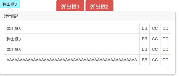
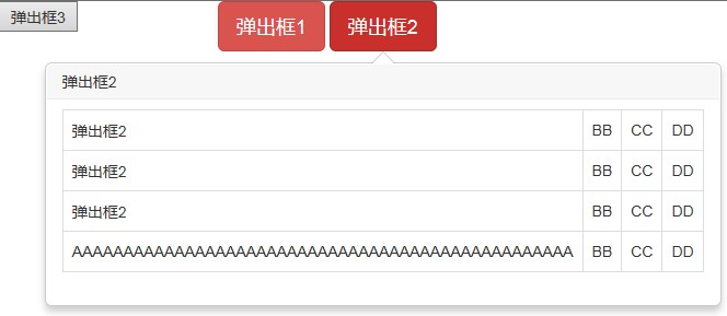
4. 效果图:
*tips:
1. 弹出框的最大宽度有默认值:275px;(bootstrap.min.css)
 1 .popover {
 2             position: absolute;
 3             top: 0;
 4             left: 0;
 5             z-index: 1060;
 6             display: none;
 7             max-width: 2000px;//我改为了2000px
 8             padding: 1px;
 9             font-family: "Helvetica Neue",Helvetica,Arial,sans-serif;
10             font-size: 14px;
11             font-style: normal;
12             font-weight: 400;
13             line-height: 1.42857143;
14             text-align: left;
15             text-align: start;
16             text-decoration: none;
17             text-shadow: none;
18             text-transform: none;
19             letter-spacing: normal;
20             word-break: normal;
21             word-spacing: normal;
22             word-wrap: normal;
23             white-space: normal;
24             background-color: #fff;
25             -webkit-background-clip: padding-box;
26             background-clip: padding-box;
27             border: 1px solid #ccc;
28             border: 1px solid rgba(0,0,0,.2);
29             border-radius: 6px;
30             -webkit-box-shadow: 0 5px 10px rgba(0,0,0,.2);
31             box-shadow: 0 5px 10px rgba(0,0,0,.2);
32             line-break: auto;
33         }

 浙公网安备 33010602011771号