WPF中Ribbon控件的使用
这篇博客将分享如何在WPF程序中使用Ribbon控件。Ribbon可以很大的提高软件的便捷性。
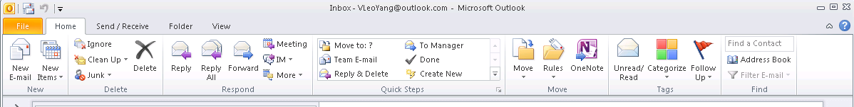
上面截图使Outlook 2010的界面,在Home标签页中,将所属的Menu都平铺的布局,非常容易的可以找到想要的Menu。在Outlook 2003时代,将Home下面的Menu都垂直的排列下来,操作的便捷程度降低了很多。Ribbon的布局会随着窗体的变化动态的调整。

上面的图片中标注了Ribbon的4个区块。
下面我们就在WPF中使用Ribbon控件来实现一个简单的界面。
1. 添加System.Windows.Controls.Ribbon的引用;
2. XAML Code:
<RibbonWindow x:Class="WpfRibbonWinApp.MainWindow"
        xmlns="http://schemas.microsoft.com/winfx/2006/xaml/presentation"
        xmlns:x="http://schemas.microsoft.com/winfx/2006/xaml"
        xmlns:d="http://schemas.microsoft.com/expression/blend/2008"
        xmlns:mc="http://schemas.openxmlformats.org/markup-compatibility/2006"
        xmlns:shell="clr-namespace:System.Windows.Shell;assembly=PresentationFramework"
        xmlns:local="clr-namespace:WpfRibbonWinApp"
        mc:Ignorable="d"
        Title="Ribbon Window App"
        WindowStartupLocation="CenterScreen"
        Height="350" Width="525">
    <Grid>
        <Grid.RowDefinitions>
            <RowDefinition Height="Auto" />
            <RowDefinition Height="*" />
        </Grid.RowDefinitions>

        <Ribbon Grid.Row="0">
            <!--Ribbon Quick Access Toolbar-->
            <Ribbon.QuickAccessToolBar>
                <RibbonQuickAccessToolBar>
                    <RibbonButton SmallImageSource="Resources\Images\Save_30px.png" />
                    <RibbonSplitButton SmallImageSource="Resources\Images\Undo_30px.png">
                        <RibbonSplitMenuItem Header="Undo1" />
                        <RibbonSplitMenuItem Header="Undo2" />
                        <RibbonSplitMenuItem Header="Undo3" />
                    </RibbonSplitButton>
                    <RibbonSplitButton SmallImageSource="Resources\Images\Redo_30px.png">
                        <RibbonSplitMenuItem Header="Redo1" />
                        <RibbonSplitMenuItem Header="Redo2" />
                        <RibbonSplitMenuItem Header="Redo3" />
                    </RibbonSplitButton>
                </RibbonQuickAccessToolBar>
            </Ribbon.QuickAccessToolBar>

            <!--Ribbon Help Pane Content-->
            <Ribbon.HelpPaneContent>
                <RibbonButton SmallImageSource="Resources\Images\Help_30px.png" />
            </Ribbon.HelpPaneContent>

            <!--Ribbon Application Menu-->
            <Ribbon.ApplicationMenu>
                <RibbonApplicationMenu KeyTip="F">
                    <RibbonApplicationMenuItem Header="Save" Width="150" ImageSource="Resources\Images\Save_30px.png"/>
                    <RibbonApplicationMenuItem Header="Options" ImageSource="Resources\Images\Settings_30px.png" />
                </RibbonApplicationMenu>
            </Ribbon.ApplicationMenu>

            <!--Ribbon Tab #1 Home-->
            <RibbonTab Header="Home" KeyTip="H">
                <RibbonGroup Header="Home">
                    <RibbonMenuButton LargeImageSource="Resources\Images\Paste_30px.png" Label="Paste" KeyTip="V">
                        <RibbonMenuItem Header="Keep Text Only" />
                        <RibbonMenuItem Header="Keep Source Format" />
                    </RibbonMenuButton>

                    <RibbonButton SmallImageSource="Resources\Images\Undo_30px.png" Label="Copy" />
                    <RibbonButton SmallImageSource="Resources\Images\Redo_30px.png" Label="Format" />
                </RibbonGroup>

                <RibbonGroup Header="Operation">
                    <RibbonMenuButton LargeImageSource="Resources\Images\Delete_30px.png" Label="Delete" />
                    <RibbonMenuButton SmallImageSource="Resources\Images\Save_30px.png" Label="Save" />
                    <RibbonMenuButton SmallImageSource="Resources\Images\Print_30px.png" Label="Print" />
                </RibbonGroup>
            </RibbonTab>

            <RibbonTab Header="View" KeyTip="V">

            </RibbonTab>

            <RibbonTab Header="Help">

            </RibbonTab>
        </Ribbon>
    </Grid>
</RibbonWindow>
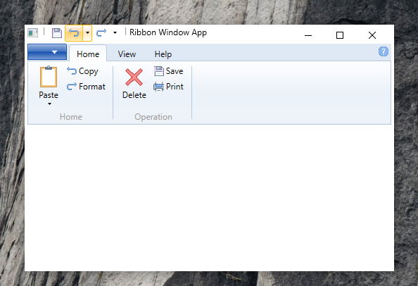
运行结果:

XAML代码中标粗的LargeImageSource和SmallImageSource对应的RibbonButton在大小上是有区别的。另外,如果需要在一个Ribbon Tab下有不同的功能分类,可以使用Ribbon Group进行划分。
另外上面的运行结果截图的窗体很怪异,左右两边明显很宽。这个问题在Windows 8一下的平台是不存在的。可以通过下面的方式解决。设置WindowsChrome,
    xmlns:shell="clr-namespace:System.Windows.Shell;assembly=PresentationFramework"

    <WindowChrome.WindowChrome>
        <WindowChrome GlassFrameThickness="{x:Static shell:WindowChrome.GlassFrameCompleteThickness}" />
    </WindowChrome.WindowChrome>
运行结果如下:
这篇博客就简单的介绍一下WPF中Ribbon控件的使用。另外除了.NET 提供的Ribbon库之外,有一些很优秀的WPF Ribbon控件库,例如:Fluent.Ribbon.功能比较全面。可以支持Metro样式的Ribbon。本篇博客的代码点击这里下载。
感谢您的阅读。
本文版权归作者和博客园共有,欢迎转载,但未经作者同意必须保留此段声明,且在文章页面明显位置给出原文连接,否则保留追究法律责任的权利。

 浙公网安备 33010602011771号