

python中用matplotlib.pyplot.subplots画共享坐标曲线图
注:(1)控制坐标轴显示刻度用到了库:matplotlib.ticker,可能需要安装一下(如果小伙伴有更好的方法,可以留言交流一下)
(2)主要用到的函数matplotlib.pyplot.subplots,别忘了加“s”
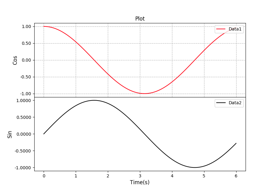
import numpy as np
import matplotlib.pyplot as plt
from matplotlib.ticker import FormatStrFormatter

from2 = FormatStrFormatter('%1.2f')
from4 = FormatStrFormatter('%1.4f')

time = np.linspace(0,6,100)                  #生成两个函数
data1 = np.cos(time)
data2 = np.sin(time)

fig = plt.figure()                           #声明画布
p1, p2 = fig.subplots(2,1, sharex = True, sharey = False)    #设置共享坐标轴 2:两行,1:一列,sharex:共享X轴,sharey:共享Y轴
plt.subplots_adjust(wspace = 0, hspace = 0 ) #wspace:图间的行距离, hspace:图间的列距离
p1.grid(linestyle = '--')                    #设置线型   在图中画格网    - 实线   -- 虚线   -. 点划线   : 点线

p1.yaxis.set_major_formatter(from2)          #用来控制坐标轴显示的刻度位数
p2.yaxis.set_major_formatter(from4)

p1.set_title('Plot')
p1.set_ylabel('Cos', fontsize=12)           #设置坐标轴名字
p2.set_ylabel('Sin', fontsize=12)
p2.set_xlabel('Time(s)', fontsize=12)

p1.plot(time, data1, 'r-', label='Data1')   #plot:画曲线图,scatter:画散点图,bar:柱状图
p2.plot(time, data2, 'k-', label='Data2')   #b: blue,g:  green,r:  red,c:  cyan,m:  magenta,y:  yellow,k:  black,w:  white
                                            #lable:legend的显示
p1.legend(loc = 'upper right')  #ncol:列   控制显示标签的位置
p2.legend(loc = 'upper right')

plt.show()
效果图:

 浙公网安备 33010602011771号