


css基础(二)
1、浮动布局
2、文字环绕
3、案例1:使用<ul> <li>标签制作导航
4、案例2:使用<ul> <li>标签制作导航(li添加背景图片)
5、清除浮动
6、css初始化
7、overflow属性
8、定位
9、定位的盒子居中显示
10、标签包含规范
11、规避拖标流
12、图片和文字垂直居中对齐
13、css可见性
14、内容移出
15、css精灵图
16、属性选择器
1、浮动布局 <--返回目录
标准流(文档流):元素自上而下,自左而右,块元素独占一行,行内元素在一行上显示,碰到父级元素的边框换行。
浮动布局:float:left | right
- 特点:
** 浮动之后不占据原来的位置(脱标)
** 浮动的盒子在一行上显示(即两个盒子都浮动,显示在一行)
** 行内元素浮动之后转换为行内块元素。(不推荐使用,转行内元素最好使用display: inline-block;)
<!DOCTYPE html>
<html>
<head>
    <title>标题</title>
    <meta charset="utf-8">
    <style type="text/css">
        div {
            width: 300px;
            height: 250px;
            background-color: green;
        }
        .one {
            background-color: red;
            float: right;/*将该div拖出,并浮于右侧*/
        }
        .two {
            background-color: blue;
            width: 400px;
            height: 350px;
        }
    </style>
</head>
<body>
    <div class="one">文本一</div>
    <div class="two">文本二</div>
    <div class="three">文本三</div>
</body>
</html>
2、文字环绕 <--返回目录
文字不会跑到图片下面
<head>
    <meta charset="UTF-8">
    <title>Document</title>
    <style type="text/css">
        .box{
            width: 400px;
            height: 300px;
            background: #eee;
        }
        .box img{
            width: 200px;
            float: left;
        }
    </style>
</head>
<body>
    <div class="box">
        <img src="1.jpg" alt="">
        <p>“中国优势”知多少 听xxx为你一一道来</p>
        <p>“中国优势”知多少 听xxx为你一一道来</p>
        <p>“中国优势”知多少 听xxx为你一一道来</p>
        <p>“中国优势”知多少 听xxx为你一一道来</p>
        <p>“中国优势”知多少 听xxx为你一一道来</p>
    </div>
</body>
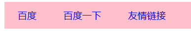
3、案例1:使用<ul> <li>标签制作导航 <--返回目录
<!DOCTYPE html>
<html lang="en">
<head>
    <meta charset="UTF-8">
    <title>Document</title>
    <style type="text/css">
        body,ul,li{
            margin:0;
            padding: 0;
        }
        ul,li{
            list-style: none;
        }
        .nav{
            width: 800px;
            height: 40px;
            background: pink;
            margin: 20px auto;
        }
        .nav ul li{
            float: left;    /*将li元素拖出*/
        }
        .nav ul li a{
            display: inline-block;
            height: 40px;
            font: 14px/40px 微软雅黑;
            padding:0 20px;
            text-decoration: none;/*去除文本下划线*/
        }
        .nav ul li a:hover{
            background: #aaa;
        }
    </style>
</head>
<body>
    <div class="nav">
        <ul>
            <li><a href="#">百度</a></li>
            <li><a href="#">百度一下</a></li>
            <li><a href="#">友情链接</a></li>
        </ul>
    </div>
</body>
</html>
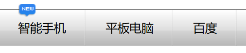
4、案例2:使用<ul> <li>标签制作导航(li添加背景图片) <--返回目录
<!DOCTYPE html>
<html lang="en">
<head>
    <meta charset="UTF-8">
    <title>Document</title>
    <style type="text/css">
        body,ul,li{
            margin: 0;
            padding: 0;
        }
        li{
            list-style: none;
        }
        .nav{
            height: 55px;
            background: url("head_bg.jpg");
            margin-top: 30px;
            border-top: 1px solid #666;
        }
        .nav-con{
            width: 1000px;
            margin:0 auto;
            height: 55px;
            position: relative;    /*定位:父相*/
        }
        .nav-con ul li{
            float: left;
            background: url("li_bg.png") no-repeat right;
            height: 55px;
            padding:0 30px;
        }
        .nav-con ul li a{
            display: inline-block;  /*将行内元素a转换为行内块元素*/
            height: 55px;
            font:18px/55px 微软雅黑;
            text-decoration: none;   /*去除文本的下划线*/
            color: #000;
        }
        .nav-con ul li a:hover{
            color:red;
        }
        .news{
            position: absolute;  /*定位:子绝*/
            left: 30px;
            bottom:40px;
        }

    </style>
</head>
<body>
    <div class="nav">
        <div class="nav-con">     <!-- navigator-content导航内容 -->
            <ul>
                <li><a href="#">智能手机</a></li>
                <li><a href="#">平板电脑</a></li>
                <li><a href="#">百度</a></li>
                <li><a href="#">么么么哒</a></li>
            </ul>
            <div class="news"><img src="new.png"></div>
        </div>
    </div>
</body>
</html>
5、清除浮动 <--返回目录
* 当父盒子没有定义高度(默认高度为0),嵌套的盒子浮动之后,下边的元素发生位置错误。
- 清除浮动不是不用浮动,而是清除浮动产生的不利影响。
- 事实上,盒子中的内容有时候不确定(比如新闻内容)。定义高度并不好。
* 清除浮动的方法
- 方法一:额外标签法
** 在最后一个浮动元素后添加标签<div style="clear:both;"/>
- 方法二:给父元素使用overflow:hidden;溢出的隐藏
** 弊端:如果有内容出了盒子,不能使用这个方法。
- 方法三:伪元素清除浮动【推荐使用】
.clearfix:after{
content: ".";
display: block;
height: 0;
line-height: 0;
visibility: hidden;
clear:both;
}
/*兼容ie浏览器*/
.clearfix{
zoom:1;
}
清除浮动demo:
<!DOCTYPE html>
<html lang="en">
<head>
    <meta charset="UTF-8">
    <title>Document</title>
    <style type="text/css">
        .header,.main,.footer{
            width: 500px;
        }
        .header,.footer{
            height: 100px;
            background: pink;
        }
        .main{
            background: blue;
        }

        .left,.right{
            width: 100px;
            height: 300px;
        }
        .left{
            background: orange;
            float: left;
        }
        .content{
            width: 300px;
            height: 300px;
            background: yellow;
            float: left;
        }
        .right{
            background: green;
            float: right;
        }
        .content-top,.content-bot{

            height: 150px;
        }
        .content-top{
            background: #660000;
        }
        .content-bot{
            background: #000066;
        }

        .clearfix:after {
            content:".";
            display: block;
            height: 0;
            line-height: 0;
            visibility: hidden;
            clear:both;
        }
        /*兼容ie浏览器*/
        .clearfix{
            zoom:1;
        }

    </style>
</head>
<body>
    <div class="header"></div>
    <div class="main clearfix">
     <div class="left"></div>
     <div class="content">
         <div class="content-top"></div>
         <div class="content-bot"></div>
     </div>
     <div class="right"></div>
    </div>
    <div class="footer"></div>
</body>
</html>
6、css初始化 <--返回目录
为了考虑浏览器的兼容性,其实不同浏览器对有些标签的默认值是不同的,
如果没有对css初始化,往往会出现浏览器之间的页面差异
body,ul,li,p,h1,h2,h3,h4,h5,h6,dl,dt,dd,input {
    margin: 0;
    padding: 0;
}
img {
    border: 0 none;
}
li {
    list-style: none;
}
a {
    text-decoration: none;
}
input {
    border: 0 none;
    outline-style: none;
}

common样式
.fl {
    float: left;
}
.fr {
    float: right;
}
.clearfix:after {
    content: ".";
    display: block;
    height: 0;
    line-height: 0;
    visibility: hidden;
    clear: both;
}
.clearfix {
    zoom: 1;
}
7、overflow属性 <--返回目录
* overflow:溢出的意思,overflow属性规定当内容溢出元素框时发生的事情。
* overflow:visible
- 默认值。内容不会被修剪,会呈现在元素框之外。
* overflow:hidden
- 内容会被修剪,并且其余内容是不可见的。
* overflow:scroll
- 内容会被修剪,但是浏览器会显示滚动条以便查看其余的内容。
* overflow:auto
- 如果内容被修剪,则浏览器会显示滚动条以便查看其余的内容。
8、定位 <--返回目录
* position:static; 静态定位
- 就是默认值,即文档流
* position:absolute; 绝对定位
- 将对象从文档流中拖出,可以通过top bottom left right进行定位,定位基于浏览器
- 嵌套的盒子,父盒子没有使用定位,子盒子绝对定位,子盒子定位是基于浏览器
- 嵌套的盒子,父盒子使用定位,子盒子绝对定位,子盒子位置是基于父元素位置。
- 给行内元素使用绝对定位之后,转换为行内块元素。(不推荐使用,推荐使用display:inline-block;)
* position:relative; 相对定位
- 不会将对象从文档流中拖出,可以通过top bottom left right进行定位
- 相对定位,位置从自身出发(即基于自己原来的位置)
- 一般子元素设置绝对定位,父元素设置相对定位(子绝父相)
- 行内元素使用相对定位不能转行内块
* position:fixed; 固定定位
- 将对象从文档流中拖出,位置基于浏览器
- 元素使用固定定位之后,会转化为行内块(不推荐,推荐使用display:inline-block;)
- 特点:页面滚动,但是固定定位的元素不滚动。
案例:
<!DOCTYPE html>
<html lang="en">
<head>
    <meta charset="UTF-8">
    <title>Document</title>
    <style type="text/css">
        .father{
            width:1226px;
            position: relative;
            margin:0 auto;
        }
        .one{
            position: absolute;
            top:0;
            left:0;
        }
        .two{
            position: absolute;
            left:242px;
            top:210px;
        }
        .theer{
            position: absolute;
            right:0;
            top:210px;
        }
    </style>
</head>
<body>
    <div class="father">
        <div><img src="1.jpg" alt=""></div>
        <div class="one"><img src="xiaom_left.png" alt=""></div>
        <div class="two"><img src="left.png" alt=""></div>
        <div class="theer"><img src="right.png" alt=""></div>
    </div>
</body>
</html>
9、定位的盒子居中显示 <--返回目录
margin:0 auto; 只能让标准流的盒子居中对齐。
定位的盒子居中:先向右走父元素盒子的一半50%,在向左走子盒子的一半(margin-left:负值。)
<head>
    <meta charset="UTF-8">
    <title>Document</title>
    <style type="text/css">
        body{
            margin:0;
            padding:0;
        }
        .box{
            height: 500px;
            background: #aaa;
            position: relative;  /*子绝 父相*/
        }
        .nav{
            width: 960px;
            height: 60px;
            background:#666;
            position: absolute;
            bottom:0;
            left:50%;                /*右移父盒子的0.5倍*/
            margin-left:-480px;  /*左移自己宽度的0.5倍*/
        }
    </style>
</head>
<body>
    <div class="box">
        <div class="nav"></div>
    </div>
</body>
10、标签包含规范 <--返回目录
* div可以包含所有的标签。
* p标签不能包含div h1等标签。
* h1可以包含p,div等标签。
* 行内元素尽量包含行内元素,行内元素不要包含块元素。
11、规避拖标流 <--返回目录
* 基本原则
- 尽量使用标准流(文档流)。
- 标准流解决不了的使用浮动。
- 浮动解决不了的使用定位。
* 规避拖标流的小技术
margin-left:auto;/*使子盒子在父盒子右侧*/
margin-left:auto;/*这两句可以使得盒子居中*/
margin-right:auto;
上面两句等价于 margin:0 auto;
12、图片和文字垂直居中对齐 <--返回目录
* 图片和文字默认是以文字的基线对齐
* vertical-align:
- 对inline-block最敏感。
- 默认属性是:vertical-align:baseline;
- vertical-align:middle;图片和文字垂直居中对齐
- sub:垂直对齐文本的下标
- super:垂直对齐文本的上标
- top:把元素的顶端与行中最高元素的顶端对齐
- text-top:把元素的顶端与父元素最高元素的底端对齐
- bottom: text-bottom:
- +/- 10px:-10px是往居中靠拢
13、css可见性 <--返回目录
* overflow:hidden; 溢出隐藏
visibility:hidden; 隐藏元素,隐藏之后还占据原来的位置。
display:none; 隐藏元素,隐藏之后不占据原来的位置。
display:block; 元素可见
display:none 和display:block 常配合js使用。
<!DOCTYPE html>
<html lang="en">
    <head>
        <meta charset="utf-8">
        <style>
             .box{
                 width:300px;
                 height:200px;
                 border:1px solid red;
                 overflow:hidden;
             }
             .one,.two,.tree{
                 width:300px;
                 height:200px;
             }
             .one{
                  background-color:green;
             }
             .two{
                  background-color:pink;
             }
             .tree{
                  background-color:yellowgreen;
             }
             a{
                display:inline-block;
                width:40px;
                border:1px solid green;
             }
        </style>
    </head>
    <body>
          <a href="#one">div1</a>
          <a href="#two">div2</a>
          <a href="#tree">div3</a>
         <div class="box">
             <div class="one" id="one">
                div1
             </div>
             <div class="two" id="two">
                div2
             </div>
             <div class="tree" id="tree">
                div3
             </div>
         </div>
    </body>
</html>

14、内容移出 <--返回目录
搜狐logo优化
<!DOCTYPE html>
<html lang="en">
<head>
    <meta charset="UTF-8">
    <title>Document</title>
    <style type="text/css">
        .logo{
            width: 143px;
            height: 76px;
            background: url("logo.png");
        }
        a{
            display: inline-block;
            text-indent:-5000em;
        }
    </style>
</head>
<body>
    <div class="logo">
        <h1>
         <a href="#">搜狐</a>
        </h1>
    </div>
</body>
</html>
将元素高度设置为0,使用内边距将盒子撑开,给盒子使用overflow:hidden;将文字隐藏。
<!DOCTYPE html>
<html lang="en">
<head>
    <meta charset="UTF-8">
    <title>Document</title>
    <style type="text/css">
     .box{
        width: 300px;
        height: 0;
        padding-bottom: 100px;
        overflow: hidden;
        background: red;
     }
    </style>
</head>
<body>
    <div class="box">14期威武</div>
</body>
</html>
15、css精灵图 <--返回目录
* 精灵图的由来
- 上图所示为网页的请求原理图,当用户访问一个网站时,需要向服务器发送请求,
网页上的每张图像都要经过一次请求才能展现给用户。
- 然而,一个网页中往往会应用很多小的背景图像作为修饰,当网页中的图像过多时,
服务器就会频繁地接受和发送请求,这将大大降低页面的加载速度。为了有效地减少服
务器接受和发送请求的次数,提高页面的加载速度,出现了CSS精灵技术(也称CSS Sprites)。
* 简单地说,CSS精灵是一种处理网页背景图像的方式。它将一个页面涉及到的所有零星背景图像
都集中到一张大图中去,然后将大图应用于网页,这样,当用户访问该页面时,只需向服务
发送一次请求,网页中的背景图像即可全部展示出来。通常情况下,这个由很多小的背景图像合成的大图被称为精灵图
* 工作原理
- CSS 精灵其实是将网页中的一些背景图像整合到一张大图中(精灵图)。
然而,各个网页元素通常只需要精灵图中不同位置的某个小图,要想精
确定位到精灵图中的某个小图,就需要使用CSS的background-image、
background-repeat和background-position属性进行背景定位,其中
最关键的是使用background-position属性精确地定位。
案例:
<!DOCTYPE html>
<html>
<head>
    <title></title>
    <style type="text/css">
        .box {
            width: 24px;
            height: 24px;
            background:url("tbbg.png") 0 -44px;
        }
    </style>
</head>
<body>
    <div class="box"></div>
</body>
</html>
16、属性选择器 <--返回目录
* input[type=text][id]
input[type=text][class]有class属性,不管其值是什么
input[type=text][class=username]
posted on 2019-12-29 16:31 wenbin_ouyang 阅读(251) 评论(0) 收藏 举报

 浙公网安备 33010602011771号