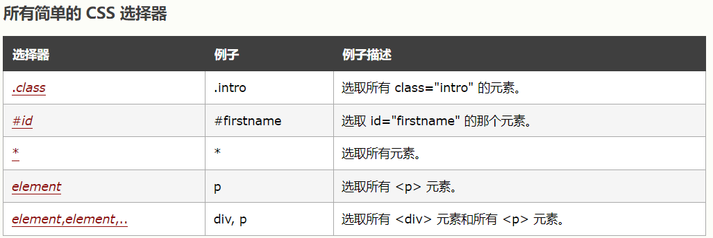
2.CSS 选择器
CSS 选择器用于“查找”(或选取)要设置样式的 HTML 元素。
我们可以将 CSS 选择器分为五类:
①.CSS 元素选择器
元素选择器根据元素名称来选择 HTML 元素。
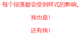
<head>
<style>
p {
  text-align: center;
  color: red;
}
</style>
</head>
<body>

<p>每个段落都会受到样式的影响。</p>
<p id="para1">我也是!</p>
<p>还有我!</p>
②.CSS id 选择器
id 选择器使用 HTML 元素的 id 属性来选择特定元素。
元素的 id 在页面中是唯一的,因此 id 选择器用于选择一个唯一的元素!
要选择具有特定 id 的元素,请写一个井号(#),后跟该元素的 id。
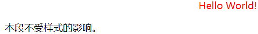
<head>
<style>
#para1 {
  text-align: center;
  color: red;
}
</style>
</head>
<body>

<p id="para1">Hello World!</p>
<p>本段不受样式的影响。</p>

</body>
③.CSS 类选择器
类选择器(.)选择有特定 class 属性的 HTML 元素。
如需选择拥有特定 class 的元素,请写一个句点(.)字符,后面跟类名。
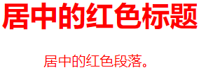
<head>
<style>
.center {
  text-align: center;
  color: red;
}
</style>
</head>
<body>

<h1 class="center">居中的红色标题</h1>
<p class="center">居中的红色段落。</p>

</body>
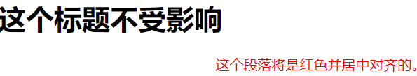
您还可以指定只有特定的 HTML 元素会受类的影响。
<head>
<style>
p.center {
text-align: center;
color: red;
}
</style>
</head>
<body>
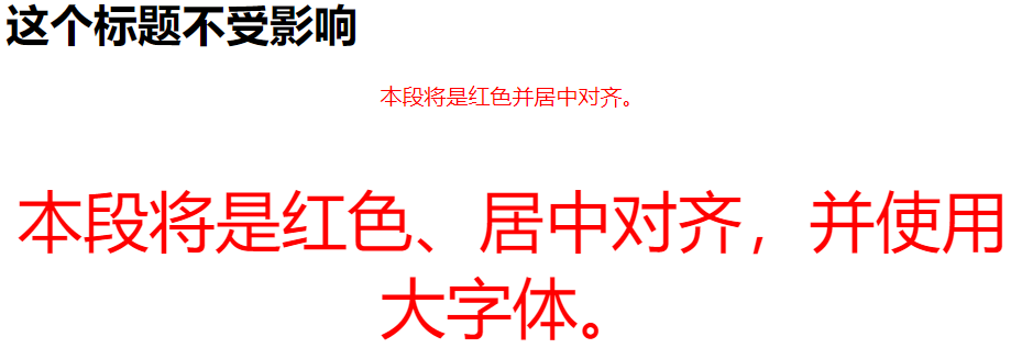
<h1 class="center">这个标题不受影响</h1>
<p class="center">这个段落将是红色并居中对齐的。</p>
</body>
HTML 元素也可以引用多个类。
<head>
<style>
p.center {
  text-align: center;
  color: red;
}

p.large {
  font-size: 300%;
}
</style>
</head>
<body>

<h1 class="center">这个标题不受影响</h1>
<p class="center">本段将是红色并居中对齐。</p>
<p class="center large">本段将是红色、居中对齐,并使用大字体。</p>

</body>
注意:类名不能以数字开头!
④.CSS 通用选择器
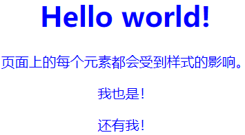
通用选择器(*)选择页面上的所有的 HTML 元素。
<head>
<style>
* {
  text-align: center;
  color: blue;
}
</style>
</head>
<body>

<h1>Hello world!</h1>

<p>页面上的每个元素都会受到样式的影响。</p>
<p id="para1">我也是!</p>
<p>还有我!</p>

</body>
⑤.CSS 分组选择器
分组选择器选取所有具有相同样式定义的 HTML 元素。
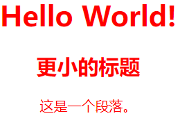
请看下面的 CSS 代码(h1、h2 和 p 元素具有相同的样式定义):
<head>
<style>
h1, h2, p {
  text-align: center;
  color: red;
}
</style>
</head>
<body>

<h1>Hello World!</h1>
<h2>更小的标题</h2>
<p>这是一个段落。</p>

</body>
延伸阅读
课外书:CSS 元素选择器
课外书:CSS 选择器分组
课外书:CSS 类选择器详解
课外书:CSS ID 选择器详解
课外书:CSS 属性选择器详解
课外书:CSS 后代选择器
课外书:CSS 子元素选择器
课外书:CSS 相邻兄弟选择器
每个 HTML 元素都可以看作一个盒子,由内容区(content)、内边距(padding)、边框(border)和外边距(margin)构成。
.box {
    width: 200px;
    height: 100px;
    padding: 20px;
    border: 1px solid black;
    margin: 10px;
/*盒模型容器内容的居中*/
    background-color: blue;
    display: flex;
    ustify-content: center;
    align-items: center;
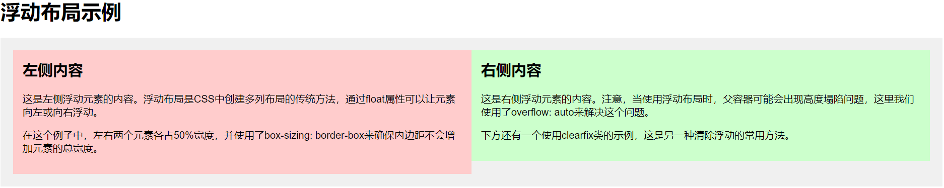
使用 float 属性让元素向左或向右浮动。
<!-- html-->
<h1>浮动布局示例</h1>

  <div class="container">
    <div class="left">
      <h2>左侧内容</h2>
      <p>这是左侧浮动元素的内容。浮动布局是CSS中创建多列布局的传统方法,通过float属性可以让元素向左或向右浮动。</p>
      <p>在这个例子中,左右两个元素各占50%宽度,并使用了box-sizing: border-box来确保内边距不会增加元素的总宽度。</p>
    </div>

    <div class="right">
      <h2>右侧内容</h2>
      <p>这是右侧浮动元素的内容。注意,当使用浮动布局时,父容器可能会出现高度塌陷问题,这里我们使用了overflow: auto来解决这个问题。</p>
      <p>下方还有一个使用clearfix类的示例,这是另一种清除浮动的常用方法。</p>
    </div>

    <!-- 清除浮动的另一种方法 -->
    <div class="clearfix"></div>
  </div>
/* css */
body {
  font-family: Arial, sans-serif;
  margin: 0;
  padding: 20px;
}

.container {
  background-color: #f0f0f0;
  padding: 20px;
  /* 清除浮动的方法之一:使用BFC */
  overflow: auto;
}

.left {
  float: left;
  width: 50%;
  background-color: #ffcccc;
  padding: 15px;
  box-sizing: border-box;
}

.right {
  float: right;
  width: 50%;
  background-color: #ccffcc;
  padding: 15px;
  box-sizing: border-box;
}

h2 {
  margin-top: 0;
}

.clearfix::after {
  content: "";
  display: table;
  clear: both;
}
弹性布局是一种一维布局模型,便于在容器内对元素进行对齐和分布。
<!-- htlm -->
<div class="flex-container">
    <div>项目 1</div>
    <div>项目 2</div>
    <div>项目 3</div>
</div>
 /* css */
.flex-container {
  display: flex;
  justify-content: space-around;
}
网格布局是一种二维布局模型,可创建复杂的网格结构。
<!-- html -->
<div class="grid-container">
    <div>项目 1</div>
    <div>项目 2</div>
    <div>项目 3</div>
</div>
/* css */
.grid-container {
    display: grid;
    grid-template-columns: repeat(3, 1fr);
    gap: 10px;
}

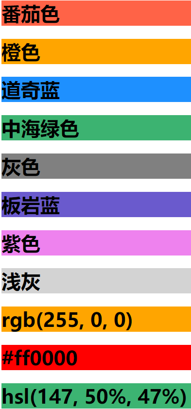
3.CSS颜色:指定颜色是通过使用预定义的颜色名称,或 RGB、HEX、HSL、RGBA、HSLA 值。
<!-- 颜色名称 -->
<h1 style="background-color:Tomato;">番茄色</h1>
<h1 style="background-color:Orange;">橙色</h1>
<h1 style="background-color:DodgerBlue;">道奇蓝</h1>
<h1 style="background-color:MediumSeaGreen;">中海绿色</h1>
<h1 style="background-color:Gray;">灰色</h1>
<h1 style="background-color:SlateBlue;">板岩蓝</h1>
<h1 style="background-color:Violet;">紫色</h1>
<h1 style="background-color:LightGray;">浅灰</h1>
<!-- RGB-->
<h1 style="background-color:rgb(255, 0, 0);">rgb(255, 0, 0)</h1>
<!-- HEX-->
<h1 style="background-color:#ff0000;">#ff0000</h1>
<!-- HSL-->
<h1 style="background-color:hsl(147, 50%, 47%);">hsl(147, 50%, 47%)</h1>
4.CSS背景(background)属性允许你为元素设置背景效果,包括颜色、图片、渐变等。
设置元素的背景色,可以使用颜色名称、十六进制值、RGB、RGBA(带透明度)等表示方式。
/* CSS */
.element {
  background-color: lightblue; /* 颜色名称 */
  background-color: #3498db;   /* 十六进制 */
  background-color: rgb(52, 152, 219); /* RGB */
  background-color: rgba(52, 152, 219, 0.7); /* RGBA(透明度 70%) */
}
/* CSS */
body {
            font-family: Arial, sans-serif;
            margin: 0;
            padding: 20px;
        }

        .container {
            display: flex;
            flex-wrap: wrap;
            gap: 20px;
            justify-content: center;
        }

        .box {
            width: 300px;
            height: 200px;
            border-radius: 10px;
            display: flex;
            align-items: center;
            justify-content: center;
            color: white;
            font-size: 24px;
            font-weight: bold;
            text-shadow: 1px 1px 3px rgba(0, 0, 0, 0.8);
            box-shadow: 0 4px 8px rgba(0, 0, 0, 0.2);
        }

        /* 本地或远程纯图片背景 */
        .image-bg {
            background-image: url('https://picsum.photos/300/200');
            background-size: cover;
            background-position: center;
        }

        /* 纯渐变背景 */
        .gradient-bg {
            background-image: linear-gradient(to right, #ff416c, #ff4b2b);
        }

        /* 图片与渐变叠加 */
        .combined-bg {
            background-image:
                linear-gradient(to right, rgba(0, 0, 0, 0.7), rgba(0, 0, 0, 0.3)),
                url('https://picsum.photos/300/200?grayscale');
            background-size: cover;
            background-position: center;
            background-blend-mode: overlay;
        }

        /* 多色渐变 */
        .multicolor-gradient {
            background-image: linear-gradient(45deg, #ff9a9e, #fad0c4, #fbc2eb, #a18cd1);
            background-size: 300% 300%;
            animation: gradientShift 8s ease infinite;
        }

        @keyframes gradientShift {
            0% { background-position: 0% 50%; }
            50% { background-position: 100% 50%; }
            100% { background-position: 0% 50%; }
        }

        h1 {
            text-align: center;
            color: #333;
            margin-bottom: 30px;
        }
<!-- html -->
<h1>CSS 背景图像与渐变示例</h1>

    <div class="container">
        <div class="box image-bg">图片背景</div>
        <div class="box gradient-bg">渐变背景</div>
        <div class="box combined-bg">叠加效果</div>
        <div class="box multicolor-gradient">动画渐变</div>
    </div>
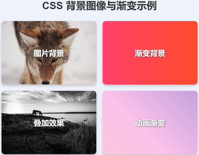
这个案例展示了四种不同的背景效果:
-
纯图片背景 - 使用网络图片作为背景
-
纯渐变背景 - 从左到右的红色到黄色渐变
-
图片与渐变叠加 - 在图片上叠加半透明渐变,使用background-blend-mode混合
-
动画渐变 - 创建多彩渐变并添加动画效果
自定义建议
-
要使用本地图片,只需将URL替换为相对路径(如images/my-photo.jpg)
-
调整linear-gradient的方向和颜色可以创建不同的渐变效果
-
尝试不同的background-blend-mode值(如multiply, screen等)可以获得不同的混合效果
控制背景图片的重复方式。
 /* CSS */
body {
            font-family: Arial, sans-serif;
            margin: 0;
            padding: 20px;
            background-color: #f5f5f5;
        }

        h1 {
            text-align: center;
            color: #333;
            margin-bottom: 30px;
        }

        .container {
            display: flex;
            flex-wrap: wrap;
            gap: 30px;
            justify-content: center;
            max-width: 1200px;
            margin: 0 auto;
        }

        .example {
            width: 300px;
            height: 200px;
            border: 2px solid #333;
            border-radius: 8px;
            background-color: white;
            padding: 15px;
            box-shadow: 0 4px 8px rgba(0, 0, 0, 0.1);
            position: relative;
            overflow: hidden;
        }

        .example::before {
            content: attr(data-title);
            position: absolute;
            top: 10px;
            left: 10px;
            background-color: rgba(0, 0, 0, 0.7);
            color: white;
            padding: 5px 10px;
            border-radius: 4px;
            font-size: 14px;
            z-index: 1;
        }

        .pattern-box {
            width: 100%;
            height: 100%;
            background-image: url('data:image/svg+xml;utf8,<svg xmlns="http://www.w3.org/2000/svg" width="40" height="40" viewBox="0 0 40 40"><circle cx="20" cy="20" r="15" fill="%23ff6b6b" opacity="0.7"/></svg>');
            background-color: #e9f7fe;
        }

        /* 不重复 */
        .no-repeat .pattern-box {
            background-repeat: no-repeat;
            background-position: center;
        }

        /* 水平重复 */
        .repeat-x .pattern-box {
            background-repeat: repeat-x;
            background-position: left center;
        }

        /* 垂直重复 */
        .repeat-y .pattern-box {
            background-repeat: repeat-y;
            background-position: top center;
        }

        /* 双向重复 (默认)*/
        .repeat .pattern-box {
            background-repeat: repeat;
        }

        /* 空间重复 - 不裁剪 */
        .space .pattern-box {
            background-repeat: space;
        }

        /* 四舍五入重复 - 缩放适应 */
        .round .pattern-box {
            background-repeat: round;
        }

        .code {
            margin-top: 15px;
            padding: 10px;
            background-color: #f0f0f0;
            border-radius: 4px;
            font-family: monospace;
            font-size: 14px;
            white-space: nowrap;
            overflow-x: auto;
        }
<!-- html -->
<h1>CSS background-repeat 属性示例</h1>

    <div class="container">
        <div class="example no-repeat" data-title="no-repeat">
            <div class="pattern-box"></div>
            <div class="code">background-repeat: no-repeat;</div>
        </div>

        <div class="example repeat-x" data-title="repeat-x">
            <div class="pattern-box"></div>
            <div class="code">background-repeat: repeat-x;</div>
        </div>

        <div class="example repeat-y" data-title="repeat-y">
            <div class="pattern-box"></div>
            <div class="code">background-repeat: repeat-y;</div>
        </div>

        <div class="example repeat" data-title="repeat">
            <div class="pattern-box"></div>
            <div class="code">background-repeat: repeat;</div>
        </div>

        <div class="example space" data-title="space">
            <div class="pattern-box"></div>
            <div class="code">background-repeat: space;</div>
        </div>

        <div class="example round" data-title="round">
            <div class="pattern-box"></div>
            <div class="code">background-repeat: round;</div>
        </div>
    </div>
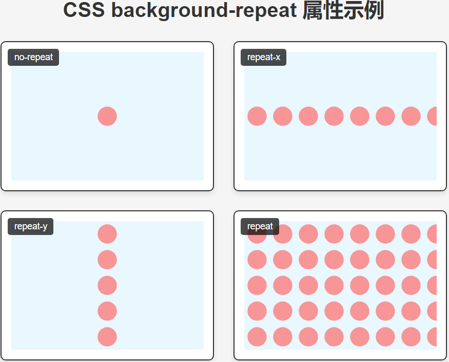
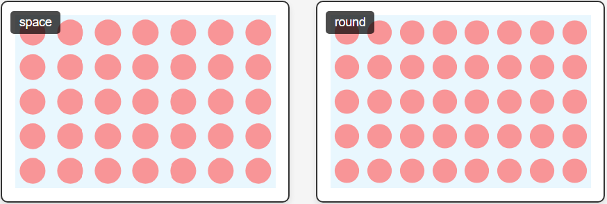
这个案例展示了6种不同的 background-repeat 属性值:
-
no-repeat - 背景图像不重复,只显示一次
-
repeat-x - 背景图像在水平方向重复
-
repeat-y - 背景图像在垂直方向重复
-
repeat - 背景图像在水平和垂直方向重复(默认值)
-
space - 图像在不被裁剪的情况下尽可能重复,多余空间均匀分配
-
round - 图像在不被裁剪的情况下尽可能重复,图像会被适当缩放以适应空间
技术细节
-
使用内联SVG作为背景图案(红色半透明圆形)
-
每个示例框都显示了对应的CSS代码
-
使用::before伪元素显示当前示例的标题
-
响应式布局,适合在不同屏幕尺寸下查看
自定义建议
-
要使用自己的图片,只需替换background-image的URL
-
可以调整pattern-box的尺寸来观察不同容器大小下的重复效果
-
尝试结合background-size属性可以获得更多效果
/* CSS */
body {
            font-family: Arial, sans-serif;
            margin: 0;
            padding: 20px;
            background-color: #f5f5f5;
        }

        h1 {
            text-align: center;
            color: #333;
            margin-bottom: 30px;
        }

        .container {
            display: grid;
            grid-template-columns: repeat(2, 1fr);
            gap: 30px;
            max-width: 1000px;
            margin: 0 auto;
        }

        .example {
            height: 250px;
            border: 2px solid #333;
            border-radius: 8px;
            background-color: white;
            padding: 15px;
            box-shadow: 0 4px 8px rgba(0, 0, 0, 0.1);
            position: relative;
            overflow: hidden;
        }

        .example::before {
            content: attr(data-title);
            position: absolute;
            top: 10px;
            left: 10px;
            background-color: rgba(0, 0, 0, 0.7);
            color: white;
            padding: 5px 10px;
            border-radius: 4px;
            font-size: 14px;
            z-index: 1;
        }

        .target-box {
            width: 100%;
            height: 100%;
            background-image: url('data:image/svg+xml;utf8,<svg xmlns="http://www.w3.org/2000/svg" width="100" height="100" viewBox="0 0 100 100"><rect x="10" y="10" width="80" height="80" fill="%23ff6b6b" opacity="0.7"/><text x="50" y="55" font-family="Arial" font-size="20" text-anchor="middle" fill="white">★</text></svg>');
            background-color: #e9f7fe;
            background-repeat: no-repeat;
            border: 1px dashed #999;
        }

        /* 关键词定位示例 */
        .center .target-box {
            background-position: center;
        }

        .top-right .target-box {
            background-position: top right;
        }

        .bottom-left .target-box {
            background-position: bottom left;
        }

        .left-center .target-box {
            background-position: left center;
        }

        /* 像素值定位示例 */
        .pixel-20-50 .target-box {
            background-position: 20px 50px;
        }

        .pixel-100-30 .target-box {
            background-position: 100px 30px;
        }

        /* 百分比定位示例 */
        .percent-50-25 .target-box {
            background-position: 50% 25%;
        }

        .percent-80-60 .target-box {
            background-position: 80% 60%;
        }

        .code {
            margin-top: 15px;
            padding: 10px;
            background-color: #f0f0f0;
            border-radius: 4px;
            font-family: monospace;
            font-size: 14px;
            white-space: nowrap;
            overflow-x: auto;
        }

        .coordinate-marker {
            position: absolute;
            font-size: 12px;
            color: #666;
        }

        .x-axis {
            bottom: 5px;
            left: 50%;
            transform: translateX(-50%);
        }

        .y-axis {
            top: 50%;
            left: 5px;
            transform: translateY(-50%) rotate(-90deg);
            transform-origin: left center;
        }
<!-- html -->
<h1>CSS background-position 属性示例</h1>

    <div class="container">
        <!-- 关键词定位 -->
        <div class="example center" data-title="center">
            <div class="target-box"></div>
            <div class="code">background-position: center;</div>
        </div>

        <div class="example top-right" data-title="top right">
            <div class="target-box"></div>
            <div class="code">background-position: top right;</div>
        </div>

        <div class="example bottom-left" data-title="bottom left">
            <div class="target-box"></div>
            <div class="code">background-position: bottom left;</div>
        </div>

        <div class="example left-center" data-title="left center">
            <div class="target-box"></div>
            <div class="code">background-position: left center;</div>
        </div>

        <!-- 像素值定位 -->
        <div class="example pixel-20-50" data-title="20px 50px">
            <div class="target-box"></div>
            <div class="code">background-position: 20px 50px;</div>
            <div class="coordinate-marker" style="left: 20px; top: 50px;">(20,50)</div>
        </div>

        <div class="example pixel-100-30" data-title="100px 30px">
            <div class="target-box"></div>
            <div class="code">background-position: 100px 30px;</div>
            <div class="coordinate-marker" style="left: 100px; top: 30px;">(100,30)</div>
        </div>

        <!-- 百分比定位 -->
        <div class="example percent-50-25" data-title="50% 25%">
            <div class="target-box"></div>
            <div class="code">background-position: 50% 25%;</div>
            <div class="coordinate-marker x-axis">x:50%</div>
            <div class="coordinate-marker y-axis">y:25%</div>
        </div>

        <div class="example percent-80-60" data-title="80% 60%">
            <div class="target-box"></div>
            <div class="code">background-position: 80% 60%;</div>
            <div class="coordinate-marker x-axis">x:80%</div>
            <div class="coordinate-marker y-axis">y:60%</div>
        </div>
    </div>
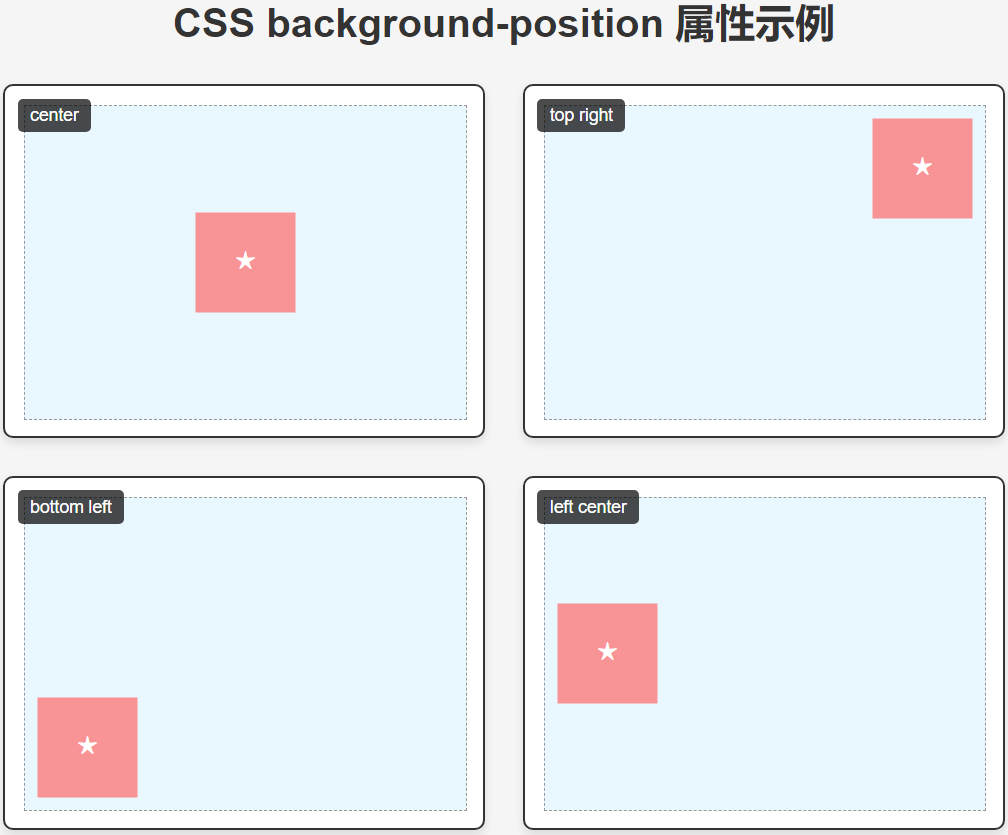
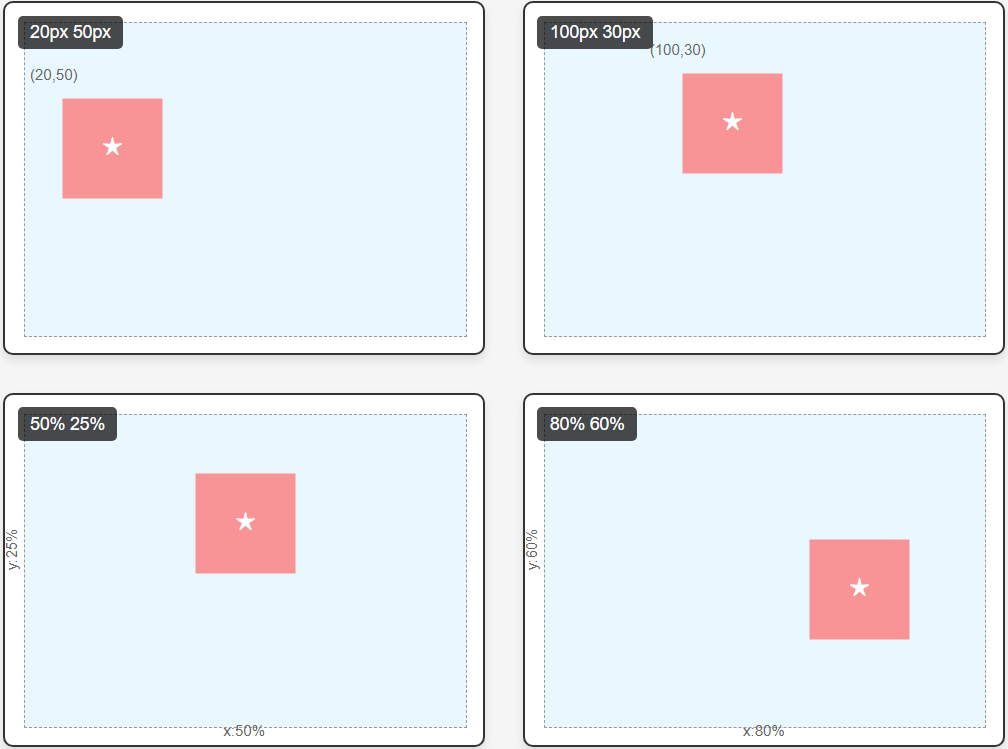
这个案例展示了8种不同的 background-position 属性值:
关键词定位
-
center - 背景图像居中
-
top right - 背景图像位于右上角
-
bottom left - 背景图像位于左下角
-
left center - 背景图像垂直居中靠左
像素值定位
-
20px 50px - 背景图像距离左上角水平20px,垂直50px
-
100px 30px - 背景图像距离左上角水平100px,垂直30px
百分比定位
-
50% 25% - 背景图像水平50%,垂直25%位置
-
80% 60% - 背景图像水平80%,垂直60%位置
技术细节
-
使用内联SVG作为背景图案(红色方块内含星形)
-
每个示例框都显示了对应的CSS代码
-
使用::before伪元素显示当前示例的标题
-
为像素和百分比定位添加了坐标标记
-
网格布局展示不同定位效果
自定义建议
-
要使用自己的图片,只需替换background-image的URL
-
可以调整.target-box的尺寸来观察不同容器大小下的定位效果
-
尝试结合background-size属性可以获得更多定位效果
-
百分比定位特别适合响应式设计中的背景定位
⑤. 背景尺寸 (background-size) 调整背景图片的尺寸。
/* CSS */
 * {
            box-sizing: border-box;
            margin: 0;
            padding: 0;
        }

        body {
            font-family: 'Arial', sans-serif;
            line-height: 1.6;
            padding: 20px;
            background-color: #f5f5f5;
            color: #333;
        }

        h1 {
            text-align: center;
            margin: 20px 0 30px;
            color: #2c3e50;
        }

        .container {
            display: grid;
            grid-template-columns: repeat(auto-fit, minmax(300px, 1fr));
            gap: 25px;
            max-width: 1200px;
            margin: 0 auto;
        }

        .example {
            background-color: white;
            border-radius: 8px;
            overflow: hidden;
            box-shadow: 0 4px 10px rgba(0, 0, 0, 0.1);
            transition: transform 0.3s ease;
        }

        .example:hover {
            transform: translateY(-5px);
        }

        .image-container {
            height: 200px;
            background-image: url('https://images.unsplash.com/photo-1506744038136-46273834b3fb?ixlib=rb-1.2.1&auto=format&fit=crop&w=1350&q=80');
            background-repeat: no-repeat;
            background-position: center;
            border-bottom: 1px solid #eee;
            position: relative;
        }

        .example-title {
            position: absolute;
            bottom: 0;
            left: 0;
            right: 0;
            background-color: rgba(0, 0, 0, 0.7);
            color: white;
            padding: 10px;
            font-size: 16px;
        }

        .example-content {
            padding: 15px;
        }

        .code {
            background-color: #f8f9fa;
            padding: 10px;
            border-radius: 4px;
            font-family: 'Courier New', monospace;
            font-size: 14px;
            margin: 10px 0;
            overflow-x: auto;
        }

        /* 不同的 background-size 示例 */
        .cover .image-container {
            background-size: cover;
        }

        .contain .image-container {
            background-size: contain;
            background-color: #e3f2fd; /* 添加背景色以显示留白 */
        }

        .stretch .image-container {
            background-size: 100% 100%;
        }

        .custom .image-container {
            background-size: 200px 150px;
        }

        /* 响应式设计示例 */
        .responsive {
            grid-column: 1 / -1;
        }

        .responsive .image-container {
            height: 300px;
            background-size: cover;
        }

        @media (max-width: 768px) {
            .responsive .image-container {
                background-size: contain;
            }
        }
<!-- html -->
<h1>CSS background-size 属性示例</h1>
<div class="container">
<div class="example cover">
<div class="image-container">
<div class="example-title">background-size: cover</div>
</div>
<div class="example-content">
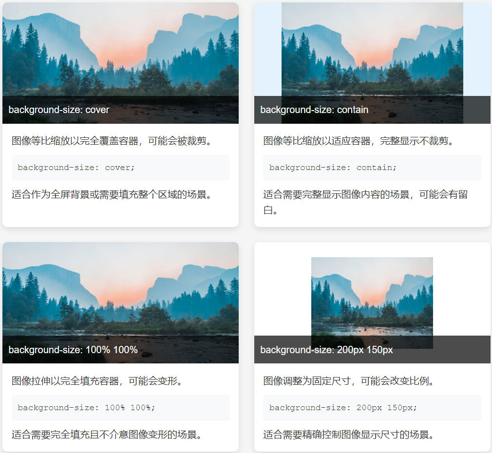
<p>图像等比缩放以完全覆盖容器,可能会被裁剪。</p>
<div class="code">background-size: cover;</div>
<p>适合作为全屏背景或需要填充整个区域的场景。</p>
</div>
</div>
<div class="example contain">
<div class="image-container">
<div class="example-title">background-size: contain</div>
</div>
<div class="example-content">
<p>图像等比缩放以适应容器,完整显示不裁剪。</p>
<div class="code">background-size: contain;</div>
<p>适合需要完整显示图像内容的场景,可能会有留白。</p>
</div>
</div>
<div class="example stretch">
<div class="image-container">
<div class="example-title">background-size: 100% 100%</div>
</div>
<div class="example-content">
<p>图像拉伸以完全填充容器,可能会变形。</p>
<div class="code">background-size: 100% 100%;</div>
<p>适合需要完全填充且不介意图像变形的场景。</p>
</div>
</div>
<div class="example custom">
<div class="image-container">
<div class="example-title">background-size: 200px 150px</div>
</div>
<div class="example-content">
<p>图像调整为固定尺寸,可能会改变比例。</p>
<div class="code">background-size: 200px 150px;</div>
<p>适合需要精确控制图像显示尺寸的场景。</p>
</div>
</div>
<div class="example responsive">
<div class="image-container">
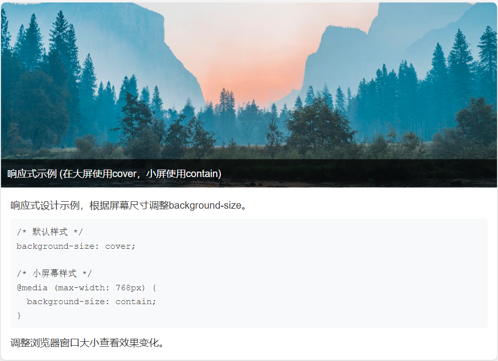
<div class="example-title">响应式示例 (在大屏使用cover,小屏使用contain)</div>
</div>
<div class="example-content">
<p>响应式设计示例,根据屏幕尺寸调整background-size。</p>
<div class="code">
/* 默认样式 */<br>
background-size: cover;<br><br>
/* 小屏幕样式 */<br>
@media (max-width: 768px) {<br>
background-size: contain;<br>
}
</div>
<p>调整浏览器窗口大小查看效果变化。</p>
</div>
</div>
</div>
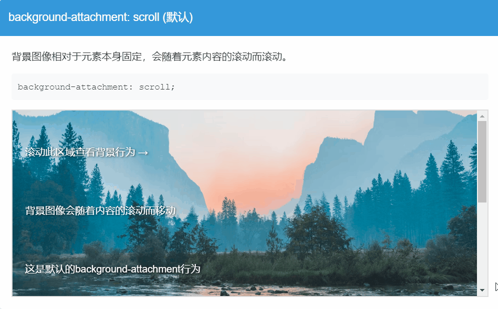
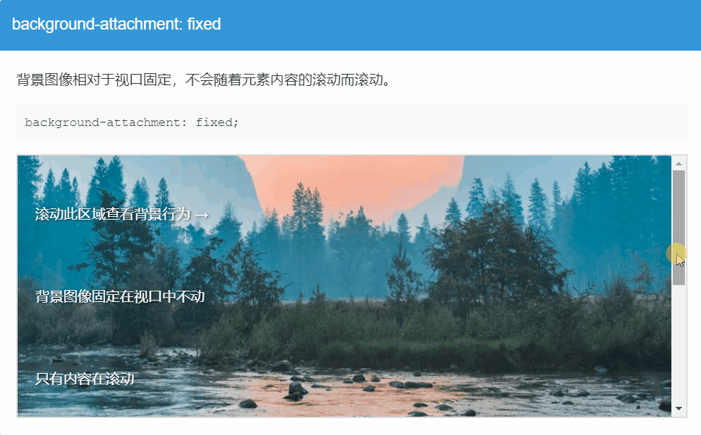
⑥.背景附着 (background-attachment) 控制背景图片随滚动的行为。
/* CSS */
* {
            box-sizing: border-box;
            margin: 0;
            padding: 0;
        }

        body {
            font-family: 'Arial', sans-serif;
            line-height: 1.6;
            color: #333;
        }

        h1 {
            text-align: center;
            margin: 20px 0;
            padding: 20px;
            background-color: #2c3e50;
            color: white;
        }

        .container {
            max-width: 1200px;
            margin: 0 auto;
            padding: 20px;
        }

        .example {
            margin-bottom: 40px;
            border-radius: 8px;
            overflow: hidden;
            box-shadow: 0 4px 10px rgba(0, 0, 0, 0.1);
        }

        .example-title {
            padding: 15px;
            background-color: #3498db;
            color: white;
            font-size: 18px;
        }

        .example-content {
            padding: 20px;
            background-color: white;
        }

        .demo-box {
            height: 300px;
            overflow-y: scroll;
            border: 2px solid #ddd;
            position: relative;
            background-image: url('https://images.unsplash.com/photo-1506744038136-46273834b3fb?ixlib=rb-1.2.1&auto=format&fit=crop&w=1350&q=80');
            background-repeat: no-repeat;
            background-position: center;
            background-size: cover;
            color: white;
            text-shadow: 1px 1px 3px rgba(0, 0, 0, 0.8);
        }

        .demo-content {
            height: 600px;
            padding: 20px;
            display: flex;
            flex-direction: column;
            justify-content: space-around;
        }

        .code {
            background-color: #f8f9fa;
            padding: 10px;
            border-radius: 4px;
            font-family: 'Courier New', monospace;
            font-size: 14px;
            margin: 15px 0;
            overflow-x: auto;
            color: #333;
        }

        /* 不同的 background-attachment 示例 */
        .scroll .demo-box {
            background-attachment: scroll;/* 随内容滚动(默认)*/
        }

        .fixed .demo-box {
            background-attachment: fixed;/* 固定在视口 */
        }

        .local .demo-box {
            background-attachment: local; /* 随元素内部内容滚动*/
        }

        .comparison {
            display: grid;
            grid-template-columns: repeat(3, 1fr);
            gap: 20px;
            margin-top: 30px;
        }

        .comparison-box {
            height: 250px;
            overflow-y: scroll;
            border: 2px solid #ddd;
            background-image: url('https://images.unsplash.com/photo-1506744038136-46273834b3fb?ixlib=rb-1.2.1&auto=format&fit=crop&w=1350&q=80');
            background-repeat: no-repeat;
            background-position: center;
            background-size: cover;
        }

        .comparison-content {
            height: 400px;
            padding: 15px;
            color: white;
            text-shadow: 1px 1px 3px rgba(0, 0, 0, 0.8);
        }

        .scroll-compare {
            background-attachment: scroll; /* 随内容滚动(默认)*/
        }

        .fixed-compare {
            background-attachment: fixed; /* 固定在视口 */
        }

        .local-compare {
            background-attachment: local; /* 随元素内部内容滚动*/
        }

        .comparison-title {
            text-align: center;
            margin-bottom: 10px;
            font-weight: bold;
            color: #333;
        }

实际应用提示:
scroll是默认行为,适合大多数常规情况
fixed常用于创建视差滚动效果
local适用于有内部滚动区域的元素
响应式设计,适应不同屏幕
/* CSS */
.element {
  background: #f0f0f0 url('image.jpg') no-repeat center/cover fixed;
  /* 顺序:颜色 图片 重复 位置/尺寸 附着 */
}
* {
            box-sizing: border-box;
            margin: 0;
            padding: 0;
        }

        body {
            font-family: 'Arial', sans-serif;
            line-height: 1.6;
            color: #333;
            padding: 20px;
            background-color: #f9f9f9;
        }

        h1 {
            text-align: center;
            margin: 20px 0 30px;
            color: #2c3e50;
            padding-bottom: 10px;
            border-bottom: 2px solid #3498db;
        }

        .container {
            max-width: 1000px;
            margin: 0 auto;
            display: grid;
            grid-template-columns: repeat(auto-fit, minmax(300px, 1fr));
            gap: 25px;
        }

        .example {
            background-color: white;
            border-radius: 8px;
            overflow: hidden;
            box-shadow: 0 4px 15px rgba(0, 0, 0, 0.1);
            transition: transform 0.3s ease;
        }

        .example:hover {
            transform: translateY(-5px);
        }

        .demo-box {
            height: 200px;
            border-bottom: 1px solid #eee;
            position: relative;
        }

        .example-title {
            padding: 15px;
            background-color: #3498db;
            color: white;
            font-size: 18px;
        }

        .example-content {
            padding: 15px;
        }

        .code {
            background-color: #f8f9fa;
            padding: 10px;
            border-radius: 4px;
            font-family: 'Courier New', monospace;
            font-size: 14px;
            margin: 10px 0;
            overflow-x: auto;
            white-space: nowrap;
        }

        .description {
            margin-top: 10px;
            font-size: 14px;
            color: #666;
        }

        /* 不同的 background 简写示例 */
        .example1 .demo-box {
            background: #ffeb3b url('https://picsum.photos/400/300?random=1') no-repeat center/cover;
        }

        .example2 .demo-box {
            background: #e3f2fd url('https://picsum.photos/400/300?random=2') repeat-x center/contain;
        }

        .example3 .demo-box {
            background: #333 url('https://picsum.photos/400/300?random=3') no-repeat right top/200px 150px;
        }

        .example4 .demo-box {
            background: linear-gradient(to bottom, rgba(0,0,0,0.7), rgba(0,0,0,0.3)),
                        url('https://picsum.photos/400/300?random=4') no-repeat center/cover fixed;
        }

        .example5 .demo-box {
            background: #8bc34a url('data:image/svg+xml;utf8,<svg xmlns="http://www.w3.org/2000/svg" width="100" height="100" viewBox="0 0 100 100"><circle cx="50" cy="50" r="40" fill="%23ffffff" opacity="0.5"/></svg>') repeat local center/50px;
        }

        .full-page {
            grid-column: 1 / -1;
            height: 400px;
        }

        .full-page .demo-box {
            height: 100%;
        }
<!-- html -->
<h1>CSS background 简写属性示例</h1>

    <div class="container">
        <div class="example example1">
            <div class="demo-box"></div>
            <div class="example-content">
                <div class="example-title">基础背景简写</div>
                <div class="code">background: #ffeb3b url('image.jpg') no-repeat center/cover;</div>
                <div class="description">
                    包含背景色、图片、不重复、居中并覆盖整个元素。注意:背景色在图片透明区域会显示。
                </div>
            </div>
        </div>

        <div class="example example2">
            <div class="demo-box"></div>
            <div class="example-content">
                <div class="example-title">水平重复 + 包含</div>
                <div class="code">background: #e3f2fd url('image.jpg') repeat-x center/contain;</div>
                <div class="description">
                    背景色为浅蓝色,图片水平重复,完整包含在元素内(可能有留白)。
                </div>
            </div>
        </div>

        <div class="example example3">
            <div class="demo-box"></div>
            <div class="example-content">
                <div class="example-title">固定尺寸 + 右上定位</div>
                <div class="code">background: #333 url('image.jpg') no-repeat right top/200px 150px;</div>
                <div class="description">
                    深色背景,图片固定在右上角,尺寸设置为200×150像素。
                </div>
            </div>
        </div>

        <div class="example example4">
            <div class="demo-box"></div>
            <div class="example-content">
                <div class="example-title">渐变叠加 + 固定背景</div>
                <div class="code">background: linear-gradient(...), url('image.jpg') no-repeat center/cover fixed;</div>
                <div class="description">
                    半透明渐变叠加在图片上,背景固定不随页面滚动(视差效果)。
                </div>
            </div>
        </div>

        <div class="example example5">
            <div class="demo-box"></div>
            <div class="example-content">
                <div class="example-title">SVG图案 + local附着</div>
                <div class="code">background: #8bc34a url('data:svg...') repeat local center/50px;</div>
                <div class="description">
                    绿色背景上叠加SVG圆形图案,图案随内容滚动(local),重复排列。
                </div>
            </div>
        </div>

        <div class="example full-page">
            <div class="demo-box"></div>
            <div class="example-content">
                <div class="example-title">全屏背景示例</div>
                <div class="code">background: #f5f5f5 url('large-image.jpg') no-repeat center/cover fixed;</div>
                <div class="description">
                    尝试滚动整个页面,观察固定背景的效果(实际效果需要更多内容使页面可滚动)。
                </div>
            </div>
        </div>
    </div>

    <!-- 添加一些内容使页面可滚动 -->
    <div style="height: 800px;"></div>

/* CSS */
.element {
  background:
    url('top.png') top no-repeat,    /* 上层图片 */
    url('bottom.png') bottom no-repeat, /* 下层图片 */
    #f0f0f0;                       /* 背景色 */
}
/* CSS */
* {
            box-sizing: border-box;
            margin: 0;
            padding: 0;
        }

        body {
            font-family: 'Arial', sans-serif;
            line-height: 1.6;
            color: #333;
            padding: 20px;
            background-color: #f5f5f5;
        }

        h1 {
            text-align: center;
            margin: 20px 0 30px;
            color: #2c3e50;
            padding-bottom: 10px;
            border-bottom: 2px solid #3498db;
        }

        .container {
            max-width: 1000px;
            margin: 0 auto;
            display: grid;
            grid-template-columns: repeat(auto-fit, minmax(300px, 1fr));
            gap: 25px;
        }

        .example {
            background-color: white;
            border-radius: 8px;
            overflow: hidden;
            box-shadow: 0 4px 15px rgba(0, 0, 0, 0.1);
            transition: transform 0.3s ease;
        }

        .example:hover {
            transform: translateY(-5px);
        }

        .demo-box {
            height: 250px;
            border-bottom: 1px solid #eee;
            position: relative;
        }

        .example-title {
            padding: 15px;
            background-color: #3498db;
            color: white;
            font-size: 18px;
        }

        .example-content {
            padding: 15px;
        }

        .code {
            background-color: #f8f9fa;
            padding: 10px;
            border-radius: 4px;
            font-family: 'Courier New', monospace;
            font-size: 14px;
            margin: 10px 0;
            overflow-x: auto;
        }

        .description {
            margin-top: 10px;
            font-size: 14px;
            color: #666;
        }

        /* 多重背景示例 */
        .example1 .demo-box {
            background:
                url('data:image/svg+xml;utf8,<svg xmlns="http://www.w3.org/2000/svg" width="100" height="100" viewBox="0 0 100 100"><circle cx="50" cy="50" r="40" fill="%23ff5722"/></svg>') top left no-repeat,
                url('data:image/svg+xml;utf8,<svg xmlns="http://www.w3.org/2000/svg" width="100" height="100" viewBox="0 0 100 100"><rect x="10" y="10" width="80" height="80" fill="%234caf50"/></svg>') center no-repeat,
                url('data:image/svg+xml;utf8,<svg xmlns="http://www.w3.org/2000/svg" width="100" height="100" viewBox="0 0 100 100"><polygon points="50,10 90,90 10,90" fill="%232196f3"/></svg>') bottom right no-repeat,
                #ffeb3b;
        }

        .example2 .demo-box {
            background:
                url('https://picsum.photos/300/200?random=1') top left / 100px 100px no-repeat,
                url('https://picsum.photos/300/200?random=2') center / cover no-repeat,
                linear-gradient(45deg, #e3f2fd, #bbdefb);
        }

        .example3 .demo-box {
            background:
                url('data:image/svg+xml;utf8,<svg xmlns="http://www.w3.org/2000/svg" width="20" height="20" viewBox="0 0 20 20"><circle cx="10" cy="10" r="5" fill="%23f44336"/></svg>') repeat,
                url('https://picsum.photos/400/300?random=3') center / contain no-repeat,
                #333;
        }

        .example4 .demo-box {
            background:
                linear-gradient(to bottom, rgba(0,0,0,0.5), transparent),
                url('https://picsum.photos/400/300?random=4') center / cover no-repeat fixed,
                #e0e0e0;
        }

        .example5 .demo-box {
            background:
                url('data:image/svg+xml;utf8,<svg xmlns="http://www.w3.org/2000/svg" width="40" height="40" viewBox="0 0 40 40"><path d="M0,40 L40,0" stroke="%239c27b0" stroke-width="2"/></svg>') repeat,
                url('data:image/svg+xml;utf8,<svg xmlns="http://www.w3.org/2000/svg" width="60" height="60" viewBox="0 0 60 60"><circle cx="30" cy="30" r="20" fill="%23ffc107" opacity="0.7"/></svg>') center no-repeat,
                #f8f8f8;
        }

        .layers {
            position: relative;
            grid-column: 1 / -1;
        }

        .layers .demo-box {
            height: 350px;
        }

        .layer-info {
            position: absolute;
            top: 10px;
            left: 10px;
            background: rgba(0,0,0,0.7);
            color: white;
            padding: 5px 10px;
            border-radius: 4px;
            font-size: 14px;
        }

        .layer1 { top: 20px; left: 20px; }
        .layer2 { top: 40px; left: 40px; }
        .layer3 { top: 60px; left: 60px; }
<!-- html -->
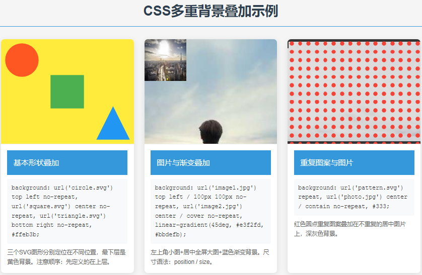
<h1>CSS多重背景叠加示例</h1>
<div class="container">
<div class="example example1">
<div class="demo-box"></div>
<div class="example-content">
<div class="example-title">基本形状叠加</div>
<div class="code">background:
url('circle.svg') top left no-repeat,
url('square.svg') center no-repeat,
url('triangle.svg') bottom right no-repeat,
#ffeb3b;</div>
<div class="description">
三个SVG图形分别定位在不同位置,最下层是黄色背景。注意顺序:先定义的在上层。
</div>
</div>
</div>
<div class="example example2">
<div class="demo-box"></div>
<div class="example-content">
<div class="example-title">图片与渐变叠加</div>
<div class="code">background:
url('image1.jpg') top left / 100px 100px no-repeat,
url('image2.jpg') center / cover no-repeat,
linear-gradient(45deg, #e3f2fd, #bbdefb);</div>
<div class="description">
左上角小图+居中全屏大图+蓝色渐变背景。尺寸语法:position / size。
</div>
</div>
</div>
<div class="example example3">
<div class="demo-box"></div>
<div class="example-content">
<div class="example-title">重复图案与图片</div>
<div class="code">background:
url('pattern.svg') repeat,
url('photo.jpg') center / contain no-repeat,
#333;</div>
<div class="description">
红色圆点重复图案叠加在不重复的居中图片上,深灰色背景。
</div>
</div>
</div>
<div class="example example4">
<div class="demo-box"></div>
<div class="example-content">
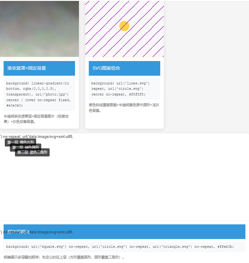
<div class="example-title">渐变遮罩+固定背景</div>
<div class="code">background:
linear-gradient(to bottom, rgba(0,0,0,0.5), transparent),
url('photo.jpg') center / cover no-repeat fixed,
#e0e0e0;</div>
<div class="description">
半透明渐变遮罩层+固定背景图片(视差效果)+灰色后备背景。
</div>
</div>
</div>
<div class="example example5">
<div class="demo-box"></div>
<div class="example-content">
<div class="example-title">SVG图案组合</div>
<div class="code">background:
url('lines.svg') repeat,
url('circle.svg') center no-repeat,
#f8f8f8;</div>
<div class="description">
紫色斜线重复图案+半透明黄色居中圆形+浅灰色背景。
</div>
</div>
</div>
<div class="example layers">
<div class="demo-box" style="background:
url('data:image/svg+xml;utf8,<svg xmlns=\"http://www.w3.org/2000/svg\" width=\"200\" height=\"200\" viewBox=\"0 0 200 200\" fill=\"%23ff5722\"><rect x=\"20\" y=\"20\" width=\"160\" height=\"160\"/></svg>') no-repeat,
url('data:image/svg+xml;utf8,<svg xmlns=\"http://www.w3.org/2000/svg\" width=\"200\" height=\"200\" viewBox=\"0 0 200 200\" fill=\"%234caf50\"><circle cx=\"100\" cy=\"100\" r=\"80\"/></svg>') no-repeat,
url('data:image/svg+xml;utf8,<svg xmlns=\"http://www.w3.org/2000/svg\" width=\"200\" height=\"200\" viewBox=\"0 0 200 200\" fill=\"%232196f3\"><polygon points=\"100,20 180,180 20,180\"/></svg>') no-repeat,
#ffeb3b;">
<div class="layer-info layer1">第一层: 橙色方形</div>
<div class="layer-info layer2">第二层: 绿色圆形</div>
<div class="layer-info layer3">第三层: 蓝色三角形</div>
</div>
<div class="example-content">
<div class="example-title">层次可视化</div>
<div class="code">background:
url('square.svg') no-repeat,
url('circle.svg') no-repeat,
url('triangle.svg') no-repeat,
#ffeb3b;</div>
<div class="description">
明确展示多层叠加顺序:先定义的在上层(方形覆盖圆形,圆形覆盖三角形)。
</div>
</div>
</div>
</div>
⑨.渐变背景 使用 CSS 渐变创建平滑过渡效果:
/* CSS */
* {
            box-sizing: border-box;
            margin: 0;
            padding: 0;
        }

        body {
            font-family: 'Arial', sans-serif;
            line-height: 1.6;
            color: #333;
            padding: 20px;
            background-color: #f5f5f5;
        }

        h1 {
            text-align: center;
            margin: 20px 0 30px;
            color: #2c3e50;
            padding-bottom: 10px;
            border-bottom: 2px solid #3498db;
        }

        .container {
            max-width: 1200px;
            margin: 0 auto;
            display: grid;
            grid-template-columns: repeat(auto-fit, minmax(300px, 1fr));
            gap: 25px;
        }

        .example {
            background-color: white;
            border-radius: 8px;
            overflow: hidden;
            box-shadow: 0 4px 15px rgba(0, 0, 0, 0.1);
            transition: transform 0.3s ease;
        }

        .example:hover {
            transform: translateY(-5px);
        }

        .gradient-box {
            height: 200px;
            border-bottom: 1px solid #eee;
        }

        .example-title {
            padding: 15px;
            background-color: #3498db;
            color: white;
            font-size: 18px;
        }

        .example-content {
            padding: 15px;
        }

        .code {
            background-color: #f8f9fa;
            padding: 10px;
            border-radius: 4px;
            font-family: 'Courier New', monospace;
            font-size: 14px;
            margin: 10px 0;
            overflow-x: auto;
        }

        .description {
            margin-top: 10px;
            font-size: 14px;
            color: #666;
        }

        /* 线性渐变示例 */
        .linear1 .gradient-box {
            background: linear-gradient(to right, #ff416c, #ff4b2b);
        }

        .linear2 .gradient-box {
            background: linear-gradient(135deg, #3498db, #9b59b6);
        }

        .linear3 .gradient-box {
            background: linear-gradient(to bottom, #00b09b, #96c93d);
        }

        .linear4 .gradient-box {
            background: linear-gradient(90deg,
                rgba(255,0,0,0.8) 0%,
                rgba(255,154,0,0.8) 10%,
                rgba(208,222,33,0.8) 20%,
                rgba(79,220,74,0.8) 30%,
                rgba(63,218,216,0.8) 40%,
                rgba(47,201,226,0.8) 50%,
                rgba(28,127,238,0.8) 60%,
                rgba(95,21,242,0.8) 70%,
                rgba(186,12,248,0.8) 80%,
                rgba(251,7,217,0.8) 90%,
                rgba(255,0,0,0.8) 100%);
        }

        /* 径向渐变示例 */
        .radial1 .gradient-box {
            background: radial-gradient(circle, #3498db, #2c3e50);
        }

        .radial2 .gradient-box {
            background: radial-gradient(ellipse at center, #f5f7fa, #c3cfe2);
        }

        .radial3 .gradient-box {
            background: radial-gradient(circle at top left, #ff758c, #ff7eb3);
        }

        .radial4 .gradient-box {
            background: radial-gradient(circle at 20% 80%, #a1ffce, #faffd1);
        }

        /* 渐变动画示例 */
        .animated {
            grid-column: 1 / -1;
        }

        .animated .gradient-box {
            background: linear-gradient(-45deg, #ee7752, #e73c7e, #23a6d5, #23d5ab);
            background-size: 400% 400%;
            animation: gradientBG 15s ease infinite;
        }

        @keyframes gradientBG {
            0% { background-position: 0% 50%; }
            50% { background-position: 100% 50%; }
            100% { background-position: 0% 50%; }
        }

        /* 渐变文字示例 */
        .text-gradient {
            display: flex;
            align-items: center;
            justify-content: center;
            font-size: 48px;
            font-weight: bold;
            background-clip: text;
            -webkit-background-clip: text;
            color: transparent;
        }

        .text-gradient .gradient-box {
            display: flex;
            align-items: center;
            justify-content: center;
            background: linear-gradient(90deg, #ff8a00, #e52e71);
        }

        /* 渐变按钮示例 */
        .button-gradient .gradient-box {
            display: flex;
            align-items: center;
            justify-content: center;
        }

        .gradient-button {
            padding: 12px 30px;
            border: none;
            border-radius: 50px;
            color: white;
            font-size: 16px;
            font-weight: bold;
            background: linear-gradient(to right, #4776e6, #8e54e9);
            cursor: pointer;
            box-shadow: 0 4px 15px rgba(0, 0, 0, 0.2);
            transition: all 0.3s ease;
        }

        .gradient-button:hover {
            transform: translateY(-3px);
            box-shadow: 0 6px 20px rgba(0, 0, 0, 0.25);
        }
<!-- html -->
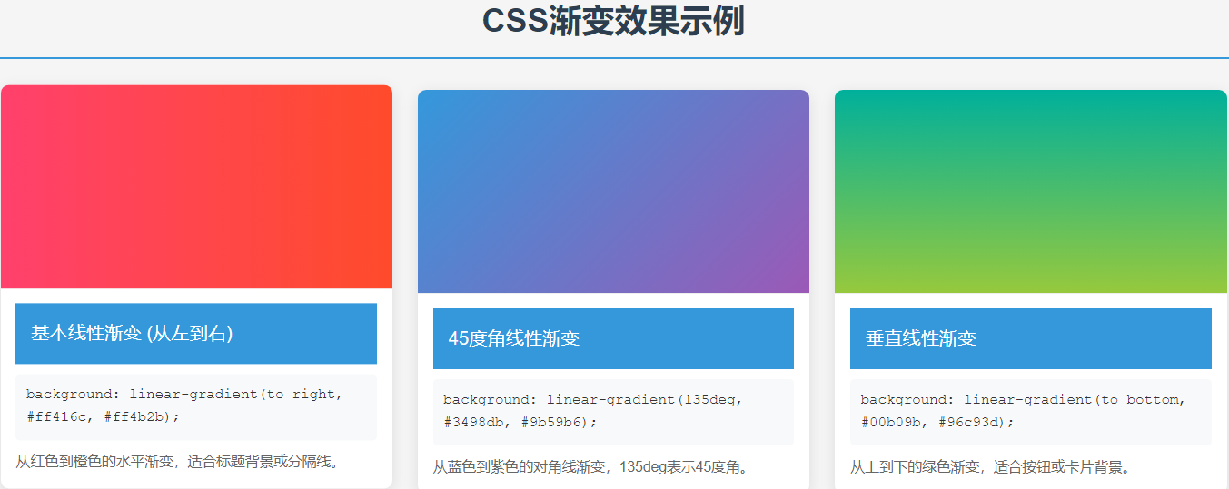
<h1>CSS渐变效果示例</h1>
<div class="container">
<div class="example linear1">
<div class="gradient-box"></div>
<div class="example-content">
<div class="example-title">基本线性渐变 (从左到右)</div>
<div class="code">background: linear-gradient(to right, #ff416c, #ff4b2b);</div>
<div class="description">从红色到橙色的水平渐变,适合标题背景或分隔线。</div>
</div>
</div>
<div class="example linear2">
<div class="gradient-box"></div>
<div class="example-content">
<div class="example-title">45度角线性渐变</div>
<div class="code">background: linear-gradient(135deg, #3498db, #9b59b6);</div>
<div class="description">从蓝色到紫色的对角线渐变,135deg表示45度角。</div>
</div>
</div>
<div class="example linear3">
<div class="gradient-box"></div>
<div class="example-content">
<div class="example-title">垂直线性渐变</div>
<div class="code">background: linear-gradient(to bottom, #00b09b, #96c93d);</div>
<div class="description">从上到下的绿色渐变,适合按钮或卡片背景。</div>
</div>
</div>
<div class="example linear4">
<div class="gradient-box"></div>
<div class="example-content">
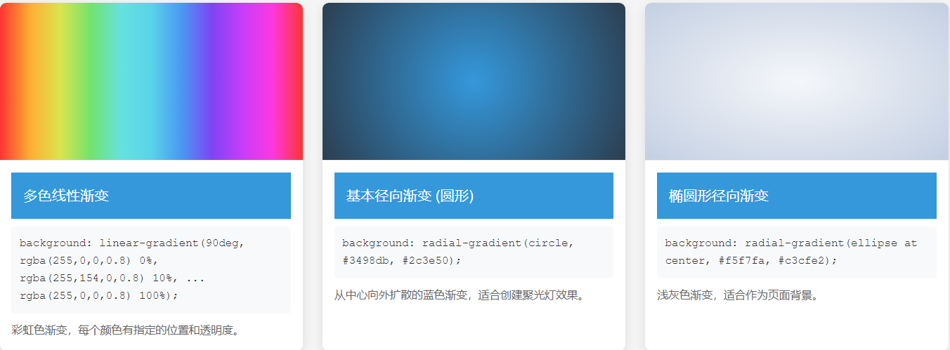
<div class="example-title">多色线性渐变</div>
<div class="code">background: linear-gradient(90deg,
rgba(255,0,0,0.8) 0%,
rgba(255,154,0,0.8) 10%,
...
rgba(255,0,0,0.8) 100%);</div>
<div class="description">彩虹色渐变,每个颜色有指定的位置和透明度。</div>
</div>
</div>
<div class="example radial1">
<div class="gradient-box"></div>
<div class="example-content">
<div class="example-title">基本径向渐变 (圆形)</div>
<div class="code">background: radial-gradient(circle, #3498db, #2c3e50);</div>
<div class="description">从中心向外扩散的蓝色渐变,适合创建聚光灯效果。</div>
</div>
</div>
<div class="example radial2">
<div class="gradient-box"></div>
<div class="example-content">
<div class="example-title">椭圆形径向渐变</div>
<div class="code">background: radial-gradient(ellipse at center, #f5f7fa, #c3cfe2);</div>
<div class="description">浅灰色渐变,适合作为页面背景。</div>
</div>
</div>
<div class="example radial3">
<div class="gradient-box"></div>
<div class="example-content">
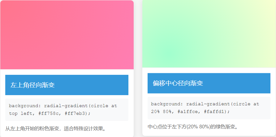
<div class="example-title">左上角径向渐变</div>
<div class="code">background: radial-gradient(circle at top left, #ff758c, #ff7eb3);</div>
<div class="description">从左上角开始的粉色渐变,适合特殊设计效果。</div>
</div>
</div>
<div class="example radial4">
<div class="gradient-box"></div>
<div class="example-content">
<div class="example-title">偏移中心径向渐变</div>
<div class="code">background: radial-gradient(circle at 20% 80%, #a1ffce, #faffd1);</div>
<div class="description">中心点位于左下方(20% 80%)的绿色渐变。</div>
</div>
</div>
<div class="example animated">
<div class="gradient-box"></div>
<div class="example-content">
<div class="example-title">动画渐变背景</div>
<div class="code">background: linear-gradient(-45deg, #ee7752, #e73c7e, #23a6d5, #23d5ab);
background-size: 400% 400%;
animation: gradientBG 15s ease infinite;</div>
<div class="description">颜色平滑过渡的动画渐变效果,适合全屏背景。</div>
</div>
</div>
<div class="example">
<div class="gradient-box text-gradient">
<div>渐变文字</div>
</div>
<div class="example-content">
<div class="example-title">渐变文字效果</div>
<div class="code">background: linear-gradient(90deg, #ff8a00, #e52e71);
background-clip: text;
color: transparent;</div>
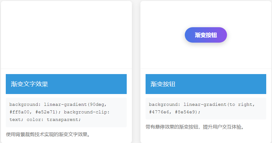
<div class="description">使用背景裁剪技术实现的渐变文字效果。</div>
</div>
</div>
<div class="example button-gradient">
<div class="gradient-box">
<button class="gradient-button">渐变按钮</button>
</div>
<div class="example-content">
<div class="example-title">渐变按钮</div>
<div class="code">background: linear-gradient(to right, #4776e6, #8e54e9);</div>
<div class="description">带有悬停效果的渐变按钮,提升用户交互体验。</div>
</div>
</div>
</div>

/* CSS */
  * {
            box-sizing: border-box;
            margin: 0;
            padding: 0;
        }

        body {
            font-family: 'Arial', sans-serif;
            line-height: 1.6;
            color: #333;
            padding: 20px;
            background-color: #f5f5f5;
        }

        h1 {
            text-align: center;
            margin: 20px 0 30px;
            color: #2c3e50;
            padding-bottom: 10px;
            border-bottom: 2px solid #3498db;
        }

        .container {
            max-width: 1000px;
            margin: 0 auto;
            display: grid;
            grid-template-columns: repeat(auto-fit, minmax(300px, 1fr));
            gap: 25px;
        }

        .example {
            background-color: white;
            border-radius: 8px;
            overflow: hidden;
            box-shadow: 0 4px 15px rgba(0, 0, 0, 0.1);
        }

        .demo-box {
            height: 200px;
            margin: 20px;
            border: 20px dashed rgba(0, 0, 0, 0.2);
            padding: 20px;
            background-image: url('data:image/svg+xml;utf8,<svg xmlns="http://www.w3.org/2000/svg" width="100" height="100" viewBox="0 0 100 100"><rect width="100" height="100" fill="%233498db"/><circle cx="50" cy="50" r="40" fill="%23e74c3c"/><polygon points="50,20 80,80 20,80" fill="%23f1c40f"/></svg>');
            background-repeat: no-repeat;
            position: relative;
        }

        .example-title {
            padding: 15px;
            background-color: #3498db;
            color: white;
            font-size: 18px;
        }

        .example-content {
            padding: 15px;
        }

        .code {
            background-color: #f8f9fa;
            padding: 10px;
            border-radius: 4px;
            font-family: 'Courier New', monospace;
            font-size: 14px;
            margin: 10px 0;
            overflow-x: auto;
        }

        .description {
            margin-top: 10px;
            font-size: 14px;
            color: #666;
        }

        /* 边框标记 */
        .border-marker {
            position: absolute;
            font-size: 12px;
            color: #333;
            background: rgba(255, 255, 255, 0.7);
            padding: 2px 5px;
            border-radius: 3px;
        }

        .border-top {
            top: 0;
            left: 50%;
            transform: translateX(-50%);
        }

        .border-right {
            top: 50%;
            right: 0;
            transform: translateY(-50%);
        }

        .border-bottom {
            bottom: 0;
            left: 50%;
            transform: translateX(-50%);
        }

        .border-left {
            top: 50%;
            left: 0;
            transform: translateY(-50%);
        }

        .padding-marker {
            position: absolute;
            font-size: 12px;
            color: #333;
            background: rgba(255, 255, 255, 0.7);
            padding: 2px 5px;
            border-radius: 3px;
        }

        .padding-top {
            top: 20px;
            left: 50%;
            transform: translateX(-50%);
        }

        .padding-right {
            top: 50%;
            right: 20px;
            transform: translateY(-50%);
        }

        .padding-bottom {
            bottom: 20px;
            left: 50%;
            transform: translateX(-50%);
        }

        .padding-left {
            top: 50%;
            left: 20px;
            transform: translateY(-50%);
        }

        .content-marker {
            position: absolute;
            font-size: 12px;
            color: #333;
            background: rgba(255, 255, 255, 0.7);
            padding: 2px 5px;
            border-radius: 3px;
            top: 50%;
            left: 50%;
            transform: translate(-50%, -50%);
        }

        /* background-clip 示例 */
        .clip-border-box .demo-box {
            background-clip: border-box;
        }

        .clip-padding-box .demo-box {
            background-clip: padding-box;
        }

        .clip-content-box .demo-box {
            background-clip: content-box;
        }

        .clip-text .demo-box {
            -webkit-background-clip: text;
            background-clip: text;
            color: transparent;
            font-size: 80px;
            font-weight: bold;
            display: flex;
            align-items: center;
            justify-content: center;
            background-repeat: repeat;
        }

        /* background-origin 示例 */
        .origin-border-box .demo-box {
            background-origin: border-box;
        }

        .origin-padding-box .demo-box {
            background-origin: padding-box;
        }

        .origin-content-box .demo-box {
            background-origin: content-box;
        }

        /* 组合示例 */
        .combination .demo-box {
            background-clip: content-box;
            background-origin: padding-box;
        }
<!-- html -->
<h1>CSS 背景裁剪(background-clip)与原点(background-origin)示例</h1>
<div class="container">
<div class="example">
<div class="example-title">默认状态 (border-box)</div>
<div class="example-content">
<div class="demo-box">
<div class="border-marker border-top">边框</div>
<div class="border-marker border-right">边框</div>
<div class="border-marker border-bottom">边框</div>
<div class="border-marker border-left">边框</div>
<div class="padding-marker padding-top">内边距</div>
<div class="padding-marker padding-right">内边距</div>
<div class="padding-marker padding-bottom">内边距</div>
<div class="padding-marker padding-left">内边距</div>
<div class="content-marker">内容区</div>
</div>
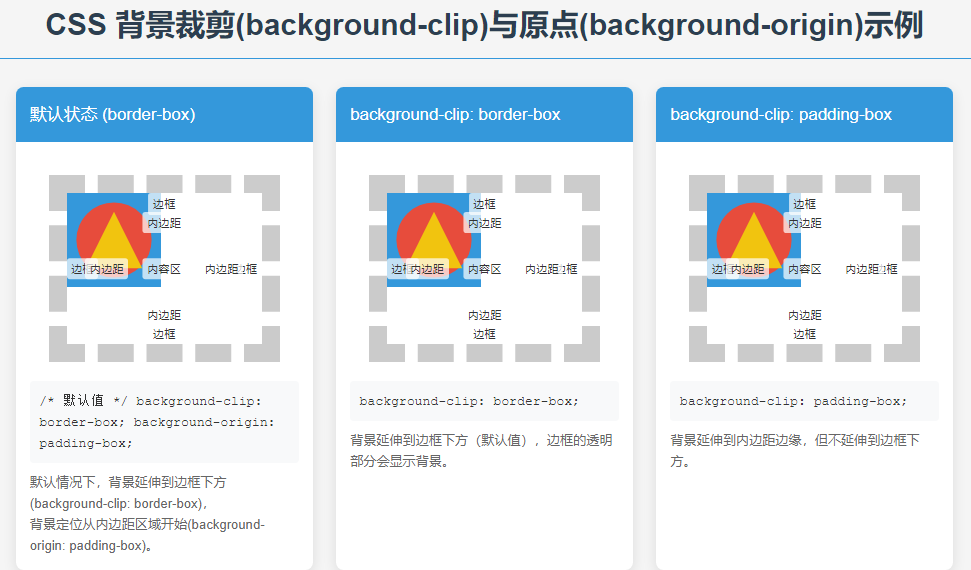
<div class="code">/* 默认值 */
background-clip: border-box;
background-origin: padding-box;</div>
<div class="description">
默认情况下,背景延伸到边框下方(background-clip: border-box),<br>
背景定位从内边距区域开始(background-origin: padding-box)。
</div>
</div>
</div>
<div class="example clip-border-box">
<div class="example-title">background-clip: border-box</div>
<div class="example-content">
<div class="demo-box">
<div class="border-marker border-top">边框</div>
<div class="border-marker border-right">边框</div>
<div class="border-marker border-bottom">边框</div>
<div class="border-marker border-left">边框</div>
<div class="padding-marker padding-top">内边距</div>
<div class="padding-marker padding-right">内边距</div>
<div class="padding-marker padding-bottom">内边距</div>
<div class="padding-marker padding-left">内边距</div>
<div class="content-marker">内容区</div>
</div>
<div class="code">background-clip: border-box;</div>
<div class="description">
背景延伸到边框下方(默认值),边框的透明部分会显示背景。
</div>
</div>
</div>
<div class="example clip-padding-box">
<div class="example-title">background-clip: padding-box</div>
<div class="example-content">
<div class="demo-box">
<div class="border-marker border-top">边框</div>
<div class="border-marker border-right">边框</div>
<div class="border-marker border-bottom">边框</div>
<div class="border-marker border-left">边框</div>
<div class="padding-marker padding-top">内边距</div>
<div class="padding-marker padding-right">内边距</div>
<div class="padding-marker padding-bottom">内边距</div>
<div class="padding-marker padding-left">内边距</div>
<div class="content-marker">内容区</div>
</div>
<div class="code">background-clip: padding-box;</div>
<div class="description">
背景延伸到内边距边缘,但不延伸到边框下方。
</div>
</div>
</div>
<div class="example clip-content-box">
<div class="example-title">background-clip: content-box</div>
<div class="example-content">
<div class="demo-box">
<div class="border-marker border-top">边框</div>
<div class="border-marker border-right">边框</div>
<div class="border-marker border-bottom">边框</div>
<div class="border-marker border-left">边框</div>
<div class="padding-marker padding-top">内边距</div>
<div class="padding-marker padding-right">内边距</div>
<div class="padding-marker padding-bottom">内边距</div>
<div class="padding-marker padding-left">内边距</div>
<div class="content-marker">内容区</div>
</div>
<div class="code">background-clip: content-box;</div>
<div class="description">
背景仅延伸到内容区域,不延伸到内边距和边框。
</div>
</div>
</div>
<div class="example clip-text">
<div class="example-title">background-clip: text (文字背景)</div>
<div class="example-content">
<div class="demo-box">CSS</div>
<div class="code">-webkit-background-clip: text;
background-clip: text;
color: transparent;</div>
<div class="description">
背景被裁剪为文字形状(需要设置文字颜色为透明)。
</div>
</div>
</div>
<div class="example origin-border-box">
<div class="example-title">background-origin: border-box</div>
<div class="example-content">
<div class="demo-box">
<div class="border-marker border-top">边框</div>
<div class="border-marker border-right">边框</div>
<div class="border-marker border-bottom">边框</div>
<div class="border-marker border-left">边框</div>
<div class="padding-marker padding-top">内边距</div>
<div class="padding-marker padding-right">内边距</div>
<div class="padding-marker padding-bottom">内边距</div>
<div class="padding-marker padding-left">内边距</div>
<div class="content-marker">内容区</div>
</div>
<div class="code">background-origin: border-box;</div>
<div class="description">
背景定位从边框区域开始(包括边框)。
</div>
</div>
</div>
<div class="example origin-padding-box">
<div class="example-title">background-origin: padding-box</div>
<div class="example-content">
<div class="demo-box">
<div class="border-marker border-top">边框</div>
<div class="border-marker border-right">边框</div>
<div class="border-marker border-bottom">边框</div>
<div class="border-marker border-left">边框</div>
<div class="padding-marker padding-top">内边距</div>
<div class="padding-marker padding-right">内边距</div>
<div class="padding-marker padding-bottom">内边距</div>
<div class="padding-marker padding-left">内边距</div>
<div class="content-marker">内容区</div>
</div>
<div class="code">background-origin: padding-box;</div>
<div class="description">
背景定位从内边距区域开始(默认值,不包括边框)。
</div>
</div>
</div>
<div class="example origin-content-box">
<div class="example-title">background-origin: content-box</div>
<div class="example-content">
<div class="demo-box">
<div class="border-marker border-top">边框</div>
<div class="border-marker border-right">边框</div>
<div class="border-marker border-bottom">边框</div>
<div class="border-marker border-left">边框</div>
<div class="padding-marker padding-top">内边距</div>
<div class="padding-marker padding-right">内边距</div>
<div class="padding-marker padding-bottom">内边距</div>
<div class="padding-marker padding-left">内边距</div>
<div class="content-marker">内容区</div>
</div>
<div class="code">background-origin: content-box;</div>
<div class="description">
背景定位从内容区域开始(不包括边框和内边距)。
</div>
</div>
</div>
<div class="example combination">
<div class="example-title">组合使用 clip 和 origin</div>
<div class="example-content">
<div class="demo-box">
<div class="border-marker border-top">边框</div>
<div class="border-marker border-right">边框</div>
<div class="border-marker border-bottom">边框</div>
<div class="border-marker border-left">边框</div>
<div class="padding-marker padding-top">内边距</div>
<div class="padding-marker padding-right">内边距</div>
<div class="padding-marker padding-bottom">内边距</div>
<div class="padding-marker padding-left">内边距</div>
<div class="content-marker">内容区</div>
</div>
<div class="code">background-clip: content-box;
background-origin: padding-box;</div>
<div class="description">
背景定位从内边距开始(origin),但只显示在内容区域(clip)。
</div>
</div>
</div>
</div>


 浙公网安备 33010602011771号