Bootstrap 关于按钮组
当为 .btn-group 中的元素应用工具提示或弹出框时,必须指定 container: 'body' 选项,这样可以避免不必要的副作用(例如工具提示或弹出框触发时,会让页面元素变宽和/或失去圆角)?
对于按钮组合,应该是 role="group",对于toolbar(工具栏)应该是 role="toolbar"。
按钮组和工具栏应给定一个明确的label标签,尽管设置了正确的 role 属性,我们使用 aria-label,但是, aria-labelledby 也可以使用。
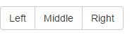
<div class="btn-group" role="group" aria-label="...">
  <button type="button" class="btn btn-default">Left</button>
  <button type="button" class="btn btn-default">Middle</button>
  <button type="button" class="btn btn-default">Right</button>
</div>
竖直的话是
class="btn-group-vertical"
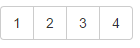
  <div class="btn-toolbar" role="toolbar" aria-label="Toolbar with button groups">
        <div class="btn-group" role="group" aria-label="First group">
            <button type="button" class="btn btn-default">1</button>
            <button type="button" class="btn btn-default">2</button>
            <button type="button" class="btn btn-default">3</button>
            <button type="button" class="btn btn-default">4</button>
        </div>
    </div>
也可以加尺寸
只要给 .btn-group 加上 .btn-group-lg,sm,xs等即可。
想要把下拉菜单混合到一系列按钮中,只须把 .btn-group 放入大 .btn-group 中就可以,嵌套。
关于 <a> 元素
只须将一系列 .btn 元素包裹到 .btn-group.btn-group-justified 中即可。
<div class="btn-group btn-group-justified" role="group" aria-label="Justified button group">
      <a href="#" class="btn btn-default" role="button">Left</a>
      <a href="#" class="btn btn-default" role="button">Middle</a>
      <a href="#" class="btn btn-default" role="button">Right</a>
    </div>

关于 <button> 元素
为了将 <button> 元素用于两端对齐的按钮组中,必须将每个按钮包裹进一个按钮组中。
<div class="btn-group btn-group-justified" role="group" aria-label="...">
<div class="btn-group" role="group">
<button type="button" class="btn btn-default">Left</button>
</div>
<div class="btn-group" role="group">
<button type="button" class="btn btn-default">Middle</button>
</div>
<div class="btn-group" role="group">
<button type="button" class="btn btn-default">Right</button>
</div>
</div>
看起来a更方便?

 浙公网安备 33010602011771号