

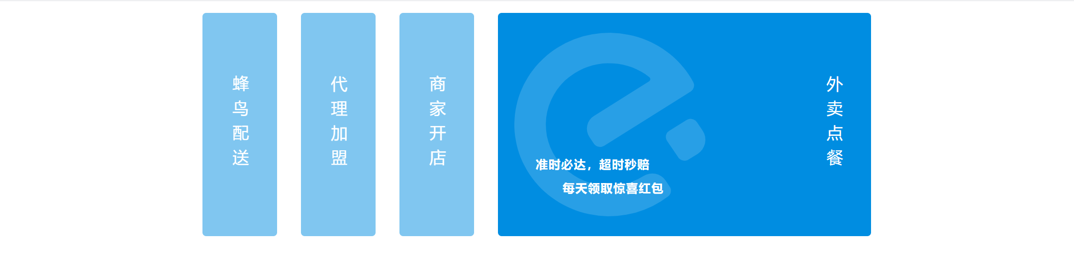
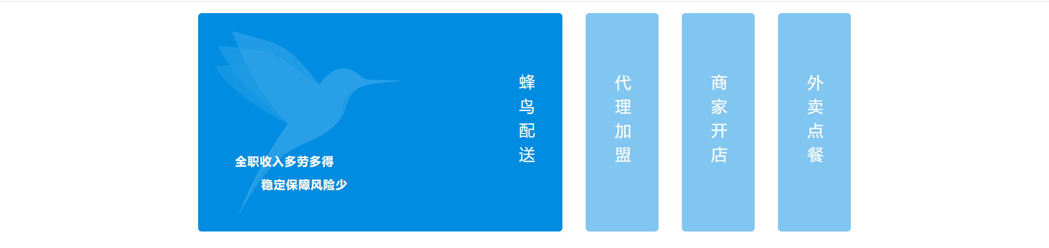
记录一次想模仿饿了么官网首页的效果的经历
饿了么官网效果大概有三点:
1. 初始展开最后一个框
2. 展开鼠标悬停的框
3. 鼠标离开并未移动到其它框的时候,保持2的样式
尝试只用css实现,然而第3步我想不到了...QAQ
<template>
  <div class="homepage-container">
    <main>
      <a href="javascript:void(0);" v-for="(segment, inx) in content" :key="inx">
        <dl>
          <dd>
            <img :src="segment.src" :alt="segment.text">
            <div>
              <p>{{segment.content}}</p>
            </div>
          </dd>
          <dt><span>{{segment.text}}</span></dt>
        </dl>
      </a>
    </main>
  </div>
</template>

<script>
export default {
  name: 'homepage',
  data() {
    return {
      active: 3,
      content: [
        {
          text: '蜂鸟配送',
          src: 'https://cube.elemecdn.com/0/c7/731d222b16d4537c0dcb5dfdc0402svg.svg',
          content: `全职收入多劳多得
          稳定保障风险少`
        },
        {
          text: '代理加盟',
          src: 'https://cube.elemecdn.com/a/0a/2e70985f1636fdad57a357eb53639svg.svg',
          content: `共创合作,领跑市场
          专业扶持为你保驾护航`
        },
        {
          text: '商家开店',
          src: 'https://cube.elemecdn.com/0/28/e556e02b60a8a25e1d3d6ef676523svg.svg',
          content: `多一种开店方式
          连接千家万户的餐桌`
        },
        {
          text: '外卖点餐',
          src: 'https://cube.elemecdn.com/a/3d/28b5752f53afa76c5abf902f78355svg.svg',
          content: `准时必达,超时秒赔
          每天领取惊喜红包`
        },
      ],
    }
  },
  methods: {

  }
}
</script>

<style lang="less" scoped>
@keyframes width {
  0% {width: 0;}
  100% {width: 400px;}
}
.homepage-container {
  display: flex;
  main {
    color: #fff;
    margin: auto;
    width: 928px;
    min-width: 928px;
    display: flex;
    align-items: center;
    a {
      color: inherit;
      text-decoration: none;
      dl {
        height: 300px;
        background: rgb(0, 141, 225);
        border-radius: 5px;
        display: flex;
        margin: 16px;
        dd {
          width: 400px;
          height: 100%;
          margin: 0;
          padding: 0;
          position: relative;
          cursor: pointer;
          img {
            width: 256px;
            height: 256px;
            opacity: 0.16;
            position: absolute;
            top: 22px;
            left: 22px;
          }
          div {
            p {
              position: absolute;
              bottom: 2em;
              left: 2em;
              font-size: 16px;
              line-height: 2;
              white-space: pre;
              font-weight: bold;
              letter-spacing: 1px;
            }
          }
        }
        dt {
          width: 100px;
          height: 100%;
          display: flex;
          span {
            writing-mode: vertical-lr;
            font-size: 22px;
            letter-spacing: 0.5em;
            display: inline-block;
            margin: auto;
            user-select: none;
            -ms-user-select: none;
            -moz-user-select: none;
            -webkit-user-select: none;
          }
        }
      }
    }
    /* 悬停元素的同辈元素都不展开,实现切换展开的效果 */
    a, a:hover ~ a {
      dl {
        opacity: 0.5;
        dd {
          display: none;
        }
      }
    }
    /* 初始化状态,最后一个框展开;鼠标悬停的也展开 */
    a:hover, a:last-child{
      dl {
        opacity: 1;
        dd {
          display: block;
          animation: width 500ms;
          animation-fill-mode: both;
        }
      }
    }
  }
}
</style>
然后只能加js实现第3步了,真香....
<template>
  <div class="homepage-container">
    <main>
      <a href="javascript:void(0);" v-for="(segment, inx) in content" :key="inx" @mouseover="active = inx" :class="{active: active === inx}">
        <dl>
          <dd>
            <img :src="segment.src" :alt="segment.text">
            <div>
              <p>{{segment.content}}</p>
            </div>
          </dd>
          <dt><span>{{segment.text}}</span></dt>
        </dl>
      </a>
    </main>
  </div>
</template>

// 数据就不重复贴了

<style lang="less" scoped>
    /* 重复的也不贴了 */
    /*
    a, a:hover ~ a {
      dl {
        opacity: 0.5;
        dd {
          display: none;
        }
      }
    }
    a:hover, a:last-child{
      dl {
        opacity: 1;
        dd {
          display: block;
          animation: width 500ms;
          animation-fill-mode: both;
        }
      }
    }*/
    a {
       dl {
        opacity: 0.5;
        dd {
          display: none;
        }
      }
    }
    .active {
      dl {
        opacity: 1;
        dd {
          display: block;
          animation: width 500ms;
          animation-fill-mode: both;
        }
      }
    }
  }
}
</style>

 浙公网安备 33010602011771号