

flex常用实例
1、垂直居中,学习flex布局以后,实现起来很方便;
    <style type="text/css">
        .demo{
            display: flex;
            width: 300px;
            height: 300px;
            border: 1px solid blue;
            justify-content: center;
            align-items: center;
        }
        .inner{
            width: 100px;
            height: 100px;
            border: 1px solid red;
        }
    </style>

     <div class="demo">
        <div class="inner">垂直居中</div>
     </div>
效果如下:

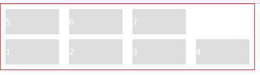
2、用flex制作列表,流式布局,每行数目固定,会自动分行。如商品列表这种,固定一排四个,平均宽度显示;
        .demo{
            width:500px;
            padding-top: 10px;
            display: flex;
            /* flex-direction: row;
            flex-wrap: wrap; */
            flex-flow: row wrap;
            color: #fff;
            border: 1px solid red;
        }
        .demo .item{
            width: calc((100% - 80px) / 4);
            margin: 0 10px 10px;
            background: #dddddd;
            line-height: 50px;
        }
     <div class="demo">
        <div class="item">1</div>
        <div class="item">2</div>
        <div class="item">3</div>
        <div class="item">4</div>
        <div class="item">5</div>
        <div class="item">6</div>
        <div class="item">7</div>
     </div>
注:flex-flow:是flex-direction 和flex-wrap的简写形式,默认是 row nowrap;
效果如下:

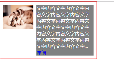
3、flex制作图文混排
        .demo{
            width:300px;
            padding: 10px;
            display: flex;
            flex-flow: row nowrap;
            align-items: flex-start;
            color: #fff;
            border: 1px solid red;
        }
        .demo .img{
            margin-right: 10px;
        }

        .demo .item{
            width: 190px;
            background: gray;
        }
     <div class="demo">
        <img class="img" width="100" height="80" src="img/7.jpg" />
        <div class="item">
            文字内容文字内容文字内容文字内容文字内容文字内容文字内容文字内容文字内容文字文字内容文字内容文字内容文字内容文字内容文字内容文字内容文字内容文字内容文字...
            <a href="#">详细</a>
        </div>
     </div>
效果如下:
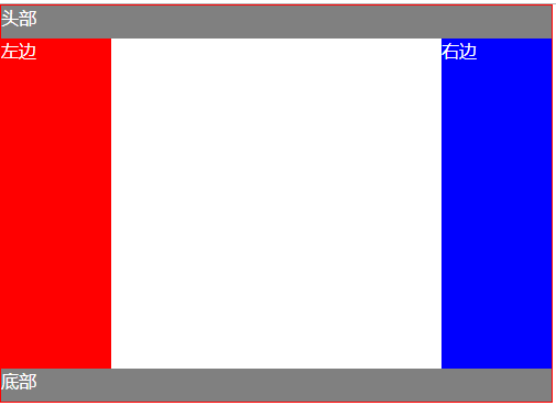
4、flex制作圣杯布局
        .demo{
            width:500px;
            display: flex;
            flex-direction: column;
            color: #fff;
            border: 1px solid red;
        }
        .header,.footer{
            background: gray;
            height: 30px;
            flex: 1;
        }
        .body{
            height: 300px;
            display: flex;
        }
        .body div{
            flex: 1;
        }
        .left{
            background:red;
        }
        .right{
            background:blue;
        }
        .left,.right{
            flex: 0 0 20%!important;
        }
     <div class="demo">
        <header class="header">头部</header>
        <div class="body">
            <div class="left">左边</div>
            <div class="center">中间</div>
            <div class="right">右边</div>
        </div>
        <footer class="footer">底部</footer>
     </div>
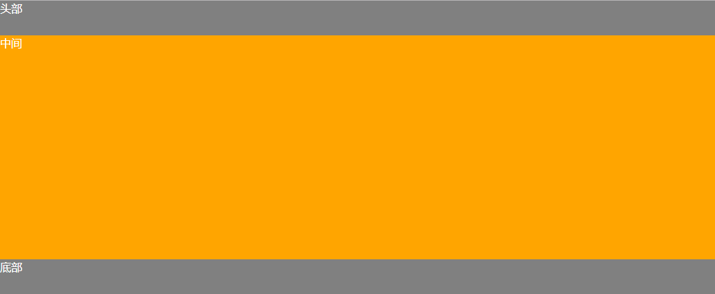
5、固定的底栏
        .demo {
            display: flex;
            min-height: 100vh;
            flex-direction: column;
            color: #ffffff;
        }
        .Site-content {
            flex: 1;
            background: orange;
        }
        .header,.footer{
            background: gray;
            height: 50px;
        }
    <div class="demo">
        <header class="header">头部</header>
        <main class="Site-content">中间</main>
        <footer class="footer">底部</footer>
    </div>
效果如下:
6、网格布局---基本网格布局
最简单的网格,就是平均分布。在容器里平均分配空间,但是需要设置项目的自动缩放。
        .Grid {
            display: flex;
            color: #ffffff;
        }
        .Grid-cell {
            background: #dddddd;
            flex: 1;
            margin:0 10px;
            line-height: 40px;
            border-radius: 3px;
        }
    <div class="Grid">
        <div class="Grid-cell">1/2</div>
        <div class="Grid-cell">1/2</div>
    </div>
    <br/>
    <div class="Grid">
        <div class="Grid-cell">1/3</div>
        <div class="Grid-cell">1/3</div>
        <div class="Grid-cell">1/3</div>
    </div>
    <br/>
    <div class="Grid">
        <div class="Grid-cell">1/4</div>
        <div class="Grid-cell">1/4</div>
        <div class="Grid-cell">1/4</div>
        <div class="Grid-cell">1/4</div>
    </div>
效果如下:

6、网格布局---百分比布局
某个网格的宽度为固定百分比,其余的网格平均分配剩余的空间。
        .Grid {
            display: flex;
            color: #ffffff;
        }
        .Grid-cell {
            background: #dddddd;
            flex: 1;
            margin:0 10px;
            line-height: 40px;
            border-radius: 3px;
        }
        .type_one{
            flex: 0 0 50%;
        }
        .type_two{
            flex: 0 0 25%;
        }
        .type_three{
            flex: 0 0 33.33%;
        }
    <div class="Grid">
        <div class="Grid-cell">100%</div>
    </div>
    <br/>
    <div class="Grid">
        <div class="Grid-cell type_one">1/2</div>
        <div class="Grid-cell">auto</div>
        <div class="Grid-cell">auto</div>
    </div>
    <br/>
    <div class="Grid">
        <div class="Grid-cell type_three">1/3</div>
        <div class="Grid-cell">auto</div>
    </div>
    <br/>
    <div class="Grid">
        <div class="Grid-cell type_two">1/4</div>
        <div class="Grid-cell">auto</div>
        <div class="Grid-cell">auto</div>
    </div>
效果如下:

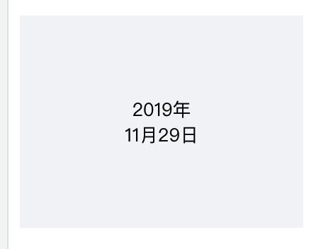
7、两行内容在一个盒子垂直居中显示
.table-left {
    display: flex;
    flex-flow: column nowrap;
    align-items: center;
    justify-content: center;
    width: 200px;
    background: #F4F5F7;
    height: 150px;
    font-size: 13px;
    text-align: center;
 }
<div class="table-left">
  <div class="time">2019年</div>
  <div>11月29日</div>
</div>
效果如下:
8、等分布局
<div class="demo">
   <div class="item item1"></div>
   <div class="item item2"></div>
   <div class="item item3"></div>
   <div class="item item4"></div>
</div>
.demo{
  display: flex;
}
.item{
  flex: 1;

某一个固定
.demo{
  display: flex;
}
.item{
  flex: 1;
}
.item2{
  flex: 0 0 50%;
某两个固定
.demo{
  display: flex;
}
.item{
  flex: 1;
}
.item2{
  flex: 0 0 50%;
}
.item4{
  flex: 0 0 20%;
}
某三个固定
.demo{
  display: flex;
}
.item{
  flex: 1;
}
.item1{
  flex: 0 0 10%;
}
.item2{
  flex: 0 0 50%;
}
.item4{
  flex: 0 0 20%;
}
圣杯布局
<div class="demo">
   <div class="header">头部</div>
   <div class="body">
      <div class="left">left</div>
      <div class="center">center</div>
      <div class="right">right</div>
   </div>
   <div class="footer">底部</div>
</div>
.demo{
  display: flex;
  flex-direction: column;
}
.demo div{
  flex: 1;
}
.body{
  display: flex;
}
.header,.footer,.left,.right{
  flex: 0 0 20%!important;
}

输入框布局,有时需要在输入框的前部添加提示,或者后部添加按钮,如图所示:

<div class="demo">
   <span class="tip"></span>
   <input type="text" name="" />
   <button>search</button>
</div>
.demo{
  display: flex;
}
input{
  flex:1;
}
9、多列展示
<div class="demo">
   <div class="left"></div>
   <div class="center">
      <p>description</p>
      <p>description</p>
      <p>description</p>
      <span>description</span>
   </div>
   <div class="btn">确认</div>
   <div class="btn">取消</div>
</div>
CSS代
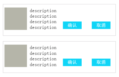
.demo{
  width: 600px;
  height: 150px;
  border: 1px solid #b7b2b7;
  margin: 30px auto;
  padding-top: 17px;
  display: flex;                /*设置为flex布局*/
  justify-content: space-around;
}
.demo > div{
  flex: none;
}
说道flex布局 我不知道多少人跟我一样 justify-content:center; align-items:center;
display:flex;
浮动但是浮空后因为脱离文档流肤元素会失去高度涉及了清除浮动
dispaly:flex
容器属性和项目属性
flex-direction column column-reverse row row-reverse
row row-reverse column column-reverse
wrap wrap-reverse nowrap
justify-content flex-start flex-end center space-between space-around space-evenly
align-items flex-start flex-end center stretch baseline
修改了flex-direction column 他买的轴向会交换
align-content flex-start flex-end center space-between space-around space0-evenly
项目属相
order 0 用于决定项目排列顺序 数值越小 项目排列越靠前
flex-grow 默认为0 表示是否有剩余空间 默认不放大

 浙公网安备 33010602011771号