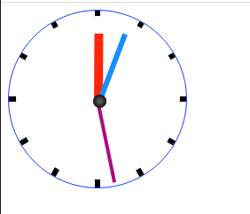
  1 <!DOCTYPE html>
  2 <html>
  3     <head>
  4         <meta charset="utf-8">
  5         <title></title>
  6         <style>
  7             #time {
  8                 width: 200px;
  9                 height: 200px;
 10                 border: 1px solid #133EFF;
 11                 border-radius: 50%;
 12                 position: relative;
 13             }
 14             #time>span{
 15                 width: 6px;
 16                 height: 200px;
 17                 position: absolute;
 18                 background-color: #000;
 19                 left: 100px;
 20                 margin-left: -3px;
 21             }
 22             #time>span:first-child{
 23                 transform:rotate(30deg);
 24             }
 25             #time>span:nth-child(2){
 26                 transform:rotate(60deg);
 27             }
 28             #time>span:nth-child(3){
 29                 transform:rotate(90deg);
 30             }
 31             #time>span:nth-child(4){
 32                 transform:rotate(120deg);
 33             }
 34             #time>span:nth-child(5){
 35                 transform:rotate(150deg);
 36             }
 37             #time>span:last-child{
 38                 transform:rotate(180deg);
 39             }
 40             #layout{
 41                 width:185px;
 42                 height: 185px;
 43                 border-radius: 50%;
 44                 position: absolute;
 45                 left: 8px;
 46                 top: 6px;
 47                 background-color: #fff;
 48             }
 49             #layout>span{
 50                 position:absolute;
 51                 left: 50%;
 52                 top: 50%;
 53                 margin-top: -50%;
 54                 transform-origin: center bottom;
 55             }
 56             .circle{
 57                 width: 10px;
 58             }
 59             #hour{
 60                 width: 10px;
 61                 height: 80px;
 62                 background-color: #ff260a;
 63                 transform: translate(-5px,20px);
 64                 animation: hourmove 216000s linear infinite;
 65             }
 66             #min{
 67                 width:6px;
 68                 height: 85px;
 69                 background-color: #178fff;
 70                 transform: translate(-3px,10px);
 71                 animation: minmove 3600s linear infinite;
 72             }
 73             #second{
 74                 width:4px;
 75                 height: 90px;
 76                 background-color: #aa0b80;
 77                 transform: translate(-2px,10px) ;
 78                 animation: secmove 60s linear infinite;
 79             }
 80             #time>.circle{
 81                 width: 15px;
 82                 height: 15px;
 83                 border-radius: 50%;
 84                 background-image: radial-gradient(circle,#666666,#000);
 85                 box-shadow: 0px 0px 2px 2px #222 inset;
 86                 position: absolute;
 87                 left: 50%;
 88                 top: 50%;
 89                 margin-left: -5px;
 90                 margin-top: -5px;
 91             }
 92             @keyframes secmove{
 93                 from{
 94                     transform: translate(-2px,10px) rotate(0deg);
 95                 }
 96                 to{
 97                     transform: translate(-2px,10px) rotate(360deg);
 98                 }
 99             }
100             @keyframes minmove{
101                 from{
102                     transform: translate(-3px,15px) rotate(0deg);
103                 }
104                 to{
105                     transform: translate(-3px,15px) rotate(360deg);
106                 }
107             }
108             @keyframes hourmove{
109                 from{
110                     transform: translate(-5px,20px) rotate(0deg);
111                 }
112                 to{
113                     transform: translate(-5px,20px) rotate(360deg);
114                 }
115             }
116         </style>
117     </head>
118     <body>
119         <div id="time">
120             <span></span>
121             <span></span>
122             <span></span>
123             <span></span>
124             <span></span>
125             <span></span>
126             <div id="layout">
127                 <span id="hour"></span>
128                 <span id="min"></span>
129                 <span id="second"></span>
130             </div>
131             <div class="circle"></div>
132         </div>
133     </body>
134 </html>
![]()


 浙公网安备 33010602011771号