
使用混合模式叠加实现文字波浪小姑
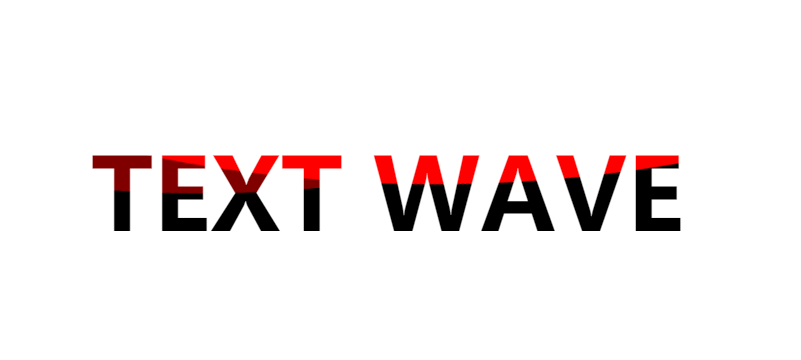
<!DOCTYPE html>
<html lang="en">
<head>
<meta charset="UTF-8">
<meta http-equiv="X-UA-Compatible" content="IE=edge">
<meta name="viewport" content="width=device-width, initial-scale=1.0">
<title>Document</title>
<style>
* {
margin: 0;
padding: 0;
}
html,
body {
display: flex;
width: 100%;
height: 100%;
}
.g-container {
margin: auto;
}
p {
position: relative;
font-size: 100px;
font-weight: 900;
background-color: #fff;
color: #000;
width: 700px;
text-align: center;
overflow: hidden;
}
p::after,
p::before {
content: '';
position: absolute;
left: 50%;
top: -1100%;
width: 3000px;
height: 3000px;
transform: translate(-45%, -97%);
border-radius: 45% 48% 43% 47%;
background-color: red;
z-index: 1;
mix-blend-mode: lighten;
animation: rotate 10s infinite linear;
}
p::before {
transform: translate(-50%, -50%);
opacity: 0.5;
animation: rotate 10s infinite .5s linear;
}
@keyframes rotate {
0% {
transform: translate(-50%, -50%) rotate(0);
}
100% {
transform: translate(-50%, -50%) rotate(360deg);
}
}
</style>
</head>
<body>
<div class="g-container">
<p>TEXT WAVE</p>
</div>
</body>
</html>

 浙公网安备 33010602011771号