
echarts renderItem-在区间段内展示连续数据
一、需求背景:
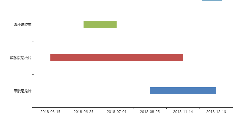
贴图说明:要求数据在不同类型的区间段内展示。
二、实现思路及代码
实现方法:
利用echarts的自定义配置:option.series[i].type='custom'中的renderItem(params, api)函数进行处理,这里包括了两个参数:params是对应每一个dataItem的数据信息;api是可调用的方法(api.value()和api.coord())。详情可以查看官方文档。
官方提供的示例:http://www.echartsjs.com/gallery/editor.html?c=custom-profile
代码及说明:
let colors = ['#4f81bd', '#c0504d', '#9bbb59', '#604a7b'];
let _that = this;    //这里需要注意
 this.option =  {
                    color: colors,
                    tooltip: {
                      formatter: function (params) {
                        return params.name + ':' + params.value[1] + '~' + params.value[2];
                      }
                    },
                    grid: {
                      left: '3%',
                      right: '3%',
                      top: '1%',
                      bottom: '10%',
                      containLabel: true
                    },
                    xAxis: {
                      data:['2018-06-15','2018-06-25', '2018-07-01','2018-08-25','2018-11-14', '2018-12-13']
                    },
                    yAxis: {
                      data:['甲泼尼龙片', '醋酸泼尼松片', '缬沙坦胶囊']
                    },
                    series: [
                      {
                        type: 'custom',
                        renderItem: function (params, api) {
                          var categoryIndex = api.value(0);
                          var start = api.coord([api.value(1), categoryIndex]);
                          var end = api.coord([api.value(2), categoryIndex]);
                          var height = 24;

                          return {
                            type: 'rect',
   /**_that.$echarts 因为是使用vue 所以特别要注意改成自己vue里面初始化echarts的方法,默认为echarts.graphic.clipRectByRect */
                            shape: _that.$echarts.graphic.clipRectByRect({
                              x: start[0],
                              y: start[1] - height / 2,
                              width: end[0] - start[0],
                              height: height
                            }, {
                              x: params.coordSys.x,
                              y: params.coordSys.y,
                              width: params.coordSys.width,
                              height: params.coordSys.height
                            }),
                            style: api.style()
                          };
                        },
                        encode: {
                          x: [1, 2],
                          y: 0
                        },
                        data:
                           [
                  //value[ 维度0 维度1 维度2]
                    //dataItem
                        {
                           itemStyle: { normal: { color: colors[0] } },//条形颜色
                           name: '甲泼尼龙片',
                   value: [0, '2018-08-25', '2018-12-13']//0,1,2代表y轴的索引,后两位代表x轴数据开始和结束
                 },
                 //dataItem
                 {
                     itemStyle: { normal: { color: colors[1] } },
                     name: '醋酸泼尼松片',
                      value: [1, '2018-06-15', '2018-11-14']
                 },
                  //dataItem
                 {
                    itemStyle: { normal: { color: colors[2] } },
                   name: '缬沙坦胶囊',
                   value: [2, '2018-06-25', '2018-07-01']
                 },
               ]
           }
       ]
  };
因为这里我是在vue里面使用的,所以需要注意几点:
1.代码中_that.$echarts.graphic.clipRectByRect,官方给出的是echarts.graphic.clipRectByRect,这里需要调整成this.$echarts.graphic.clipRectByRect,而这里this并不是指向vue对象的,需要转换一下。
2.series.data中的值,每一个都对应dataItem;data.value中分别对应[纬度0,纬度1,纬度2];encode中的x[1,2]表示纬度1,纬度2映射到X轴上,y:0表示纬度0映射到Y轴上,所以data.value中的数据顺序要和encode中的x,y的配置要配合使用.
3.本demo中encode.y=0所对应的是data.value中纬度0的数据,data.value中纬度0所对应的Y轴上类别分别是yAxis.data[]里面所对应的类别.

 浙公网安备 33010602011771号